Improved interaction experience through the use of cards in the design
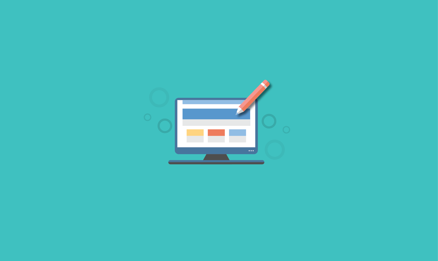
Talented Nick Babich developer, UX / UI specialist, shared his experience on the UX Planet blog about Improving the experience of interaction through the use of cards in the design . Our team completed the translation of this article.
Web and mobile applications are already far from the usual Internet pages and turned into full-fledged personalized systems. These systems are built on many individual pieces of content. Cards - here is a new creative concept.
')
Regardless of how you feel about this concept, the cards are now with us for a long time.
What are cards?
Cards are such small rectangles filled with an inclusive image and text that serve as points of transition to more detailed information. When it comes to finding a balance between aesthetics and the convenience of the user interface, they are almost the main candidates for use. And the reason is that cards are a convenient means for displaying content consisting of various elements.
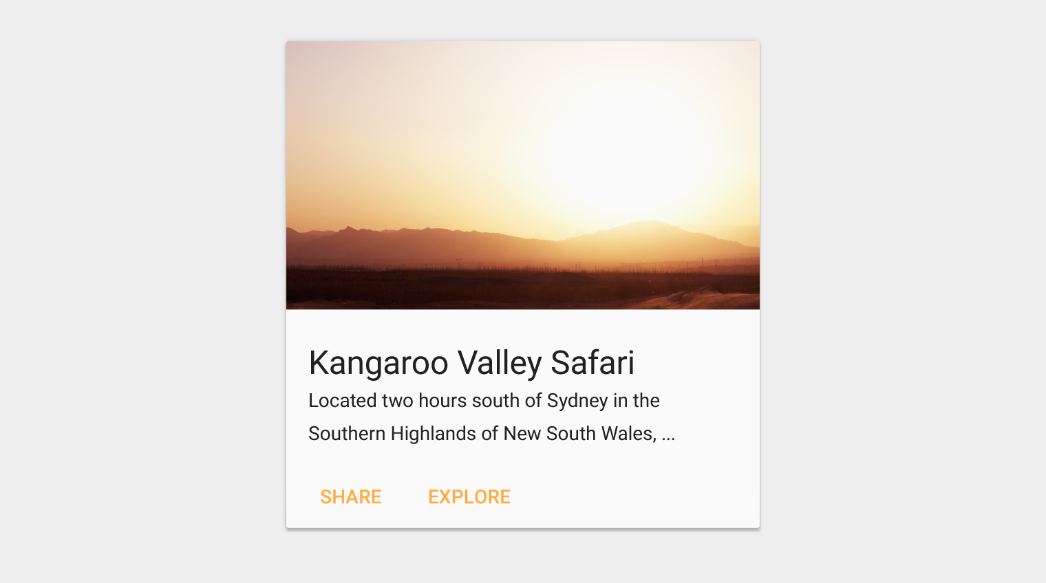
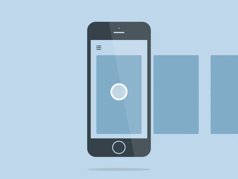
Sample card
Great metaphors
Using cards in the user interface is a great metaphor, because they look like real tangible cards. Even before the advent of mobile devices, cards surrounded us everywhere: bank cards, baseball cards, playing cards, and so on. Cards - this is, in fact, a widespread way of interaction, familiar to people. Therefore, users intuitively understand that the card displays some of the content in the same way as in real life.
Cards are a great way to tell a short story. Here a good example from real life can serve as baseball cards. On both sides of the card contains basic information about the player.

Each card is dedicated to one player.
Content Organization
Cards divide content into semantic parts that take up less space on the screen. By the same principle as the text consists of paragraphs of several sentences, the cards can collect together different pieces of information and form one single piece of content.

Sample card series
Cards layouts have gained popularity when giants like Facebook began to use them in the design of their interfaces for screen and mobile sites and applications. Facebook is actively using container-style designs to group information, despite the almost endless stream of data.
Visual comfort
Design using cards is often found on sites with a large visual load. In general, this is the most important quality of cards. Studies have shown that when using cards on similar sites or in applications, the images instantly fall into the user's field of view. The accents on the cards make the user interface more comfortable.
Take a look at Dribble, a famous website that represents an online community that displays design work. In the case of the presentation of the content of this type of card are really the best option.

Dribbble website
How to make a card
Cards for the same layout should be the same in width, but may differ in height. The maximum height is limited by the size of the free space, but it can be temporarily extended (for example, to display the "comments" field).
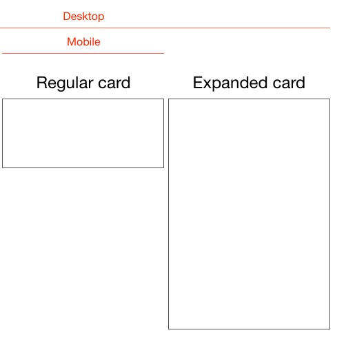
Cards can be fixed or variable height
From a design point of view, the cards should have rounded corners and short shadows. Rounded corners give the card a kind of holistic block with content, and shadows give a sense of depth and volume.

Rounded corners and short shadows
These elements will add some visual sophistication to your projects, but they won't distract you. And with them it seems that the cards seem to "dissolve" above the page.
In addition, you can use animation and movement.
Card benefits
When used correctly, the cards can improve some aspects of the experience of interaction with the application. Due to its form and functionality, the cards are transformed into the original element for the formation of the user interface, simple and intuitive.
More understandable form
You already know that content is always in priority. Cards in design are containers for information that can hold almost anything. Placing the content in the cards makes it more visible and more understandable to the user. Because of this, it is easier for users to access exactly the content they need. This allows the user to receive only the information that he wants to receive.

This example shows cards with different types of content.
Source: Material Design
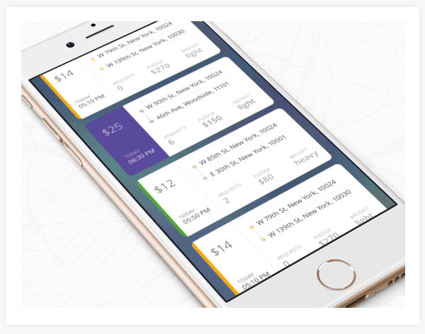
Responsive and mobile design
One of the most important features of the cards is that they can be manipulated almost endlessly. Card-based design works equally well on large screens and mobile devices, because cards divide content into simple blocks. They are well suited for responsive design, because, in fact, they are content containers that are easy to scale in one direction or another.
Last but not least, with the help of cards it is easy to create a layout that will look equally good on different mobile devices. That is why it will be easier for you to create an appropriate experience regardless of device

Design for touch screens
Cards are simply created for devices with touch screens. This is one of the secrets of the popularity of cards. They literally flooded applications for mobile devices. Electronic cards are similar in appearance and functional use with real ones, and because of this, it is very comfortable for the user to work with them. Users do not spend time, do not think long about how to work with the card. They like the simplicity of the card, and they intuitively understand how to work with it, scale it, scroll or activate it to get more detailed information on the content contained in it.
Scrolling
Where to use?
Flow
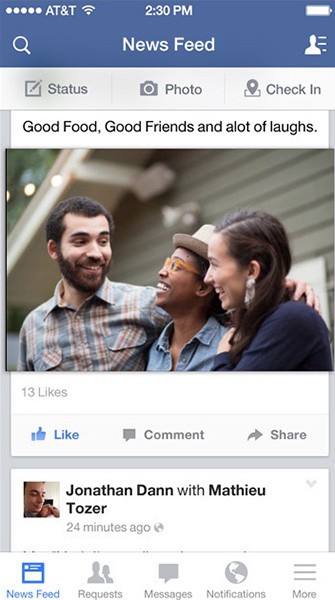
Cards that appear in the stream create a natural chronology of events. Think about how Facebook uses flashcards to provide the user with a quick overview of recent events in the News Feed. Facebook news feeds are an endless stream, and the cards divide it into individual messages. Card function - content sharing. They pull out separate parts of the content from the endless stream and pack it up so that the content becomes easier to read.
Deepen the topic
With the help of cards, you can pack content in such a way that the user, having chosen what interests him, can go deep into this particular topic. Take a look at Tinder's use of cards: if you flip your finger left or right, you are shown people who match your preferences.

Source: Tinder
Pinterest uses dynamic-sized card columns like a grid that helps organize content and offers users a fascinating view of the content.

What do these two services have in common? They extract from the service only the information that is relevant at the moment
Dialogues
Since cards are content containers, they are ideal for providing a list of actions to choose from. Consider, for example, the AirDrop service on Apple devices. When you have an incoming data transfer request, a card pops up with a notification and a question: accept or reject the transfer?

In this case, there is only one option, you do not need to choose anything. Source: Apple
The working process
With the help of cards it is easy to classify various tasks. A great example of this use of cards is Trello. The management system borrowed from Kanban is based exclusively on cards. The Trello workspace is a board filled with cards, each of which represents a different task.

Do not use cards
Homogeneous content
In the event that your content is presented in the form of a quickly viewed list, or a table, instead of cards it is better to use homogeneous content in order not to add a lot of unnecessary actions.
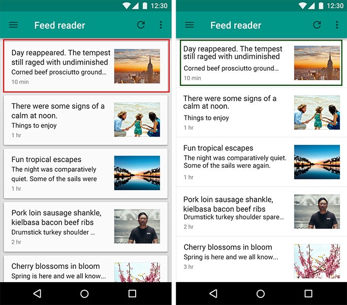
Left: In this case, the use of cards prevents the user from quickly viewing content.
Cards are not the best choice for an image gallery. It is better to present the content in the form of tiles, so it will be easier to perceive. Below is an example of such a layout.

Left: Design using cards for images. Right: Simple list design
Large screen size
Design using cards will look great on small screens, but on large monitors a jumble of cards runs the risk of becoming an unreadable mess. Visually, this design is still beautiful, but judging by the objective indicators of the speed of reading and perception of content, this type of design will be much inferior to the same without using cards. Below is the design page with the cards on the big screen.

Redesign an existing application
When users are already accustomed to one type of design, they may encounter significant difficulties in the new scheme of interaction with the application. You should first ask your users what exactly they would like to change. And only then, on the basis of their answers, gradually rebuild the application, constantly monitoring whether innovations are perceived well.
Conclusion
I hope you understand why card design is gaining more and more popularity. And I would like to believe that this trend will continue in the near future. Because cards not only facilitate the perception of visual information, they are also one of the most flexible elements in the framework of a site or application that help to merge content into one. Nowadays, people view large amounts of information very quickly, and the cards help a lot with this, regardless of the device. If you want to create a better interaction experience - concentrate on what is convenient for people.
Source: https://habr.com/ru/post/304540/
All Articles