How typography can save your life
In our blog, we write about various aspects of working with mailing lists - from the layout of letters to typography . The last topic is very interesting and extensive - the importance of working with the text of the letter is difficult to overestimate. However, typography plays a big role not only on the Internet - today we will talk about how it can in reality save lives.
After several decades of “screaming,” the US National Weather Service recently announced that it would no longer publish its forecasts and weather warnings in capital letters only. Since May 11, all her messages are published in a mixed register.
')
It is impossible to say that the habit of the weather service to write about its forecasts in capital letters was completely its decision. Old equipment, used at the time of the service in the late 1800s, could only produce capital letters. Unfortunately, people are accustomed to the fact that a set of capital letters should be perceived as a scream . It took a long time before the weather service and its customers updated the hardware and software, and now they are finally ready to enter the 20th century.
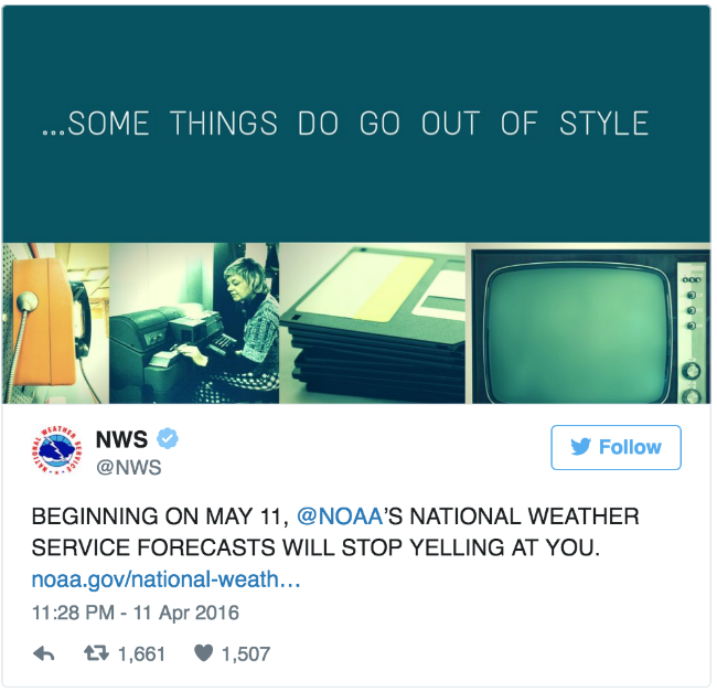
The national meteorological service on Twitter: “Starting from May 11, the National Meteorological Service @NOAA [NOAA - US National Oceanic and Atmospheric Administration - approx. perev.] stop screaming at you "
For designers all over the world, this was the greatest victory in typography history that we have not seen since Massimo Vignelli came up with a new design for the New York metro. It may be an exaggeration, but typography is so important that a person’s life sometimes even depends on it.
The meteorological service using only capital letters is practically the version of “A boy who shouted:“ Wolves! ”, Only from the world of typography. If you type all the texts in upper case — from warning of a dangerous hurricane to reporting a small rainstorm — then everything will look equally important. People understand that in most cases this is not the case, therefore they can become indifferent to any warnings. When nothing stands out, it is much easier to lose sight of the real threat.
Now that the weather service can competently use the messages typed in capital letters - for example, as a means to indicate a real danger - the public is more likely to pay attention to them.
“We realized that we can still use messages from uppercase letters in case we need to select an event, for example:“ ATTENTION! THREATS TORNADO. EVERYONE WILL HIDE IN UKRAINE! ”Says Art Thomas, a national service meteorologist responsible for the project. “We hope that the use of capital letters will attract people’s attention at particularly important moments and encourage them to take care of their safety.”
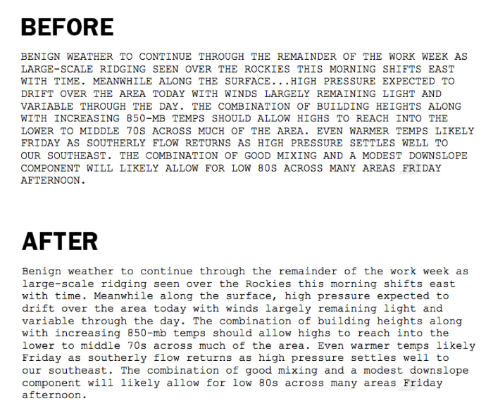
Examples of the use of the meteorological service of the upper and mixed registers in local weather forecasts. Source: NOAA
Timely pressing the Caps Lock key is not just a useful strategy for drawing attention to the events of interest, but also a method that makes it easier to read the text. Considering that when reading we pay attention to the form of the word, large blocks of text consisting only of capital letters are read more slowly. In an emergency, the extra time to decrypt an urgent message may cost us dearly.
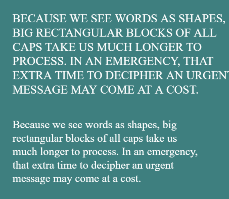
The text typed in capital letters is harder to read than the text typed in a mixed case.
Of course, if your goal is to convey a message that will be hard to read, then the upper case is ideal for this. Companies warning of possible danger with uppercase letters hide, intentionally or not, important information from customers.
The following is the warning version from the US Department of Health, which is mentioned in the famous " Visual Explanations " by Edward Tufti. This warning is depicted on one of the billboards: the message was specially highlighted in capital letters, underlined, and its borders are highlighted in black.
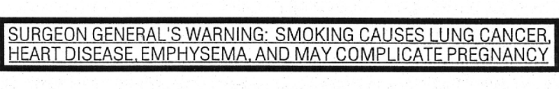
Warning about the dangers of smoking, which is difficult to read. Source: Visual Explanations
Since 1984, each pack of cigarettes was supposed to contain one of four special warnings about the dangers of smoking, including the inscription in capital letters "Ministry of Health warns." In 2009, US President Barack Obama signed a new law requiring manufacturers of larger labels with clear graphics. However, tobacco companies started a legal dispute, and since then the issue of introducing new labels has remained open.
Representatives of the companies claim that they are trying to “highlight” important messages using the upper register. That is why so many legal documents and contracts include sections in which it seems that the reader is being shouted. You can blame the US law - in particular, the Uniform Commercial Code - which requires certain sections of contracts to be “ clearly distinguished ”.
Typically, these instructions apply to those parts of documents that sound like this: "Company X does not guarantee that it will keep its promises, and all risk is on you." It is logical that such sections should not be overlooked. There is one thing: if you “clearly distinguish” the text, then it becomes harder to read. The reason for this is the historical confusion. Legally, the law defines “clearly distinguished” the following concepts:
- “(A) a caption of capital letters equal to or larger in size than the text surrounding it, or distinguished by style, font or color from the text surrounding it of the same or smaller size, and
- (B) a label larger than the text surrounding it, or distinguished by the style, type or color of the surrounding text of the same size, or separated from the surrounding text of the same size by symbols or signs that draw attention to the written ”.
So why do we use upper case instead of bold, italic or even text selection tools? Just because lawyers used to use typewriters, and the only way to isolate anything at that time was to use capital letters. Despite the fact that today modern typing devices can “clearly distinguish” a message in other ways, it is difficult to break the established tradition. You can ask about this in the weather service.

Common situation? Blame typewriters and stubborn lawyers. Source: iTunes Terms and Conditions
But let's digress from capital letters and move, perhaps, to the most famous place where choosing a font can save a person's life - to the roads.
From the 1950s in the United States, all the inscriptions on road signs were printed in Highway Gothic typeface — it was the most common font until the early 2000s. But there were some problems with him. Drivers noticed or not, but the inscriptions made in this font were hard to read in rainy weather, at a distance and in the dark. When the light hit the road sign, the words were mixed into one glowing, blurred porridge, which is called a "halo" [Eng. halation]. For an ordinary person, such an inscription will cause slight irritation, but if you are an elderly person with poor eyesight, moving at a speed of 70 miles per hour, this can lead to tragic consequences.
Road engineers for a long time could not find a way out of this situation. They thought about making the letters 20% larger, but for this they would have to make larger signs that would cost several billion dollars. Therefore, they decided to turn to designers - specialists in eco-graphic and typography. These designers designed Clearview, a new typeface that occupies the same space as Highway Gothic, but is easier to read.
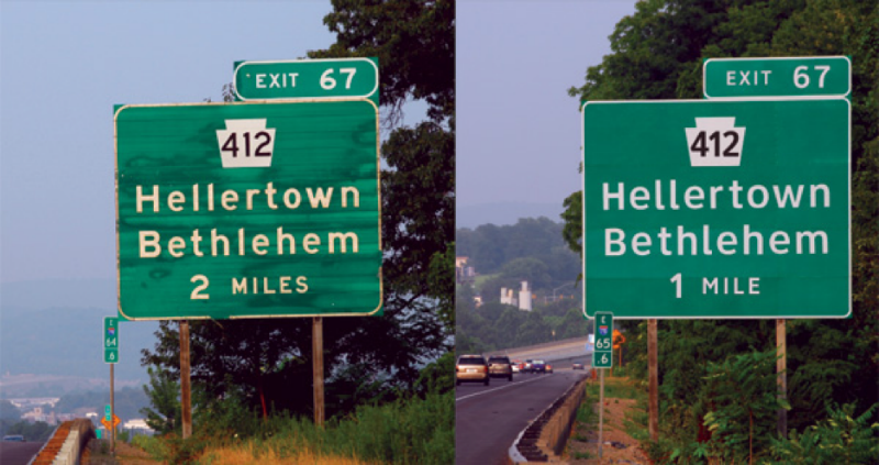
Highway Gothic (left) compared with the new alternative headset Clearview. Source: Termimal Design, Inc.
One of the most important changes in the new headset was the expansion of the space inside the letters - the so-called counter -space, for example, the voids in the letters O or P. In addition, the designers adjusted the height of the upper bearing elements, as in the letters b, d, f, h, as well as the space between the letters. As a result, all these changes, taken together, seem to have borne fruit. After numerous tests in bad weather and other weather conditions, Clearview became a headset that improved the clarity of the inscriptions when reading, and also reduced the reaction time and the distance at which the inscription can be recognized. Soon on many highways of the country appeared inscriptions, made in Clearview.

Clearview's first tests in vivo. Source: Terminal Design, Inc.
But not for long. This year, the US Federal Highway Administration announced that it would not require that all signs be written in Clearview. It explained this as “often arising confusion and contradictions in the design of road signs, the processes of their production and application.” Management also cites a number of evidence that Clearview is not so much easier to read the signs at night. Thus, the Office actually puts an end to innovation in typography, arguing that "it is not going to take part in the examination, development and support of alternative writing styles in the future."
However, attempts to create a headset that can save human life continue to be made in the road environment - this time inside the car. In 2012, scientists from MIT began working with the printing company Monotype to solve the problem of distraction of drivers. They thought that if they were able to develop a user-friendly display design inside the vehicle, drivers would spend less time trying to recognize the words on the screen and more time watching the road. In order to make it easier to get information from the screens, the two organizations tried to change the fonts.
They settled on a “humanistic” style, in which the distance between the characters was greater, and the glyphs were more distinguishable. According to the study , humanistic styles are more readable than the square and geometric fonts widely used in car manufacturing. The illustration from a joint article by MIT and Monotype shows differences in counterspaces and other subtleties that affect readability:
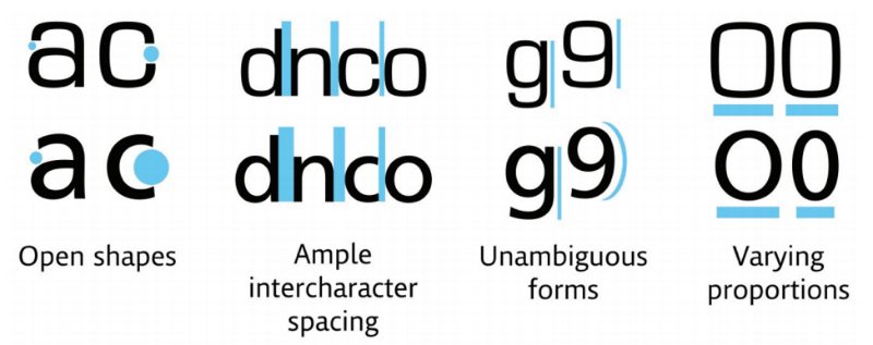
The square font (Eurostile) is at the top compared to the humanistic font (Frutiger) at the bottom. Source: Monotype Imaging
New humanistic fonts, as it turned out, worked well. The total time of the translation of the glance, that is, how long the driver did not look at the road, was reduced by half a second for male drivers who took part in the experiment (the women showed the same results). The time difference was about 12%. It may seem insignificant, but half a second means 50 feet for the average car on the highway. A length of two cars could cost a person a life.
Even NASA perfectly understands the importance of typography: they have a whole report for this - “On the typography of documentation in the cockpit”. In this report, NASA scientist Asaf Degani (Asaf Degani) notes: “Although cockpit documentation is an important (and sometimes necessary) form of displaying information in modern crew cabins, the effective design of such documents is still the subject of research.”
Effective design in this case may indeed be a necessity. The report describes the accident that occurred on May 26, 1987, when an airplane from Air New Orleans Flight 962 went to Florida. Even before the plane reached a height of several hundred feet, the pilot was forced to make an emergency landing. During the landing, the plane went to the nearest highway and destroyed several vehicles.
It turned out that the crew had forgotten to turn the engine control lever. The National Transportation Safety Board called this situation “a lack of discipline in checking onboard documentation”. What is the reason? Answer: bad design. Here is what the Security Council said about what happened:
“The font in the Air New Orleans documentation is 57% smaller than needed, when compared to ergonomic requirements. A smaller font reduces readability even under optimal conditions. There is no evidence that a low level of readability has played a role in the incident. However, the Security Council believes that under certain conditions of operation this flaw could prevent the document from fulfilling its main task. Therefore, the Security Council believes that the Federal Aviation Administration of the United States should take measures to determine whether the aircraft documentation complies with accepted ergonomic requirements.
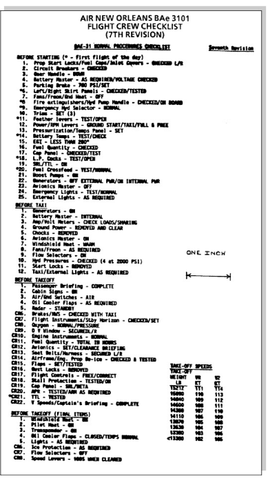
Air New Orleans documentation was hard to read, as the font size in it was 57% less than recommended. Source: NASA
Despite the fact that NASA probably also has a number of other unresolved security issues, Degani emphasizes the role of typography in ensuring the safety of pilots and passengers: “The efficiency and accuracy of reading lists, maps, airport plans, flight plans, fare sheets, trip sheets, etc. d., partially depend on typographical and graphic factors. Moreover, in the event of an accident or emergency, the efficiency of the crew in evaluating, reading, perceiving and executing instructions is essential for safety in flight. "
At the end of the report, he gives recommendations, starting with the length of the line and ending with the choice of font color and the presence of serifs (by the way, he is against using upper case, read recommendation # 4). The following is a complete list of these recommendations:
NASA Recommendations for On-Board Documentation
1. Sans serif fonts are usually easier to perceive than serif fonts.
2. Try not to use fonts where the characters are too similar to each other, as this will reduce the readability of the printed text.
3. Try not to print critical documents on a matrix printer.
4. It is advisable to write long fragments of text in lower case.
5. If you want to use upper case, the first letter of the word should be larger to make the word easier to read.
6. When choosing a font height, you must consider the ratio of the growth of lowercase letters to the growth of capital letters.
7. As a general recommendation, when making important documents, the growth of lowercase letters should be at least 0.10 inches.
8. The recommended ratio of the height of the characters of the font to their width is 5: 3.
9. Line spacing should be at least 25-33% of the total font size.
10. The horizontal spacing between characters should be 25% of the total area and be no less than the width of one stroke.
11. Try not to write long text in italics.
12. If possible, use 1-2 headsets to highlight text.
13. In most documents, use black characters on a white background.
14. Try not to use white characters on a black background when describing standard flight procedures. In case this is necessary:
- Use a minimum of text;
- Use a relatively large size;
- Use sans serif fonts to reduce losses in readability.
15. Documentation recommends using a black font on a white or yellow background.
16. Try not to use black font on a dark red, green and blue background.
17. To protect documents, use a plastic with anti-reflective coating.
18. Make sure paper and print quality is above standard. Poor print quality will affect text readability.
19. The designer should take into account the age peculiarities of pilots who will read the documentation and choose a more conservative approach in evaluating statistical information.
Of course, there are countless examples of bad typography. Fortunately, only a few lead to accidents and confusion in emergency situations. But in such cases, even minor changes in the shape of the letter or the style of the font become important details. So remember this the next time you press the Caps Lock key.
Source: https://habr.com/ru/post/304470/
All Articles