UX button design: creation tips, types and states
Nick Babich is a developer, a UX / UI specialist, wrote a note on the UX Planet blog about UX-button design: tips on creating, types and states . Our team has translated this article.
Buttons are the most common, “everyday” element of interaction design. That is why they need to pay special attention, because the buttons are an essential element that ensures unhindered interaction in the network and applications. We will discuss the types and states of the buttons — you need to know this information in order to create effective buttons and improve your user experience.
')
Let's imagine for a moment how to bring a choice through design. How will the user understand that this element is the button? It focuses on color and shape.
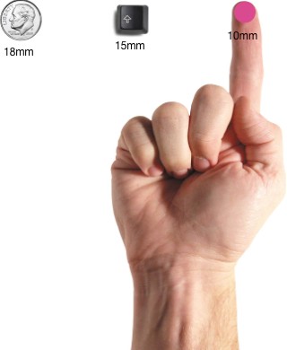
Very carefully consider the size of the zone of contact and the inner field. The size of the buttons also helps the user to understand what this element is. Each platform gives its recommendations on the minimum size of the touch zone. The results of a study conducted by MIT Touch Lab showed that the average size for touching with finger pads is 10-14 mm, and for finger tips - from 8 to 10 mm, with the most optimal minimum size of the touch zone being 10X10 mm.
Place the buttons where users can easily find them or where they expect to see them. See how iOS tutorials advise you to place buttons.
Do not forget about the order and position of the buttons. The order in which the buttons go, especially if there are paired buttons (for example, “previous” and “next”), is very important. Make sure that the main focus of the design is on the main or most important user action.
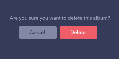
In the example below, we use a red button that contains a potentially destructive action. Please note that the main action is not only more saturated in color and contrast, but is located on the right side of the dialog box.
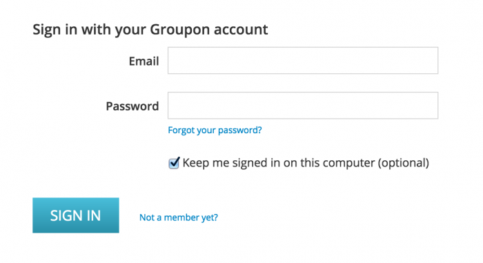
The labels on the buttons should indicate the action that the button performs. Clearly describe what will happen when you press it.
Exactly the same buttons as above, but without the corresponding inscription. Feel the difference?

The most important buttons (especially if they call for action) should look like the most important buttons.

Usually the buttons are tried to make rectangular with straight or rounded edges, depending on the style of the site or application. According to some studies, rounded edges enhance the perception of information and attract the eye to the center of the element.
You can show creativity and use other forms, for example, a circle, a triangle and even some original and unusual forms. Although the latter option is still risky.

The main thing is to observe the unity of style in the entire interface so that the user can determine where the buttons are in your application.
1. Volume button
The volume button is usually rectangular with a lift (gradation of shades indicates that the button is clickable). Volume buttons add texture to a mostly flat layout. They emphasize functions in the most active or wide areas.
On the line in one row. Use voluminous buttons to add value to actions on the site or in an application with a large number of different content.
Volume buttons are raised and filled with color when pressed.
Volume buttons stand out against the flat. An example is given for an Android application.
2. Flat buttons
Flat buttons do not lift, but also fill with color. The main advantage of flat buttons is that they do not distract attention from the content.

In the dialog boxes (to maintain the unity of the action of the button and content)

On the toolbar
Bottom location for the user to quickly find them.

Behavior
Flat button in the Android application dialog box.

3. Switch
A toggle button allows the user to switch between two or more states.
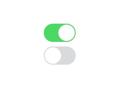
Application
Almost all switches are used as On / Off buttons.
The toggle buttons can also be used for a group of related elements. But the layout of the layout should clearly indicate that these buttons are part of the entire group of elements. There are other requirements:
· The group must have at least three buttons
· The buttons should have text, an icon, or both.

Icons are best used when the user can make a selection and cancel it, there are no other options. For example, give or remove a star from the product. Placing icons usually in the application bar, toolbar, action buttons or switches.
It is very important to choose the right icon for the button. I talked about this in the article “Icons as a factor in a successful user experience.”
Example
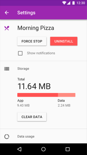
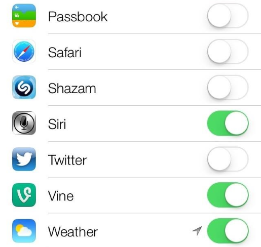
In Apple iOS, the switches are used in the Settings section.
4. Contour buttons
Contour buttons are transparent buttons of a simple form, usually rectangular. Typically, the contour of the button is a very thin line, and the inside contains plain text.

Application
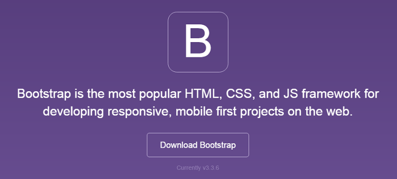
Perhaps you should not use the contour buttons for a call to action. Here, look at Bootstrap. The “Download” contour button is no different from the main logo, which can confuse users.
It is best to use these buttons for secondary content, since they will not (at least should not) compete with your main call to action. I would like the user to first see the main CTA button, and only then (if it is not relevant for him) go to the second button.
The button calling for a positive action is more contrast and the user clearly sees the action.

Behavior

Example
The AirBnB website has contour buttons for the Become a Host action.
5. Floating button with drop down menu
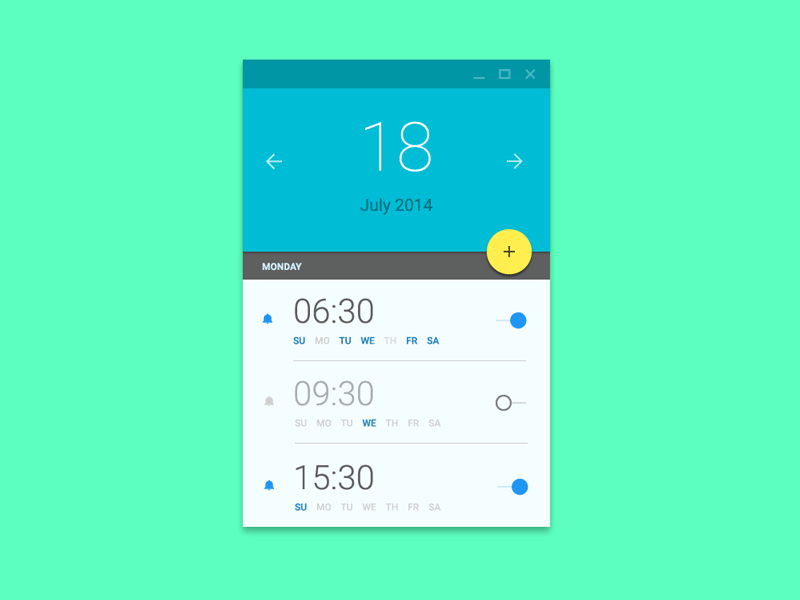
A floating button with a drop-down menu is one of the elements of Google’s material design. This is a round material button that rises and gives an inkblot effect when pressed.
Application
Floating buttons with drop-down menus are used to invoke function keys.
Behavior
They can be immediately noticed by a circular icon hovering over the UI. They include such types of behavior as morphing, launching and moving the anchor point.
Select the type of button.
The choice of button style depends on its importance, the number of containers on the screen, and the screen layout.


Function: Is the button important and unique enough to make it float?
Sizes: Choose the type of button, depending on the container in which it will be located and on how many layers of depth you have on the screen.
Layout: Use predominantly one type of button per container. Mix button types only if there are grounds for this, for example, highlighting an important function.
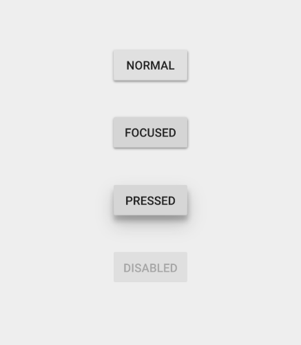
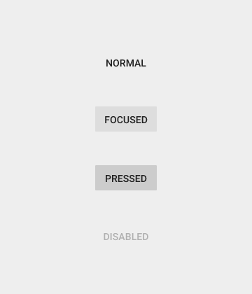
Button states
Here it is not a question of how the user sees the initial button, but of those cases when nothing changes when you hover over it. The user does not immediately understand the button or not? Now you have to click to find out ...
An object such as a button has several states, and providing a visual response in order to display the current state of the button should be a priority.
Normal condition
The main rule of this state is that the button should look like a button in its normal state. Windows 8 is a good example of bad button design. It is difficult for the user to understand whether objects in the settings menu are clickable or not.

Condition in focus
It will be correct to make the user understand that he is pointing the pointer over the button. The user immediately understands that his action was taken, and wants a visual confirmation.
Pressed state
Animating the various elements of your design, you can make a fresh note, show a little creativity and please the user.

Inactive state
There are two options - hide the button, or display it in an inactive state.
Advantages of the hidden button:


Benefits of using the inactive state:
Placement control. The user understands where controls and buttons are located in the interface.

The buttons are designed to direct the user and push him to take action of interest. Smooth switching promotes smooth interaction; problems, such as the inability to find the right button, are interference at best and, at worst, a complete failure.
UX button design is recognizable and clear. Think of a site or application as a conversation initiated by a busy user. Button plays a crucial role in this conversation.
Buttons are the most common, “everyday” element of interaction design. That is why they need to pay special attention, because the buttons are an essential element that ensures unhindered interaction in the network and applications. We will discuss the types and states of the buttons — you need to know this information in order to create effective buttons and improve your user experience.
')
Tips for creating buttons
Buttons should look like buttons.
Let's imagine for a moment how to bring a choice through design. How will the user understand that this element is the button? It focuses on color and shape.
Very carefully consider the size of the zone of contact and the inner field. The size of the buttons also helps the user to understand what this element is. Each platform gives its recommendations on the minimum size of the touch zone. The results of a study conducted by MIT Touch Lab showed that the average size for touching with finger pads is 10-14 mm, and for finger tips - from 8 to 10 mm, with the most optimal minimum size of the touch zone being 10X10 mm.
Location and order
Place the buttons where users can easily find them or where they expect to see them. See how iOS tutorials advise you to place buttons.
Do not forget about the order and position of the buttons. The order in which the buttons go, especially if there are paired buttons (for example, “previous” and “next”), is very important. Make sure that the main focus of the design is on the main or most important user action.
In the example below, we use a red button that contains a potentially destructive action. Please note that the main action is not only more saturated in color and contrast, but is located on the right side of the dialog box.
Inscriptions
The labels on the buttons should indicate the action that the button performs. Clearly describe what will happen when you press it.
Exactly the same buttons as above, but without the corresponding inscription. Feel the difference?
Call to Action (CTA)
The most important buttons (especially if they call for action) should look like the most important buttons.
Button shape
Usually the buttons are tried to make rectangular with straight or rounded edges, depending on the style of the site or application. According to some studies, rounded edges enhance the perception of information and attract the eye to the center of the element.
You can show creativity and use other forms, for example, a circle, a triangle and even some original and unusual forms. Although the latter option is still risky.
The main thing is to observe the unity of style in the entire interface so that the user can determine where the buttons are in your application.
Button types and behavior
1. Volume button
The volume button is usually rectangular with a lift (gradation of shades indicates that the button is clickable). Volume buttons add texture to a mostly flat layout. They emphasize functions in the most active or wide areas.
Application
On the line in one row. Use voluminous buttons to add value to actions on the site or in an application with a large number of different content.
Behavior
Volume buttons are raised and filled with color when pressed.
Example
Volume buttons stand out against the flat. An example is given for an Android application.
2. Flat buttons
Flat buttons do not lift, but also fill with color. The main advantage of flat buttons is that they do not distract attention from the content.
Application
In the dialog boxes (to maintain the unity of the action of the button and content)
On the toolbar
Bottom location for the user to quickly find them.
Behavior
Example
Flat button in the Android application dialog box.
3. Switch
A toggle button allows the user to switch between two or more states.
Application
Almost all switches are used as On / Off buttons.
The toggle buttons can also be used for a group of related elements. But the layout of the layout should clearly indicate that these buttons are part of the entire group of elements. There are other requirements:
· The group must have at least three buttons
· The buttons should have text, an icon, or both.
Icons are best used when the user can make a selection and cancel it, there are no other options. For example, give or remove a star from the product. Placing icons usually in the application bar, toolbar, action buttons or switches.
It is very important to choose the right icon for the button. I talked about this in the article “Icons as a factor in a successful user experience.”
Example
In Apple iOS, the switches are used in the Settings section.
4. Contour buttons
Contour buttons are transparent buttons of a simple form, usually rectangular. Typically, the contour of the button is a very thin line, and the inside contains plain text.
Application
Perhaps you should not use the contour buttons for a call to action. Here, look at Bootstrap. The “Download” contour button is no different from the main logo, which can confuse users.
It is best to use these buttons for secondary content, since they will not (at least should not) compete with your main call to action. I would like the user to first see the main CTA button, and only then (if it is not relevant for him) go to the second button.
The button calling for a positive action is more contrast and the user clearly sees the action.
Behavior
Example
The AirBnB website has contour buttons for the Become a Host action.
5. Floating button with drop down menu
A floating button with a drop-down menu is one of the elements of Google’s material design. This is a round material button that rises and gives an inkblot effect when pressed.
Application
Floating buttons with drop-down menus are used to invoke function keys.
Behavior
They can be immediately noticed by a circular icon hovering over the UI. They include such types of behavior as morphing, launching and moving the anchor point.
Select the type of button.
The choice of button style depends on its importance, the number of containers on the screen, and the screen layout.
Function: Is the button important and unique enough to make it float?
Sizes: Choose the type of button, depending on the container in which it will be located and on how many layers of depth you have on the screen.
Layout: Use predominantly one type of button per container. Mix button types only if there are grounds for this, for example, highlighting an important function.
Button states
Here it is not a question of how the user sees the initial button, but of those cases when nothing changes when you hover over it. The user does not immediately understand the button or not? Now you have to click to find out ...
An object such as a button has several states, and providing a visual response in order to display the current state of the button should be a priority.
Normal condition
The main rule of this state is that the button should look like a button in its normal state. Windows 8 is a good example of bad button design. It is difficult for the user to understand whether objects in the settings menu are clickable or not.
Condition in focus
It will be correct to make the user understand that he is pointing the pointer over the button. The user immediately understands that his action was taken, and wants a visual confirmation.
Pressed state
Animating the various elements of your design, you can make a fresh note, show a little creativity and please the user.
Inactive state
There are two options - hide the button, or display it in an inactive state.
Advantages of the hidden button:
- · Clarity. Only what is needed for the current task is displayed.
- · Saving space. This will allow you to change management using the same space for different purposes. Which is very convenient if there are a lot of controls. Gmail uses this method.
Benefits of using the inactive state:
- Show the possibility of action. Even if the button is not used, the user knows that the action is possible. You can even make a hint and explain the criteria for use.
Placement control. The user understands where controls and buttons are located in the interface.
Conclusion
The buttons are designed to direct the user and push him to take action of interest. Smooth switching promotes smooth interaction; problems, such as the inability to find the right button, are interference at best and, at worst, a complete failure.
UX button design is recognizable and clear. Think of a site or application as a conversation initiated by a busy user. Button plays a crucial role in this conversation.
Source: https://habr.com/ru/post/304398/
All Articles