Increase Conversion: 9 Essential Elements of the Right Email Template
You conduct A / B testing, carefully segment the market and select every word in the text of your mailing list , but what do you do to optimize its markup? The aesthetics of your template are as important as the content of the letter itself. So let's look at nine design elements that will help you increase conversion.
Keep your email wide
The width of the email should not exceed 600px. This is the standard width at which your email will be correctly displayed in web and desktop clients.
')
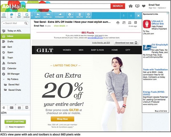
Screenshot from sitepoint
In Outlook, Thunderbird and Apple Mail, the preview window is limited in size, so the width of the letter should not exceed 600px. And do not worry about the display of letters on mobile devices. We will discuss this in the next section.
Use the “mobile first” approach
In the early 1990s, when developing e-mails, web developers adhered to the concept of resiliency (graceful degradation). Currently, progressive enhancement (progressive enhancement) techniques are being used more and more, which means designing primarily for mobile devices.

Your letter template should be adaptive, while using media queries alone is not enough. To make it convenient for users to read your email from a mobile, you need to create a visual hierarchy of content and bring the most important information to the top of the page.
The first thing you need to compress the content of the letter in one column. One-column structure allows your letter to scale to the screens of small mobile devices and linearly distribute information.
Another trick to help make your email more attractive and less overloaded is to hide some of the content for viewing from your mobile. This can be especially useful when the letter contains links to a page that is not supported by mobile devices. If the information is not essential, you can hide it in the mobile version. By giving users fewer options, you can increase the click through rate of your main call to action.
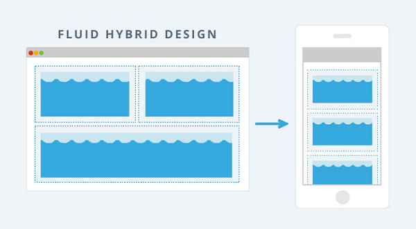
Use the "floating hybrid" design
About 66 percent of all emails open on mobile devices. Moreover, 70 percent of smartphone users claim that they immediately delete email if it is displayed incorrectly on their device. Therefore, if you do not pay enough attention to how your letters look on phones and tablets, then most likely your marketing campaigns are ineffective. Ultimately, this approach has a negative impact on the brand itself and the return on investment.
Undoubtedly, each design element in the template of your letter is crucial for success, but special attention should be paid to its adaptability.
The best emails intended for reading from mobile devices are created from adaptive or " floating hybrid " (fluid hybrid) templates. "Floating hybrid" design replaces design using technology media queries. The fact is that, thanks to this “elastic” design, the email is displayed correctly even on those clients and devices that do not support modern CSS.
Want to get down to business right away? At Email on Acid, you can find a free “floating hybrid” template that has been tested on the most popular clients and devices.
Add visual elements
The old saying goes: "It is better to see once than hear a hundred times." It is relevant for email marketing. About 80 percent of your audience will somehow see your letter, so a properly selected image is extremely important to convey a message.
When choosing an image for your letter, remember that preference should be given to photographs of people. Images of faces are processed by the so-called “spindle-shaped cerebral gyrus” - a part of the brain that is also responsible for emotions. Such images will allow the reader to create an emotional connection with your brand or letter content.

In her letter, the charity organization charity: water perfectly matched the image to the text. Together, both elements create a convincing story that will not leave anyone indifferent.
Do not overdo it with the number of images
The image should be one of the elements of your letter template, but not its only element. In some e-mail clients, downloading images may be blocked by default or at the request of the user. In this case, the images that make up your letter will not convey any information to the recipient!
Below is an example of a letter that consists entirely of blocked images:
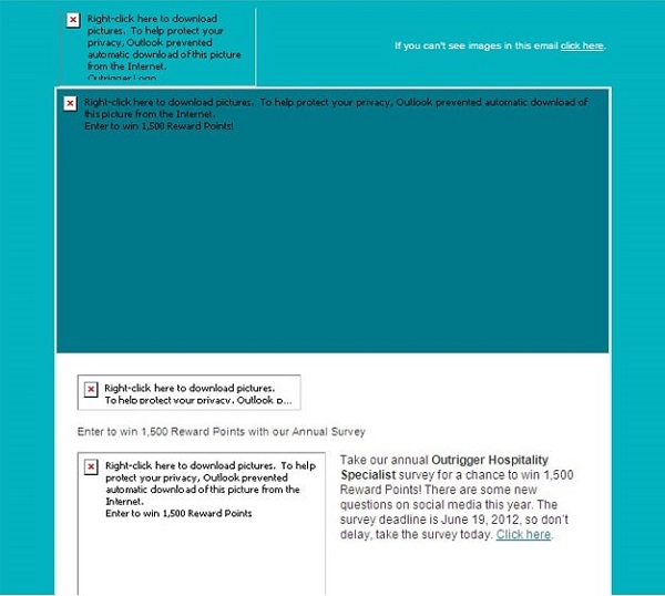
And even the message “right-click to download the image” will not make the letter more attractive. To avoid such a bad experience, always add an alternative description to the image. In our article on the rules of the layout of email-letters, you can find some tips on adding alternative text.
Choose the right font
The font in your letter should not only be readable - it should be a reflection of your brand and ensure its uniform presentation in different media.
Particular attention should be paid to the font size. Make sure that it increases on the screen of mobile phones so that users do not have to compress or increase your email. For Apple devices, it is recommended that the default font size is 17px for body text, and the minimum size is 11px. For Android devices, it is preferable to use a default font size of 16px for body text with a minimum size of 12px. Thus, the font size of the main text should be 16 - 17px, and the size of footnotes and captions to images - 12px.
The study showed that the Courier and Verdana fonts are the most readable, however, in general, readers prefer the Arial and Verdana fonts. Here is a short list of universal fonts:
- Arial
- Arial black
- Comic sans ms
- Courier new
- Georgia
- Impact
- Times new roman
- Trebuchet ms
- Verdana
- Σψμβολ2 (Symbol)
- Webdings
Use lines to sort the content of the letter.
The lines give the letter order and form. Therefore, when using lines — whether it is bold or thin — make sure that the arrangement of the elements of the letter does not lead to confusion or incorrect perception of the material.
If the content of your letter is diverse, then clearly identify individual fragments using separators or borders. Otherwise, it will be difficult for subscribers to find the information they are interested in in your letter.
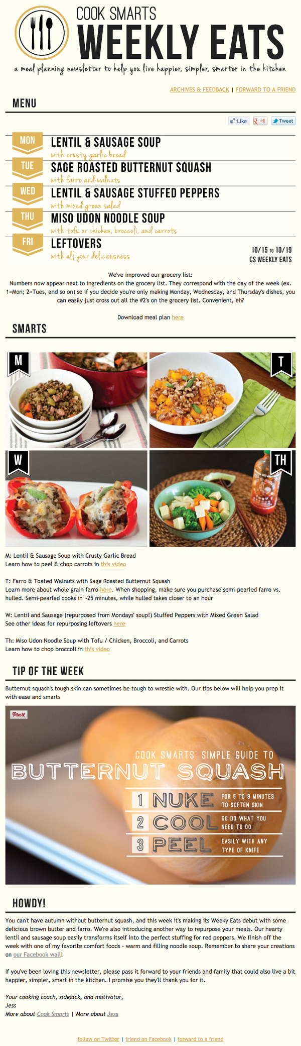
Cook Smarts uses the lines very well in its newsletter, organizing its useful tips and recipes. As a result, the recipient of the letter does not have the impression that a cookbook has exploded in his mailbox.
Use "negative space"
It is not necessary to fill every gap in the template of your letter. White (negative, free) space makes writing more convenient for reading and general perception, helps to highlight the most important aspects and stimulates the reader’s imagination.
When creating a letter template, it is very important to harmoniously combine text and images with empty space in order to make it easier for the reader to process and assimilate the information received.
There are two types of white space:
- Active white space — spaces that are intentionally added to delimit content items and keep the reader’s attention.
- Passive empty space - spaces that arbitrarily arise during the design. For example, the space between words in a string or around a logo.
The following letter template from the envatotuts + service is an excellent example of the successful use of negative space. Looking through the content of this letter, the reader easily perceives its various elements.
When designing your next template, remember: what you exclude from the letter is just as important as what you include in it.
Add a compelling call to action
If you make every effort to create an attractive headline and interesting content, but at the same time forgot to highlight your call to action (CTA), then you will face a complete failure. The call to action button should attract the attention of the reader, make sure that it stands out among other elements of the letter.
This can help you color decision. The CTA color should contrast with the text and background color of the template.
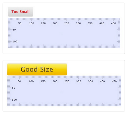
In addition, the CTA button must be commensurate with other elements of the email. On the Hubspot platform, you can use a useful tool to measure the call-to-action button.
And, finally, do not place your call to action on the image. As mentioned above, many email clients block images by default. In this case, readers will not see this important element of your letter.
Instead, use the “bulletproof” buttons on VML and CSS that will work even when locking images. You can read more about this in the EOA article "The last bulletproof button you will ever use." In it, you will also find the code for placing the CTA button in the center of the template.
Other materials on the Pechkina blog:
- Email, social networks, instant messengers: What does the media influence and how to choose them
- How to create email-auto-answers: Analysis of 100 applications to support services of IT companies
- Working with email: How to reduce the number of incoming messages to zero
- Why spam is so hard to beat
- Email and Security: Is it possible to protect email correspondence?
Source: https://habr.com/ru/post/304348/
All Articles