Proportions in art. Is there anything better than the golden section? Research over 1,000,000 old and modern paintings
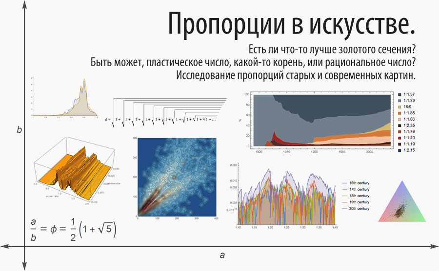
Translation of the post Michael Trotta (Michael Trott) " Aspect Ratios in Art? Being Plastic, Rooted, or Just Rational? Investigating Aspect Ratios from Old vs. Modern Paintings ".
The code given in the article can be downloaded here .
Many thanks to Kirill Guzenko KirillGuzenko for his help in translating and preparing the publication.
Content
Preface: The golden ratio - a beautiful mathematical concept
The work of Fechner in 1876 on the aesthetics of rectangles and the aspect ratio in paintings
Easy Start: Artwork Analysis - Wolfram Knowledgebase Knowledge Areas
The first part: features of the probability distribution of the aspect ratio
Aspect ratios for different centuries, genres and artists
Analyzing five old German museum catalogs
Kress collection: four large PDF files
We present the collections of the following galleries: Metropolitan (Metropolitan), Art Institute of Chicago, the Hermitage, the National Gallery (National Gallery), the Rijksum and the Tate Britain.
Exception in the aspect ratio: National Portrait Gallery
Web Gallery of Fine Arts: handy database, ready to use
Note II: the importance of accuracy in measurements
WikiArt: another major web resource
Collection of the French State Museum
Paintings in Italian churches: height is everything
Smithsonian collection
A large collection of paintings in the UK
The current fine arts market: more rational than ever
Sold paintings: most are painted recently, and the distribution has a long tail
East: all indicators are different
Proportions of packages, cars, labels, logos, emblems, paper, banknotes, postage stamps and films
- Products from the supermarket
- Wine labels
- Labels of German beers
- Food Logos
- Banknotes
- Car sizes
- Paper sheets
- Stamps
- NCAA (National University Sports Association) Team Emblems
- Emblems of German football clubs
- Movie Formats
Conclusion: so what is the best ratio?
Pictures of the great masters - perhaps the most beautiful of human heritage. They were treasured and admired, carefully stored and sold for hundreds of millions of dollars, and perhaps not by accident they are the main goal of art thieves. Their compositions, colors, details, themes can keep us in admiration and attention for hours. But what about the ratio of their external dimensions - height to width?
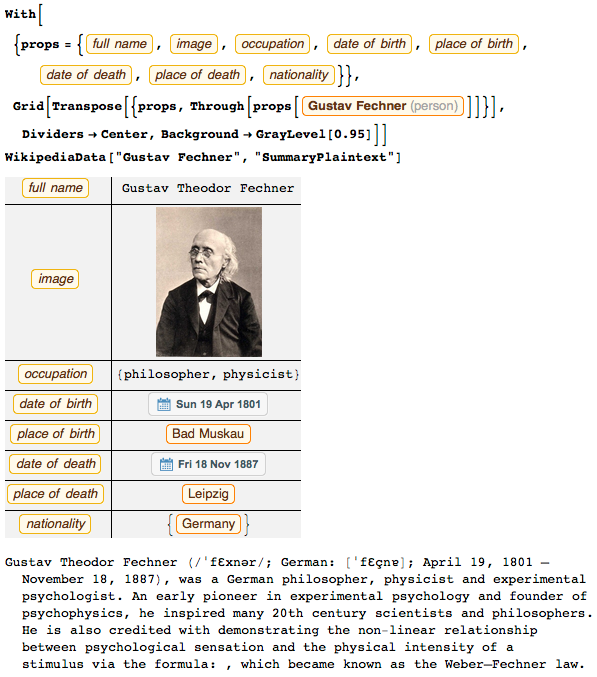
In 1876, the German scientist Gustav Theodor Fechner studied the human perception of rectangular shapes, and then concluded that rectangles with a golden proportion (the same as the golden section ) are most pleasing to the human eye. To test his experimental observations, Fechner also analyzed the ratios of more than ten thousand pictures.
A little more to learn about Fechner will help us the following code:
')
By the standards of 1876, Fechner did an amazing job, and we can repeat some fragments of his analytical work using the capabilities of the modern information rich world — with big data technologies, infographics, numerical models, knowledge systems of the scientific and digital worlds.
After reviewing the golden proportion and Fechner's findings, we will look at the aspect ratios in the various groups of pictures and the final distribution, as well as the most popular correlations. We will learn about the tendencies of the last century in the field of aspect ratios and consider how it has become more rationalistic.
Preface: The golden ratio - a beautiful mathematical concept
Golden ratio φ = (1+
 ) /2≈1.618033988… - a special number in mathematics. In binary or decimal form, the sequence of its numbers looks more or less random:
His representation in the form of a continued fraction is as succinct and beautiful as the resulting mathematical expression:

You can write it more explicitly:

Another similar representation is a similar square root iteration:

Although these are simple square roots, the golden ratio is a special number. For example, this is the worst approximated irrational number:

Here is a graph showing the sequence q ∙ | q ∙ ϕ - round (q ∙ ϕ) | . The value of the sequence members is always greater than 1/5 ^ ½:

In addition, we can show approximations to the golden section by taking successive parts of a continued fraction:

The visualization of the defining golden section of the equation 1 + 1 / φ = φ is shown below. It sets the ratio of the shown segments (the red segment has a length of 1 / φ, blue - 1).

Below are wide and high rectangles with aspect ratios equal to the golden ratio and 1 / golden ratio, respectively.

And it is not surprising that such a beautiful number from the point of view of mathematics was often used to create aesthetic forms. The history of the golden section goes back centuries. It was mathematically described by Euclid, and the famous da Vinci drawings were based on the golden section.
The Wolfram Demonstrations Project has about ninety interactive documents related to the use of the golden section. Especially it is worth paying attention to the Mona Lisa and the golden rectangle , as well as the golden spiral.

The golden section is often found in nature. The golden section version for corners is the so-called golden angle , which breaks a circle into two parts, the lengths of which have a ratio equal to the golden section:

The golden angle, for example, can be found in the phyllotaxis models:

M. Akhtaruzzaman and A. Shafie gives a very long list of where the golden section is found in nature and man-made objects.
However, the versatility of the golden section in art is often overestimated. The most popular misconceptions are given in the work for the authorship of Markowsky .
In the future, we will often encounter the square root of the golden section. If we also consider complex numbers, then another, fairly simple continued fraction will give the square root of the golden ratio in the composition of its real and imaginary part (
 - approx. Ed.):
The term golden section was first used by Martin Om , brother of the famous physicist George Ohm , in his book in 1835.
The work of Fechner in 1876 on the aesthetics of rectangles and the aspect ratio in paintings
The first volume of the frequently cited work by Vorschule der Aesthetik (1876), by Gustav Theodor Fechner - a physicist, an experimental psychologist and philosopher - discusses the human perception of the golden section.
Nowadays, Fechner is probably the most famous for the law of subjectivity in the perception of sensations (the intensity of sensation is directly proportional to the logarithm of the intensity of the stimulus), which is called the Weber-Fechner law :

In chapter 14.3 (volume 1) of his book, Fechner discusses aesthetics in the aspect ratio of rectangles. After polling 347 people, each of which was offered a choice of 10 rectangles with different aspect ratios, the most popular was with a 34/21 aspect ratio, and this ratio differs from the golden ratio by less than 0.1%. Below is the cited to this day, but rarely found in publications, a table with the results of Fechner:
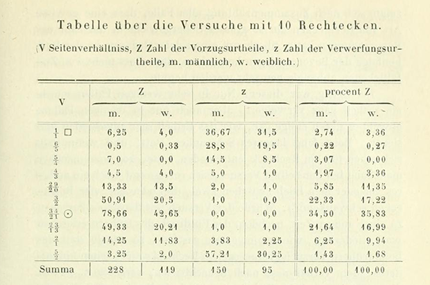
In chapter 33 of the second volume, the sizes of the paintings are discussed, in chapter 44 a detailed analysis (on 41 pages) of 10,558 paintings from 22 European galleries is presented. Interestingly, Fechner discovered that the typical ratio of height and width for painting deviates greatly from the expected golden section.
Fechner conducted a detailed analysis of 775 paintings on hunting and military subjects, and a more crude analysis for the remaining 9,783 paintings. Below are the results for paintings on hunting and military themes ( Genre ), landscapes ( Landschaft ) and still lifes ( Stillleben ). In the table, the height is denoted as h , and the width as b . And V.-M. There is a ratio h / b or b / h :

And now, in our days, we can repeat its analysis using modern means and knowledge.
McManus ( here and here ) will help you to learn more about the modified versions of the Fechner experiment, McManus et al. , Konecni , Bachmann , Stieger and Swami , Friedenberg , Ohta , Russel , Green , Davis and Jahnke , Phillips et al. and hoge . Jensen recently analyzed pictures from the CGFA database, but the discrete values of height and width used (from analyzing the number of pixels in images) do not allow to obtain a large-scale structure of the distribution of aspect ratios, and even more so to obtain explicit extremes (below we will analyze the test set of images).
While Fechner made a detailed analysis of quantitative invariants (means, medians, etc.) for the aspect ratio of the paintings, he did not investigate the general form of the distribution of aspect ratios, as well as the distribution of local maxima in this distribution.
Easy Start: Artwork Analysis - Wolfram Knowledgebase Knowledge Areas
One of the subject areas of the EntityValue feature is " Artwork " (art objects). Here we can get the names of the works, the names of artists, the dates of completion of works on paintings, as well as the values of the width and height of several thousand paintings. Pictures are available as a feature class from the Artwork area in the Wolfram Knowledgebase (Wolfram Knowledge Base):

Here is a typical example of the data being received:

The paintings have the most diverse aspect ratio - there are both very wide and very elongated vertically. Below is a collage of 36 images of paintings sorted by their aspect ratio (ratio of width to height). Each image is represented in a gray square with a red border:


Most of the paintings have an aspect ratio in the range from 1/4 to 4. Here are examples of paintings that are very elongated in width or height:

We can get an idea of the most common themes of paintings, making a cloud of them:

Now that we have all the images uploaded, let's explore them. You can take the average values of all colors for each picture and place them on the RGB color triangle:

Before analyzing the proportions of h / b in more detail, let's consider their product, which will give us the area of the picture. (In the above-mentioned work of Fechner, much attention was paid to this issue.)
Now we will place all the paintings on the plane (horizontally - aspect ratio, vertically - the area of the picture). Since the size of the pictures vary greatly, we will use the logarithmic scale vertically. Add also tooltips that will show the picture and its parameters for each of the points:

Below is a histogram of aspect ratio distribution.
From now on, following the definition in the Wolfram Language, we will assume that
aspect ratio = height / width ,
and not vice versa. As shown above, Fechner adhered to the same definition.

Let's now look at the aspect ratio histogram in more detail. The shape of this distribution can be said to be trimodal. For wide pictures (width> height) the ratio will be less than one, for square pictures the ratio will be near one, and for high pictures (height> width) the ratio will be, respectively, greater than 1. The wide and high pictures give their peaks; less pronounced local peaks can also be observed.
It was not unexpected to get a trimodal structure for wide, tall and square paintings. In this connection, two questions naturally arise:
1) What are the local peak values?
2) What is the approximate general form of distribution (normal, lognormal, etc.)?
In 1997, Shortess, Clarke and Shannon analyzed 594 pictures and studied in more detail the neighborhood of the maximum point of the distribution. In accordance with the work of Fechner from 1876, the local maximum of the max distribution (h / b, b / h) lies at point 1.3. The number 1.3 is clearly different from the golden section and the authors suggest that the value of this maximum is probably either the Pythagorean number (4/3) or the plastic number ( plastic constant , silver section ).
The plastic number is a positive real solution of the equation x³ - x - 1 = 0 :

The plastic constant was introduced by Dom Hans van der Laan in 1928 as a special number in the context of the aesthetics of three-dimensional (but not two-dimensional) forms. The plastic constant represented in the radicals ℘ has a rather complex form:

The “quality” of the graph, derived from an analysis of 594 pictures, was not enough to distinguish ℘ and 4/3, with the result that Shortess, Clarke and Shannon suggested that the maximum aspect ratio lies in the " platinum constant " (the term they entered), which is approximately equal to 1.3. In their work, no small details of the structure of the aspect ratio distribution were also found.
Note : this “platinum constant” is not related to the platinum cross section used in numerical analysis.
(There is an interesting mathematical relationship between the golden section and the plastic constant: the golden section is the point of the smallest cluster of Piso numbers , and the plastic constant is the smallest of the Pizo numbers, but we will not touch upon this connection in the future).
If we reduce the width of the histogram rectangles, we can see at least two maxima for wide and tall pictures:

If we consider the integral distribution function, we can notice that the number of square pictures is quite small. Square pictures correspond to a small vertical jump with a ratio of sides equal to one:

Let us now compare the distribution of the ratios of the sides of high and wide pictures; for this, we invert the “high” ratios and are compatible with the “wide ones”. The maxima at points 0.8 (global) and 0.75 (the second maximum) are very well combined:

Here is how the smoothed distributions and maxima of the ratios of the sides of wide and inverted high patterns correlate:

The quantile graph below illustrates the similarity of our distributions:

Is it possible to get the maxima in numerical form and associate them with any specific numbers? Below are the above-mentioned constants and three more extras: the square root of the golden section , 5/4 and 6/5 :

Of all the possible constants, we chose the square root of the golden section for the reason that it naturally appears in the so-called Kepler triangle . The ratio of its sides is
 :
:
The Pythagorean theorem is no less important for the square root of the golden section. The Kepler triangle becomes the governing equation for the golden section:

Shortess and others included the fraction 4/3 as the Pythagorean constant, since this number is the ratio of the two smallest sides of the Pythagorean triangle with side lengths of 3, 4, 5 (3² + 4² = 5²).
A fraction of 6/5 was included because, as we will see later, this aspect ratio is often found in the paintings over the past 200 years.
The distribution of the aspect ratios in the pictures together with the selected constants shows that the largest peak probably lies in the value of the root from the golden section, and the smaller peak is somewhere in the range 1.32 ... 1.33.
Here is a list of constant contenders for the exact value of the maximum. We use this list in the further analysis of the ratios of the sides in different groups of paintings. Let's illustrate these relationships:

The graph below shows six constants located on the number line. The difference between the plastic constant and 4/3 is the smallest among all pairs of six selected constants:


Below are the wide rectangles with the aspect ratios of the selected constant values:

For greater clarity, we place these rectangles one above the other:

And here is the graph above with the constants marked on the horizontal axis:

Other fractions with small denominators will appear in different groups of pictures further, and they can be included according to their aesthetic criteria, as, for example, 55/45 = 11/9 = 1. (2) (see here , here , here and here ) or 27/20 = 1.35 , or the so-called “meta-golden section of chi” - solving the equation Χ² - X / φ = 1 with a value of 1.35 ...
Since the resolution of the histogram is rather limited, let's calculate the number of pictures that have a certain aspect ratio plus or minus a small deviation. We can do this quite effectively using the Nearest function:

As we see, one can clearly distinguish two maxima, the larger of which is closer to the square root of the golden section than to the plastic constant or Pythagorean number:

The first part: features of the probability distribution of the aspect ratio
Before including more artists and paintings in the study, let's take a closer look at the distribution of aspect ratios.
All the most used average values of the aspect ratio of “high” paintings are greater than the value of the aspect ratio, which accounts for the maximum:

Here are the averages for “wide” pictures:

How do wide pictures compare to high? Interestingly it turns out - their number almost completely coincides:

The statistics for all the pictures considered as rectangles (i.e. the maximum aspect ratio (height, width) / minimum (height, width) ) have averages that are very close to the values for tall pictures:

As in the above graph with overlaid distributions, the distribution of high paintings almost completely coincides with the distribution for wide paintings, in which the proportions are inverted. But what is the actual distribution for high (or all) pictures (see question 2 above)? If we smooth our distribution, ignore the numerous small peaks and use a lower resolution, we could try to compare our distribution with a normal, log-normal, heavy tail (heavy-tailed distribution), etc.
To avoid unnecessary noise and artifacts, we will consider only those pictures whose aspect ratio is less than 4:

The SmoothKernelDistribution function allows you to smooth out several maxima and get a smooth distribution (graph on the left). The risk function constructed in logarithmic (log-log) coordinates (f (a) / (1-F (a))) and the function 1 / a give us a hint that the distribution with a heavy tail is the best approximation:

Let's see how we can fit (fit) our distribution to normal and lognormal:

But the distribution with a heavy tail:

Since the height / width ratio has a slowly falling tail, normal, log-normal and extreme distributions ( extreme value distribution ) are bad models. The range of aspect ratios between 1.4 and 2 clearly indicates this:

Four distributions with slowly decreasing tails generally describe our distribution much better:

If we quantify our models using a logarithmic measure of similarity, we see that the truncated distribution with a heavy tail is best suited:

The aspect ratio distribution has a curious property: we saw above that the distributions of wide and high pictures after the corresponding transformation are very close in form. This means that their maxima are at least approximately consistent. But combining the distribution of p (x) high pictures with 0 <x <1 and p̅ (x) of wide pictures with 1 <x <∞ , will give us that p̅ (x) = p (1 / x) / x² . But at the same time for the highs
 from p ( x ) and
  from p̅ ( x ) ≈1 / . Interestingly, for the parameters found for suitable distribution models, this property holds with an accuracy of 2%. In the code below, we get the difference in the position of the maxima for the beta simple distribution (beta prime distribution) (the results for stable distributions are almost the same).
Aspect ratios for different centuries, genres and artists
Now the question arises: how did our trimodal distribution change over time, from genre to genre, depending on the artists?
Let's consider the dependence on time, grouping the pictures by centuries (they are considered the year of completion of the work on the picture). It can be noted that from at least the fourteenth century, tall paintings often had an aspect ratio of about 1.3, broad pictures had an aspect ratio of about 0.76, and square pictures became popular only relatively recently. You can also see that for high paintings the distribution has a flatter form in the sixteenth, seventeenth and eighteenth centuries, when compared with the distribution for the nineteenth century (we will see similar trends in other collections of paintings):

The median of the ratio of the sides of all the pictures has decreased over the past 500 years and became equal to slightly more than 1.3. (here we define the aspect ratio as the ratio of the length of the longer side to the smaller side). The average has also decreased and seems to be fixed at 1.35:

For comparison, here is the distribution of the area of paintings (in square meters) and how it has changed over the centuries:

For the last 450 years, the median area of paintings has been very stable and was about 2 m 2 :

And what about the ratios in different artistic trends? WikiGallery contains very visual information about the trends in the visual arts. We import the page and get a list of directions, as well as how many pictures in each of them are presented:

Unfortunately, the size information is not available for all paintings. Importing all pages with pictures and extracting data on height and width from the thumbnail size allows building distributions of proportions for each style or genre with varying accuracy.
The overwhelming majority of directions demonstrate pronounced bimodal distributions with peaks in aspect ratios of about 1.3 and 0.76 (the directions are sorted by the total number of pictures presented on the corresponding Wiki pages).

Let's use Wikipedia again and consider the aspect ratios of various artists:

And even if the total number of pictures per histogram is now significantly less, we can still detect the bimodal (for square pictures peak disappeared) form of distribution. And again you can see pronounced maxima at points 1.3 for high and 0.76 for wide pictures.

Again the distributions contain sharp peaks. Some artists, such as Cezanne, preferred the standard canvas dimensions (for a more detailed study of the canvas sizes that Francis Bacon used, see here) .
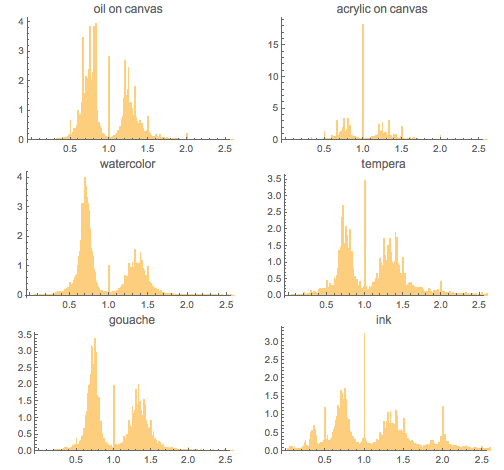
Let's also look at a more contemporary artist, Thomas Kinkade , the "artist of light." Modern paintings use standard materials and are implemented in certain sizes and aspect ratios, so that the shape and size of the picture are largely determined by standards rather than aesthetics. Therefore, this time we will be guided not by text data about the image, but by the images themselves, receiving data about their sizes based on their pixel resolution. Even if you use miniatures, the distribution of the aspect ratio will be quite correct:

In addition to our typical maximum of ~ 1.3, we can observe a pronounced maximum of about 3/2 - very likely, this is an artifact of standardization:

Analyzing five old German museum catalogs
The above histograms show at least two maxima for high pictures, as well as two maxima for wide pictures, with a large peak next to the square root of the golden section. Since we do not know what the selection criteria were for the artwork included in “Artwork” - the area of Entity - we must test our hypothesis on some independent collections of pictures.
An accessible source for the size of the paintings are museum catalogs. Various old catalogs, similar to those used by Fechner, are available in scanned and recognized forms. Here are some examples:
- Beschreibendes Verzeichnis der Gemälde im Kaiser Friedrich-Museum , 1906
- Katalog der Gemälde-Sammlung der Kgl. Älteren Pinakothek in München , 1886
- Verzeichnis der Gemälde-Sammlung im Kgl. Museum der bildenden Künste zu Stuttgart , 1891
- Katalog der Königlichen Gemäldegalerie zu Dresden , 1896
- Katalog der Königlichen Gemäldegalerie zu Cassel , 1913
We simply import test recognized versions from directories. In different catalogs, the length and width of pictures may be presented in different ways, but within the same catalog, usually these parameters are contained in one form. As a result, looking at the form in which the data is presented, it is not a daunting task to retrieve the size data using string patterns.

Catalog of the Kaiser Friedrich Museum (now the Bode Museum):

Catalog of the Pinakothek in Munich (now the Old Pinakothek):

Catalog from the museum der bildenden Künste zu Stuttgart (now the State Gallery of Stuttgart):

Catalog from the Gemäldegalerie in Dresden (now the Old Masters Gallery of Dresden):

Gemäldegalerie zu Cassel catalog (now Neue Galerie Kassel):

For all five museums, the results are very similar:

Add new data from these five directories and build it all together with constants marked with vertical lines:

And again we see two global maxima in the distribution of aspect ratios. For high pictures, we get a fairly even maximum, without clearly visible local minima.
( Archive.org also contains older painting catalogs, such as Schloss Schleissheim catalogs, Berthold Zacharia collections, Bavaria National Gallery collections, and many others. The distributions of the aspect ratio of the pictures in these catalogs are very similar to those that we are currently analyzing).
Kress collection: four large PDF files
A famous collection of paintings is the Kress collection . Individual images are in many museums in the United States. But, fortunately (for our analysis), data on the paintings in the catalog are available in four detailed catalogs in the form of PDF documents - in total, this is about 900 pages of pictures. (Most of the data analyzed in this article corresponds exclusively to works of Western art. Regarding Eastern preferences in art, you can see the recent work of Zheng, Weidong and Xuchen ).
By importing PDF files in text form and extracting the ratio values from there, we get about 700 new points. (From this point on, I will no longer give the code for importing data from various sites; often the download time for all data is very long and you will not be able to repeat the download quickly)

This time we observe local maxima near the root of two and golden section.
: (Metropolitan), , , (National Gallery), (Rijks)
, , .
Metropolitan - . « », .
, , , 1.27:

, , , , 1600 1800 . 1200 , :

3400 . :

— . :

. 16- , :

. 4600 :

. 8000+ . :

, , :

, 6/5, 5/4, 9/7, 4/3 3/2, ( ).

Nearest , 6/5, 5/4, 9/7, 4/3, 3/2, ( 0.01).

, Nearest:

, . 1% 9/7 , 14/11. , , :

- , - . :

, . , .
:
.
- :

, , , , . . 45 000 :

, , 6/5. 5/4, 4/3:

(., , , ), . , / ( ), 1.48, 1,2 . .
- : ,
. : . . — , CSV.
, , Import:

:

. :

, , :

( ), 18 800+ :

, :

, . :

, , 140 / :

«» :

, 5 10 , , :

, :

, , , . ( .)

. 5 , :

( ( ), — . .):

, :

, 0.02:

, . ? . , (/) / (/) (/) / (/) 3, 4 7, 6 18 :

, 20 000 ( [0,2]), :

:

, 5/4, :

, , ± 1%, . . 16- . , 5/4, 4/3 9/7 17- . , , 13- . ; ± 5% .

? 16 . - , , . , . ; , . -, 5/4 4/5 — :

Nearest . windowedMaximaPlot , :

:

:
- 400 1.2.
- 18- , , 0.8.
- 19- .
Labreuche talks about the process of standardization of paintings. In France, the first standardization occurred in the seventeenth century, and the second - in the nineteenth (for recent times and with a lot of mathematics, see the work of Dinh Dang ). Simon discusses canvas standardization in the UK.
Here are the sizes for some standardized nineteenth-century French canvases. Data in format
{ width , { height of portrait , height of landscape , height of marina (sea landscape) }}:

Aspect ratios ( maximum (height / width, width / height) ) for all webs have the following distribution:

It is not easy to find large and accurate sets of data on the size of old paintings. On the other hand, various websites have tens of thousands of pictures of pictures in both JPG and PNG. Maybe the aspect ratio is simply calculated through the ratio of the number of pixels in width and height? We have seen above that most of the paintings are measured to an accuracy of about one centimeter. With an average height and width of paintings of about one meter, we get an error of about 2%. Even thumbnails are approximately 100 pixels in size or a few hundred pixels wide / high. Thus, one would again expect results that are accurate to exactly 1..2%. But there is no guarantee that the images were not cropped, that the frame was included in the size, or there are border pixels or not. The web art gallery has, in addition to the actual size of the paintings, their images. After downloading the images and calculating the aspect ratios, we will try to compare them with the ratios calculated on the basis of real heights and widths of the pictures. Here is the final distribution of two ratios (pictures and their images) together, as well as the model of this distribution, presented as CauchyDistribution [1.003, 0.019] . The average value from two pixel measurements is 1.036, the standard deviation is 0.38. These numbers indicate that the error from using images to determine the aspect ratio is too large to properly convey the small-scale distribution structure:

DataWGA data also stores information about artists. Does the average ratio of sizes in the paintings during the life of the artist? Here is the distribution of the ratio of paintings in the course of the life of artists:

We can see a general pattern of changes in the average aspect ratio for the artist’s paintings depending on his age. The first pictures are statistically more extreme proportions. At the end of the first third of life the aspect ratio is minimal, and at the end of the second third the aspect ratio is maximum (left graph). The cumulative average aspect ratio shows a minimum of ~ 0.4 of the life span of the painters (the graph on the right). Both graphs show the maximum (height / width, width / height) divided by the average of all aspect ratios. (The connection between creativity and age is discussed here ).


The reader, if desired, can independently conduct more accurate measurements of some pictures; in the meantime, we will do some calculations with the data on the web gallery of fine arts. Let's also calculate and visualize the distribution of paintings in the world. We take the current cities in which the paintings are located (which contain data on the width and height), as their positions, take the average of all the paintings in this city and present the maximum (height / width, width / height) as a function of the city. It is not surprising that the majority of large collections of paintings do not deviate strongly from the median of 1.333. To find cities and work with their locations, we will use the Interpreter function:


Note II: the importance of accuracy in measurements
Let's examine more closely the width and height values. If we construct a diagram for fractional centimeters, we clearly see that the vast majority of paintings are measured with an accuracy of less than 1 cm. Only about 10% of all paintings contain size data indicated in millimeters (and some of those indicated to within 5 millimeters probably also rounded):

Let's examine more closely the width and height values. Since most of the paintings were written before the centimeter was introduced as a unit of measurement, popular sizes in painting probably should not be a multiple of a centimeter. This means that the measured values of heights and widths are not actual values. He consoles only a very homogeneous distribution of millimeter parts of the sizes of the paintings, which were measured with an accuracy of one millimeter.
In many of the analyzed data sets, the width and height of the picture are represented as integers and in centimeters. (The obvious exception is the data set from the Tate collection, in which practically every picture is measured to the millimeter accuracy). Since the widths and heights of most paintings are in the same order as 100 cm, to accurately determine the aspect ratio, rounding to the centimeter is a tangible operation. How many of the observed maxima for different fractions with small denominators are the result of inaccurate values of widths and heights?
Let's model this effect. The aspectRatioModelValue function models the aspect ratio of pictures. We assume a stable distribution of widths and the fact that the distribution of heights is a normal distribution with an average value of 1.3 xwidth . And we will model only tall pictures, limiting the height so that the height is not less than the width:

Now we “cut out the canvases” for tall paintings and look at the distribution of proportions. We do this twice for each of the 100,000 paintings. The upper graph contains the distribution obtained by using dimensions exactly up to millimeters. The graph below shows that in 65% of all cases, measurements are accurate to a centimeter, 25% to half a centimeter, and 10% to a millimeter. For each of the results of three computational experiments, we impose a histogram of the resulting distribution:

A comparison of the upper and lower graphs tells us that the distribution of the aspect ratio is quite smooth if the measurements are accurate to a millimeter. The lower distribution contains artifacts caused by measurement accuracy to centimeters.
Looking at a fairly smooth histogram for millimeter precision values and the above histogram of aspect ratios for the Tate collection, one can see that the frequent occurrences of ratios that can be represented as simple fractions are a real effect. At the same time, as shown in the above experiment with weights {0.65, 0.25, 0.10}, rounding to centimeters artificially enhances the effect of some simple fractions, such as 6/5, 5/4, and 3/2 .
An even simpler way to demonstrate the effect of rounding errors when measuring aspect ratios in a data set of a web gallery of fine arts is to change the width and height values. We will add from -5 mm to 5 mm to each integer size to simulate a more accurate measurement. Again, as the aspect ratio we will use the ratio of the larger side to the smaller:

Now we impose the initial distribution on the changed one - where we changed the values of the widths and heights. We see that the maxima on some rational ratios are strongly suppressed, but the global maximum of about 5/4 does not change its position, the second maximum, 4/3, is also stable, as well as the small first maximum, 6/5. At the same time, the peaks by 3/2 and 2 lose a lot in height:

We do everything in reverse order with the Tate collection dataset: round up all the widths and heights up to a centimeter. Again, let's build the initial distribution of the ratio of the sides together with the changed:

While the heights of the local peaks have changed, the largest peaks are still present, moreover, very pronounced.
WikiArt: another major web resource
Let's look at another major web resource - WikiArt. For computing tasks this site is very conveniently structured. We have a list of 900+ artists with hyperlinks to pages with their works. Each picture has its own page, which contains conveniently structured information. Here, for example, information about the picture Mona Lisa:

Note that the above data contains information about the style and genre. This implies the use of the WikiArt dataset to search for possible dependencies of formats on a genre (we have already examined the styles above).
There are about 7000 pictures in the data set with information about their sizes. For brevity, all data has been encoded as a single black and white image:

Pictures with information about the sizes have the following distribution according to their age. You can see the prevailing number of paintings from the eighteenth and nineteenth centuries:

Based on the results obtained earlier, it can be expected that this data set, which is dominated by pictures of the last one and a half centuries, will have distinct peaks on the aspect ratios, which correspond to some fractions. The distribution below with vertical lines at 6/5, 5/4, 4/3 and 3/2 confirms this hypothesis:

The genre is obviously closely connected with the format of the picture - whether it will be wide, square or high. Here are the proportions of broad, square and tall pictures for various genres:

Let's now consider the distribution of aspect ratios as a function of the genre:

Using the TimelinePlot function, we plot the ranges of the second and third quartile relations:


Tall paintings in landscapes are much less common than wide ones. But even if by the aspect ratio we mean the ratio of the long side to the short side, then we will still see a clear dependence of the proportions on the genre.
The genre often also affects the size of the picture itself. Here are the second and third quartiles in the aspect ratios and areas for different genres (in the attached Mathematica document, this picture is interactive: move the cursor to an opaque rectangle to see the genre):

If we divide each genre by style, we get a more fine-grained structure of the distribution of aspect ratios. Choose the 50 most popular genres and styles, each of which must be represented by at least fifty pictures:

Neoclassical nude paintings stand out for their largest average aspect ratio (around 1.86):

And here is a more detailed diagram showing average aspect ratios for various styles and genres that contain at least five pictures. (Hover over a vertical column to see the genre and proportions.)

Collection of the French State Museum
As we saw above, collections of paintings of several thousand paintings give several maxima in the distribution of aspect ratios in the range 1.24 - 1.33. Let us now consider the second large data set.
The catalog of French national museums Joconde contains descriptions of more than half a million objects of art. Search by pictures gives ~ 67000 results. Not all of them are paintings that are hung on the wall; The collection also includes paintings on porcelain figurines and other surfaces. Total ~ 31000 paintings with clearly defined sizes. Since the information about the paintings comes from several museums, sizes can be presented in various formats. It will take some time to retrieve the dimensions.

Interestingly, here we get a new maximum equal to ~ 1.23.
The display of the distribution of wide images on it for high images with height replacement by width shows that the two maxima match very well. Thus, the ratio of 5/4 (or 4/5) - the most popular:

In the collection of high paintings at ~ 11% more than wide.
Paintings in Italian churches: height is everything
A very large database of paintings by Italian Catholic churches can be found here. A search for oil paintings gives 130,000 results, of which 124,000 contain data on width and height.
The collection contains a lot of relatively new paintings (sixteenth century ≈ 4%, seventeenth century ≈ 23%, eighteenth century ≈ 36%, nineteenth century ≈ 24%, twentieth century ≈ 13%).
Here is the distribution. Let us show the distribution together with the lines at 1, 6/5, 5/4, 4/3, 7/5, 3/2, 5/3 and 2. These lines are surprisingly well consistent with the positions of the maxima:

The graph clearly indicates a significant predominance of high paintings over wide. And all the highs fall on fractions with small denominators. And this is despite the fact that only about 8% of the total number of paintings are measured with an error of less than half a centimeter.
Smithsonian collection
Smithsonian Museum of American Art has a website with which you can explore a large number of paintings. About 286,000 paintings contain size information. Here is the resulting distribution of proportions:

As noted, pronounced peaks on rational fractions are more often observed for pictures of the last 200 years. Here is a graph of the distribution of ages of paintings from this collection, which confirms this:

A large collection of paintings in the UK
We will gather the third large data set from the British site Your Paintings , which represents 200,000+ paintings, 56,000 of which have width and height data.
Unlike previous data sets, many of the paintings in this collection are younger than 150 years old. It turns out, the predominance of new paintings should change the distribution of aspect ratios?

We again observe a pronounced maximum. Five of the most pronounced highs for high pictures fall on fractions with small denominators. Let us draw the numbers 6/5, 5/4, 9/7, 4/3, 3/2 as their vertical lines, and their inverse values. For wide pictures, we see the same (that is, inverted) positions of the maxima as for the tall pictures:

Great news - 52% of all sizes are set more precisely than in centimeters. This means that the visible maximums are not just rounding defects, but the pictures and the truth often have an aspect ratio, expressed as a fraction with a small denominator.
But the graph of the number of paintings with higher resolution and with a maximum distance from a given aspect ratio of 0.01:

The current fine arts market: more rational than ever
The last section with British paintings in the last 150 years shows a clear tendency to use rational numbers with small denominators as the aspect ratio. The question arises: what is the most popular ratio today?
There is no such museum, which has thousands of paintings in recent years (at least I could not find one). So, let's pay attention to the dealers of modern paintings (the last few decades). After some searching I went to Saatchi Art . Search in oil paintings , issued 96,000 paintings. So what are their ratios? Here is a graph with the distribution of their proportions. The vertical lines are drawn on the values 1, 6/5, 5/4, 4/3, 3/2, 2, and the corresponding inverse values. Please note that this time we use a logarithmic vertical scale:

In fact, all the trends that were visible in Your Paintings dataset became even more pronounced:
- still a large proportion of square paintings
- pronounced maxima on the aspect ratio, which are rational numbers with small denominators - both for wide and high pictures,
- almost equal number of wide and high pictures.
The maxima in certain ratios are reflected in the distribution of the areas of the paintings — several dozen distinct values are observed:

It can be assumed that they are caused by the size of industrially made canvases. To test this assumption, let us analyze the pictures of Dick Blick shop on sale :

The constructed area distribution for ~ 1600 obtained pictures has the same key features as the above distribution:


On the distribution presented above using the aspectRatioCDFPlot distribution, the most common proportions can be seen, which manifest themselves in the form of vertical segments:

And even if it is impossible to buy paintings in the museum, you can buy them in Saatchi. Thus, for this data set, we can consider the relationship between price and aspect ratio. (For various statistics on prices and quality properties of paintings, see Reneboog and Van Houtte , Higgs and Forster and Bayer and Page .)
The data do not indicate a clear dependence of the price of the picture on its aspect ratio:

At the same time, there is a weak correlation between price and area according to the law.
 . (For a detailed study of the relationship of squares to the prices of Korean paintings, see Nahm ).
Sold paintings: most are painted recently, and the distribution has a long tail
Earlier we examined the aspect ratio of paintings from various museum collections. In the last section, we looked at the aspect ratios of the paintings presented for sale. And what about the proportions of recently sold paintings? Artnet site - an excellent source of information about the paintings sold at auction. It contains about 590,000 paintings with size information.
While paintings sold at auction may be medieval, most still belong to modern ones. Here is the cumulative distribution of paintings over the last millennium. Note that the vertical axis is logarithmic. We see the distribution according to the Pareto principle - 90% of all paintings sold at auction are made after 1855:

, , , . , . 5/6, 4/5, 3/4, 2/3, 5/7, 7/10 :

:

, , . [1.1, 1.4] ( 0,01). 6/5, 5/4, 4/3:

. , , , . , . — , - :
. , 1/10 10. : Hussainbad Imambara Complex , Makimono scroll of river scenes , Sennenstreifen . : La salive de dieu , Pilaster , Exotic rain .
, , , , 1825 . 1950:

, (/, /) . ( ) «Artwork» ( ), , . . , , 0.1:

Sotheby 100000 , 15 . , . :

, :

, :

:
, , . ? , . , — .
- . Here is an example:

:

~10500 . :

. 1/3 2. . Zheng, Weidong Xuchen . , .
, , , , , , ,
; , .
. , . ItemMaster ( ).
, /. — ( , ). / 3/2:

(. Raghubir Greenleaf , Salahshoor Mojarrad , Ordabayeva Chandon , ).
, , . , . , - , , , , . , , . . wine.com 5000 :

, . , :

Catawiki 2700 . , :

. - :

. brandsoftheworld.com ~9000 . . , , . , , :

, , — ? Entity, ~800 , :

, , . , :

, . , ? 3600 2015 , :

/:

. , . 65 — . , , , / 1/3:

. ? 13 . , ( ):

. , 1.41 —
 — , , ISO. — 4/3:
Stamps
— , ? , — -. Colnect 500000+ . , 1849 2015, ~6000 . :

:

, -, , . :

( (, )/(, ) ) . , ( ²). , :

NCAA ( )
, . . : NCAA . , — .
(/) NCAA. — ~0,8, :

(/) 1348 . 1.15:

, . filmportal 85000 , 100 . 27000 — . . , - ~4/3. 60- :

( Warner Bros. , Paramount Pictures , Twentieth Century Fox , Universal Pictures Metro-Goldwyn-Mayer ) 100 . 4/3 1955, — 2.18:

: «»?
: — 1000000+ .
, :
- .
- I .
- .
- ( , ) : 1.3 1.27 ( ).
- , , , ; .
- 19 20 6/5, 5/4, 9/7, 4/3 3/2.
- , - , , .
- The golden ratio is not a ratio, however popular in paintings (the golden ratio in architecture - see Shekhawat , Huylebrouck and Labarque , Birkett and Jurgenson and Foutakis ).
- The distribution of the proportions of paintings is unique and quite different from the distribution of rectangular objects from the modern world (for example, labels, stamps, logos, etc.).
The reasons for the transition to ratios in the form of fractions with small denominators in the seventeenth century is an open question. Was the transition caused by aesthetic reasons, or due to the peculiarities of industrial production and standardization? We leave this question to art historians.
For a clearer answer to the question of whether the maxima correspond to certain known constants (the square root of the golden section, the plastic constant, 4/3 or 5/4), more accurate data on the size of eighteenth-century paintings is needed. Many catalogs give dimensions without specifying the measurement accuracy and whether the frame is in the indicated dimensions. The measurement accuracy is most often equal to a centimeter. With typical picture sizes of about one hundred centimeters, rounding up to a centimeter introduces a certain amount of distortion to the distribution. On the other hand, the use of images for the analysis of aspect ratio is not possible, since the errors caused by clipping and perspective distortions are too large. We intentionally did not combine data from different collections. In addition to the question of identifying duplicates, it would be necessary to carefully examine whether the dimensions are indicated with a frame or not, as well as to investigate in greater detail the question of the accuracy of measurements of the indicated dimensions. Such an expert art critic should be carried out very carefully.
One large collection, which we did not include in the study, can be useful in determining the exact maximum values of the distribution of aspect ratios for 178,000 old paintings of the online catalog of 645 museums from Germany, Austria and Switzerland that De Gruyter published on the Internet At the time of writing this article to me Could not get permission to access data from this directory. (There are also various small databases of pictures, including lost ones , which can be analyzed, but they will probably give results similar to those obtained by us).
Interestingly, recent studies show that not only humans, but also other mammals, probably prefer proportions around 1.2 (see a recent study by Winné et al. ).
Images of paintings can be used for a wide variety of quantitative studies - for example, analyzing the spectral distribution of the power of spatial frequencies, which are the Fourier components of colors and brightness , analysis of lightness and directions , structure and composition ( here , here , here ), psychological bases of color structures , and automatic classification . If time permits, we will conduct similar research in the future. A very entertaining study of a large number of aspects of 2229 paintings in MoMA was conducted by Roder.
And, of course, you can analyze in a similar way a variety of man-made objects, find out how often the golden section appears in different areas - in cars , for example. Aspect ratios can be explored in the modern extension of the concept of paintings - in graffiti . You can analyze the very content of the picture, to look at the frequency of occurrence of the golden section (see here and here ). Let's leave it to readers who are interested in the development of this direction.
For questions about Wolfram technologies, write to info-russia@wolfram.com
Source: https://habr.com/ru/post/304326/
All Articles