Visualization with Google Chart Tools API
The Google Chart Tools API is a feature-rich data visualization toolkit. With it you can relatively easily build graphs and charts on the site.
The Google Chart Tools API functionality includes:
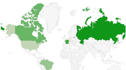
Let's make data visualization with the help of a map colored in accordance with the entered data. To begin with we connect files, loader.js is obligatory.
Select the type of visualization and insert it into the following code, in our case geochart.
')
Instead of geochart you can put:
Orgchart - Tree.
Map - Map
Annotationchart - Graph.
Corechart - Chart.
Gauge - Speedometer.
And much more.
Create the drawChart () function. Specify the parameters of the visualization, in our case maps. In the array you need to put a kind of "table" of data: in one cell the country is defined, in the other - the data that will appear during the hover effect, the number corresponds to the brightness of the state on the map.
Additional settings.
We specify the container in which we will place the card.
Container.
All effects of GCT API visualization are based on this pattern.
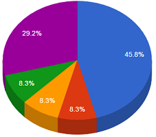
Now create a simple diagram.
To make a 3D diagram, add the is3D: true parameter.
You can "cut" the center.
Or "pull out" the pieces of the diagram in the distance.
The step chart is created in a similar way, but in the settings you need to add isStacked: true.
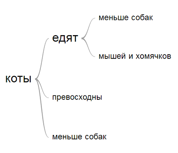
Now create a "tree", where the words are visually connected to each other.
To try.
We connect the wordtree element.
In the settings we display the word from which the tree will be built. The format string is of great importance: if you specify implicit, the tree will be built automatically from the specified word. The value explicit allows you to build a tree in manual mode.
From the word "cats" will be built a tree, the same words will be combined into one.

And, in conclusion, I want to show the work of sensors - speedometers.
To try.
Connection
In the array, specify the name of the sensor and the position of the arrow.
In the options listed:
Block size with sensors, drawing the sensor fields in red and yellow.
Position minorTicks: 5 reduces the cost of dividing the sensor.
Let when you press a button, the sensors are updated.
Visualization methods using the GCT API are very diverse, all their functionality does not fit into the framework of this post, the documentation for this library can be read here .
The Google Chart Tools API functionality includes:
- Dynamic pictograms;
- Cards;
- Dials and displays;
- Formulas;
- QR codes;
- Ability to create your own visualization tools and use third-party.
Map
Let's make data visualization with the help of a map colored in accordance with the entered data. To begin with we connect files, loader.js is obligatory.
<script type="text/javascript" src="https://www.gstatic.com/charts/loader.js"></script> <script type="text/javascript" src="https://www.google.com/jsapi"></script> /* . */ Select the type of visualization and insert it into the following code, in our case geochart.
')
google.charts.load('current', {'packages':['geochart']}); google.charts.setOnLoadCallback(drawChart); Instead of geochart you can put:
Orgchart - Tree.
Map - Map
Annotationchart - Graph.
Corechart - Chart.
Gauge - Speedometer.
And much more.
Create the drawChart () function. Specify the parameters of the visualization, in our case maps. In the array you need to put a kind of "table" of data: in one cell the country is defined, in the other - the data that will appear during the hover effect, the number corresponds to the brightness of the state on the map.
var data = google.visualization.arrayToDataTable([ ['Country', 'Popularity'], ['Sweden', 300], ['United States', 300], ['France', 400], ['Canada', 500], ['Spain', 500], ['RU', 900] ]); Additional settings.
var options = { title: 'Simple map' // . }; We specify the container in which we will place the card.
var chart = new google.visualization.GeoChart(document.getElementById('regions_div')); chart.draw(data, options); } Container.
<div id="regions_div" style="width: 900px; height: 500px;"></div> All effects of GCT API visualization are based on this pattern.
Diagram
Now create a simple diagram.
google.charts.load('current', {'packages':['corechart']}); google.charts.setOnLoadCallback(drawChart); function drawChart() { var data = google.visualization.arrayToDataTable([ ['Color', 'Quantity'], ['Orange', 11], ['Black', 2], ['Red', 1], ['White', 2], ['Green', 7] ]); To make a 3D diagram, add the is3D: true parameter.
var options = { title: 'Quantity of colors', is3D: true } You can "cut" the center.
pieHole: 0.4 Or "pull out" the pieces of the diagram in the distance.
slices: { 4: {offset: 0.2}, 1: {offset: 0.3}, 2: {offset: 0.4}, 3: {offset: 0.5}, } The step chart is created in a similar way, but in the settings you need to add isStacked: true.
Tree
Now create a "tree", where the words are visually connected to each other.
To try.
We connect the wordtree element.
google.charts.load('current', {packages:['wordtree']}); google.charts.setOnLoadCallback(drawChart); In the settings we display the word from which the tree will be built. The format string is of great importance: if you specify implicit, the tree will be built automatically from the specified word. The value explicit allows you to build a tree in manual mode.
var options = { wordtree: { format: 'implicit', word: '', colors: ['red', 'black', 'green'] // . } }; From the word "cats" will be built a tree, the same words will be combined into one.
function drawChart() { var data = google.visualization.arrayToDataTable( [ ['Phrases'], [' '], [' '], [' '], [' '], [' '] ] ); Sensor
And, in conclusion, I want to show the work of sensors - speedometers.
To try.
Connection
google.charts.load('current', {'packages':['gauge']}); In the array, specify the name of the sensor and the position of the arrow.
var data = google.visualization.arrayToDataTable([ ['Label', 'Value'], ['Gas', 80], ['Oil', 55], ['mperage', 68] ]); In the options listed:
Block size with sensors, drawing the sensor fields in red and yellow.
Position minorTicks: 5 reduces the cost of dividing the sensor.
var options = { width: 400, height: 120, redFrom: 90, redTo: 100, yellowFrom:75, yellowTo: 90, minorTicks: 5 }; Let when you press a button, the sensors are updated.
Js code
google.charts.load('current', {'packages':['gauge']}); google.charts.setOnLoadCallback(drawChart); function drawChart() { // onclick. var data = google.visualization.arrayToDataTable([ ['Label', 'Value'], ['Gas', 80], ['Oil', 55], ['mperage', 68] ]); var options = { width: 400, height: 120, redFrom: 90, redTo: 100, yellowFrom:75, yellowTo: 90, minorTicks: 5 }; var chart = new google.visualization.Gauge(document.getElementById('chart_div')); chart.draw(data, options); data.setValue(0, 1, 40 + Math.round(60 * Math.random())); // chart.draw(data, options); data.setValue(1, 1, 40 + Math.round(60 * Math.random())); chart.draw(data, options); data.setValue(2, 1, 60 + Math.round(20 * Math.random())); chart.draw(data, options); } Visualization methods using the GCT API are very diverse, all their functionality does not fit into the framework of this post, the documentation for this library can be read here .
Source: https://habr.com/ru/post/304296/
All Articles