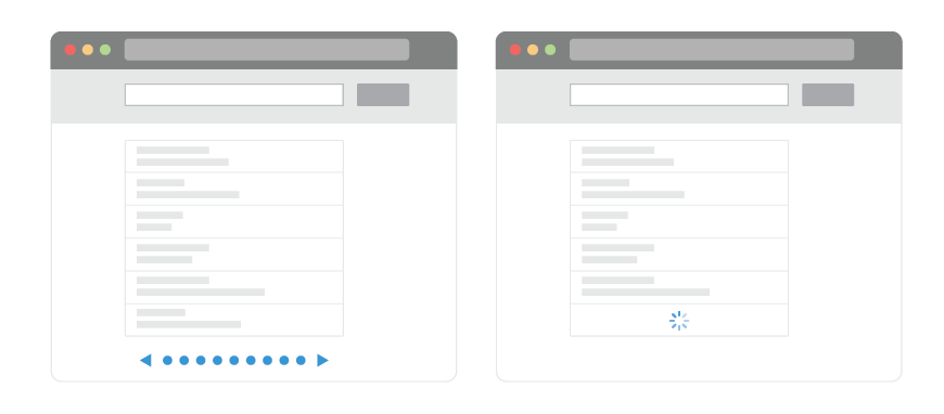
Infinite scrolling vs. pagination
Nick Babich, a developer, tech enthusiast and a specialist in love with UX / UI wrote a note on the UX Planet blog about endless scrolling, we made an adaptive translation of the material specifically for Habrahabr readers.
“What should I choose for my content: endless scrolling, or pagination?” Some designers are still engaged in dragging the rope between the two methods before deciding what to use in your project. Each method has its strengths and weaknesses. In this article, we offer an overview of the two techniques, so that you can more easily decide which of them should be used in your projects.
Infinite scrolling is a technique that allows users to scroll through a massive piece of content so that its end does not fall into view. This method simply refreshes the page when scrolling down. Although it looks very tempting, this method is not an ideal solution for any website or application.
')

Plus # 1: User Involvement and Content Disclosure.
Using scrolling as the primary data mining method can cause the user to stay longer on your web page and increase its involvement in the content. With the increasing popularity of social networks, data consumption increases; endless scrolling provides an efficient way to view this ocean of information without having to load all pages.
Infinite scrolling is almost a required element of news interfaces. When the user is not looking for something specific, he needs to look through a variety of topics in order to find one that he likes.
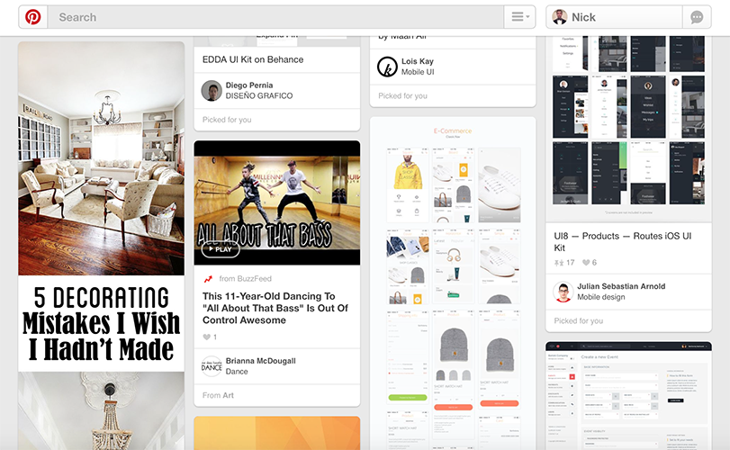
Ocean of notes Pinterest
You can appreciate the benefits of endless scrolling on the example of Facebook news feed. Users understand the unspoken law of Facebook, according to which they will not be able to see absolutely all the posts, because the content is updated too often. However, using the infinite scrolling, Facebook is doing everything possible to put as much information as possible on users. In this case, scrolling allows users to scan information and navigate through this stream.

Facebook news feed allows you to view a huge amount of updated content
Plus # 2: Scrolling is better than clicking.
Users are more comfortable using scrolling than clicking / clicking. Mice with wheels and touchscreens made scrolling much easier than clicking. For long continuous content, a textbook, for example, scrolling is much more comfortable than clicking when text is cut into several separate screens and pages.

For clicking / clicking: each content update requires additional clicks and page load timeout. For scrolling: a single and simple action updates the content.
Plus number 3: Scrolling is good for mobile devices.
The smaller the screen, the longer the scroll bar. Popularization of mobile versions of browsers is another important argument in favor of scrolling. Scrolling is simple and straightforward to use when controlling it from the touchscreen. As a result, users enjoy a truly responsive application or site, regardless of the type of device they use.
Minus number 1: Page performance and device resources.
The speed of loading pages is the most important thing for users. Numerous studies have shown that low download speeds cause people to leave your site or delete applications. And this is bad news for those who use endless scrolling. The more users scroll down the page, the more content will be loaded on one page. As a result, the content update rate will drop more and more.
Another problem is the limited resources of the device. On many devices with limited resources, such as iPad, the endless scrolling of sites, especially with a large number of images, can start to slow down due to the huge flow of downloadable information.
Minus number 2: Search and location of objects.
Another problem with endless scrolling is that when users find themselves at a certain point in the stream, they cannot fix their location using the bookmark and return to this point later. If they leave the site, they lose the point at which they’ve finished viewing, and they have to scroll all over again to return to the same place. The inability to fix the position of the scroll not only causes the user inconvenience, but also, as a result, spoils the overall interaction experience.
In 2012, Etsy spent a lot of time implementing a new interface with endless scrolling and found that this new interface is significantly inferior to the old one in terms of functionality. Although the number of purchases has not decreased, the site utilization rates have dropped significantly - now people haven't used search so often.

Etsy search interface with a scroll bar. Current version contains pagination
As Dmitry Fadeev notes: “People want to return to the list of search results in order to once again look at the items they have just seen and compare them with those that are somewhere in the other end of the list. The endless scrolling not only prevents them from doing this, it also makes it difficult to move up and down the list. When users close the page and then open it again, they are forced to scroll through the list again and wait for all the search results to load. Thus, an interface with endless scrolling is actually slower than paginated. ”
Minus number 3: Scrollbar mismatch.
Another unpleasant thing is that the scroll bar does not reflect the actual amount of data. You scroll down in complete confidence that the end is near. This in itself encourages you to twist to the end, because there is so little left. But then you went down even lower - and suddenly the band loaded up and doubled, adding you as much information to be viewed. From the point of view of accessibility for the user, loadable scroll bars are a very bad option.
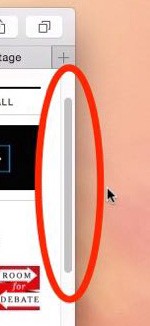
The scrollbar should reflect the actual page size.
Minus number 4: The absence of a footer.
Footers do not exist just like that: they contain content that the user sometimes needs. For example, if users cannot find something, or they need additional information, they usually refer to the footer. But since the scroll bar is infinite, the new data in it is all loaded and loaded as it goes down, the footer all the time and remains out of sight.

When LinkedIn in 2012 introduced endless scrolling to the interface, users had the opportunity to see the bottom of the screen before the new fragment of the content bar was loaded.
Sites on which endless scrolling is implemented must either attach the footer to the bottom of the scrollbar so that it is always available, or transfer the information contained in it to the page header, or to the side panels.

Facebook has moved all links from the footer to the right sidebar
Another solution is to download content on demand using the download button. New content is not loaded automatically until the user clicks the button. Thus, users can easily get to the footer, and not chase after it.

Instagram has a “upload more” button that allows users to access the footer
Pagination is a user interface framework that divides content into individual pages. If you scroll down the page and see a series of numbers - it will be the pagination of the site or application.

Plus # 1: Good conversion.
Pagination works great when the user is looking for something specific in the list of results, and not just scans and summarizes the flow of information.
You can appreciate the benefits of paging using the example of Google Search. Depending on your query, choosing the best search result may take seconds or hours. But when you decide to stop searching in the current Google format, you will know the exact number of search results. You can decide where you should stop, or how many results you need to see.

Google search results
Plus # 2: A sense of control.
Endless scrolling is like an endless game: no matter how much you scroll, you will still have the feeling that you will never reach the end. When users know the exact amount of results available, they can make a more informed decision about when to stop and not wander through the endlessly scrolling list. According to a study by David Breastplate: “Reaching the end point gives a sense of control.” The study also clarifies that when a user has limited, but still meaningful results, he can easily determine whether the results include what is needed or not.
Also, when users see the total number of results (of course, if the total amount of data is not infinite), they can estimate how long it takes to search for what they need.
Plus number 3: The location of the elements.
The paginated interface allows the user to visually remember the location of the element. The user may not remember the exact page number, but he will know approximately where he saw the desired object, and the numbered links will allow him to get where he needs to go.

Paged users control the navigation, because they know which page to click on to get back to where they were before.
Page numbering works well on websites and in online sales applications. When buying something from an online store, users want to be able to return to the place where they left off and continue their purchases.
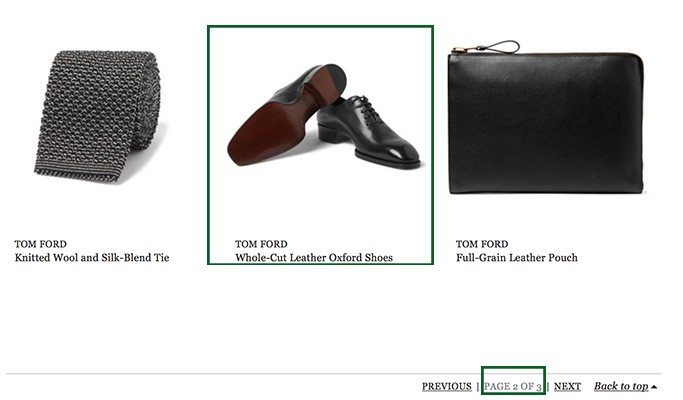
Site MR Porter uses pagination
Minus: Additional actions.
To go to the next part of the content when it is paginated, the user must find the target link (for example, “next”), move the mouse over it, click and wait for the new page to load.

Need to click to download content.
The main problem here is that most sites show users very limited content on one page. If you make your pages longer without sacrificing download speed, users will have access to more content on a single page, and they don’t have to press the navigation buttons too often.
There are only a few situations where endless scrolling will be effective. It is ideal for sites and applications that present custom content (Twitter, Facebook) or visual content (Pinterest, Instagram). On the other hand, pagination is a safe option and a good solution for sites and applications that are designed for targeted user activity.
Google is a good example to illustrate. Google Images uses endless scrolling because users view images much faster than text. Reading search results takes much longer. That is why Google search results are still presented more traditionally as separate pages.
Designers must weigh the pros and cons of endless scrolling and pagination before choosing one of the methods. The choice depends on the content of the project and how this content is served. To summarize, endless scrolling works well on sites or applications like Twitter, where users consume an endless stream of data without focusing on anything specific. The paginated interface is good for displaying search results when people are looking for a specific product, and it is important for them to localize each item viewed.
In the following articles we will look at the best examples of using infinite scrolling and pagination. So stay tuned!
“What should I choose for my content: endless scrolling, or pagination?” Some designers are still engaged in dragging the rope between the two methods before deciding what to use in your project. Each method has its strengths and weaknesses. In this article, we offer an overview of the two techniques, so that you can more easily decide which of them should be used in your projects.
Infinite scrolling
Infinite scrolling is a technique that allows users to scroll through a massive piece of content so that its end does not fall into view. This method simply refreshes the page when scrolling down. Although it looks very tempting, this method is not an ideal solution for any website or application.
')
Plus # 1: User Involvement and Content Disclosure.
Using scrolling as the primary data mining method can cause the user to stay longer on your web page and increase its involvement in the content. With the increasing popularity of social networks, data consumption increases; endless scrolling provides an efficient way to view this ocean of information without having to load all pages.
Infinite scrolling is almost a required element of news interfaces. When the user is not looking for something specific, he needs to look through a variety of topics in order to find one that he likes.
Ocean of notes Pinterest
You can appreciate the benefits of endless scrolling on the example of Facebook news feed. Users understand the unspoken law of Facebook, according to which they will not be able to see absolutely all the posts, because the content is updated too often. However, using the infinite scrolling, Facebook is doing everything possible to put as much information as possible on users. In this case, scrolling allows users to scan information and navigate through this stream.
Facebook news feed allows you to view a huge amount of updated content
Plus # 2: Scrolling is better than clicking.
Users are more comfortable using scrolling than clicking / clicking. Mice with wheels and touchscreens made scrolling much easier than clicking. For long continuous content, a textbook, for example, scrolling is much more comfortable than clicking when text is cut into several separate screens and pages.
For clicking / clicking: each content update requires additional clicks and page load timeout. For scrolling: a single and simple action updates the content.
Plus number 3: Scrolling is good for mobile devices.
The smaller the screen, the longer the scroll bar. Popularization of mobile versions of browsers is another important argument in favor of scrolling. Scrolling is simple and straightforward to use when controlling it from the touchscreen. As a result, users enjoy a truly responsive application or site, regardless of the type of device they use.
Minus number 1: Page performance and device resources.
The speed of loading pages is the most important thing for users. Numerous studies have shown that low download speeds cause people to leave your site or delete applications. And this is bad news for those who use endless scrolling. The more users scroll down the page, the more content will be loaded on one page. As a result, the content update rate will drop more and more.
Another problem is the limited resources of the device. On many devices with limited resources, such as iPad, the endless scrolling of sites, especially with a large number of images, can start to slow down due to the huge flow of downloadable information.
Minus number 2: Search and location of objects.
Another problem with endless scrolling is that when users find themselves at a certain point in the stream, they cannot fix their location using the bookmark and return to this point later. If they leave the site, they lose the point at which they’ve finished viewing, and they have to scroll all over again to return to the same place. The inability to fix the position of the scroll not only causes the user inconvenience, but also, as a result, spoils the overall interaction experience.
In 2012, Etsy spent a lot of time implementing a new interface with endless scrolling and found that this new interface is significantly inferior to the old one in terms of functionality. Although the number of purchases has not decreased, the site utilization rates have dropped significantly - now people haven't used search so often.
Etsy search interface with a scroll bar. Current version contains pagination
As Dmitry Fadeev notes: “People want to return to the list of search results in order to once again look at the items they have just seen and compare them with those that are somewhere in the other end of the list. The endless scrolling not only prevents them from doing this, it also makes it difficult to move up and down the list. When users close the page and then open it again, they are forced to scroll through the list again and wait for all the search results to load. Thus, an interface with endless scrolling is actually slower than paginated. ”
Minus number 3: Scrollbar mismatch.
Another unpleasant thing is that the scroll bar does not reflect the actual amount of data. You scroll down in complete confidence that the end is near. This in itself encourages you to twist to the end, because there is so little left. But then you went down even lower - and suddenly the band loaded up and doubled, adding you as much information to be viewed. From the point of view of accessibility for the user, loadable scroll bars are a very bad option.
The scrollbar should reflect the actual page size.
Minus number 4: The absence of a footer.
Footers do not exist just like that: they contain content that the user sometimes needs. For example, if users cannot find something, or they need additional information, they usually refer to the footer. But since the scroll bar is infinite, the new data in it is all loaded and loaded as it goes down, the footer all the time and remains out of sight.
When LinkedIn in 2012 introduced endless scrolling to the interface, users had the opportunity to see the bottom of the screen before the new fragment of the content bar was loaded.
Sites on which endless scrolling is implemented must either attach the footer to the bottom of the scrollbar so that it is always available, or transfer the information contained in it to the page header, or to the side panels.
Facebook has moved all links from the footer to the right sidebar
Another solution is to download content on demand using the download button. New content is not loaded automatically until the user clicks the button. Thus, users can easily get to the footer, and not chase after it.
Instagram has a “upload more” button that allows users to access the footer
Pagination
Pagination is a user interface framework that divides content into individual pages. If you scroll down the page and see a series of numbers - it will be the pagination of the site or application.
Plus # 1: Good conversion.
Pagination works great when the user is looking for something specific in the list of results, and not just scans and summarizes the flow of information.
You can appreciate the benefits of paging using the example of Google Search. Depending on your query, choosing the best search result may take seconds or hours. But when you decide to stop searching in the current Google format, you will know the exact number of search results. You can decide where you should stop, or how many results you need to see.
Google search results
Plus # 2: A sense of control.
Endless scrolling is like an endless game: no matter how much you scroll, you will still have the feeling that you will never reach the end. When users know the exact amount of results available, they can make a more informed decision about when to stop and not wander through the endlessly scrolling list. According to a study by David Breastplate: “Reaching the end point gives a sense of control.” The study also clarifies that when a user has limited, but still meaningful results, he can easily determine whether the results include what is needed or not.
Also, when users see the total number of results (of course, if the total amount of data is not infinite), they can estimate how long it takes to search for what they need.
Plus number 3: The location of the elements.
The paginated interface allows the user to visually remember the location of the element. The user may not remember the exact page number, but he will know approximately where he saw the desired object, and the numbered links will allow him to get where he needs to go.
Paged users control the navigation, because they know which page to click on to get back to where they were before.
Page numbering works well on websites and in online sales applications. When buying something from an online store, users want to be able to return to the place where they left off and continue their purchases.
Site MR Porter uses pagination
Minus: Additional actions.
To go to the next part of the content when it is paginated, the user must find the target link (for example, “next”), move the mouse over it, click and wait for the new page to load.
Need to click to download content.
The main problem here is that most sites show users very limited content on one page. If you make your pages longer without sacrificing download speed, users will have access to more content on a single page, and they don’t have to press the navigation buttons too often.
When to use endless scrolling / pagination?
There are only a few situations where endless scrolling will be effective. It is ideal for sites and applications that present custom content (Twitter, Facebook) or visual content (Pinterest, Instagram). On the other hand, pagination is a safe option and a good solution for sites and applications that are designed for targeted user activity.
Google is a good example to illustrate. Google Images uses endless scrolling because users view images much faster than text. Reading search results takes much longer. That is why Google search results are still presented more traditionally as separate pages.
Conclusion
Designers must weigh the pros and cons of endless scrolling and pagination before choosing one of the methods. The choice depends on the content of the project and how this content is served. To summarize, endless scrolling works well on sites or applications like Twitter, where users consume an endless stream of data without focusing on anything specific. The paginated interface is good for displaying search results when people are looking for a specific product, and it is important for them to localize each item viewed.
In the following articles we will look at the best examples of using infinite scrolling and pagination. So stay tuned!
Source: https://habr.com/ru/post/304166/
All Articles