Ghost buttons in UX design
In 2014, ghost buttons became the main trend in the UI design world. We are talking about transparent rectangular or square buttons, which are also called “empty”, “bare” or “hollow”, we could not ignore this material and made an adaptive translation of the article of the UX Planet magazine specifically for Habrahabr readers.
The borders of the ghost buttons are usually indicated by a thin line, and inside there is a simple text. Most often, this design is used in the buttons for a call to action.

')
Normal appearance (left) and appearance when you hover the cursor (right).

Usually the size of ghost buttons exceeds the size of traditional buttons, and they are placed in the most conspicuous places, for example, right in the center of the screen. The stylish, spectacular appearance, if done correctly, attracts attention with its contrast with the rest of the page, and the color accent when you hover the cursor gives an extra charm.
The first time the term “ghost buttons” was used on the Tumblr microblogging service on a blog with ghost buttons. The ghost buttons owe their origins to the so-called flat design revolution. This became a real trend after the release of the iOS 7 operating system, where many buttons have become like this.
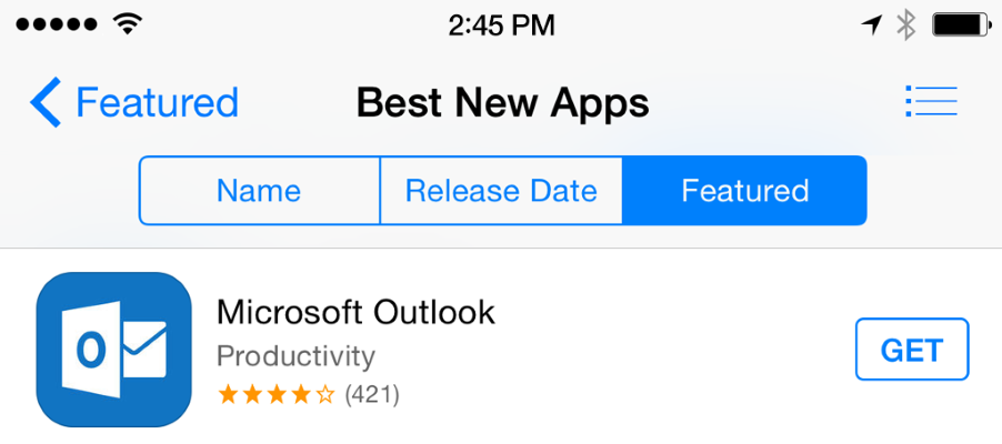
'Name', 'Release Data', 'Featured' and 'Get' are ghost buttons.
A simple rectangular shape in combination with a neat discreet font looks stylish in a "flat" user interface design.
Let's now see what positive moments ghost buttons can bring to your design and user experience:
Just do it. Simplicity is perhaps the main reason for the popularity of ghost buttons. Such buttons are not a problem even for absolute beginners in design. The most common form are simple geometric shapes (rectangle or oval) with the complete absence of any illustrations or animations.
The ideal focal point. When using ghost buttons, the user's attention is not distracted from the main object on the page. Buttons with a properly selected background and contrasting borders draw the user's attention, but do not overload their eyesight with unnecessary visual information. From this design, "not dazzled" in the eyes.
Ghost buttons fit organically into any page and have a positive effect on the aesthetic perception of the overall design. The image in the background remains visible; the simple, unobtrusive appearance of such buttons draws the user's attention to the main video series even more.
Integrated into any design because they are transparent. Ghost buttons just dissolve on your page.
Ghost buttons can be used individually or grouped together; The main condition for their effective use is to place them in prominent places.
Yes, there are a lot of reasons to use ghost buttons in your design, however, there are points to think about. When developing the design of your application or website, be sure to weigh the pros and cons and determine whether the chosen concept will work for a specific project.
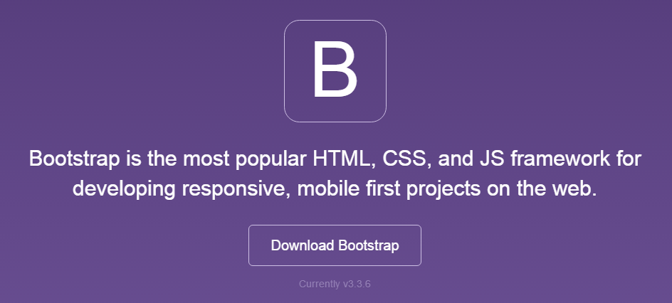
As a rule, using ghost buttons as a basic element for a call to action is not a good idea. Below is a simple example: see how the Download Bootstrap ghost button almost blends into the logo.
Ghost buttons are better suited for secondary tasks, as they do not interfere with your main suggestions. In the ideal case, the main CTA element should be seen best of all, and if for some reason you could not convince your client, he is given the choice to go somewhere else.
A good example is the Specular website - using the flat 'Purchase Now' button, which calls to buy, but the user is given a choice - he can get even closer with your offer by clicking on the ghost button 'Take Tour'.

Conclusion: the use of ghost buttons goes against the traditional idea of what a call to action should look like, so it’s better to use them for other purposes.
Buttons-ghosts really do not correspond to the familiar concept of “buttons”, moreover, if you make a mistake with their location, they may simply not be noticed.

Not all users are able to equally perceive design techniques; conservative users who are not accustomed to new elements may not notice the ghost button at all, or they won’t guess what can be pressed on it. For example, did you immediately see the 'Get Access' button on the bottom image? This is not an easy task even for the most advanced users in terms of design.
Conclusion: ghost buttons can turn into real casts and dissolve against your page.
A good idea would be to make the color change when you hover the cursor over the button. This is especially important for ghost buttons, as the user can doubt whether it is a button.
Ghost buttons can merge with the background, and the inscription can be illegible; It annoys users. Very often, designers place text inside a ghost button and do not provide sufficient contrast.
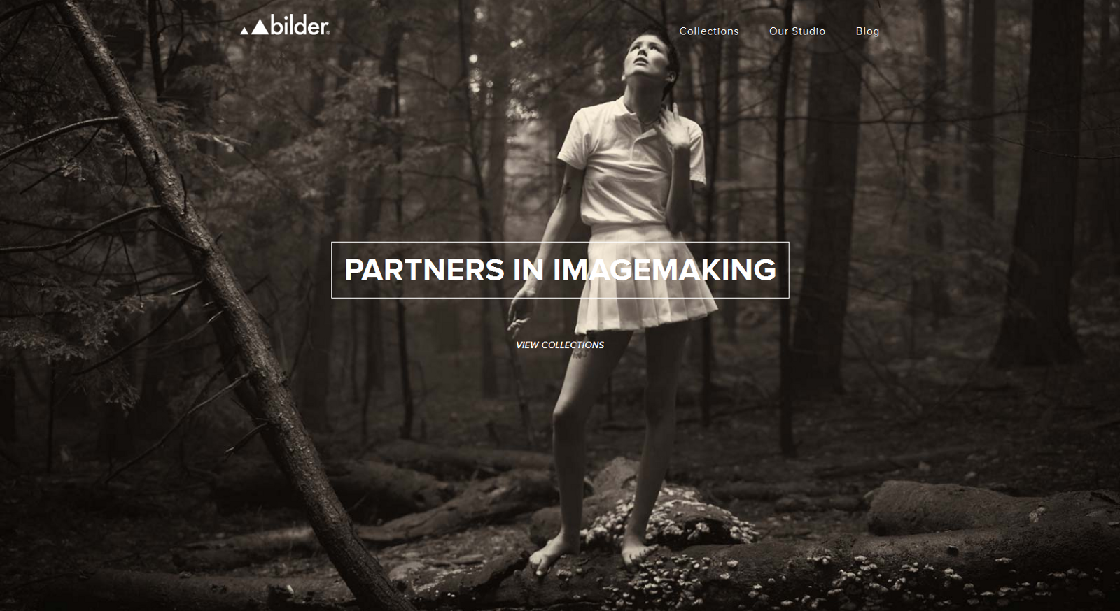
The example in the image below on the website uses the background image as a full-screen photo. The button calls the user to click on it and learn more about the company, but the white letters of the inscription in one place are almost indistinguishable against the background of the girl’s light dress.
Conclusion: when using ghost buttons on the background of a picture or photo, use such color solutions of the text and borders of the buttons that provide the necessary contrast.
As a rule, ghost buttons use not just unambiguous "Click here" or "Save." At the same time, the wording of such a text should be carefully thought out and correspond to the meaning of the basic information presented on the page.

Such an approach is clearly visible on the Integra website: behind the highlighted text on the website’s home page, there is a demonstration in the form of successive images. At the bottom is a ghost button with the inscription 'Showreel' (demonstration). There are no questions where the link to this button leads.

Due to its simplicity and minimalist style, ghost buttons look almost the same on any website or application. Yes, indeed, how to achieve uniqueness and uniqueness when it comes to simple geometric shapes?
However, some designers find solutions that distinguish their work from the masses. Basically, this is achieved using special fonts and small decorative elements along the contour of the button, as is done in the example below.
Any button, regardless of whether it is a classic button or a ghost button, is set to encourage the user to take some action. Effective UX-design of buttons is always, first of all, recognition and clarity. Smooth transitions help to communicate, but difficulties in finding the right button interrupt the entire carefully structured process of user interaction and can even force it to leave your site.

The borders of the ghost buttons are usually indicated by a thin line, and inside there is a simple text. Most often, this design is used in the buttons for a call to action.
')
Normal appearance (left) and appearance when you hover the cursor (right).
Usually the size of ghost buttons exceeds the size of traditional buttons, and they are placed in the most conspicuous places, for example, right in the center of the screen. The stylish, spectacular appearance, if done correctly, attracts attention with its contrast with the rest of the page, and the color accent when you hover the cursor gives an extra charm.
The origin of the ghost buttons
The first time the term “ghost buttons” was used on the Tumblr microblogging service on a blog with ghost buttons. The ghost buttons owe their origins to the so-called flat design revolution. This became a real trend after the release of the iOS 7 operating system, where many buttons have become like this.
'Name', 'Release Data', 'Featured' and 'Get' are ghost buttons.
A simple rectangular shape in combination with a neat discreet font looks stylish in a "flat" user interface design.
We are not afraid of any ghosts!
Let's now see what positive moments ghost buttons can bring to your design and user experience:
Just do it. Simplicity is perhaps the main reason for the popularity of ghost buttons. Such buttons are not a problem even for absolute beginners in design. The most common form are simple geometric shapes (rectangle or oval) with the complete absence of any illustrations or animations.
The ideal focal point. When using ghost buttons, the user's attention is not distracted from the main object on the page. Buttons with a properly selected background and contrasting borders draw the user's attention, but do not overload their eyesight with unnecessary visual information. From this design, "not dazzled" in the eyes.
Ghost buttons fit organically into any page and have a positive effect on the aesthetic perception of the overall design. The image in the background remains visible; the simple, unobtrusive appearance of such buttons draws the user's attention to the main video series even more.
Integrated into any design because they are transparent. Ghost buttons just dissolve on your page.
Ghost buttons can be used individually or grouped together; The main condition for their effective use is to place them in prominent places.
What should be remembered when developing the design of ghost buttons
Yes, there are a lot of reasons to use ghost buttons in your design, however, there are points to think about. When developing the design of your application or website, be sure to weigh the pros and cons and determine whether the chosen concept will work for a specific project.
Ghost buttons as call-to-action buttons
As a rule, using ghost buttons as a basic element for a call to action is not a good idea. Below is a simple example: see how the Download Bootstrap ghost button almost blends into the logo.
Ghost buttons are better suited for secondary tasks, as they do not interfere with your main suggestions. In the ideal case, the main CTA element should be seen best of all, and if for some reason you could not convince your client, he is given the choice to go somewhere else.
A good example is the Specular website - using the flat 'Purchase Now' button, which calls to buy, but the user is given a choice - he can get even closer with your offer by clicking on the ghost button 'Take Tour'.
Conclusion: the use of ghost buttons goes against the traditional idea of what a call to action should look like, so it’s better to use them for other purposes.
Ghost buttons do not look like “buttons” in the traditional presentation
Buttons-ghosts really do not correspond to the familiar concept of “buttons”, moreover, if you make a mistake with their location, they may simply not be noticed.
Not all users are able to equally perceive design techniques; conservative users who are not accustomed to new elements may not notice the ghost button at all, or they won’t guess what can be pressed on it. For example, did you immediately see the 'Get Access' button on the bottom image? This is not an easy task even for the most advanced users in terms of design.
Conclusion: ghost buttons can turn into real casts and dissolve against your page.
Attract attention
A good idea would be to make the color change when you hover the cursor over the button. This is especially important for ghost buttons, as the user can doubt whether it is a button.
Be careful with the background
Ghost buttons can merge with the background, and the inscription can be illegible; It annoys users. Very often, designers place text inside a ghost button and do not provide sufficient contrast.
The example in the image below on the website uses the background image as a full-screen photo. The button calls the user to click on it and learn more about the company, but the white letters of the inscription in one place are almost indistinguishable against the background of the girl’s light dress.
Conclusion: when using ghost buttons on the background of a picture or photo, use such color solutions of the text and borders of the buttons that provide the necessary contrast.
Use meaningful text for ghost buttons.
As a rule, ghost buttons use not just unambiguous "Click here" or "Save." At the same time, the wording of such a text should be carefully thought out and correspond to the meaning of the basic information presented on the page.
Such an approach is clearly visible on the Integra website: behind the highlighted text on the website’s home page, there is a demonstration in the form of successive images. At the bottom is a ghost button with the inscription 'Showreel' (demonstration). There are no questions where the link to this button leads.
Ghost buttons and personality
Due to its simplicity and minimalist style, ghost buttons look almost the same on any website or application. Yes, indeed, how to achieve uniqueness and uniqueness when it comes to simple geometric shapes?
However, some designers find solutions that distinguish their work from the masses. Basically, this is achieved using special fonts and small decorative elements along the contour of the button, as is done in the example below.
Conclusion
Any button, regardless of whether it is a classic button or a ghost button, is set to encourage the user to take some action. Effective UX-design of buttons is always, first of all, recognition and clarity. Smooth transitions help to communicate, but difficulties in finding the right button interrupt the entire carefully structured process of user interaction and can even force it to leave your site.
Source: https://habr.com/ru/post/304044/
All Articles