Typography in the design of emails
In the development of design for email newsletters, many experts do not pay enough attention to typography. Nevertheless, even despite some limitations of e-mail as an environment for design decisions, working with typography can make letters much better.
Today we bring to your attention an adapted translation of the study of Anna Iman (Anna Yeaman), co-founder and director of the US agency, which was originally published on the pages of the authoritative resource SmashingMagazine.
')
Last year I read the post of Jan Constantin (Jan Constantin) "Trends and modern methods of typographic design" and immediately decided to carry out a similar work, but with reference to the mailing list. At that time, I was learning responsive web typography. I identified a group of sites that I liked, and tried to figure out what the secret of their typography was, in order to apply new knowledge to the design of email distribution.
After I got acquainted with the work of Konstantin, I wanted to understand how other designers of email-newsletters used adaptive typography. As a result, I collected 50 examples of mailing from different areas, in which, in my opinion, high-quality typography was selected, and decided to check whether they have something in common. Initial data and results of this work you can see in the Google-table .
Considering the fact that about 50% of all e-mails are opened from mobile devices, all letters selected for the study were adaptive, consisted of one column of the main text and the header. I collected statistics on three types of devices depending on the width of the screen: large (PC), medium (450 pixels) and small (320 pixels).
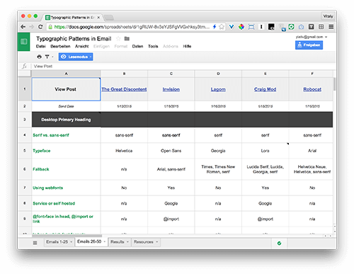
Google-table with a complete overview of each letter
I knew that a sample of 50 letters would hardly be statistically significant. I just wanted to identify a number of general trends. The average value in the article, I denote the mathematical expectation. The most popular value is the one that occurs most often. Also in several cases I use the concept of median value. All letters investigated in the work were sent from November 2014 to January 2015. I used tools like WhatFont, Charcounter and WebPagetest in my work.
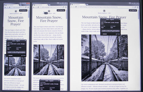
How the letter is displayed on the three types of devices in the WhatFont application
I answered almost the same questions as Constantine, with a number of exceptions. In total, about 90 conclusions were made, and in this post only the main ones were considered:
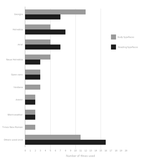
Helvetica became the most popular typeface in headlines and was used in 16% of cases, such as, for example, in Offscreen and TGD ezines . Georgia was most often used in the body of the letter (24%), such as, for example, in the mailings of Mr Porter and the New York Times . Two headsets from the Google Fonts set, Merriweather and Open Sans, are gaining popularity, which can be seen in the iOS Dev Weekly and InVision mailing lists.
Most popular headsets in the headers and in the body of the letter
Konstantin notes that serif fonts are used much more frequently in the main texts of websites (61.5%). Our study showed that for letters this figure is 36%. Perhaps in his work he studied more news sites in which serif fonts are more common. In addition, a lot of text is rarely found in the newsletter, since the main content is usually located on the landing page. An interesting example is the Craig Mod website , which uses the Lora serif font from Google Fonts both in the headers and in the body of the letter. Most often serif and sans serif fonts are used together: an example is the classic combination of Helvetica-Georgia in the MailChimp mailing list.
In 36% of cases, serif fonts are used in the body of the letter, in 64% - sans-serif fonts
To select a headset, I recommend reading the manual "Combine Headsets" and the article "Cool Font Combinations." In addition, Paul Airy writes about how to combine fonts in an email list. And if you thought that there are no web fonts in letters, then you are mistaken .
On Butterick's Practical Topography website they write : “In any project, the first thing to do is to shape the main text beautifully and only then worry about the rest.” Many articles on typography also say that you should always start with the design of the main text. The most important thing is to observe the proportions between the font size, the format or the length of the line and the height of the line, taking into account the width of the device’s screen.
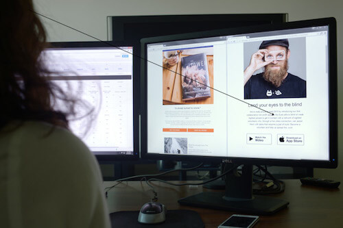
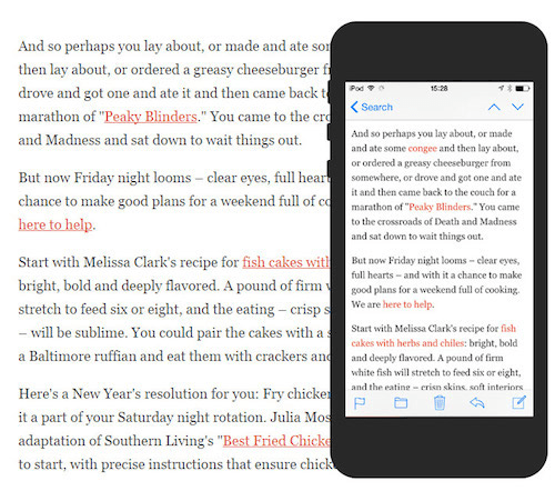
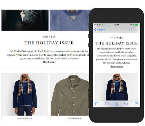
The key factor in choosing the font size is the distance [from the reader] to the device screen. The PC screen is located at arm's length, so the 20-pixel text of the letter from Robocat, typed in Helvetica (in the photo on the right), is easier to read than the Patagonia newsletter with 14-pixel Muli (in the photo on the left). iA writes that in its Writer application, when reading on the iPad, the company uses a larger font than on the iPhone, because we keep the iPad a little further from us.
At a distance, a text with a size of 20 pixels (on the right) is perceived more easily than a text with a size of 14 pixels (on the left)
Another factor that should not be forgotten when considering the font proportions is the format of the line, that is, the width of the letter body. The format of a string is measured either in pixels or in the number of characters in a string — email developers usually do not work with pin. Robert Bringhurst (Robert Bringhurst) recommends using in the text string letters with one column, adapted for PC, from 45 to 75 characters, ideal - 66 characters (including spaces).
I did a little experiment with a Georgia font of 16 pixels with an average line format of 540 pixels. With such parameters, the number of characters in the string will be slightly more than 70, and this is not so bad, considering that 75 is the maximum. But ideally, it is better to reduce the number of characters to 66, while the line width is around 480 pixels.
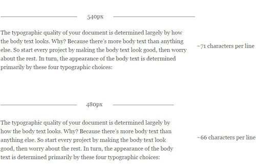
Robert Bringhurst advises to have from 45 to 75 characters in one line, the ideal option is 66 characters. Source: Practical Typography
According to calculations of Constantine, on the line of a web page, on average, there are 83.9 characters. In our study, the body line contains an average of 78.5 characters. When viewing emails on a mobile device, the average number of characters is reduced to 39. Typecast recommends sticking to the range of 35-40 characters when viewing emails on a regular smartphone. According to the results of our research, 48% of letters got into this range.
The most popular (53%) line format in letter templates adapted for PCs was the 600 pixel wide version. In general, the screen width varied from 480 to 760 pixels. If you want to make the column wider, just increase the font size until you reach the optimal number of characters. Trent Walton (Trent Walton) offers an original solution: you need to put the symbol "*" on two marks - 45 and 75 characters. Thus, if at some point both asterisks are on the same line, it means that the font needs to be increased.
The following are the main conclusions regarding line height.
The standard rule: line height should be 1.5 times the font size. That is, if the font size is 16 pixels, then the line height will be 24 pixels. The study confirms this rule: the ratio of line height to font size was 1.51. The greater the length of the string, the greater you can make its height.
Tim Brown (Tim Brown) calls this height change "smooth" or "fluid." Jason Santa Maria explains : “When your gaze reaches the end of the line, you need to see the gap between the lines and understand where the next line is, so as not to get lost ... If the lines become shorter, they can be placed a little more densely” . We also noted a decrease in this ratio when switching to a mobile device - it fell from 1.51 to 1.45.
The line height in the NYT Cooking list is reduced from 30 pixels on a PC to 25 pixels on a smartphone (the ratio of line height to font size is reduced from 1.6 to 1.5)
52% of designers of email-mailing sets the height of lines in pixels. Some companies, for example, Semplice , change the height of the line for different elements of the letter. 24% exhibit altitude as a percentage. For example, Lagom sets a height of 150%. Oliver Reichenstein thinks that 140% is a “good reference point,” although much depends on the typeface chosen. Paul Airy advises to set the height in percent, because in pixels it is more difficult to choose the right ratio. However, developers are most likely accustomed to pixels, as they are supported by many email clients.
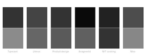
Several color combinations for the header (above) and the body of the letter (below)
Oliver Reichenstein writes : “On a high-contrast screen, it is preferable to choose either dark gray for the main text or light gray for the background instead of black and white shades.”
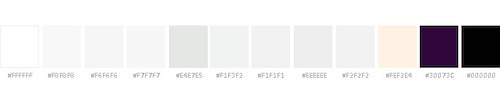
#FFFFFF has become the most popular (72%) color for letter background
When using more saturated fonts, Jason Santa Maria advises either to increase the height of the line, or to choose a lighter tone, so as not to burden the rest of the content. Developers sometimes adjust the text color on different devices depending on how the fonts of different sizes are displayed on them. In Photoshop, it is impossible to clearly determine whether a font is suitable for mailing or not: you have to study its behavior in the browser using self-made prototypes , Typecast or Typetester .

If the main text is centered, then reading is more difficult, because every time you have to look for the beginning of the next line
The users on whom we tested the mailing lists, constantly said that text aligned in the center is harder to read. “Perhaps the blocks with a lot of text are a little more difficult to read. I think this is because the text is centered, ”wrote one participant in the experiment in UserTesting. The same can be said about the narrower screens of mobile devices. Signatures, short sentences and headings aligned to the center, are perceived normally, but when it comes to paragraphs, the text has to be aligned to the left. As mentioned in “Dress Up Text”, whole paragraphs should never be centered.
Many email developers do not use h2, h3 tags, etc., so I fixed the first and second largest fonts in the headers using WhatFont. The most popular font size in the main headlines on a PC is 30 pixels, whereas for Constantin the figure is 38 pixels on the Web as a whole. Perhaps a smaller font is chosen for readability on both PCs and mobile devices.
64% used the same scale in the headers on all types of devices. If we talk about the remaining 36%, then 87.5% of them reduced the scale on mobile devices. For example, in the mailing list from Mr Porter, the font size on a mobile device has been reduced from 30 to 25 pixels - a slight change that makes the style more elegant, unlike bulky headlines on a PC.
The font size of the Mr Porter ezine header is reduced from 30 pixels on a PC to 25 pixels on a mobile device.
There is no consensus on the exact size of the headings, although in the desktop version the font of the header was on average twice as large as the font in the body of the letter. For comparison, on Typecast they write that their h1 values are three times the main text font, although you can find larger headlines on the Internet. If you want to experiment with different ratios, use the Modular Scale service. In addition, there is a standard typographical scale:
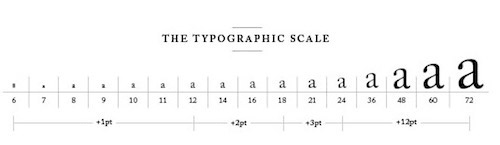
Scale from Robert Bringhurst's “The Foundations of Style in Typography”. Image: Retinart
As an alternative to using font size for visual highlighting, Marko Dugonjić suggests changing the style of the text: for example, italics, all capital letters or capitals [eng. small caps]. Check out his demo version (section “Allocation with a change of style”). This approach will be especially useful on mobile devices, where there is less space for large headers. Another option is to switch to a narrow font. Headlines are a creative platform for designers. Here they have more options for font sizes and alignment, as well as more opportunities to use web fonts, as opposed to text in the body of the letter.
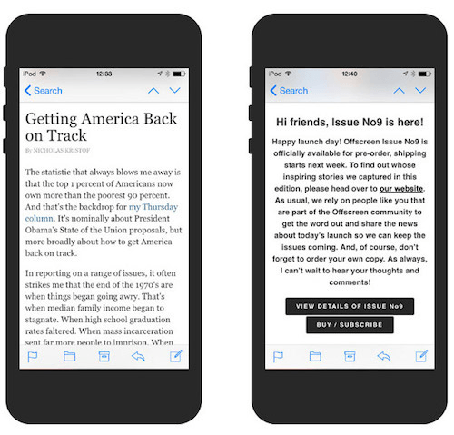
Entries under the heading are at the top of the letter. This is the first text that users usually see on their smartphones, along with the sender's name and subject. In my research, I distinguish between the concepts of instructional inscriptions, for example, “Watch online,” and a passage of text that is more informative and often complements the subject of the letter. Litmus explores this issue in detail in its review and lists in it a table of applications that display the text under the heading.

The text under the title is displayed along with the sender's name and subject line.
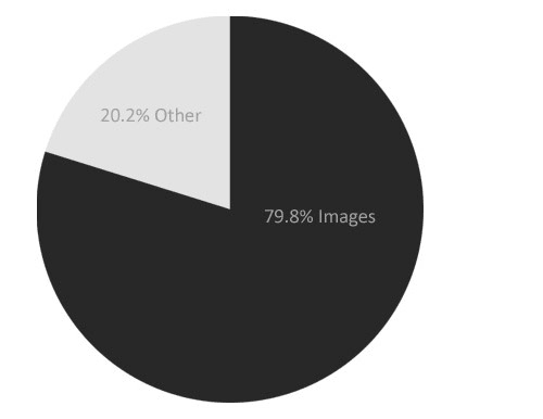
Initially, I included performance in my research, as I often heard about how web fonts reduce it. If you look at the list of the top 20 Google Fonts fonts, you can see that their average size is 28 KB (WOFF format) per font. If we consider that the majority of study participants used three fonts, the amount converges (the average size of the loaded font was 69.7 KB). Although web fonts can sometimes be cause for concern, they take up only 9.8% of the total letter volume. , 79,8% .
(Guy Podjarny) , . , – Litmus. , .
< 79,8% ( 568 )

, H&M 4,095 , .. -
, iA, Fray, Medium Pelican Books «» , email-. , ?
, - , , . , , .
, - ,
, : , 16 24 , . , «» . Google- , , .
, , . , . , . , , .
Today we bring to your attention an adapted translation of the study of Anna Iman (Anna Yeaman), co-founder and director of the US agency, which was originally published on the pages of the authoritative resource SmashingMagazine.
')
Last year I read the post of Jan Constantin (Jan Constantin) "Trends and modern methods of typographic design" and immediately decided to carry out a similar work, but with reference to the mailing list. At that time, I was learning responsive web typography. I identified a group of sites that I liked, and tried to figure out what the secret of their typography was, in order to apply new knowledge to the design of email distribution.
After I got acquainted with the work of Konstantin, I wanted to understand how other designers of email-newsletters used adaptive typography. As a result, I collected 50 examples of mailing from different areas, in which, in my opinion, high-quality typography was selected, and decided to check whether they have something in common. Initial data and results of this work you can see in the Google-table .
Methodology
Considering the fact that about 50% of all e-mails are opened from mobile devices, all letters selected for the study were adaptive, consisted of one column of the main text and the header. I collected statistics on three types of devices depending on the width of the screen: large (PC), medium (450 pixels) and small (320 pixels).
Google-table with a complete overview of each letter
I knew that a sample of 50 letters would hardly be statistically significant. I just wanted to identify a number of general trends. The average value in the article, I denote the mathematical expectation. The most popular value is the one that occurs most often. Also in several cases I use the concept of median value. All letters investigated in the work were sent from November 2014 to January 2015. I used tools like WhatFont, Charcounter and WebPagetest in my work.
How the letter is displayed on the three types of devices in the WhatFont application
What was interesting to me
I answered almost the same questions as Constantine, with a number of exceptions. In total, about 90 conclusions were made, and in this post only the main ones were considered:
- How popular are serif and sans serif headsets in the headers and body of the letter?
- What headsets are used most often?
- What font size is most often found in the body of the letter, and does this frequency change when switching from a PC to a mobile device?
- What is the average number of characters per line for each screen type?
- What is the most popular line width in a letter on a PC?
- What is the average ratio of the height of the line in the body of the letter to the size of the font?
- What is the average ratio between height and line length in the body of the letter?
- Is the same color used in the headline and in the letter body?
- What colors are most often used for the background?
- How does the text in the header and in the body of the letter align with the type of screen?
- What font size is more commonly used in headings?
- Do links attach to headlines?
- What is the size and color of the text subtitle of the letter and is this text displayed on mobile devices?
- How long is the average letter loading?
- How much do web fonts weigh compared to images?
Serif and sans serif fonts
- 74% of the fonts used in the headings were sans serif;
- 64% of the fonts used in the body of the letter were sans serif;
- The most popular sans serif fonts in the headlines are Helvetica (16%) and Arial (14%);
- The most popular serif fonts in the headings are Georgia (14%) and Merriweather (4%);
- The most popular sans serif fonts in the body of the letter are Helvetica or Neue Helvetica (20%), Arial (10%);
- The most popular serif fonts in the body of the letter are Georgia (24%), Merriweather and Times (4% each);
- Serif fonts were 10% more often used in the body of the letter than in the headers;
- In the body of the letter there were only 5 different serif fonts and 15 different sans serif fonts;
- In the headings there were 24 different types of fonts, of which 16 were met once;
- In the body of the letter there were 20 different types of fonts, of which 11 were met once;
- Times New Roman was unpopular: it was not used in any of the headlines.
Helvetica became the most popular typeface in headlines and was used in 16% of cases, such as, for example, in Offscreen and TGD ezines . Georgia was most often used in the body of the letter (24%), such as, for example, in the mailings of Mr Porter and the New York Times . Two headsets from the Google Fonts set, Merriweather and Open Sans, are gaining popularity, which can be seen in the iOS Dev Weekly and InVision mailing lists.
Most popular headsets in the headers and in the body of the letter
Konstantin notes that serif fonts are used much more frequently in the main texts of websites (61.5%). Our study showed that for letters this figure is 36%. Perhaps in his work he studied more news sites in which serif fonts are more common. In addition, a lot of text is rarely found in the newsletter, since the main content is usually located on the landing page. An interesting example is the Craig Mod website , which uses the Lora serif font from Google Fonts both in the headers and in the body of the letter. Most often serif and sans serif fonts are used together: an example is the classic combination of Helvetica-Georgia in the MailChimp mailing list.
In 36% of cases, serif fonts are used in the body of the letter, in 64% - sans-serif fonts
To select a headset, I recommend reading the manual "Combine Headsets" and the article "Cool Font Combinations." In addition, Paul Airy writes about how to combine fonts in an email list. And if you thought that there are no web fonts in letters, then you are mistaken .
Letter body
On Butterick's Practical Topography website they write : “In any project, the first thing to do is to shape the main text beautifully and only then worry about the rest.” Many articles on typography also say that you should always start with the design of the main text. The most important thing is to observe the proportions between the font size, the format or the length of the line and the height of the line, taking into account the width of the device’s screen.
Font size
- The most popular (44%) font size on a PC is 16 pixels;
- The median font size on a PC is also 16 pixels (the average is 15.7 pixels);
- In the body of the letter opening from a PC, the font size varied from 13 to 20 pixels;
- The most popular (38%) font size on mobile devices is 16 pixels;
- The median font size on mobile devices is also 16 pixels (the average is 15.58 pixels);
- In the body of the letter opening from a mobile device, the font size varied from 13 to 20 pixels;
- In 72% of cases, when switching from a PC to a mobile device, the font size did not change;
- In the remaining 28% of cases, when switching from a PC to a mobile device, the text more often decreased (64%) than increased (36%).
The key factor in choosing the font size is the distance [from the reader] to the device screen. The PC screen is located at arm's length, so the 20-pixel text of the letter from Robocat, typed in Helvetica (in the photo on the right), is easier to read than the Patagonia newsletter with 14-pixel Muli (in the photo on the left). iA writes that in its Writer application, when reading on the iPad, the company uses a larger font than on the iPhone, because we keep the iPad a little further from us.
At a distance, a text with a size of 20 pixels (on the right) is perceived more easily than a text with a size of 14 pixels (on the left)
String format
Another factor that should not be forgotten when considering the font proportions is the format of the line, that is, the width of the letter body. The format of a string is measured either in pixels or in the number of characters in a string — email developers usually do not work with pin. Robert Bringhurst (Robert Bringhurst) recommends using in the text string letters with one column, adapted for PC, from 45 to 75 characters, ideal - 66 characters (including spaces).
- 600 pixels - the most popular body width for a PC (range - from 480 to 760 pixels, average value - 623 pixels);
- 540 pixels - average column width on a PC;
- The line of text on a PC is on average 78.5 characters;
- In a line of text 450 pixels wide, on average 53.86 characters are located;
- In a line of text 320 pixels wide, the average is 39.02 characters;
- The format of the string on mobile devices varies from 22 to 57 characters;
- In 76% of cases, this range is narrowed to 36-46 characters.
I did a little experiment with a Georgia font of 16 pixels with an average line format of 540 pixels. With such parameters, the number of characters in the string will be slightly more than 70, and this is not so bad, considering that 75 is the maximum. But ideally, it is better to reduce the number of characters to 66, while the line width is around 480 pixels.
Robert Bringhurst advises to have from 45 to 75 characters in one line, the ideal option is 66 characters. Source: Practical Typography
According to calculations of Constantine, on the line of a web page, on average, there are 83.9 characters. In our study, the body line contains an average of 78.5 characters. When viewing emails on a mobile device, the average number of characters is reduced to 39. Typecast recommends sticking to the range of 35-40 characters when viewing emails on a regular smartphone. According to the results of our research, 48% of letters got into this range.
The most popular (53%) line format in letter templates adapted for PCs was the 600 pixel wide version. In general, the screen width varied from 480 to 760 pixels. If you want to make the column wider, just increase the font size until you reach the optimal number of characters. Trent Walton (Trent Walton) offers an original solution: you need to put the symbol "*" on two marks - 45 and 75 characters. Thus, if at some point both asterisks are on the same line, it means that the font needs to be increased.
Line height
The following are the main conclusions regarding line height.
- With a font size of 16 pixels, the most popular line height was 24 pixels high;
- The average ratio of line height to “height” (total volume) of the text was 1.51 (for Constantin - 1.46);
- With a 450-pixel width of the line, the ratio of the height of the line to the height of the text decreases to 1.49;
- With a 320-pixel width of the line, the ratio of the height of the line and the height of the text decreases to 1.45;
- 22% of companies in the study, reduce the height of the line for letters, adapted for mobile devices;
- 52% set the row height in pixels;
- 24% set the row height in percent;
- The ratio of the length of a line to its height averaged 23.1 (for Constantine - 24.9);
- The ratio of the amount of indent between paragraphs to the height of the line averaged 1.38 (for Constantin - 1.39).
The standard rule: line height should be 1.5 times the font size. That is, if the font size is 16 pixels, then the line height will be 24 pixels. The study confirms this rule: the ratio of line height to font size was 1.51. The greater the length of the string, the greater you can make its height.
Tim Brown (Tim Brown) calls this height change "smooth" or "fluid." Jason Santa Maria explains : “When your gaze reaches the end of the line, you need to see the gap between the lines and understand where the next line is, so as not to get lost ... If the lines become shorter, they can be placed a little more densely” . We also noted a decrease in this ratio when switching to a mobile device - it fell from 1.51 to 1.45.
The line height in the NYT Cooking list is reduced from 30 pixels on a PC to 25 pixels on a smartphone (the ratio of line height to font size is reduced from 1.6 to 1.5)
52% of designers of email-mailing sets the height of lines in pixels. Some companies, for example, Semplice , change the height of the line for different elements of the letter. 24% exhibit altitude as a percentage. For example, Lagom sets a height of 150%. Oliver Reichenstein thinks that 140% is a “good reference point,” although much depends on the typeface chosen. Paul Airy advises to set the height in percent, because in pixels it is more difficult to choose the right ratio. However, developers are most likely accustomed to pixels, as they are supported by many email clients.
Colour
- # 000000 (black) was the most popular text color (20%), followed by # 333333 (twilight gray) (16%);
- The letters used 28 different shades of gray, most of which are dark gray;
- 56% of mailing list authors used the same text color both in the title and in the body of the letter;
- 26% in the body of the letter used a lighter shade of gray than in the title, 4% - darker, and 14% took different colors;
- 72% used #FFFFFF (white) as background;
- 48% did not insert links into the body of the letter, 20% selected links with a different color, 18% highlighted and underlined, 10% only emphasized, and 4% used other options;
- # 000000 was the most popular color for the main title (24%), followed by # 333333 (16%);
- 40% of subtitles differed in color from the main title: for example, they were distinguished by a lighter shade of gray.
Several color combinations for the header (above) and the body of the letter (below)
Oliver Reichenstein writes : “On a high-contrast screen, it is preferable to choose either dark gray for the main text or light gray for the background instead of black and white shades.”
#FFFFFF has become the most popular (72%) color for letter background
When using more saturated fonts, Jason Santa Maria advises either to increase the height of the line, or to choose a lighter tone, so as not to burden the rest of the content. Developers sometimes adjust the text color on different devices depending on how the fonts of different sizes are displayed on them. In Photoshop, it is impossible to clearly determine whether a font is suitable for mailing or not: you have to study its behavior in the browser using self-made prototypes , Typecast or Typetester .
Alignment
- 54% of the main headers on the PC are centered, 46% are on the left;
- 54% of the main headers on mobile devices are left aligned, 46% - in the center;
- 74% of the creators of mailings align the main text on the PC along the left edge, the remaining 26% - in the center;
- 76% align the main text on the mobile device along the left edge, the remaining 24% - in the center.
If the main text is centered, then reading is more difficult, because every time you have to look for the beginning of the next line
The users on whom we tested the mailing lists, constantly said that text aligned in the center is harder to read. “Perhaps the blocks with a lot of text are a little more difficult to read. I think this is because the text is centered, ”wrote one participant in the experiment in UserTesting. The same can be said about the narrower screens of mobile devices. Signatures, short sentences and headings aligned to the center, are perceived normally, but when it comes to paragraphs, the text has to be aligned to the left. As mentioned in “Dress Up Text”, whole paragraphs should never be centered.
Average font size in headers
- 30 pixels is the most popular (18%) size in headers on a PC (30 pixels is also the median size, and the average size is 31.6 pixels);
- The font sizes in the headings on the PC were divided into two groups: from 24 to 26 pixels and from 28 to 36 pixels;
- The font in the headers was on average exactly twice as large as the font in the body of the letter (31.6 and 15.7 pixels, respectively);
- The font in the headers on the PC on average was 1.2 times the height of the line (this ratio varied from 0.65 to 1.8);
- Links were not attached to 62% of the main headers on the PC;
- 68% of the creators of mailings did not change the font size in the title when switching from a PC to a 450-pixel letter width format; 87.5% of those who changed the font size reduced it;
- 64% chose the same font sizes for the heading on PC and mobile devices (one scale);
- On mobile devices, for the main header, most often they chose a size of 30 and 32 pixels (both at 12% each);
- The average font size in the main header on a mobile device (320 pixels) was 28.48 pixels (median font size was 26.5 pixels)
- The ratio of the font size in the header to the height of the line averaged 1.17 for mobile devices;
- Only 14% used some uppercase letters in the heading (as a rule, these were clothing stores);
- 72% used subtitles;
- The average font size of the subtitles is 27.9 pixels (for the desktop).
Many email developers do not use h2, h3 tags, etc., so I fixed the first and second largest fonts in the headers using WhatFont. The most popular font size in the main headlines on a PC is 30 pixels, whereas for Constantin the figure is 38 pixels on the Web as a whole. Perhaps a smaller font is chosen for readability on both PCs and mobile devices.
64% used the same scale in the headers on all types of devices. If we talk about the remaining 36%, then 87.5% of them reduced the scale on mobile devices. For example, in the mailing list from Mr Porter, the font size on a mobile device has been reduced from 30 to 25 pixels - a slight change that makes the style more elegant, unlike bulky headlines on a PC.
The font size of the Mr Porter ezine header is reduced from 30 pixels on a PC to 25 pixels on a mobile device.
There is no consensus on the exact size of the headings, although in the desktop version the font of the header was on average twice as large as the font in the body of the letter. For comparison, on Typecast they write that their h1 values are three times the main text font, although you can find larger headlines on the Internet. If you want to experiment with different ratios, use the Modular Scale service. In addition, there is a standard typographical scale:
Scale from Robert Bringhurst's “The Foundations of Style in Typography”. Image: Retinart
As an alternative to using font size for visual highlighting, Marko Dugonjić suggests changing the style of the text: for example, italics, all capital letters or capitals [eng. small caps]. Check out his demo version (section “Allocation with a change of style”). This approach will be especially useful on mobile devices, where there is less space for large headers. Another option is to switch to a narrow font. Headlines are a creative platform for designers. Here they have more options for font sizes and alignment, as well as more opportunities to use web fonts, as opposed to text in the body of the letter.
Headline text
Entries under the heading are at the top of the letter. This is the first text that users usually see on their smartphones, along with the sender's name and subject. In my research, I distinguish between the concepts of instructional inscriptions, for example, “Watch online,” and a passage of text that is more informative and often complements the subject of the letter. Litmus explores this issue in detail in its review and lists in it a table of applications that display the text under the heading.
- 66% of mailing list creators use the text under the heading on the PC;
- 36% include only instructions in it, 33% - instructions and an excerpt of the letter, 30% - only an excerpt;
- The most popular text size under the heading on a PC is 11 pixels (33%), then 12 pixels (18%) and then 10 pixels (12%) (average value is 12.3 pixels);
- The font sizes of the text under the heading range from 9 to 18 pixels;
- The ratio of the size of the text under the title to the size of the main text averaged 0.78;
- The ratio of the size of the text under the heading to the height of the line on the PC was on average 1.11;
- 76% used the text under the heading sans serif;
- The most popular sans serif font was Arial, with serifs - Georgia;
- The text under the title used 22 different colors, the most popular is # 000000, then # 999999;
- 82% supported the text under the heading on mobile devices, 18% hid it;
- The most popular text size under the heading on mobile devices is 11 pixels (40%), then 16 pixels (22%) and then 14 pixels (18%) (average font size is 12.9 pixels);
- The font sizes of the text under the heading on mobile devices ranged from 8 to 16 pixels;
- 71% kept their size when switching to mobile devices, 22% increased the font, 7% decreased;
- The ratio of the size of the text under the heading to the size of the main text on a mobile device averaged 0.85.
The text under the title is displayed along with the sender's name and subject line.
Performance
- The time during which the first element of the letter was displayed averaged 0.94 seconds;
- The full load time of the letter averaged 2.64 seconds;
- The total number of HTTP requests averaged 24;
- The average number of requests for images was 13.7, that is, 57% of the total number of requests;
- A fully downloaded letter weighed an average of 711 KB;
- The images in the letter weighed an average of 568 KB;
- Images accounted for 79.8% of the volume of the entire letter;
- Image size varied from 9 KB to 4.4 MB, of which 50% weighed 200 KB or more;
- Web fonts on average occupied 69.7 KB (9.5% of the volume of the entire letter);
- 30% used web fonts (the most popular was Open Sans, then Merriweather).
Initially, I included performance in my research, as I often heard about how web fonts reduce it. If you look at the list of the top 20 Google Fonts fonts, you can see that their average size is 28 KB (WOFF format) per font. If we consider that the majority of study participants used three fonts, the amount converges (the average size of the loaded font was 69.7 KB). Although web fonts can sometimes be cause for concern, they take up only 9.8% of the total letter volume. , 79,8% .
(Guy Podjarny) , . , – Litmus. , .
< 79,8% ( 568 )
, H&M 4,095 , .. -
Conclusion
, iA, Fray, Medium Pelican Books «» , email-. , ?
, - , , . , , .
, - ,
, : , 16 24 , . , «» . Google- , , .
, , . , . , . , , .
- 74% , 64% ;
- – 15,7 , – 15,58 ;
- 623 ;
- , , – 78,5, 450 – 53,86;
- , , 22 57 ;
- 1,51 1,45 (320 );
- 23,1;
- 76% ;
- : 24 26 28 36 ;
- (320 ) 28,48 ;
- 12,3 , – 12,9 ;
- (31,6 15,7 );
- 0,78 , – 0,85;
- The average time for which the first element of the letter is loaded was 0.94 seconds;
- The total number of HTTP requests averaged 24.
Source: https://habr.com/ru/post/304038/
All Articles