Simple graphics using D3.js

D3.js (or simply D3) is a JavaScript library for processing and visualizing data with incredibly huge capabilities. When I first found out about it, I probably spent at least two hours just looking at examples of data visualization created on D3. And of course, when I myself needed to build graphics for a small internal site in our enterprise, first of all I remembered D3 and with the thought that “now I will surprise everyone with the coolest visualization,” I took up studying the source codes of examples ...
... and I realized that I absolutely do not understand anything! The strange logic of the library, in the examples a whole bunch of lines of code to create the simplest graph - it was of course a blow, mainly on vanity. Okay, wiped my snot - I realized that I shouldn’t take the D3 swoop, and to understand this library we must start from its very foundations. Therefore, I decided to go another way - to take one of the libraries as a basis for my schedules - add-ons on D3. As it turned out, there are quite a lot of such libraries - it means that I’m not the only one who is not understanding (it was my pride rising from the ashes).
Having tried several libraries, I stopped at dimple as more or less suitable for my needs, rebuilt all my graphics with it, but the dissatisfaction remained. Some things did not work as we would like, other functionality could not be implemented without deep digging into the dimple, and it was postponed. And in general, if you need to dig deeply, then it is better to do it directly with D3, and not with additional settings, the rich functionality of which in my case is used for no more than five to ten percent, but the settings I needed on the contrary were not enough. And so what happened happened - D3.js.
Attempt number two
First of all I read everything that is on D3 on Habré . And in the commentary under one of the articles I saw a link to the book Interactive Data Visualization for the Web . Opened, looked, began to read - and instantly became involved! The book is written in simple and understandable English, plus the author is in itself a wonderful and interesting storyteller, well revealing the subject of D3 from the beginning.
Based on the results of reading this book (as well as parallel heaps of other documentation on the topic), I wrote a small (more accurately, microscopic) library for constructing simple and minimalist line graphs. And in turn, using the example of this library, I want to show that it is not at all difficult to build graphs with D3.js.
So (my favorite word), let's get started.
First let's decide which data we want to rebuild as a graph. I decided not to grind out a set of conditional data, but took real ones that I encounter every day, simplifying and depersonalizing them for better understanding.
Imagine some sort of mining and processing plant, say, iron ore at some conditional deposit (take a candle factory, ”the classic phrase of literature from behind the shoulder reminds me, but the data are already prepared, because the candle factory is postponed until the next times).
So, we extract ore and we produce iron. There is a production plan drawn up by technologists, taking into account the geological features of the field, production capacity, and so on. etc. The plan (in our case) is broken down by months, and it is clear how much it is necessary to extract ores and smelt iron in one month or another in order to fulfill this plan. There is also a fact - monthly actual data on the implementation of the plan. Let's take it all and display it as a graph.
The server will provide us with the above data in the form of the following tsv file:
Category Date Metal month Mined % fact 25.10.2010 2234 0.88 fact 25.11.2010 4167 2.55 ... plan 25.09.2010 1510 1 plan 25.10.2010 2790 2 plan 25.11.2010 3820 4 ... Where in the Category column are the planned or actual values, Date is the data for each month (we date from the 25th), Metal month - how much metal in the month we planned (or received) and column Mined% - what percentage of metal mined at the moment.
I think everything is clear with the data, now we are starting the program. I will not show all the code, such as library calls, css styles, and the like, so as not to clutter up the article and focus on the main thing, and you can download the example described here at the end of the article.
First of all, using the d3.tsv function, load the data:
d3.tsv("sample.tsv", function(error, data) { if (error) throw error; // } Loading data in D3 is very simple. If you need to load data in a different format, for example in csv , just change the call from d3.tsv to d3.sv. Is your data in JSON format ? Change the call to d3.json. I tried all three formats and stopped at tsv, as the most convenient for me. You can use any one you like, or even generate data directly in the program.
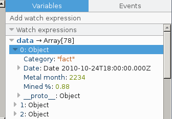
In the picture below you can see how the downloaded data looks in our program.

If you look closely at the figure, you can see that the data is loaded as strings, because the next stage of the program is to cast the dates to the data type date, and the numeric values to the numeric type. Without these conversions, D3 will not be able to correctly process dates, and it will apply a selective approach to numerical values, i.e. some numbers will be taken, while others will simply be ignored. For these casts, call the following function:
preParceDann("Date","%d.%m.%Y",["Metal month","Mined %"],data); In the parameters of this function, we pass the name of the column in which the dates are written, the date format in accordance with the rules for recording dates in D3; then comes an array with the names of the columns for which you want to do the conversion of digital values. And the last parameter is the data we downloaded earlier. The conversion function itself is quite small and therefore, in order not to return to it again, I will bring it right away:
function preParceDann(dateColumn,dateFormat,usedNumColumns,data){ var parse = d3.time.format(dateFormat).parse; data.forEach(function(d) { d[dateColumn] = parse(d[dateColumn]); for (var i = 0, len = usedNumColumns.length; i < len; i += 1) { d[usedNumColumns[i]] = +d[usedNumColumns[i]]; } }); }; Here we initialize the date prasing function and then for each data row we convert the dates, and for the specified columns we translate the rows into numbers.
After performing this function, our data is already presented in this form:
Immediately I answer a possible question - Why does this function have a complication with the list of columns in which you need to format digital data? - and this answer is simple: in a real table there can be (and there is) a much larger number of columns and not all of them can be digital. Yes, and we certainly will not build on all columns of graphics, so why unnecessary manipulations on data conversion?
Before proceeding to the next step, let's recall our data file - it sequentially records first the actual and then the project data. If we now rebuild the data as they are, we get a complete mess. Because both the fact and the plan will be drawn in the form of a single diagram. Therefore, we perform another data manipulation using the D3 function with the curious name nest (nest):
var dataGroup = d3.nest() .key(function(d) { return d.Category; }) .entries(data); As a result of this function, we get the following data set:
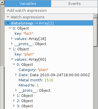
where we see that our data array is already divided into two sub-arrays: one fact, another plan.
Everything, we have finished with data preparation - now we proceed to setting the parameters for plotting:
var param = { parentSelector: "#chart1", width: 600, height: 300, title: "Iron mine work", xColumn: "Date", xColumnDate: true, yLeftAxisName: "Tonnes", yRightAxisName: "%", categories: [ {name: "plan", width: "1px"}, {name: "fact", width: "2px"} ], series: [ {yColumn: "Metal month", color: "#ff6600", yAxis: "left"}, {yColumn: "Mined %", color: "#0080ff", yAxis: "right"} ] }; Everything is simple here:
| Parameter | Value |
|---|---|
| parentSelector | The id of the element of our page in which the schedule will be built up |
| width: 600 | width |
| height: 300 | height |
| title: "Iron mine work" | headline |
| xColumn: "Date" | the name of the column from which the coordinates for the X axis will be taken |
| xColumnDate: true | if true, then the x axis is the dates (unfortunately, this functionality is still unfinished, that is, we can build only the dates along the x axis) |
| yLeftAxisName: "Tonnes" | left y axis name |
| yRightAxisName: "%" | the names of the right y axis |
| categories: | long thought how to name that. that flies out of the “nest” D3 and did not invent anything better than the categories. For each category, the name is given - how it is spelled out in our data and the width of the construction |
| series: | Obviously, the diagrams themselves, we define from which column we take values for the y axis, color, and to which axis the diagram will belong, left or right |
We set all the initial data, now we finally call the plotting and enjoy the result:
d3sChart(param,data,dataGroup); 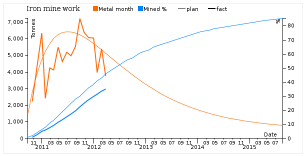
What do we see on this chart? And we see that the plans were too optimistic and in order to have a reliable forecast it is necessary to make an inevitable adjustment. It is also necessary to take a closer look at the production, the actual schedule is painfully ragged ... Okay, okay - we already go where we, programmers, have not been called, therefore we return to our sheep - how is this schedule built?
I repeat the call of the function of plotting:
d3sChart(param,data,dataGroup); Looking at it, a reasonable question arises, which you probably want to ask me - Why do two arrays of data, data and dataGroup, be passed to the function? The answer is: the initial data array is needed in order to set the correct data range for the axes. I suspect that this sounds not very clear - but I will try to explain this moment soon.
The first thing we do in the construction function is to check if there is an object at all in which we will build a graph. And if this object itself is not there - we swear strongly:
function d3sChart (param,data,dataGroup){ // check availability the object, where is displayed chart var selectedObj = null; if (param.parentSelector === null || param.parentSelector === undefined) { parentSelector = "body"; }; selectedObj = d3.select(param.parentSelector); if (selectedObj.empty()) { throw "The '" + param.parentSelector + "' selector did not match any elements. Please prefix with '#' to select by id or '.' to select by class"; }; Our following actions: we initialize various indents, the sizes and we create scales.
var margin = {top: 30, right: 40, bottom: 30, left: 50}, width = param.width - margin.left - margin.right, height = param.height - margin.top - margin.bottom; // set the scale for the transfer of real values var xScale = d3.time.scale().range([0, width]); var yScaleLeft = d3.scale.linear().range([height, 0]); var yScaleRight = d3.scale.linear().range([height, 0]); We do not forget that our library has just hatched and has not been accustomed to adjust some things (for example, indents) from the outside, due to the artificially accelerated incubation process. Therefore, once again I ask you to understand and forgive.
Jokes, jokes, but back to the code above - with indents and sizes, I think everything is clear, we need the scales to recalculate the initial values of the coordinates into the coordinates of the plot area. It can be seen that the x scale is initialized as a time scale, and the left and right scales along the y axis are initialized as linear. In general, there are many different scales in D3, but considering them, as well as many other things, is already much beyond the scope of this article.
We continue, we have created scales, now we need to configure them. And this is where the original data set comes in handy. If in a very simple way - with the previous actions we set a range of scales in the coordinates of the graph, with the same commands we associate this range with data ranges:
xScale.domain([d3.min(data, function(d) { return d[param.xColumn]; }), d3.max(data, function(d) { return d[param.xColumn]; })]); yScaleLeft.domain([0,d3.max(data, function(d) { return d[param.series[0].yColumn]; })]); yScaleRight.domain([0,d3.max(data, function(d) { return d[param.series[1].yColumn]; })]); For the X scale, we set the minimum value to the minimum date in our data, and the maximum to the maximum. For Y axes, we take 0 for the minimum, and we also learn the maximum from the data. For this, we also needed non-broken data - to find out the minimum and maximum values.
The next step is to tune the axes. Here begins a little confusion. In D3 there are scales (scales) and axes (axis). The scales are responsible for converting the original coordinates into the coordinates of the construction area, the axes are intended to display on the charts those rods and dashes that we see on the graph and which in Russian are called “coordinate scales plotted along the X and Y axes”. Therefore, in the future, if I am writing a scale, keep in mind that we are talking about axis, i.e. about drawing the scale on the chart.
So, I remind you - we have two scales for the Y axis and one scale for the X axis, from which we had to pretty much tinker. The fact is that I was completely uncomfortable with how D3 displays the date scale by default. But all my attempts to adjust the date signatures the way I need it, were broken, like waves, against the cliffs of power and monumentality of this library. Therefore I had to go on forgery and deception: I created two scales on the X axis. On one scale, only years are displayed on my scale, on the other months. For months, a small check has been added that excludes the first month from the output. And after all, just a couple of sentences ago, I blamed this library for monumentality, and here is such a wonderful example of flexibility.
var xAxis = d3.svg.axis().scale(xScale).orient("bottom") .ticks(d3.time.year,1).tickFormat(d3.time.format("%Y")) .tickSize(10); var monthNameFormat = d3.time.format("%m"); var xAxis2 = d3.svg.axis().scale(xScale).orient("bottom") .ticks(d3.time.month,2).tickFormat(function(d) { var a = monthNameFormat(d); if (a == "01") {a = ""}; return a;}) .tickSize(2); var yAxisLeft = d3.svg.axis().scale(yScaleLeft).orient("left"); var yAxisRight = d3.svg.axis().scale(yScaleRight).orient("right"); We continue to consider the code. We have carried out all the preparatory work and are now proceeding directly to the formation of the image. The next 4 lines of code sequentially create the svg area, draw an outlining frame, create with a given offset a group of svg objects in which our graph will be plotted. And the last action - the title is displayed.
var svg = selectedObj.append("svg") .attr({width: param.width, height: param.height}); // outer border svg.append("rect").attr({width: param.width, height: param.height}) .style({"fill": "none", "stroke": "#ccc"}); // create group in svg for generate graph var g = svg.append("g").attr({transform: "translate(" + margin.left + "," + margin.top + ")"}); // add title g.append("text").attr("x", margin.left) .attr("y", 0 - (margin.top / 2)) .attr("text-anchor", "middle").style("font-size", "14px") .text(param.title); The next big piece of code signs the units of measure of our 3 axes. I think everything is clear and in detail need not be considered:
g.append("g").attr("class", "x axis").attr("transform", "translate(0," + height + ")") .call(xAxis) .append("text") .attr("x", width-20).attr("dx", ".71em") .attr("y", -4).style("text-anchor", "end") .text(param.xColumn); g.append("g").attr("class", "x axis2").attr("transform", "translate(0," + height + ")") .call(xAxis2); g.append("g").attr("class", "y axis") .call(yAxisLeft) .append("text").attr("transform", "rotate(-90)") .attr("y", 6).attr("dy", ".71em").style("text-anchor", "end") .text(param.yLeftAxisName); g.append("g").attr("class", "y axis").attr("transform", "translate(" + width + " ,0)") .call(yAxisRight) .append("text").attr("transform", "rotate(-90)") .attr("y", -14).attr("dy", ".71em").style("text-anchor", "end") .text(param.yRightAxisName); And finally, the core of the graphing function is the drawing of the diagrams themselves:
dataGroup.forEach(function(d, i) { for (var i = 0, len = param.categories.length; i < len; i += 1) { if (param.categories[i].name == d.key){ for (var j = 0, len1 = param.series.length; j < len1; j += 1) { if (param.series[j].yAxis == "left"){ // init line for left axis var line = d3.svg.line() .x(function(d) { return xScale(d[param.xColumn]); }) .y(function(d) { return yScaleLeft(d[param.series[j].yColumn] ); }); }; if (param.series[j].yAxis == "right"){ // init line for right axis var line = d3.svg.line() .x(function(d) { return xScale(d[param.xColumn]); }) .y(function(d) { return yScaleRight(d[param.series[j].yColumn] ); }); }; // draw line g.append("path").datum(d.values) .style({"fill": "none", "stroke": param.series[j].color, "stroke-width": param.categories[i].width}) .attr("d", line); }; }; }; }); “Three nested cycles!” Exclaim you in a rage. And you will be absolutely right in your indignation - I myself do not like to make such nested constructions, but sometimes I have to. In the third cycle nesting, we initialize our lines of diagrams, where, depending on the series, we indicate whether this line belongs to the right or left scale. After that, in the second nesting we already draw the line on the chart, setting its thickness from the properties of the categories. Those. in fact, we only have two lines of code involved in the construction, everything else is just a strapping, necessary for processing a different number of diagrams on the graph.
Well, the last action with our schedule is the conclusion of the legend. I repent of the legend - here I was in a hurry and made it to a tyap-bluff, this code will be rewritten soon and I show it only to demonstrate once again that everything is pretty simple in D3. And yet - here is a good example of how not to do it:
var legend = svg.append("g").attr("class", "legend").attr("height", 40).attr("width", 200) .attr("transform", "translate(180,20)"); legend.selectAll('rect').data(param.series).enter() .append("rect").attr("y", 0 - (margin.top / 2)).attr("x", function(d, i){ return i * 90;}) .attr("width", 10).attr("height", 10) .style("fill", function(d) {return d.color; }); legend.selectAll('text').data(param.series).enter() .append("text").attr("y", 0 - (margin.top / 2)+10).attr("x", function(d, i){ return i * 90 + 11;}) .text(function(d) { return d.yColumn; }); // add legend for categories var legend1 = svg.append("g").attr("class", "legend").attr("height", 40).attr("width", 200) .attr("transform", "translate(350,20)"); legend1.selectAll('line').data(param.categories).enter() .append("line").attr("y1", 0 - (margin.top / 2)+5).attr("x1", function(d, i){ return i * 60;}) .attr("y2", 0 - (margin.top / 2)+5).attr("x2", function(d, i){ return i * 60+15;}) .style("stroke", "black").style("stroke-width", function(d) { return d.width; }); legend1.selectAll('text').data(param.categories).enter() .append("text").attr("y", 0 - (margin.top / 2)+10).attr("x", function(d, i){ return i * 60 + 17;}) .text(function(d) { return d.name; }); That's all. Thanks for attention! I hope that I did not disappoint you with my article.
The source code and sample data can be downloaded from GitHub .
In conclusion, I just want to add that I was looking for a similar article or tutorial when I tried to deal with the D3 library myself. Looking for an article, where by examples, separately and consistently, it would be shown: how to load and prepare data, how to create and set up a construction area, and how to display this data. Unfortunately, I didn’t meet anything like that then, and in the examples on D3 from the author everything is so mixed up that without understanding the logic of the work and not having basic knowledge of this library, it is very difficult to figure out where the data manipulation ends, and where the manipulation with representation of this data, and vice versa.
06/23/2016 upd. I updated the program on Gitkhab: I improved the time scale, made that I could put a number row instead of dates on the X axis, fixed some errors and now I can build graphs without categories.
08/12/2016 upd. Redid the program to work on the 4th version of d3. A lot of incompatibilities have come out. The example described in the article works only with the 3rd version of the library and lies on Github in files with the _v3 prefix in the file name.
')
Source: https://habr.com/ru/post/303834/
All Articles