How to create visually effective calls to action
How to make the call to action delicate but effective? This article reveals a few simple secrets. We tried to use them when creating a new design for our site “ I love IP ”. And at the same time they decided to translate it. We hope this article will also be useful to you .
Creating effective landing pages is not an easy task. This is a constant struggle between what works and what does not. This is a continuous process of testing, measuring and improving.
')
One of the most difficult tasks I have encountered in my work is to direct the attention of site visitors to a call to action. And although the main role in this process is most likely played by the text, it is very important to back it up with a design that will draw attention to your message.
The good news is that people's behavior is quite predictable, and we can use it.
People really like repetitive visual patterns. And they very quickly notice any deviation from them. That is what we can use to get their attention.
But how to do it delicately, without intrusive buttons and exclamation marks?
Every call to action needs attention.
Before we go directly to the design, let's talk about how to attract attention. Why is it so hard? And why do you need to use some tricks for this?
The goal of most sites is to attract the target audience and encourage them to take action. Whether it is a subscription to a newsletter, social interaction or the purchase of goods.
Of course, this action in itself is usually not so attractive for those who first came to your site. It is unlikely that you will be able to interest your visitors with just the phrase: “Sign up for my newsletter!”
Because it is the content that attracts your target audience. It could be a good selling text, blog posts, infographics, a free e-book, or something else.
Once you are interested in site visitors, you can direct them further to the next stage of your conversion funnel.
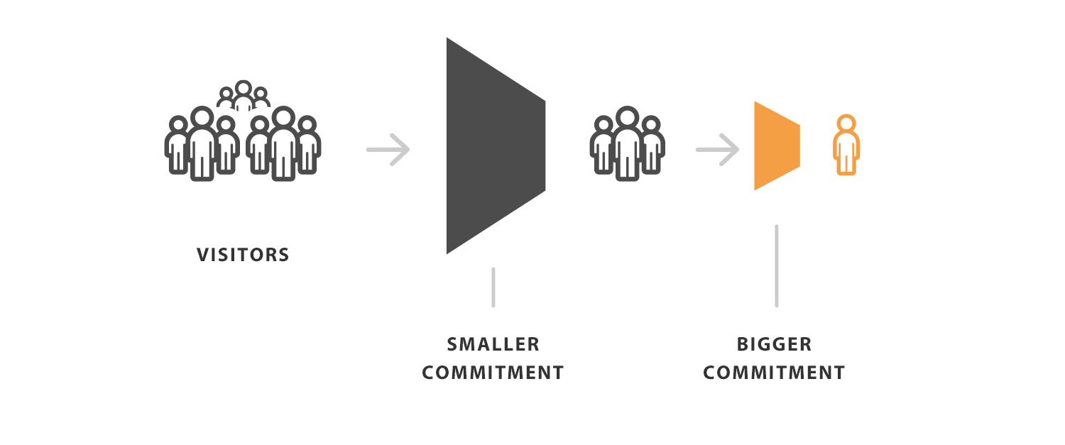
Visitors Less commitment. More commitments
Now, to attract the attention of a person and direct him to action is very difficult. And the more costs it requires, the more difficult it is to do. Different calls for action may require different approaches.
For example, offering to subscribe to a newsletter in exchange for free valuable information is much easier than asking for something to buy.
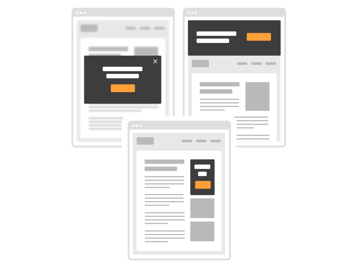
The call to action, which does not require large expenditures, may be more direct. It can be placed in a pop-up window or on a large banner at the top of the site.
But this approach will not work if you want to sell something. You need to prepare your visitors, enlighten them, dispel doubts and generate interest in the product before offering to buy it.
That is why it is necessary to have a call to action more strategically. You should not do it too soon, your visitors may not be ready for it yet.
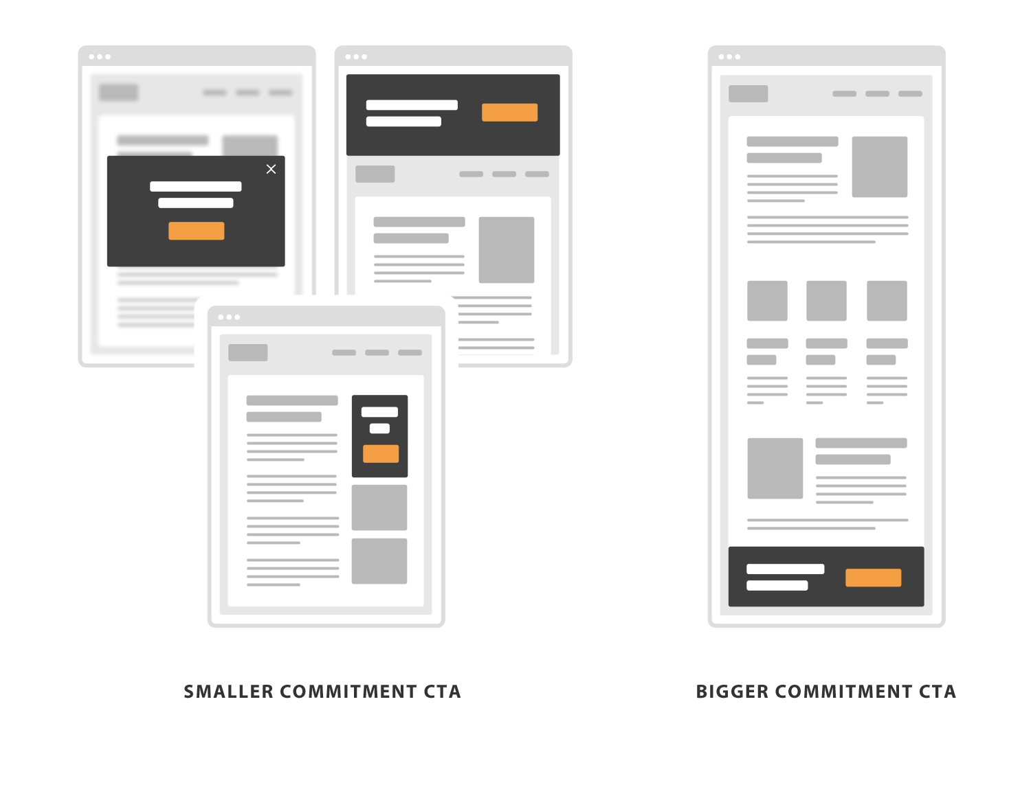
The location of the call to action for a smaller and larger commitment
First determine your visual patterns.
As I said, only the design will not be able to convince a person to do something. The main role is played by the text. But with the help of design you can draw attention to your message, pointing visitors to the right direction.
And this brings us to the main idea of this post, which is how to effectively break visual patterns in order to capture the attention of visitors.
The visual identity of your site is determined by typography, colors, layout and interface elements. Together, they create certain repetitive visual images.

Typography, layout, interface elements
Try to make navigation and browsing your site predictable. You want to create an ongoing and positive interaction experience when reading your content. This should be your foundation.
The main thing here is consistency. The more stable your visual patterns, the easier it is to break them in a more delicate and elegant way.
But why do you disturb your beautiful design? In order to direct the visitor's view of your offer on a page that is full of content. In other words, get his attention wherever you need .
To make it easier to understand, imagine that you were invited to a party where everyone is dressed as they want. In such a variety of styles and colors it will be very difficult for you to attract attention to yourself. This is possible, but radical measures will need to be taken.
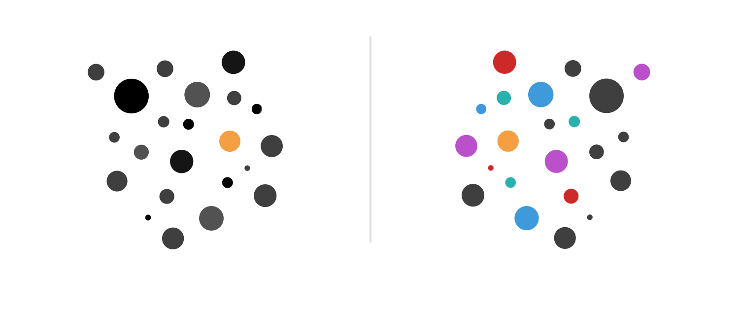
Now imagine that at the party everyone is dressed in black and white. To stand out, you just wear a red shirt. People will notice you, and for this you do not need to run and shout.
By analogy, in all this it makes sense only if you have a permanent basis. Without it, when everything is replete, it is very difficult to single out one thing.
Now break these patterns.
In the design draw attention to the call to action can be easily with the help of contrast. I speak not only about the contrast in color, but also in size, selection, white space, or even location.
Not all techniques work equally well for different people. Therefore, it is best to combine several of them at once.
For example, a call to action can be placed on a contrasting background and highlight the title with a bold. Additionally, you can increase the padding around it to create a stronger contrast of content and space.

Additional white space is a great way to highlight, which does not make the design noisy. Simply by adding padding around the element, you separate it from the rest of the content. This separation and a clear violation of the layout easily attracts the eye.

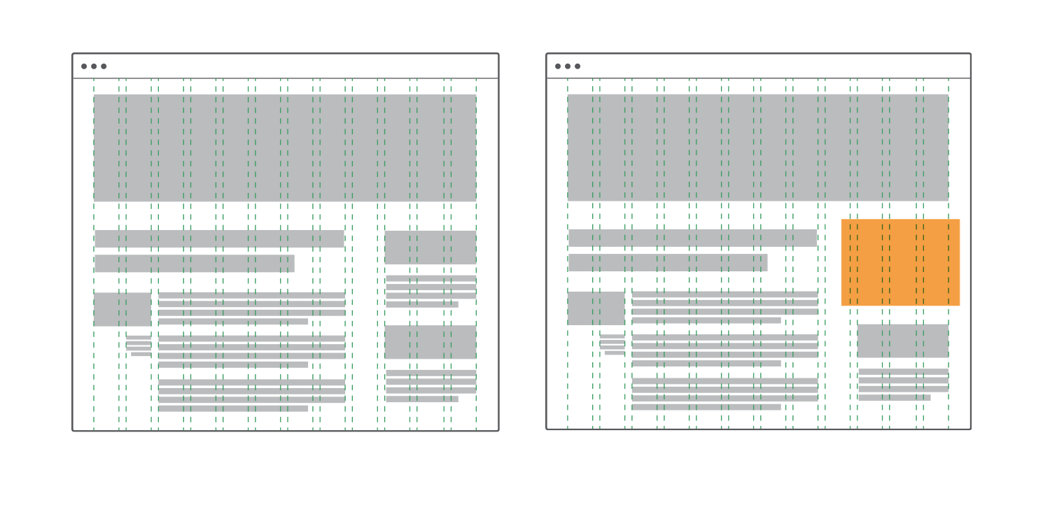
You can also break the grid if you have one.
Grid is widely used in web design. And this is a topic for a separate post. In a nutshell, this is a jumble of vertical and horizontal lines that fully dictate your layout.
By placing all the content on these lines, you can create an orderly and permanent design structure on your page. The grid helps to create a visual pattern on the site.
Breaking the grid will make your call to action more visible. Yes, everything is so simple. Placing elements not on the grid, you give them more importance.
Our eyes love visual patterns and recognize them well. And any deviation from the perfect design will surely attract the eye.
That's right, friends, and you can capture the attention of visitors.
See also :
Full guide to creating landing pages that sell
Source: https://habr.com/ru/post/303520/
All Articles