10 logos whose design has not changed for decades
Some logo designs have become so familiar that their changes would cause bewilderment, and even resentment among consumers. Over time, they can only slightly upgrade to the wake of the corporate identity of companies, which changes to meet modern market requirements. Also allowed are new, adapted versions, such as animation or 3D. But not the cardinal rebranding.
Below is a selection of 10 examples of really successful branding, which is simply impossible to imagine. Because the logos listed below have already become iconic.
')
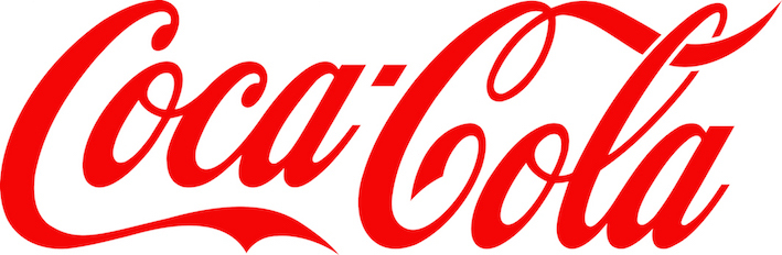
Coca-Cola has changed a lot with its brand. Beginning with the launch of the brand in 1886 and the exclusion of coca leaves from the components of the drink (cocaine was made from them) in 1893, before the distribution of products in Burma, which made soda officially available in every country (except Cuba and North Korea). And only one thing remained unchanged - the Coca-Cola corporate logo.
This classic italic was introduced on May 8, 1886. Despite its long history, the Coca-Cola logo has remained virtually unchanged, not counting minor edits and color solutions. It became brighter, the shape of the letters changed a little, but the overall style remained true to the original idea.
The wide distribution of the drink in the XX and XXI centuries made the logo one of the most recognizable in the world. According to some statistics, 94% of the world's inhabitants at least once, but have heard about the Coca-Cola brand. The drink is known and drunk in more than 206 countries. This fact became evident after the promotion in 2000, when the company placed a billboard with separate parts of the logo. And even in this form, people recognized their favorite brand.

Companies are used to allocating huge amounts of money from the budget for the process of developing corporate identity elements. In doing so, they forget that some of the best logo designs were created for a fairly modest reward. Like, for example, Nike’s world-famous “stroke” imitating the wing of the goddess Nike.
This logo was designed by a student at Portland University, Carolyn Davidson (Carolyn Davidson) in 1971, who received only $ 35 for her work. The truth is later, in 1983, the girl received a “gratitude” in the form of a Nike gold ring with diamonds and an envelope with shares of the company ... That wave is fair.
Today it is one of the most recognizable logos in the world, embodying a high and positive feeling that covers all kinds of sports. The Nike example proves that the simplest ideas are often the best.

Another example of an inexpensive and fun logo is the famous Playboy rabbit (1953). It was created by the magazine's designer, Arthur Paul (Art Paul), in just half an hour. And according to Paul himself, if he had spent more time developing, drawing the details and bringing the work to perfection, the logo would most likely not be so good. In 1954, Paul became the art director of the magazine.
This stylized silhouette, wittily playing on the "masculine strength" of rabbits, survived both the sexual revolution and the counter-revolution. This is the way of transition from business presentation to its formation.
Selling rights to use the Playboy logo - from clothing and beauty products to bars and clubs - is one of the main sources of income for the magazine. In 2014, Playboy was ranked 42nd on the list of the top 150 global licensees. Not bad at all, as for a quick sketch of the logo.

Shell's first Transport and Trading Company logo was a black and white sketch of a scallop shell lying (1897). Seven years later, the recumbent sink transformed into a vertical one.
In 1915, the California-based Shell, for the first time, built service stations and had to stand out from the competition. And so they made the logo color, using a bright duet of red and yellow (due to the close Spanish ties of the state of California).
Over the years, the logo has gradually changed in accordance with new trends in graphic design, until it acquired the look that it has to this day. The modern Shell logo was created in 1971 by the famous French designer Raymond Loewy. He slightly simplified the design, removing unnecessary characters. And since then the logo has not actually changed. It is so recognizable that it is often used without specifying the name of the company. By the way, in the 70s the interpretation of the composition changed somewhat. In a more "bold" version of the shell symbolized the sunrise and a bright new future.
Shell logo proves that clarity and minimalism do not go out of fashion and at all times remain a successful design solution.

Perhaps the signature of Walter Disney (Walter Elias Disney) has become one of the most famous in history, wonderfully fit into the design of the logo. The signature execution style inspired to make it the hallmark of an animation studio. And the logo has not changed since the 30s.
But is this really a Disney signature? In the network goes the view that the graphic inscription in the logo is the idea of designers who used the first favorite font. Others argue that the upper part is based on the signature of one of the employees at Disney authorized to leave autographs on behalf of the great Walter.
No matter how it is in reality - this fabulous logo perfectly copes with its task. He conveys sincere joy, fun and good mood, which the company gives both children and adults.

The Volkswagen logo has remained almost unchanged over the past 75 years. For the most part, due to the simplicity of the idea: V and W are combined into a monogram and are arranged in a circle, symbolizing the directness and unambiguity of the character of German "people's cars".
In the 80s there was a funny story. The popularity of the car played a cruel joke with the automakers and owners of this car. The fact is that the American rapper Mike D (a group of Beastie Boys) came on the scene with a chain with a chrome emblem of Volkswagen. After that, a wave of brand identity theft from the hoods of cars passed through Detroit.
Classic logo design does not change. He is only improving and developing. In 2012, the new version of the logo became volumetric and was supplemented with 3D effects.

Paul Rand can rightfully be considered the champion of his time in creating logos. This American art director and graphic designer is famous for creating logos for IBM, ABC, Westinghouse, UPS, NeXT Computers and Enron. And in 1966 he was even asked to rethink and modernize his beloved Ford logo.
The radical new project that Rand created was really impressive. But ultimately, Henry Ford II (Henry Ford II) could not part with his favorite logo, which has been used on cars since 1927.
The graphic logo of the company was invented by the engineer and designer of the company Charles Harold Wills (Childe Harold Wills). And its development remains virtually unchanged to this day. Now it’s hard to imagine another version of the Ford logo. You will tell nothing, really abrupt example of design. By the way, the Ford logo has the Spencerian font, which is also used in Coca-Cola.
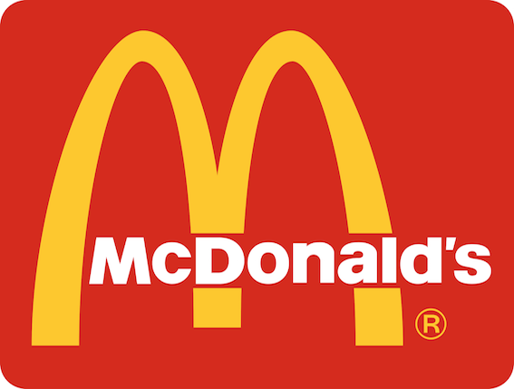
The McDonald's logo has actually become the symbol of all the fast food for its lovers and for those who are protesting against junk food. It can be said that it has cultural and political significance for Americans and is as famous throughout the world as the Statue of Liberty.
The logo was created by Jim Shindler (Jim Shindler) in 1962 in the form of an arch, already familiar to visitors from the architecture of those years, used in McDonald's restaurants. He combined the two golden arches together to form the famous "M". First, these arches show that owning a McDonalds franchise is comparable to having a gold mine. Secondly, they symbolize the gate to a successful business, behind which the owner may feel like a “stone wall”.
Currently, the logo appears in more than 31,000 McDonald's restaurants in 116 countries around the world. And every year there are more and more new branches. McDonald's is undoubtedly the most recognizable brand.

Probably, for many publishers, the image of a penguin, a friendly and wingless bird, is associated with publications. Since its first iteration, this charming talisman of the British publishing house Penguin Books has become a globally recognized symbol of good reading and taste.
The logo appeared in 1935, when the publisher Allen Lane (Allen Lane) decided to release a series of inexpensive paperback books, which, despite the price, corresponded to good quality. Lane picked up the name Penguin Books proposed by the secretary and sent 21-year-old developer Edward Young to the London Zoo for the young man to sketch out the penguins.
And now, for decades, a simple graphic penguin looks straight into the reader's eyes. But several times the logo was redrawn a bit (in 2003 the penguin became “slimmer” by 15 percent).

In this list there is another example of a logo with an animal - the symbol of the popular Mozilla web browser.
An overly detailed, yet effective design was created in 2004 by Jon Hicks based on a sketch by Daniel Burka and sketched by Stephen Desroches, which Hicks then represented using Fireworks MX.
Fiery fox, surrounding stylized land, for 12 years more than once simplified. But it remained clear even in tiny display sizes on mobile devices. But the appearance of the logo did not change much. Also remains unchanged and its essence, symbolizing the double aspirations of Firefox to the global space and high-speed Internet.
This selection ends here. But of course it is not exhaustive. There are many other logos that have long been known throughout the world and have been representing their companies for decades.
Below is a selection of 10 examples of really successful branding, which is simply impossible to imagine. Because the logos listed below have already become iconic.
1. Coca-Cola
')
Coca-Cola has changed a lot with its brand. Beginning with the launch of the brand in 1886 and the exclusion of coca leaves from the components of the drink (cocaine was made from them) in 1893, before the distribution of products in Burma, which made soda officially available in every country (except Cuba and North Korea). And only one thing remained unchanged - the Coca-Cola corporate logo.
This classic italic was introduced on May 8, 1886. Despite its long history, the Coca-Cola logo has remained virtually unchanged, not counting minor edits and color solutions. It became brighter, the shape of the letters changed a little, but the overall style remained true to the original idea.
The wide distribution of the drink in the XX and XXI centuries made the logo one of the most recognizable in the world. According to some statistics, 94% of the world's inhabitants at least once, but have heard about the Coca-Cola brand. The drink is known and drunk in more than 206 countries. This fact became evident after the promotion in 2000, when the company placed a billboard with separate parts of the logo. And even in this form, people recognized their favorite brand.
2. Nike
Companies are used to allocating huge amounts of money from the budget for the process of developing corporate identity elements. In doing so, they forget that some of the best logo designs were created for a fairly modest reward. Like, for example, Nike’s world-famous “stroke” imitating the wing of the goddess Nike.
This logo was designed by a student at Portland University, Carolyn Davidson (Carolyn Davidson) in 1971, who received only $ 35 for her work. The truth is later, in 1983, the girl received a “gratitude” in the form of a Nike gold ring with diamonds and an envelope with shares of the company ... That wave is fair.
Today it is one of the most recognizable logos in the world, embodying a high and positive feeling that covers all kinds of sports. The Nike example proves that the simplest ideas are often the best.
3. Playboy
Another example of an inexpensive and fun logo is the famous Playboy rabbit (1953). It was created by the magazine's designer, Arthur Paul (Art Paul), in just half an hour. And according to Paul himself, if he had spent more time developing, drawing the details and bringing the work to perfection, the logo would most likely not be so good. In 1954, Paul became the art director of the magazine.
This stylized silhouette, wittily playing on the "masculine strength" of rabbits, survived both the sexual revolution and the counter-revolution. This is the way of transition from business presentation to its formation.
Selling rights to use the Playboy logo - from clothing and beauty products to bars and clubs - is one of the main sources of income for the magazine. In 2014, Playboy was ranked 42nd on the list of the top 150 global licensees. Not bad at all, as for a quick sketch of the logo.
4. Shell
Shell's first Transport and Trading Company logo was a black and white sketch of a scallop shell lying (1897). Seven years later, the recumbent sink transformed into a vertical one.
In 1915, the California-based Shell, for the first time, built service stations and had to stand out from the competition. And so they made the logo color, using a bright duet of red and yellow (due to the close Spanish ties of the state of California).
Over the years, the logo has gradually changed in accordance with new trends in graphic design, until it acquired the look that it has to this day. The modern Shell logo was created in 1971 by the famous French designer Raymond Loewy. He slightly simplified the design, removing unnecessary characters. And since then the logo has not actually changed. It is so recognizable that it is often used without specifying the name of the company. By the way, in the 70s the interpretation of the composition changed somewhat. In a more "bold" version of the shell symbolized the sunrise and a bright new future.
Shell logo proves that clarity and minimalism do not go out of fashion and at all times remain a successful design solution.
5. Disney
Perhaps the signature of Walter Disney (Walter Elias Disney) has become one of the most famous in history, wonderfully fit into the design of the logo. The signature execution style inspired to make it the hallmark of an animation studio. And the logo has not changed since the 30s.
But is this really a Disney signature? In the network goes the view that the graphic inscription in the logo is the idea of designers who used the first favorite font. Others argue that the upper part is based on the signature of one of the employees at Disney authorized to leave autographs on behalf of the great Walter.
No matter how it is in reality - this fabulous logo perfectly copes with its task. He conveys sincere joy, fun and good mood, which the company gives both children and adults.
6. Volkswagen
The Volkswagen logo has remained almost unchanged over the past 75 years. For the most part, due to the simplicity of the idea: V and W are combined into a monogram and are arranged in a circle, symbolizing the directness and unambiguity of the character of German "people's cars".
In the 80s there was a funny story. The popularity of the car played a cruel joke with the automakers and owners of this car. The fact is that the American rapper Mike D (a group of Beastie Boys) came on the scene with a chain with a chrome emblem of Volkswagen. After that, a wave of brand identity theft from the hoods of cars passed through Detroit.
Classic logo design does not change. He is only improving and developing. In 2012, the new version of the logo became volumetric and was supplemented with 3D effects.
7. Ford
Paul Rand can rightfully be considered the champion of his time in creating logos. This American art director and graphic designer is famous for creating logos for IBM, ABC, Westinghouse, UPS, NeXT Computers and Enron. And in 1966 he was even asked to rethink and modernize his beloved Ford logo.
The radical new project that Rand created was really impressive. But ultimately, Henry Ford II (Henry Ford II) could not part with his favorite logo, which has been used on cars since 1927.
The graphic logo of the company was invented by the engineer and designer of the company Charles Harold Wills (Childe Harold Wills). And its development remains virtually unchanged to this day. Now it’s hard to imagine another version of the Ford logo. You will tell nothing, really abrupt example of design. By the way, the Ford logo has the Spencerian font, which is also used in Coca-Cola.
8. McDonalds
The McDonald's logo has actually become the symbol of all the fast food for its lovers and for those who are protesting against junk food. It can be said that it has cultural and political significance for Americans and is as famous throughout the world as the Statue of Liberty.
The logo was created by Jim Shindler (Jim Shindler) in 1962 in the form of an arch, already familiar to visitors from the architecture of those years, used in McDonald's restaurants. He combined the two golden arches together to form the famous "M". First, these arches show that owning a McDonalds franchise is comparable to having a gold mine. Secondly, they symbolize the gate to a successful business, behind which the owner may feel like a “stone wall”.
Currently, the logo appears in more than 31,000 McDonald's restaurants in 116 countries around the world. And every year there are more and more new branches. McDonald's is undoubtedly the most recognizable brand.
9. Penguin
Probably, for many publishers, the image of a penguin, a friendly and wingless bird, is associated with publications. Since its first iteration, this charming talisman of the British publishing house Penguin Books has become a globally recognized symbol of good reading and taste.
The logo appeared in 1935, when the publisher Allen Lane (Allen Lane) decided to release a series of inexpensive paperback books, which, despite the price, corresponded to good quality. Lane picked up the name Penguin Books proposed by the secretary and sent 21-year-old developer Edward Young to the London Zoo for the young man to sketch out the penguins.
And now, for decades, a simple graphic penguin looks straight into the reader's eyes. But several times the logo was redrawn a bit (in 2003 the penguin became “slimmer” by 15 percent).
10. Firefox
In this list there is another example of a logo with an animal - the symbol of the popular Mozilla web browser.
An overly detailed, yet effective design was created in 2004 by Jon Hicks based on a sketch by Daniel Burka and sketched by Stephen Desroches, which Hicks then represented using Fireworks MX.
Fiery fox, surrounding stylized land, for 12 years more than once simplified. But it remained clear even in tiny display sizes on mobile devices. But the appearance of the logo did not change much. Also remains unchanged and its essence, symbolizing the double aspirations of Firefox to the global space and high-speed Internet.
This selection ends here. But of course it is not exhaustive. There are many other logos that have long been known throughout the world and have been representing their companies for decades.
Source: https://habr.com/ru/post/303256/
All Articles