As we increased the percentage of registrations by 68% with the help of form design
Tips and examples in the design of login forms and registration.
It would seem that what could be simpler than the registration form and, even more so, the entrance to the site? A pair of fields and a button. But in the nuances of this simplicity lies the success of the work done and the number of users of your service. How to make the forms easier, the process more pleasant and thereby reduce the number of treatments? I'll tell you what rules we were guided by when developing our community of entrepreneurs BOSS.ZONE .
What is the mechanism of registration and user logon?
- Login form
- Registration form
- Reminder or password reset form
- Message after a reminder or reset password
- Registration through social networks
This is a necessary minimum. It must somehow be put together and get a single and clear mechanism for the user to enter.
Ways of implementation
Tabs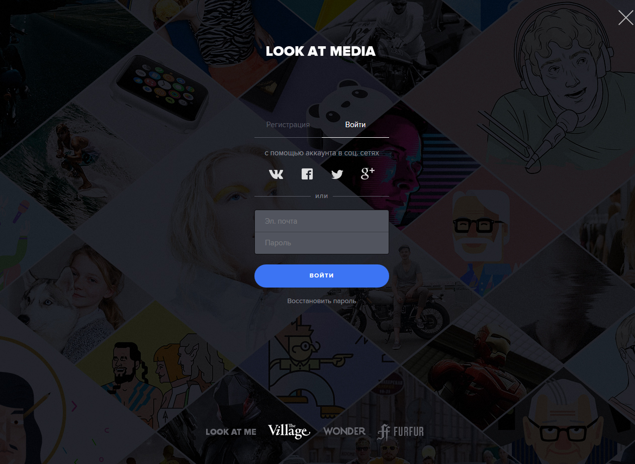
Individual pages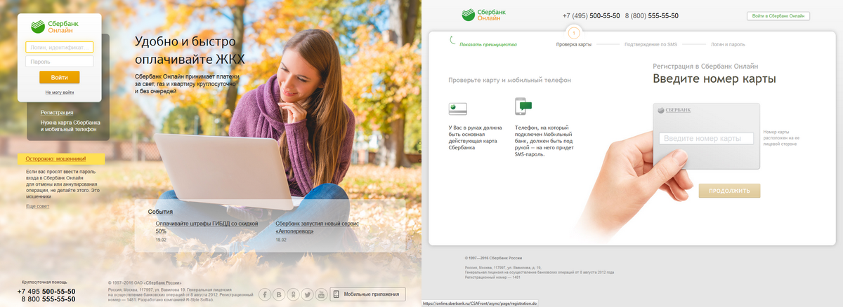
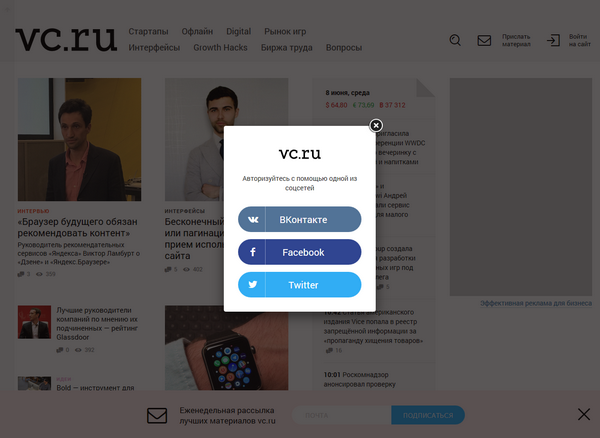
Popapes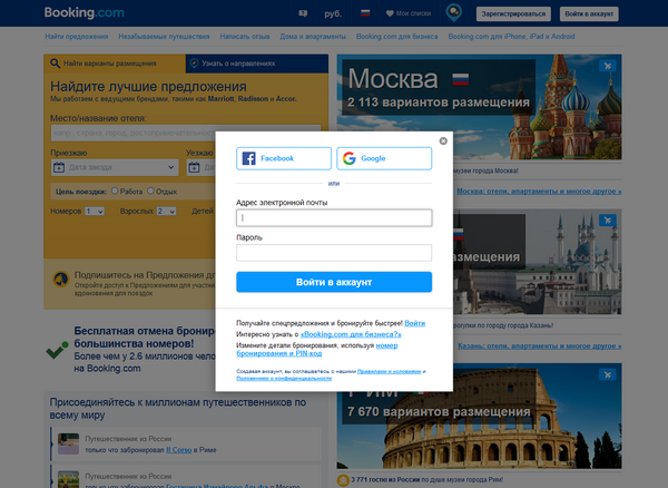
All on one page

Step-by-step process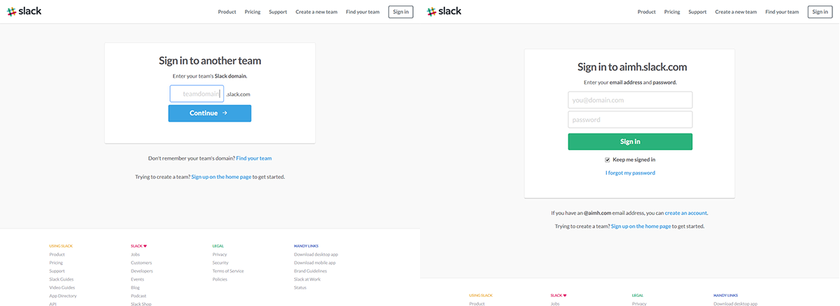
Of course, you can combine different methods. For example, tabs in pop-ups or extended tabs with details like on separate pages. There are also specific registrations that require a special approach, for example, Internet banks.
')
How to make registration more efficient
Humanity Be people, do not force to do that you can. Some information can be determined automatically, for example, by gender or city. If this cannot be done, then after registration you can clarify the missing information. The smaller the fields, the better.
Time Spent . Show in seconds how fast the registration is, if it really is. No one wants to waste their precious time. The cursor should automatically go up to the first form field.
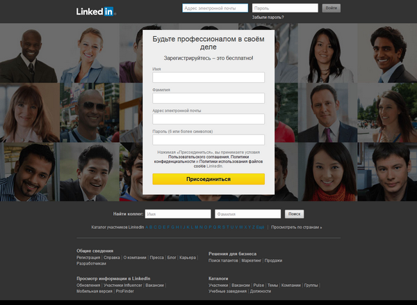
Signatures It is better to write the names of the fields above them, and not near them. So the glance of a person slides down from above, and not an “upside down Christmas tree.”
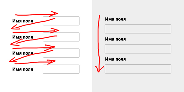
If you do not sign the field names next to them, but use the placeholder, remove it only after the person starts typing something. Otherwise, he may forget that he had to write here. Especially if you switch between the fields with the Tab key. Another placeholder can not be removed, but to reduce and move up.
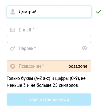
Correctness . Error messages should be written in plain language for the common person, and not in technical terms. They should appear next to each field separately, and not in a bunch somewhere in one place. In addition to the text you need to highlight the fields themselves. And whenever possible write hints. It would be ideal to check the correctness of the entered data immediately, without reloading the page. For example, it is very convenient when you invent a nickname. Mark the correct fields, for example, tick. It pleases in the process of filling out the entire form.
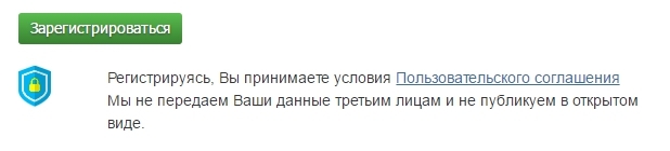
Safety Must be the user's consent to the privacy policy and a link to the user agreement. For the security effect of the input data, tell us that you do not pass them on to third parties.
Password . Ask for the password a maximum of once. If the person was sealed and could not enter, he will recover the password. Or do not ask the password at all, but generate it and send it to the post office. If you still ask him, then give the opportunity to see it as you type. We don't often have someone behind our backs.
Social networks . Let's be able to log in via social networks. Immediately. It is fast and convenient. You can generally leave only social networks for login. This option makes it impossible to make a bunch of mistakes, but it is for a young audience. You can “otgresti” if your target audience is over 40.

Checkboxes . Most often, we usually use our device, and not a stranger. Therefore, in order not to force users to log in permanently, you need to check the “Alien Computer” box. And if a person presses it, then when you close your site it automatically logs out. The wording may be different, for example, “Stay in the system” with an active check mark. For me personally, the first option seems more logical. Do not sign up for default mailings.
Visual images . Photos of people attract the eye and “enliven” the page. But here we must be careful. Do not use stock pictures - they repel and create the effect of regular unnecessary registration. Use photos of your clients or your employees (it depends on the specifics of the portal). Do not hire photo models. People should see their own kind.
Testing Open in different browsers, devices. Emulators do not always work like a real device. Use yourself and let other people try. The number of bugs will decrease.
How we did it
People who sit on the Internet, but at the same time do not use social networks units. Therefore, we decided to focus on the entrance using social networks and leave the possibility of classical registration via e-mail.
The first window is the choice of the registration method : Vkontakte, Facebook, Google+, E-mail
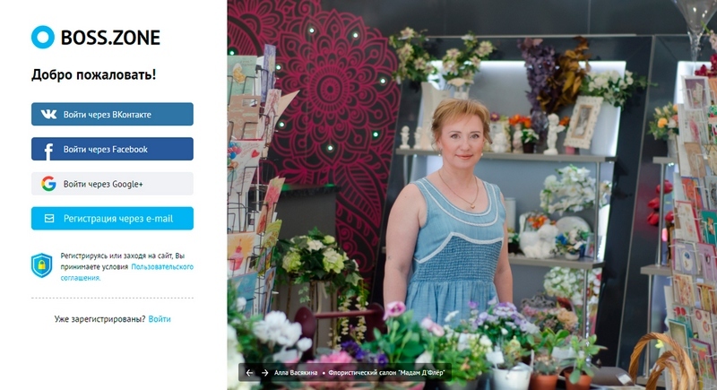
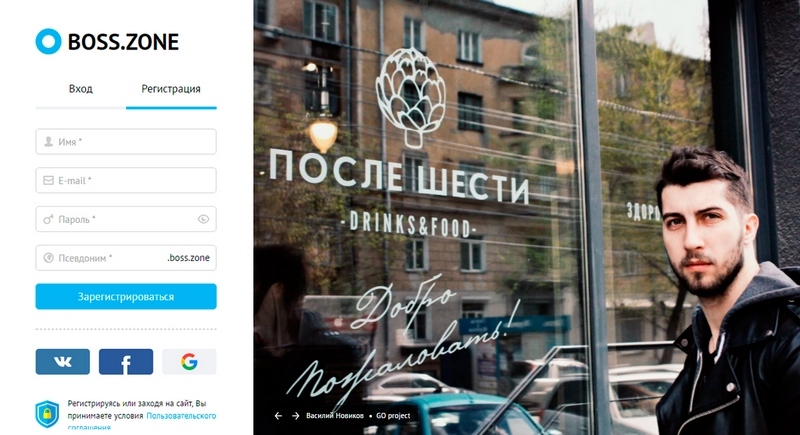
Registration with the help of social networks does not require anything from the designer, if additional information is not needed. For example, in our case, it was necessary to additionally request the user's nickname. He acted as a subdomain of his page. This is the classic registration window via e-mail (we will additionally duplicate the social buttons, in case a person, nevertheless, chooses a faster way).
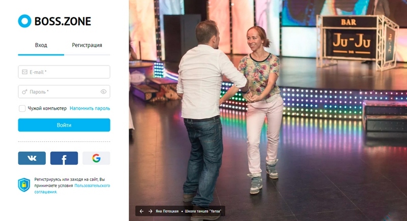
The login window is an email (or nickname) and password. Put a tick "someone else's computer" and a link to a password reminder. In the case of several failed login attempts, a captcha appears.
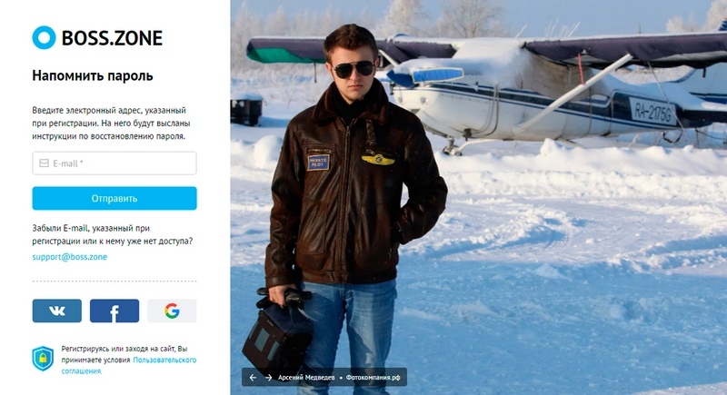
And finally, a password reminder window . There is nothing new here, the main thing is to maintain a general style with the other forms.
results
Percentage of withdrawals
The first window minus 19.27% of departures. It became 23.92%
E-mail registration minus 30.09% of departures. It became 16.10%
Authorization minus 25.26% of departures. It became 7.81%
The number of registrations increased by 68%.
And this is not the limit. There is still to implement an instant check on the correctness of the fields and free nickname.
Source: https://habr.com/ru/post/303016/
All Articles