Aytreker in the service of a presentation consultant
Almost all of last October I spent working with Highload ++ 2015 speakers. Since the conference is large and participants gather from different cities and even countries, most of this work was done remotely: we had webinars, then Skype called each other and only at the very end meeting There I was particularly clearly faced with the typical problem of learning: it is necessary not only to show how it is right, but how wrong — but also
It is logical to ask what I did wrong, I came to the conclusion that, taking into account the specifics of the audience, it is necessary to resort to persuasion using technical means, to support emotions with data. I already had to use an eytreker to analyze how people use, for example, search on the Internet, and I was well aware of its possibilities. Well, I decided, at the same time we will check, is it so awful what I ask you not to do?
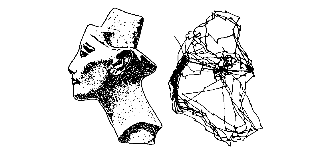
Research on how people look is already more than a hundred years old, but, in order to understand conceptually how to use this tool, it is necessary and sufficient to read Alfred Yarbus’s book The Role of Eye Movement in the Sight Process (Nauka Publishers, 1965 ). From this book, in particular, taken the starting picture of the article.
A rather long certificate about who this is and why you need to love him.
Yarbus is a Soviet scientist, and the first publication of his book took place in the USSR, but rather quickly it was translated into English and published in the USA under the name Eye Transition and Vision, where it was deservedly appreciated and subsequently published three more times. What is still relevant is written in this book half a century ago?
')
Being a physicist by training, Yarbus designed special suckers that held onto the eyeball (for me, as a person, and not even contact lenses have mastered, it’s scary to think about it, but nonetheless), but on the other hand he attached a mirror to them. On the mirror it was he who directed the beam of light that was reflected on the photo paper. The mirror was moving along with the eyeball. Thus, Yarbus managed to record the trajectory of movement of the gaze and superimpose it on the image that the experimental person was looking at.
The most important thing that he managed to do was to link this trajectory with the task that the person was solving. Yarbus showed that the trajectory of eye movement and the points where attention is concentrated as much as possible differ significantly for the same person in the same picture, if he is asked different questions from this picture or does not ask questions at all.
This is shown in many examples, but the most famous is Repin's painting “Not Waiting”. Each participant in the experiment was asked to look at this picture several times at intervals of a couple of weeks, consistently solving problems: determine the characters' age, determine the wealth shown in the family picture, guess what people were doing before the arrival of the exile, etc. It turned out that the same person age will be determined by persons, wealth - by clothes and things, etc., and this can be seen from the trajectory of his gaze.
What was done
Initially, I wanted to create a coherent story in pictures, which would all be related to each other in meaning and at the same time contain all the typical problems that I needed to illustrate, but it turned out to be difficult. After a few months, I gave up, and as a result, a disparate data set appeared, designed in the form of intentionally curved slides. It was with this set that I tormented the six participants in the experiment. I did not set myself the task of conducting rigorous research (firstly, six people would not be enough for this, and secondly, then we need to more strictly develop the design of twin slides, “good” and “bad”. I was primarily interested in whether convincing pictures for educational materials could be obtained from heat maps.
First of all, for control, let's reproduce the Yarbus experiment. I took a fragment of the painting “We Weren't Waiting” and suggested that the participants determine the approximate age of the characters, for which they were given a minute. The combined heat map was:
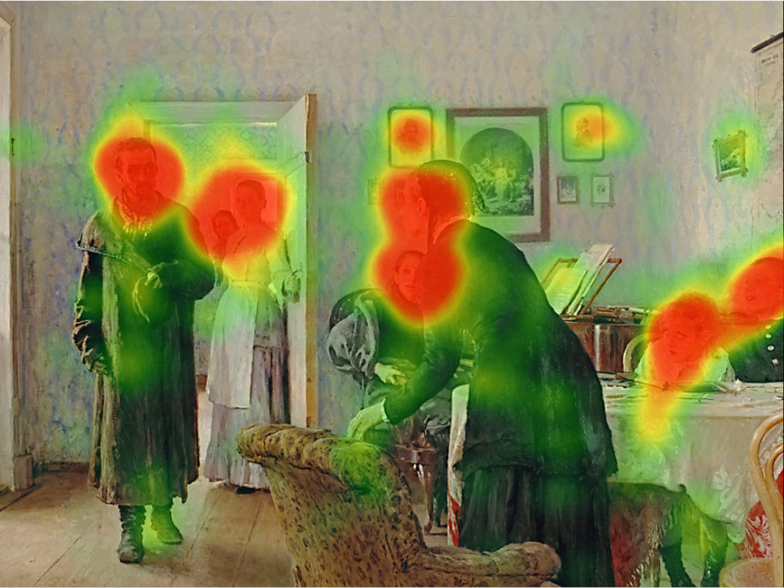
I found that the experiment was repeated successfully: the only noticeable difference from the map from the book is that there the subject did not look at the portraits on the wall. For the rest, all the attention on the faces, as it should be.
Down with the legends!
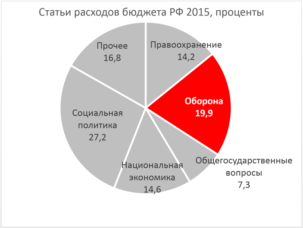
After that, you can finally launch an attack on one of the main enemies with whom I fight, sparing no effort. These are legends on presentation diagrams. In a magazine or on a stand where a person has a lot of time, a legend may be appropriate, but during a speech we don’t really want a person to spend his mental energy on its decoding and run his eyes back and forth trying to match colors while you are talking to him then you tell. As data, I took the structure of the budget revenues of the Russian Federation for 2015 from here . From the description it follows that this is a combination of the data of the Ministry of Finance, forecasts and some kind of analytics, that is, the reality is only slightly more than nothing. But for our task it is irrelevant. From these numbers, I built just such a remarkably awful diagram:
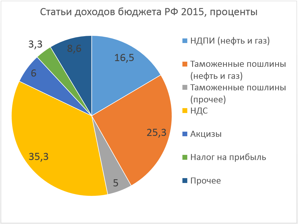
From what Excel generated by default for me, I changed only the font: I have no doubt that it should be large. I allocated participants ~ 20 seconds to this diagram, then the slide switched automatically. How did they manage this time?
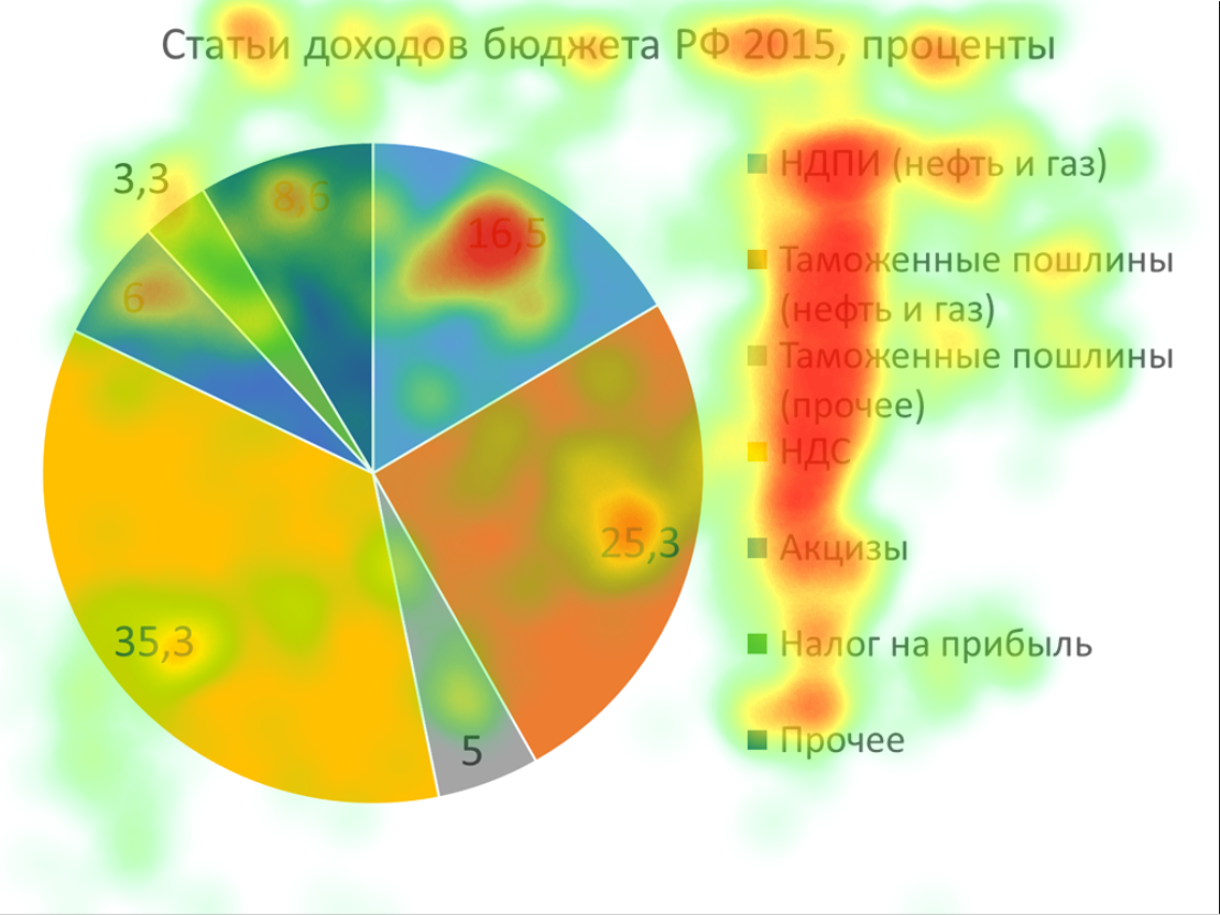
Not all got to the largest - yellow - sector (VAT). On the legend, the gaze holds on for a long time, much less attention is paid to the numbers in the sectors. Of course, the inscriptions are longer than the numbers, and it seems to be longer to read them, but in fact there is no intelligible logic in viewing. To make sure of this, let's see a video of eye movements of one of the participants:
Do we really want people to rush their eyes on our slides? Until the last moment, as in a detective story, it is not clear whether she will even reach the yellow sector at all. Even straining how in the area of 0: 12-0: 14 it was found that in the diagram three different shades of blue, and the participant painfully compared them with elements of the legend. I believe that this activity requires a lot of brain resources, and at the same time a person is not able to listen to something and draw conclusions from it.
For comparison, I took from the same source data on budget expenditures for 2015 and made another diagram, like this:
Just in case, there is no policy here, I highlighted the defense in red, only to check whether the participants of the experiment will (erroneously) remain as the largest expenditure item. I, however, did not collect such data, but the red sector remained in the diagram. It happens.
Here is the heat map of this slide:
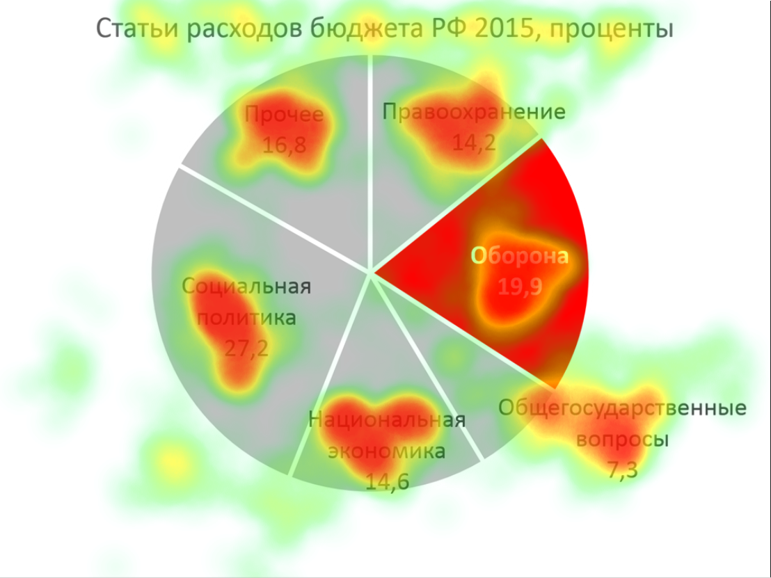
It seems to me that the difference is very large: people saw all the sectors and had the opportunity to examine them in detail, while the number of sectors was the same and I allocated the same time. Just in case, I’ll give a video with the trajectory of the eyes of the same participant as before.
Pay attention, for the same time she managed, without straining, to bypass the diagram in a circle almost two times. In general, the second diagram is almost good. If she hadn’t looked as much as a packman, then it would have been absolutely cool.
I'd like to believe that this demonstration will convince you to eradicate the legends from the diagrams that you have on the slides. Legends, perhaps, should not be afraid, only if it has exactly two points. If more, then it is better to sign them on the spot, so that the viewer is not confused.
Down with the vertical text!
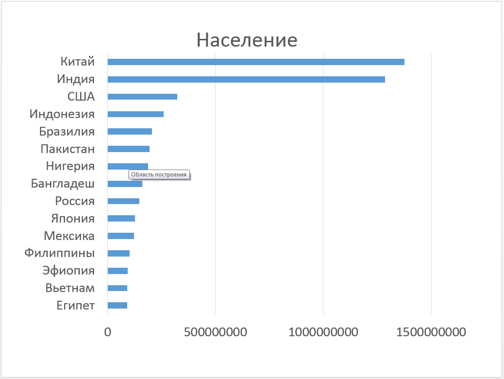
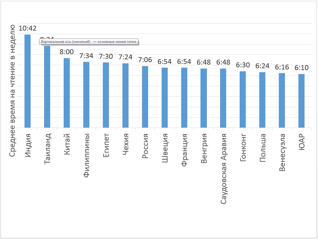
The next enemy I fought is vertical text. For the demonstration, I made a diagram about the most reading countries (shortly before that a suitable link flew in Facebook), as well as the number of people in the most populated countries. In both cases, I took the top 15 and again allocated the same time to the slideshow.
Here are the slides:
And that's how people viewed them:
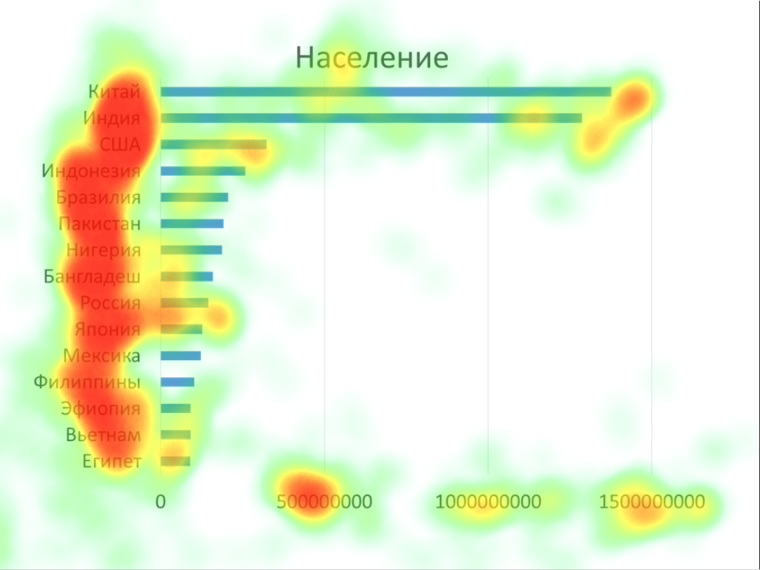
It is noteworthy how brightly 500,000,000 burns on the horizontal scale, the rest is more or less simple. Do not write such long numbers.
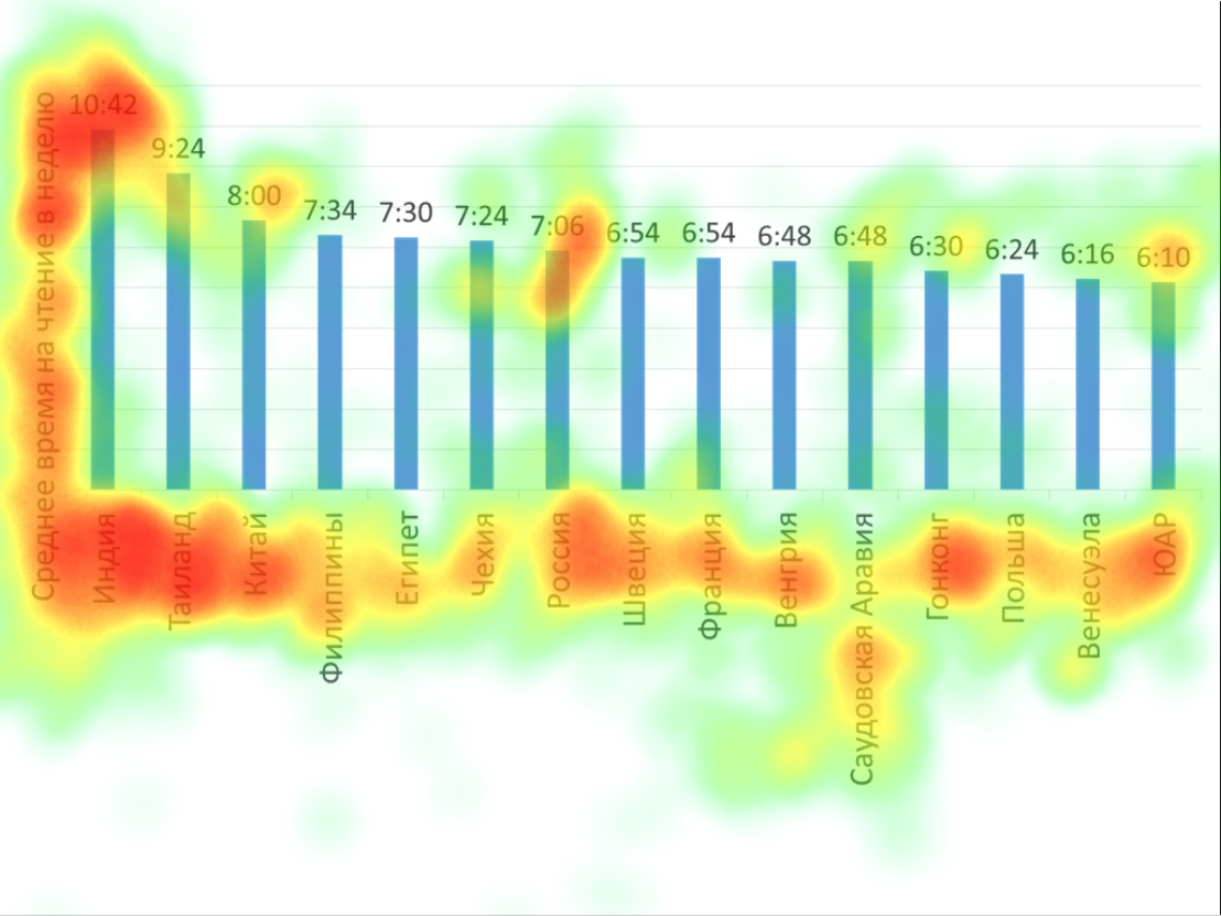
Let us note how much effort went into reading the name of the vertical axis (however, it’s really necessary to think about the units in which the reading is measured), and also to see that all 15 country names are evenly attentive, unlike the previous slide.
Total
I consider the experience successful: the pictures turned out to be quite effective, the people to whom I showed them no longer want in their legends and vertical text diagrams. These two elements are especially important because almost any tool for creating diagrams is sure to generate them for you, unless you explicitly deny it. And now you know what to prohibit.
In addition, it seems that this approach can almost always be used to prepare slides for an important presentation. If you make heat maps, it is easy to find places that attract the eye, although they should not, and, conversely, places that viewers do not see, but we would really like to see.
Bonus track
Boromir suggests that you can not just take and write an article without advertising. I invite everyone on June 9 at 19:00 Moscow time to the webinar dedicated to diagrams in presentations. There are a lot of interesting points in diagrams, and not all of them are invested in Habr's theme, so more than two articles in the cycle fail (the previous article is here ). Participation is free, but registration is required, which you need to follow this link .
Source: https://habr.com/ru/post/302648/
All Articles