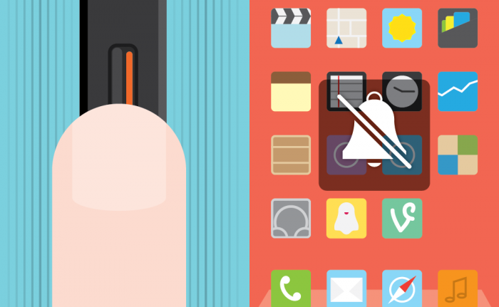
5 mistakes to be avoided when creating micro-interactions
Micro-interaction is one of the key points of UI / UX design. They contain parts, parts of a product that perform one specific task. Every time we change settings, synchronize data and devices, set an alarm, enter a username and password, or choose a specific function, we are faced with micro-interactions. They accompany us everywhere: in various devices and applications of our phones, computers, office and home appliances, in transport and at home. And if micro-interactions are made correctly, they make our life more comfortable, more interesting and easier.
In this post, we will look at 5 errors that should be avoided when creating microinteractions.
')
Designer ego can be compared with a delicate and whimsical flower, which needs not only constant watering, but also praise. So when developing high-quality micro-interactions, the ego is sent to rest. Because there is a real and difficult job to do.
Let's take a closer look at the example of designer Sergei Valiukha (who is a master in the layout of elements, choosing colors and creating animations). By the way, the animation is ideal for demonstrating the work of micro-interaction.
We will analyze step by step:
Conclusion: there are many important subtleties that should be considered in the creation of such animation. With a real example, you can see what works and what doesn't. It does not mean that the designer should not show their creativity by adding wonderful details. But it is also worth remembering that a surplus of parts can overload the design and degrade it.
Narrative has an important role for users. This is due to personal experience, continuity, the impact of the above on cognitive load and the direct organization of our brain - how it perceives the meaning of information. Based on this, we build mental models of things in order to use them.
Using the example of Srikanta Shetty (a very strong animator and designer), let's consider a variant of a not very successful narrative:
The first thing you can see is a strange markup. We expect the text to appear above the line. But it turns out that in fact it is not a line at all, but a drop-down form. And it is here that we enter the login and password.
We did not see what was expected and what seemed quite logical. This puzzled and forced to interrupt the task (input information). An unexpected interpretation completely changes the already constructed mental model and leads us away from the intended result.
For contrast, another example:
Almost every successful microinteraction that I encountered consisted of one movement.
Let us consider in more detail the work of designer Romain Passiland (by the way, the owner of a really cool portfolio):

Having experience with animation and a trained eye, I see that there are two separate movements that can be safely combined into one. In the above example, two different actions occur:
- lines are transformed;
- the icon rotates.
Instead of combining these two actions, Romaine separated them for some reason (the icon returns, then the lines are transformed). For clarity, another example:

Left and right animations also violate the principle of “one movement”. But the animation, which is in the middle - what we need. Action in one movement - clean, complete and effective. Minimum load for the user.
Designers who study UI animations sometimes find it difficult to separate movement from a static project. What is clear and partly a function of the complex nature of good microinteraction: it is difficult to determine in real time. But the bad microinteraction sticks out like a broken finger.
In the following diagram, I summarize the main details of my theories on design and animation:
The look immediately attracts the area with a dot and an arrow pointing at it. The point is made in pink color, so you can instantly find and highlight it among the whole project. And now let's move from theory to practice.
The talented designer Sam Tybalt (he has a great design and animation interruptions) once got excited and decided to create amazing animation over a not very successful project:
I think many will now think that this is just my nagging, because the design idea is still quite fresh. And she really is. As mentioned above, Sam is a talented guy. In this composition, the button "Add to basket" is well played.
But in this example there is no animation solution that would keep the design from itself. The mistake lies in the design, and not in the performance of it after some time. In essence, microinteraction is a design over time.
Here the “Add to cart” button is transformed, changes shape and fills the image. This is not only unnecessary, but given the scale of this element UI - it carries an additional cognitive load on the user's brain.
In filmmaking, it is said that the problems on the set begin with a script. A bad script leads to a bad shot. A bad design - to a bad microinteraction.
Since designers generally do not use animation for 300-400 ms for decoration, it is easy to lose control over the details and stop noticing the possibilities that they reveal.
Using Ivan Belets as an example, consider the five missing parts:

Examples for contrast - increased attention to detail. In these works, everything is thought out to the smallest detail, all possibilities are used and there is nothing superfluous. Wayne Gretzky would be proud. Unless of course his users care a bit (which I personally doubt).

Even in the absence of solid experience, you can create a beautiful and clean microinteraction. Focus on the following key concepts:
- restraint;
- narrative;
- the rule of one movement;
- animation is not omnipotent;
- details give opportunities.
This of course does not guarantee a stunning design, but at least a step in the right direction.
In this post, we will look at 5 errors that should be avoided when creating microinteractions.
')
1. Restrain yourself
Designer ego can be compared with a delicate and whimsical flower, which needs not only constant watering, but also praise. So when developing high-quality micro-interactions, the ego is sent to rest. Because there is a real and difficult job to do.
Let's take a closer look at the example of designer Sergei Valiukha (who is a master in the layout of elements, choosing colors and creating animations). By the way, the animation is ideal for demonstrating the work of micro-interaction.
We will analyze step by step:
- The most obvious thing to notice is Flip 3D in photos. This technology is already superfluous. The rule of micro-interactions: if the removal of something or makes the visualization more "clean", no doubt remove the extra effects.
- You may also notice that the photo feed mode cuts the picture, whereas in the edit mode it is larger.
- The top navigation icons take a long time to navigate. Micro-interactions should be very fast, lasting no more than 300-400 ms.
- The lower icons are located in different places, and in fact they already have the opposite meaning, thereby increasing the cognitive load.
Conclusion: there are many important subtleties that should be considered in the creation of such animation. With a real example, you can see what works and what doesn't. It does not mean that the designer should not show their creativity by adding wonderful details. But it is also worth remembering that a surplus of parts can overload the design and degrade it.
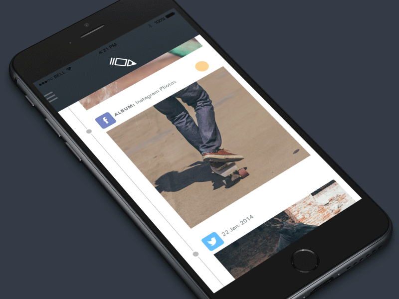
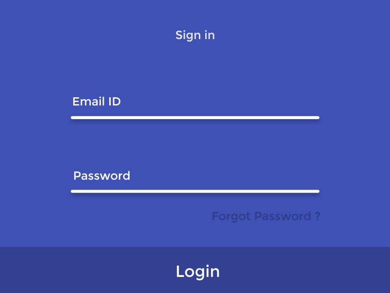
2. Do not sacrifice a narrative in the name of catharsis.
Narrative has an important role for users. This is due to personal experience, continuity, the impact of the above on cognitive load and the direct organization of our brain - how it perceives the meaning of information. Based on this, we build mental models of things in order to use them.
Using the example of Srikanta Shetty (a very strong animator and designer), let's consider a variant of a not very successful narrative:
The first thing you can see is a strange markup. We expect the text to appear above the line. But it turns out that in fact it is not a line at all, but a drop-down form. And it is here that we enter the login and password.
We did not see what was expected and what seemed quite logical. This puzzled and forced to interrupt the task (input information). An unexpected interpretation completely changes the already constructed mental model and leads us away from the intended result.
For contrast, another example:
3. What can not be done in one motion, you should not do at all
Almost every successful microinteraction that I encountered consisted of one movement.
Let us consider in more detail the work of designer Romain Passiland (by the way, the owner of a really cool portfolio):
Having experience with animation and a trained eye, I see that there are two separate movements that can be safely combined into one. In the above example, two different actions occur:
- lines are transformed;
- the icon rotates.
Instead of combining these two actions, Romaine separated them for some reason (the icon returns, then the lines are transformed). For clarity, another example:
Left and right animations also violate the principle of “one movement”. But the animation, which is in the middle - what we need. Action in one movement - clean, complete and effective. Minimum load for the user.
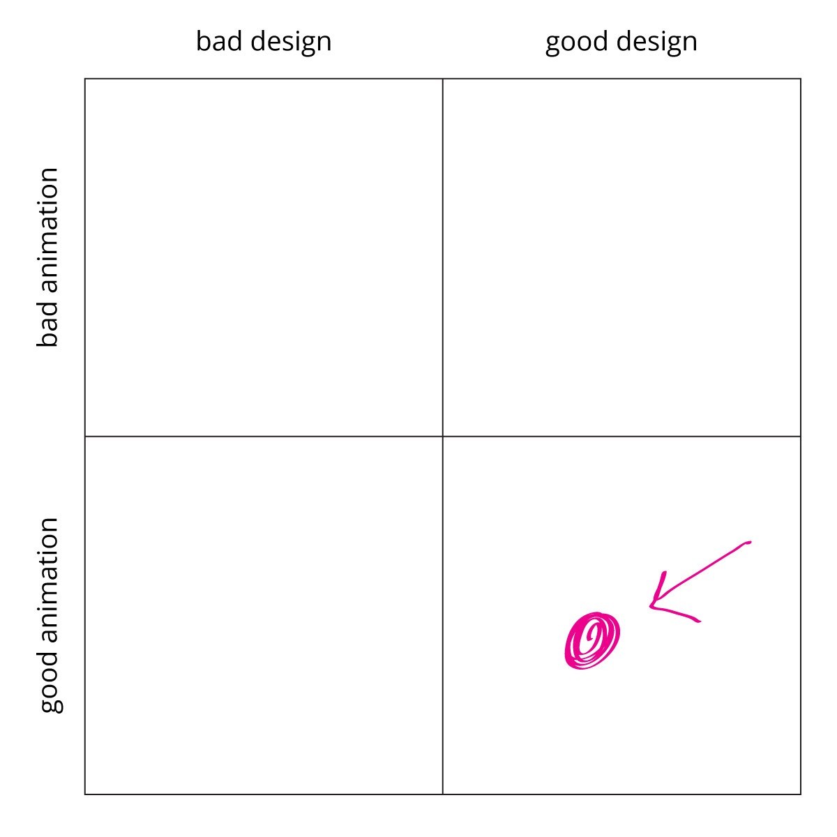
4. The problem is not animation, the problem is in design.
Designers who study UI animations sometimes find it difficult to separate movement from a static project. What is clear and partly a function of the complex nature of good microinteraction: it is difficult to determine in real time. But the bad microinteraction sticks out like a broken finger.
In the following diagram, I summarize the main details of my theories on design and animation:
The look immediately attracts the area with a dot and an arrow pointing at it. The point is made in pink color, so you can instantly find and highlight it among the whole project. And now let's move from theory to practice.
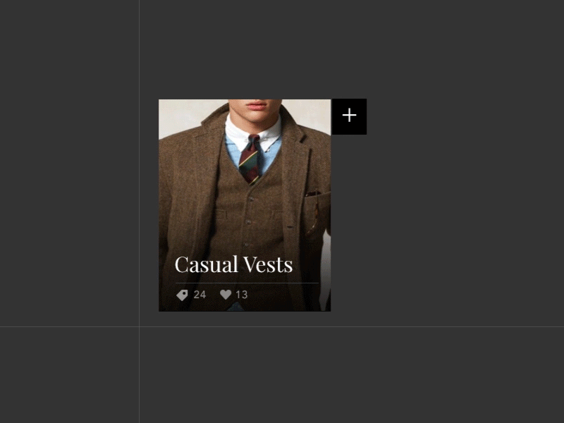
The talented designer Sam Tybalt (he has a great design and animation interruptions) once got excited and decided to create amazing animation over a not very successful project:
I think many will now think that this is just my nagging, because the design idea is still quite fresh. And she really is. As mentioned above, Sam is a talented guy. In this composition, the button "Add to basket" is well played.
But in this example there is no animation solution that would keep the design from itself. The mistake lies in the design, and not in the performance of it after some time. In essence, microinteraction is a design over time.
Here the “Add to cart” button is transformed, changes shape and fills the image. This is not only unnecessary, but given the scale of this element UI - it carries an additional cognitive load on the user's brain.
In filmmaking, it is said that the problems on the set begin with a script. A bad script leads to a bad shot. A bad design - to a bad microinteraction.
5. Canadian hockey player Wayne Gretzky: “If you didn’t make any attempt to hit the target, you missed 100%”
Since designers generally do not use animation for 300-400 ms for decoration, it is easy to lose control over the details and stop noticing the possibilities that they reveal.
Using Ivan Belets as an example, consider the five missing parts:
- It is possible to create a clean and elegant transformation of the icon in the menu / back button. The menu icon extends from above, which creates a sense of incoherence and incoherence.
- The right arrow in the yellow square - unnecessary rotation and the effect of scaling. It looks weird. It would be better if the arrow was mixed together with the content.
- When you move the text of the paragraph appears and disappears unnecessarily. It must persist.
- Heading moves from left to right. Repeated disappearance of content would be worth making it more elegant, instead of discoloration and an incomprehensible slip of the text.
- Cropped image of a soldier. It would be nice to convert the preview image in such a way that it retains the context. In this case, the thumbnail just becomes the background of the title, showing the least interesting part of the image.
Examples for contrast - increased attention to detail. In these works, everything is thought out to the smallest detail, all possibilities are used and there is nothing superfluous. Wayne Gretzky would be proud. Unless of course his users care a bit (which I personally doubt).
In conclusion
Even in the absence of solid experience, you can create a beautiful and clean microinteraction. Focus on the following key concepts:
- restraint;
- narrative;
- the rule of one movement;
- animation is not omnipotent;
- details give opportunities.
This of course does not guarantee a stunning design, but at least a step in the right direction.
Source: https://habr.com/ru/post/301604/
All Articles