FlexboxLayout - part 2
- Part 1
- Part 2
In this section, we will look at the attributes for child views, which are responsible for positioning within parent elements.
In the previous article, we saw that FlexboxLayout has a number of attributes that control the size and location of child elements, but that’s not all. All layout managers in Android apply their own layout parameters ( LayoutParams ) to the children , which provide these nested elements with specific attributes. FlexboxLayout is no exception. Moreover, it is in the child attributes that the entire power of this layout is revealed.
Before plunging into the wilds of the theory, it is worth mentioning that in my application, these child attributes can be seen in the element mode by entering it by long pressing the nested element. Being in the element mode, you can click to select other child elements, and then adjust the attribute values for the selected elements.
layout_order
This attribute controls the position of the inner element within the parent. By default, all elements get the value 1 and are arranged in the order of the declaration in the XML file (if they were declared there) or in the code. I did not add this attribute to the application - it is fairly obvious.
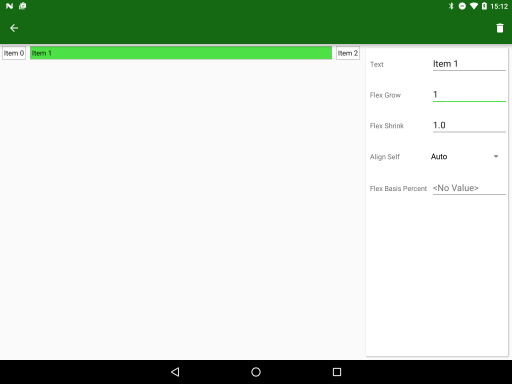
layout_flexGrow
It works similarly to the weights in LinearLayout - the remaining space in the parent element will be divided in proportion to the layout_flexGrow values of the child elements. The default value of 0.0 will not change the size of this item.
layout_flexGrow
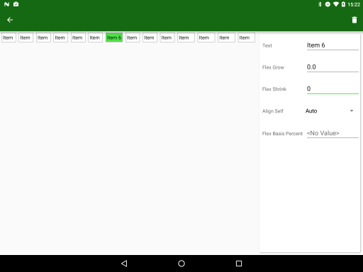
layout_flexShrink
The complete opposite of the previous element. Used with flexWrap = "no_wrap" . In the case when the total size of all child elements is larger than the container size, their size will be reduced in proportion to the value of this attribute. The default value is 1.0 , i.e. all items will decrease equally. By setting the value to 0.0 , you can prevent the reduction of a specific element.
layout_flexShrink
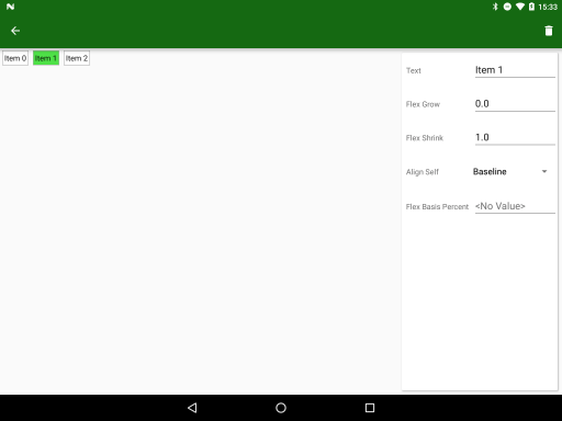
alignSelf
Last time, we looked at the container’s slightly tangled attributes - alignItems and alignContent , which control both the location of the elements themselves and the virtual stripes in which they are located. Now there is another attribute, layout_alignSelf , which is applied to the children and allows you to override the container's alignItem value. The default is auto , i.e. the element inherits the value of the container, but you can change it to one of the flex_start , flex_end , center , baseline, or stretch values.

alignSelf = "flex_start"
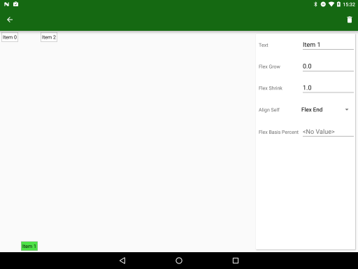
alignSelf = "flex_end"
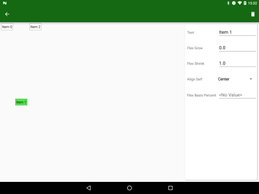
alignSelf = "center"
alignSelf = "baseline"
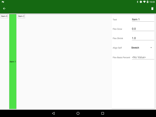
alignSelf = "stretch"
layout_flexBasisPercent
And the last attribute that allows you to set a behavior similar to PercentLayout . The default value of -1.0 will not set the size of the element in percent, and a value from 0.0 to 1.0 will set the size of the element relative to the size of the container (if the value is 1.0, the child will take up all the space).
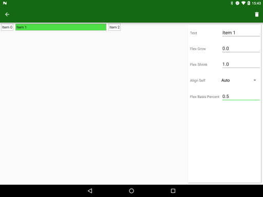
layout_flexBasisPercent = "0.5"
At the end with the attributes. The final part of the article will be a kind of ready-made recipe, in which we will see how to combine parent and child attributes, solving a real problem.
From the translator: something the article turned out to be short and unpretentious (what was the point of breaking it into 2 parts?). I wrote to his blog that the topic of performance was not disclosed, I hope it will respond.
')
Source: https://habr.com/ru/post/301416/
All Articles