The growth of hockey players: analyze the data of all world championships in the current century

One of these days the regular world hockey championship ended.
While watching matches, an idea was born. When, during breaks, the television camera shows the players leaving the locker room, it is hard not to notice how huge they are. Against the background of coaches, team functionaries, ice arena employees, journalists, or just fans, they tend to look very impressive.

And I wondered. Are hockey players superior to ordinary people? How does the growth of hockey players over time compared to ordinary people? Are there persistent cross-country differences?
Data
IIHF, the organization that holds the World Hockey Championships, publishes the teams involved each year with information about the height and weight of each player. Archive of this data here .
I gathered together the data of all world championships from 2001 to 2016. From year to year, the format for providing data varies slightly, which requires some effort to clean them up. Without imagining how to automate the process correctly, I copied all the data manually, which took a little more than 3 hours. United dataset laid out in open access .
# load required packages require(dplyr) # data manipulation require(lubridate) # easy manipulations with dates require(ggplot2) # visualization require(ggthemes) # themes for ggplot2 require(cowplot) # nice alignment of the ggplots require(RColorBrewer) # generate color palettes require(texreg) # easy export of regression tables require(xtable) # export a data frame into an html table # download the IIHF data set; if there are some problems, you can download manually # using the stable URL (https://dx.doi.org/10.6084/m9.figshare.3394735.v2) df <- read.csv('https://ndownloader.figshare.com/files/5303173') # color palette brbg11 <- brewer.pal(11,'BrBG') Are hockey players growing up? Rough (intermittent) comparison
To begin with, let's compare the average growth of players in all 16 world championships.

# mean height by championship df_per <- df %>% group_by(year) %>% summarise(height=mean(height)) gg_period_mean <- ggplot(df_per, aes(x=year,y=height))+ geom_point(size=3,color=brbg11[9])+ stat_smooth(method='lm',size=1,color=brbg11[11])+ ylab('height, cm')+ xlab('year of competition')+ scale_x_continuous(breaks=seq(2005,2015,5),labels=seq(2005,2015,5))+ theme_few(base_size = 15)+ theme(panel.grid=element_line(colour = 'grey75',size=.25)) gg_period_jitter <- ggplot(df, aes(x=year,y=height))+ geom_jitter(size=2,color=brbg11[9],alpha=.25,width = .75)+ stat_smooth(method='lm',size=1,se=F,color=brbg11[11])+ ylab('height, cm')+ xlab('year of competition')+ scale_x_continuous(breaks=seq(2005,2015,5),labels=seq(2005,2015,5))+ theme_few(base_size = 15)+ theme(panel.grid=element_line(colour = 'grey75',size=.25)) gg_period <- plot_grid(gg_period_mean,gg_period_jitter) The positive trend is obvious. For a decade and a half, the average height of the hockey player at the World Championships has increased by almost 2 centimeters (left panel). As if a slight increase on the background of a rather large variation (right panel). Is it a lot or a little? To answer the question, it is necessary to correctly compare with the population (but this is closer to the end of the article).
Cohort analysis
A more correct way to study changes in growth involves comparing birth cohorts. Here we are faced with a curious nuance - some hockey players have participated in more than one world championship. The question is: do you want to clean up repeated entries for the same people? If we are interested in the average height of the hockey player in the championship (as in the picture above), perhaps it does not make sense to clean. But if we want to trace the change in the growth of hockey players as such, in my opinion, it would be wrong to assign more weight to those players who regularly went to the world championships. Therefore, for further analysis, I cleared the data from repeated records of the same players.
# remove double counts dfu_h <- df %>% select(year,name,country,position,birth,cohort,height) %>% spread(year,height) dfu_h$av.height <- apply(dfu_h[,6:21],1,mean,na.rm=T) dfu_h$times_participated <- apply(!is.na(dfu_h[,6:21]),1,sum) dfu_w <- df %>% select(year,name,country,position,birth,cohort,weight) %>% spread(year,weight) dfu_w$av.weight <- apply(dfu_w[,6:21],1,mean,na.rm=T) dfu <- left_join(dfu_h %>% select(name,country,position,birth,cohort,av.height,times_participated), dfu_w %>% select(name,country,position,birth,cohort,av.weight), by = c('name','country','position','birth','cohort')) %>% mutate(bmi = av.weight/(av.height/100)^2) The total number of observations was reduced from 6292 to 3333. If the hockey player participated in more than one world championship, I averaged the data on height and weight, since the height and (in particular) the weight of an individual hockey player could change with time. How many times do hockey players get the honor to play for national teams at world championships? On average, just under 2 times.
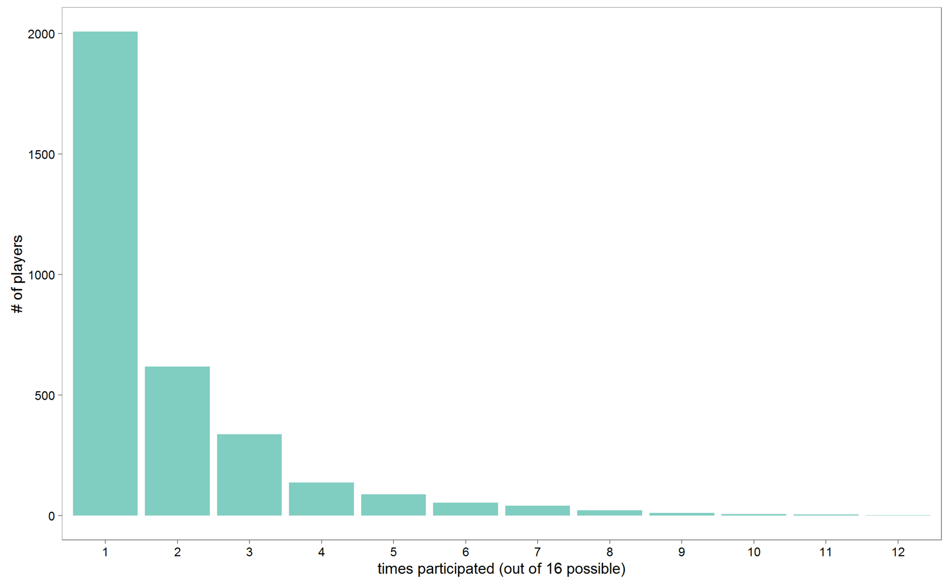
# frequencies of participation in world championships mean(dfu$times_participated) df_part <- as.data.frame(table(dfu$times_participated)) gg_times_part <- ggplot(df_part,aes(y=Freq,x=Var1))+ geom_bar(stat='identity',fill=brbg11[9])+ ylab('# of players')+ xlab('times participated (out of 16 possible)')+ theme_few(base_size = 15) But there are also unique ones. Let's see which players took part in at least 10 world championships. There were 14 such players.
# the leaders of participation in world championships # save the table to html leaders <- dfu %>% filter(times_participated > 9) View(leaders) print(xtable(leaders), type="html", file="table_leaders.html") | name | country | position | birth | cohort | av.height | times_participated | av.weight | bmi | |
|---|---|---|---|---|---|---|---|---|---|
| one | ovechkin alexander | RUS | F | 1985-09-17 | 1985 | 188.45 | eleven | 98.36 | 27.70 |
| 2 | nielsen daniel | DEN | D | 1980-10-31 | 1980 | 182.27 | eleven | 79.73 | 24.00 |
| 3 | staal kim | DEN | F | 1978-03-10 | 1978 | 182.00 | ten | 87.80 | 26.51 |
| four | green morten | DEN | F | 1981-03-19 | 1981 | 183.00 | 12 | 85.83 | 25.63 |
| five | masalskis edgars | LAT | G | 1980-03-31 | 1980 | 176.00 | 12 | 79.17 | 25.56 |
| 6 | ambuhl andres | SUI | F | 1983-09-14 | 1983 | 176.80 | ten | 83.70 | 26.78 |
| 7 | granak dominik | Svk | D | 1983-06-11 | 1983 | 182.00 | ten | 79.50 | 24.00 |
| eight | madsen morten | DEN | F | 1987-01-16 | 1987 | 189.82 | eleven | 86.00 | 23.87 |
| 9 | redlihs mikelis | LAT | F | 1984-07-01 | 1984 | 180.00 | ten | 80.40 | 24.81 |
| ten | cipulis martins | LAT | F | 1980-11-29 | 1980 | 180.70 | ten | 82.10 | 25.14 |
| eleven | holos jonas | NOR | D | 1987-08-27 | 1987 | 180.18 | eleven | 91.36 | 28.14 |
| 12 | bastiansen anders | NOR | F | 1980-10-31 | 1980 | 190.00 | eleven | 93.64 | 25.94 |
| 13 | ask morten | NOR | F | 1980-05-14 | 1980 | 185.00 | ten | 88.30 | 25.80 |
| 14 | forsberg kristian | NOR | F | 1986-05-05 | 1986 | 184.50 | ten | 87.50 | 25.70 |
Alexander Ovechkin, 11 times! But here it should be noted that, in principle, it was not possible for all hockey players to participate in all 16 championships: the birth cohort depends (how much the playing career intersected with this observation period), on whether the player’s team participated in all world championships (see 3) and whether the player is stable in the national team; Finally, there is the NHL, consistently distracting the best of the best from participating in the world championships.

# countries times participated df_cnt_part <- df %>% select(year,country,no) %>% mutate(country=factor(paste(country))) %>% group_by(country,year) %>% summarise(value=sum(as.numeric(no))) %>% mutate(value=1) %>% ungroup() %>% mutate(country=factor(country, levels = rev(levels(country))), year=factor(year)) d_cnt_n <- df_cnt_part %>% group_by(country) %>% summarise(n=sum(value)) gg_cnt_part <- ggplot(data = df_cnt_part, aes(x=year,y=country))+ geom_point(color=brbg11[11],size=7)+ geom_text(data=d_cnt_n,aes(y=country,x=17.5,label=n,color=n),size=7,fontface=2)+ geom_text(data=d_cnt_n,aes(y=country,x=18.5,label=' '),size=7)+ scale_color_gradientn(colours = brbg11[7:11])+ xlab(NULL)+ ylab(NULL)+ theme_bw(base_size = 25)+ theme(legend.position='none', axis.text.x = element_text(angle = 90, hjust = 1,vjust=0.5)) Are hockey players growing up? Regression analysis
Regression analysis allows you to more correctly answer the question of changing the growth of players. In this case, with the help of a multinomial linear regression, the growth of a hockey player depending on the birth cohort is predicted. By including various additional (control) variables in the specification of the regression model, we obtain the value of the coefficient that is most interesting for us, "other things being equal." For example, adding to the explanatory variables, in addition to the birth cohort, the player's position on the field, we get the relationship of growth and cohort, cleared of the effect of differences depending on the position; adding to the control variables of the country, we get the result, cleared of cross-country differences. Of course, if the control variables themselves are significant, you should also pay attention to this.
Regression models (especially linear regressions) are very sensitive to outliers (see, for example, this article ). Without going deep into this vast topic, I only removed from the analysis the cohorts for which we have too few representatives.
# remove small cohorts table(dfu$cohort) dfuc <- dfu %>% filter(cohort<1997,cohort>1963) Not wanting to cut the data hard, I removed only the cohorts born in 1963, 1997, and 1998, for which we have less than 10 players.
So, the results of the regression analysis. In each of the following models, I add one variable.
Dependent variable : the growth of a hockey player.
Explaining swapped : 1) birth cohort; 2) + position on the field (comparison with defenders); 3) + country (comparison with Russia).
# relevel counrty variable to compare with Russia dfuc$country <- relevel(dfuc$country,ref = 'RUS') # regression models m1 <- lm(data = dfuc,av.height~cohort) m2 <- lm(data = dfuc,av.height~cohort+position) m3 <- lm(data = dfuc,av.height~cohort+position+country) # export the models to html htmlreg(list(m1,m2,m3),file = 'models_height.html',single.row = T) | Model 1 | Model 2 | Model 3 | ||
|---|---|---|---|---|
| (Intercept) | -10.17 (27.67) | -18.64 (27.01) | 32.59 (27.00) | |
| cohort | 0.10 (0.01) *** | 0.10 (0.01) *** | 0.08 (0.01) *** | |
| positionF | -2.59 (0.20) *** | -2.59 (0.20) *** | ||
| positionG | -1.96 (0.31) *** | -1.93 (0.30) *** | ||
| countryAUT | -0.94 (0.55) | |||
| countryBLR | -0.95 (0.53) | |||
| countryCAN | 1.13 (0.46) * | |||
| countryCZE | 0.56 (0.49) | |||
| countryDEN | -0.10 (0.56) | |||
| countryFIN | 0.20 (0.50) | |||
| countryFRA | -2.19 (0.69) ** | |||
| countryGER | -0.61 (0.51) | |||
| countryHUN | -0.61 (0.86) | |||
| countryITA | -3.58 (0.61) *** | |||
| countryJPN | -5.24 (0.71) *** | |||
| countryKAZ | -1.16 (0.57) * | |||
| countryLAT | -1.38 (0.55) * | |||
| countryNOR | -1.61 (0.62) ** | |||
| countryPOL | 0.06 (1.12) | |||
| countrySLO | -1.55 (0.58) ** | |||
| countrySUI | -1.80 (0.53) *** | |||
| countrySVK | 1.44 (0.50) ** | |||
| countrySWE | 1.18 (0.48) * | |||
| countryUKR | -1.82 (0.59) ** | |||
| countryUSA | 0.54 (0.45) | |||
| R 2 | 0.01 | 0.06 | 0.13 | |
| Adj. R 2 | 0.01 | 0.06 | 0.12 | |
| Num. obs. | 3319 | 3319 | 3319 | |
| RMSE | 5.40 | 5.27 | 5.10 | |
| *** p <0.001, ** p <0.01, * p <0.05 | ||||
Interpretation of models
Model 1 . An increase in the cohort by one year corresponds to an increase in the growth of hockey players by 0.1 cm. The coefficient is statistically significant, but the model explains only 1% of the variation of the dependent variable. In principle, this is not a problem, since modeling is explanatory, the prediction problem is not posed. Nevertheless, the low coefficient of determination shows that there must be other variables, much better explaining the differences between hockey players in growth.
Model 2 . Defenders are the highest hockey players. Goalkeepers are 2 cm lower, attackers are 2.6 cm. All coefficients are statistically significant. The explained variation of the dependent variable increases to 6%. The coefficient of the variable birth cohort does not change.
Model 3 . Adding control variables for countries is curious for two reasons. First, some of the differences are statistically significant and interesting in their own right. For example, the Swedes, Slovaks and Canadians are statistically significantly higher than our players. The majority of nations are significantly lower than us, the Japanese are already 5.2 cm, the Italians are 3.6 cm, the French are 2.2 cm (see also Figure 4). Secondly, the introduction of control variables for countries significantly reduces the coefficient for a variable birth cohort to 0.08. This means that cross-country differences explain part of the differences in birth cohorts. The coefficient of determination of the model increases to 13%.

# players' height by country gg_av.h_country <- ggplot(dfuc ,aes(x=factor(cohort),y=av.height))+ geom_point(color='grey50',alpha=.25)+ stat_summary(aes(group=country),geom='line',fun.y = mean,size=.5,color='grey50')+ stat_smooth(aes(group=country,color=country),geom='line',size=1)+ #geom_hline(yintercept = mean(height),color='red',size=.5)+ facet_wrap(~country,ncol=4)+ coord_cartesian(ylim = c(170,195))+ scale_x_discrete(labels=paste(seq(1965,1995,10)),breaks=paste(seq(1965,1995,10)))+ theme_few(base_size = 15)+ theme(legend.position='none', panel.grid=element_line(colour = 'grey75',size=.25)) The most complete model shows that the increase in the growth of hockey players occurs at a rate of 0.08 cm per year. This means an increase of 0.8 cm per decade or 2.56 cm over 32 years from 1964 to 1996. Note that when taking control variables into account, the rate of increase in hockey players is about one and a half times lower than in a more coarse analysis of average values (Figure 1): 0.8 cm per decade versus about 1.2 cm.
Before we finally try to understand how significant is the increase in growth, I want to draw attention to another interesting point. The introduction of control variables implies the fixation of differences between categories with a single slope of the regression line (a single coefficient with the main explanatory variable). This is not always good and may mask significant differences in the closeness of the relationship between the variables studied in the subsamples. For example, a separate simulation of the dependence of the growth of players on roles (Figure 5) shows that the relationship is most pronounced for goalkeepers and least noticeable for defenders.

dfuc_pos <- dfuc levels(dfuc_pos$position) <- c('Defenders','Forwards','Goalkeeprs') gg_pos <- ggplot(dfuc_pos ,aes(x=cohort,y=av.height))+ geom_jitter(aes(color=position),alpha=.5)+ stat_smooth(method = 'lm', se = T,color=brbg11[11],size=1)+ scale_x_continuous(labels=seq(1965,1995,5),breaks=seq(1965,1995,5))+ scale_color_manual(values = brbg11[c(8,4,10)])+ facet_wrap(~position,ncol=3)+ xlab('birth cohort')+ ylab('height, cm')+ theme_few(base_size = 20)+ theme(legend.position='none', panel.grid=element_line(colour = 'grey75',size=.25)) # separate models for positions m3d <- lm(data = dfuc %>% filter(position=='D'),av.height~cohort+country) m3f <- lm(data = dfuc %>% filter(position=='F'),av.height~cohort+country) m3g <- lm(data = dfuc %>% filter(position=='G'),av.height~cohort+country) htmlreg(list(m3d,m3f,m3g),file = '2016/160500 Hockey players/models_height_pos.html',single.row = T, custom.model.names = c('Model 3 D','Model 3 F','Model 3 G')) | Model 3 D | Model 3 F | Model 3 G | ||
|---|---|---|---|---|
| (Intercept) | 108.45 (46.46) * | 49.32 (36.73) | -295.76 (74.61) *** | |
| cohort | 0.04 (0.02) | 0.07 (0.02) *** | 0.24 (0.04) *** | |
| countryAUT | 0.14 (0.96) | -2.01 (0.75) ** | 0.47 (1.47) | |
| countryBLR | 0.30 (0.87) | -1.53 (0.73) * | -2.73 (1.55) | |
| countryCAN | 1.55 (0.78) * | 0.39 (0.62) | 3.45 (1.26) ** | |
| countryCZE | 0.87 (0.84) | 0.30 (0.67) | 0.63 (1.36) | |
| countryDEN | -0.60 (0.95) | 0.10 (0.75) | -0.19 (1.62) | |
| countryFIN | -0.55 (0.89) | -0.04 (0.67) | 2.40 (1.32) | |
| countryFRA | -3.34 (1.15) ** | -2.06 (0.93) * | 1.39 (2.07) | |
| countryGER | 0.48 (0.85) | -1.40 (0.72) | -0.65 (1.33) | |
| countryHUN | -1.32 (1.47) | -0.70 (1.16) | 0.65 (2.39) | |
| countryITA | -2.08 (1.08) | -4.78 (0.82) *** | -2.02 (1.62) | |
| countryJPN | -4.13 (1.26) ** | -6.52 (0.94) *** | -2.27 (1.98) | |
| countryKAZ | -1.23 (0.95) | -1.82 (0.79) * | 1.79 (1.58) | |
| countryLAT | -0.73 (0.95) | -1.39 (0.75) | -3.42 (1.49) * | |
| countryNOR | -3.25 (July 1) ** | -1.06 (0.85) | -0.10 (1.66) | |
| countryPOL | 0.82 (1.89) | -0.58 (1.55) | 0.37 (2.97) | |
| countrySLO | -1.57 (0.99) | -1.54 (0.79) | -2.25 (1.66) | |
| countrySUI | -1.98 (0.91) * | -2.36 (0.71) *** | 1.12 (1.47) | |
| countrySVK | 2.94 (0.87) *** | 0.81 (0.67) | -0.70 (1.50) | |
| countrySWE | 0.75 (0.81) | 1.24 (0.65) | 1.37 (1.33) | |
| countryUKR | -1.37 (1.01) | -1.77 (0.80) * | -3.71 (1.66) * | |
| countryUSA | 0.76 (0.78) | -0.08 (0.62) | 2.58 (1.26) * | |
| R 2 | 0.09 | 0.10 | 0.24 | |
| Adj. R 2 | 0.07 | 0.09 | 0.20 | |
| Num. obs. | 1094 | 1824 | 401 | |
| RMSE | 5.08 | 5.08 | 4.87 | |
| *** p <0.001, ** p <0.01, * p <0.05 | ||||
Separate modeling shows that in the cohorts of 1964–1996, the average height of hockey players participating in the world championships in 2001–2016 increased at a rate of 0.4 cm per decade for defenders, 0.7 cm for attackers and (!) 2.4 cm for goalkeepers. For three ten years, the average height of goalkeepers increased by 7 cm!
It is time to compare these changes with average values for the population.
Comparison with population
The results of the regression analysis fix significant cross-country differences. Therefore, it makes sense to compare by countries: hockey players of a particular country with the male population of the same country.
To compare the growth of hockey players with the average male population, I used data from a relevant scientific article ( PDF ). I copied the data from the article (using the wonderful tabula program) and also posted it in the public domain .
# download the data from Hatton, TJ, & Bray, BE (2010). # Long run trends in the heights of European men, 19th–20th centuries. # Economics & Human Biology, 8(3), 405–413. # http://doi.org/10.1016/j.ehb.2010.03.001 # stable URL, copied data (https://dx.doi.org/10.6084/m9.figshare.3394795.v1) df_hb <- read.csv('https://ndownloader.figshare.com/files/5303878') df_hb <- df_hb %>% gather('country','h_pop',2:16) %>% mutate(period=paste(period)) %>% separate(period,c('t1','t2'),sep = '/')%>% transmute(cohort=(as.numeric(t1)+as.numeric(t2))/2,country,h_pop) # calculate hockey players' cohort height averages for each country df_hoc <- dfu %>% group_by(country,cohort) %>% summarise(h_hp=mean(av.height)) %>% ungroup() Unfortunately, data on population growth overlap with only 8 countries from my hockey dataset: Austria, Denmark, Finland, France, Germany, Italy, Norway, Sweden.
# countries in both data sets both_cnt <- levels(factor(df_hb$country))[which(levels(factor(df_hb$country)) %in% levels(df_hoc$country))] both_cnt 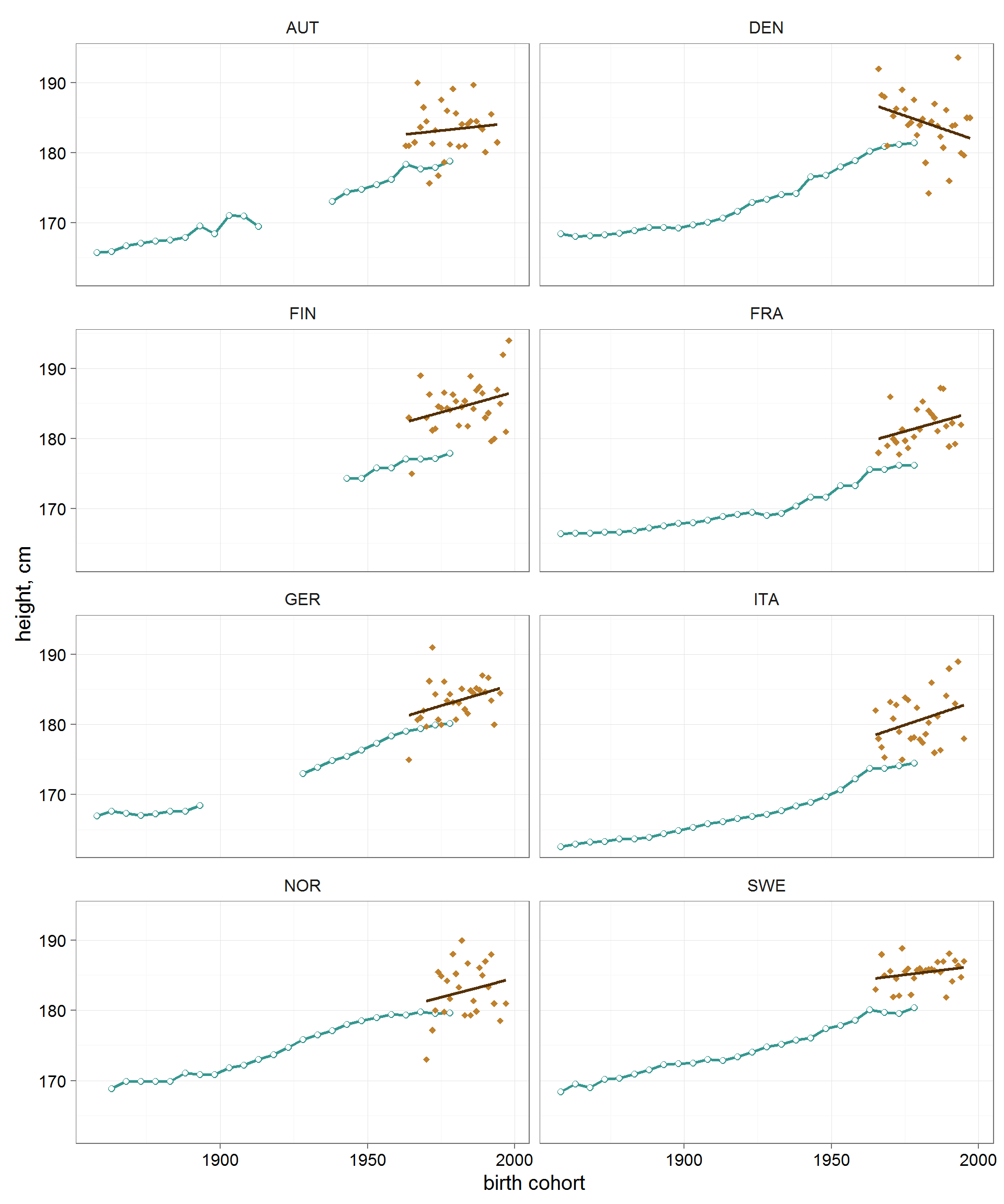
gg_hoc_vs_pop <- ggplot()+ geom_path(data = df_hb %>% filter(country %in% both_cnt), aes(x=cohort,y=h_pop), color=brbg11[9],size=1)+ geom_point(data = df_hb %>% filter(country %in% both_cnt), aes(x=cohort,y=h_pop), color=brbg11[9],size=2)+ geom_point(data = df_hb %>% filter(country %in% both_cnt), aes(x=cohort,y=h_pop), color='white',size=1.5)+ geom_point(data = df_hoc %>% filter(country %in% both_cnt), aes(x=cohort,y=h_hp), color=brbg11[3],size=2,pch=18)+ stat_smooth(data = df_hoc %>% filter(country %in% both_cnt), aes(x=cohort,y=h_hp), method='lm',se=F,color=brbg11[1],size=1)+ facet_wrap(~country,ncol=2)+ ylab('height, cm')+ xlab('birth cohort')+ theme_few(base_size = 15)+ theme(panel.grid=element_line(colour = 'grey75',size=.25)) In all the countries analyzed, hockey players are 2–5 cm higher than statistical men. But this is not surprising - there is a significant selection in sports.
Another is remarkable. In the developed countries of the world, a particularly rapid increase in the growth of the male population occurred in the first mid-20th century. In the cohorts of about the 1960s, the growth of men approached the plateau and peaked to grow rapidly. The trend of the average growth of hockey players in all countries (except for some reason Denmark) seemed to continue the suspended long-term trend of the entire male population.
For cohorts of Europeans born in the first half of the 20th century, the rate of increase in average growth ranged from 1.18 to 1.74 cm per decade, depending on the country (Figure 7). Since the 1960s, this indicator has dropped to the level of 0.15-0.80 in 10 years.

# growth in population df_hb_w <- df_hb %>% spread(cohort,h_pop) names(df_hb_w)[2:26] <- paste('y',names(df_hb_w)[2:26]) diffs <- df_hb_w[,3:26]-df_hb_w[,2:25] df_hb_gr<- df_hb_w %>% transmute(country, gr_1961_1980 = unname(apply(diffs[,22:24],1,mean,na.rm=T))*2, gr_1901_1960 = unname(apply(diffs[,9:21],1,mean,na.rm=T))*2, gr_1856_1900 = unname(apply(diffs[,1:8],1,mean,na.rm=T))*2) %>% gather('period','average_growth',2:4) %>% filter(country %in% both_cnt) %>% mutate(country=factor(country,levels = rev(levels(factor(country)))), period=factor(period,labels = c('1856-1900','1901-1960','1961-1980'))) gg_hb_growth <- ggplot(df_hb_gr, aes(x=average_growth,y=country))+ geom_point(aes(color=period),size=3)+ scale_color_manual(values = brbg11[c(8,3,10)])+ scale_x_continuous(limits=c(0,2))+ facet_wrap(~period)+ theme_few()+ xlab("average growth in men's height over 10 years, cm")+ ylab(NULL)+ theme_few(base_size = 20)+ theme(legend.position='none', panel.grid=element_line(colour = 'grey75',size=.25)) Against the backdrop of a stagnating trend in the population, an increase in the growth of hockey players looks very impressive. And acceleration among goalkeepers in general is unprecedented.
Do not forget about the selection. The divergence of trends in the population and among hockey players probably indicates a growing selection - hockey is demanding more and more growth for a successful career.
Breeding in sports
Looking through the scientific literature on the topic, I came across a remarkable result . It turns out that in professional sports people born in the first half of the year prevail. This is explained by the fact that sports sections, as a rule, form children's teams on birth cohorts. Thus, those born at the beginning of the year always have a little more than the time they have lived behind their shoulders, which is often directly expressed in physical superiority over peers born at the end of the year. It is easy to check this result on our dataset.

# check if there are more players born in earlier months df_month <- df %>% mutate(month=month(birth)) %>% mutate(month=factor(month,levels = rev(levels(factor(month))))) gg_month <- ggplot(df_month,aes(x=factor(month)))+ geom_bar(stat='count',fill=brbg11[8])+ scale_x_discrete(breaks=1:12,labels=month.name)+ xlab('month of birth')+ coord_flip()+ theme_few(base_size = 20)+ theme(legend.position='none', panel.grid=element_line(colour = 'grey75',size=.25)) Indeed, the distribution is quite biased towards the early months. If you break the data by the decade of birth, then with the naked eye you can see that the effect increases with time (Figure 9). Indirectly, this indicates that the selection in hockey is becoming tougher.

# facet by decades df_month_dec <- df_month %>% mutate(dec=factor(substr(paste(cohort),3,3),labels = paste('born in',c('1960s','1970s','1980s','1990s')))) gg_month_dec <- ggplot(df_month_dec,aes(x=factor(month)))+ geom_bar(stat='count',fill=brbg11[8])+ scale_x_discrete(breaks=1:12,labels=month.abb)+ xlab('month of birth')+ facet_wrap(~dec,ncol=2,scales = 'free')+ theme_few(base_size = 20)+ theme(legend.position='none', panel.grid=element_line(colour = 'grey75',size=.25)) For the future
It will be interesting to see whether the physical data on the game statistics of hockey players. I came across an entertaining article published in a very decent scientific journal, in which the authors found a correlation between the ratio of the proportions of a hockey player’s face and the average number of penalty minutes per game.

Reproducibility
The full R script that reproduces the results of my article is here .
Version R-3.2.4 used
All packages are as of 2016-03-14. In the case of packet incompatibilities, this code will be guaranteed to be reproduced using the checkpoint package with the corresponding date.
')
Source: https://habr.com/ru/post/301340/
All Articles