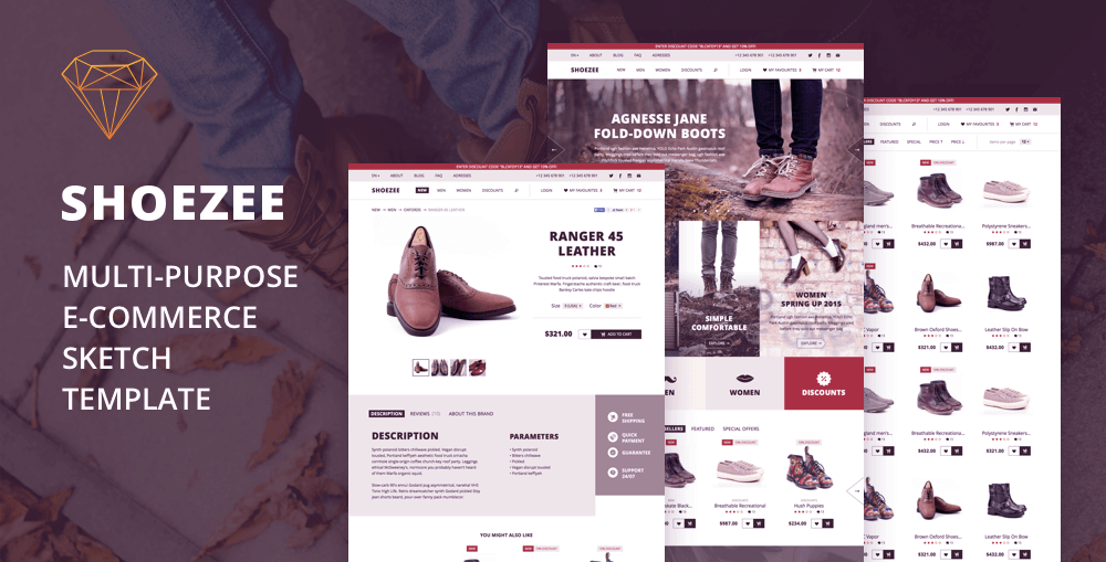
How I did a web store template in Sketch.app for Themeforest. Part 2: we lay out the goods
Hello. In the last article, I talked about designing the starting page for a web store template . Today we understand the prototypes of the remaining pages.
I do not dwell on all parts in great detail. I will describe only the most-most in importance and complexity. This part will be more about the store design itself and less about the sketch. But it just so happens that without it you can’t go any further.
Catalog
General page
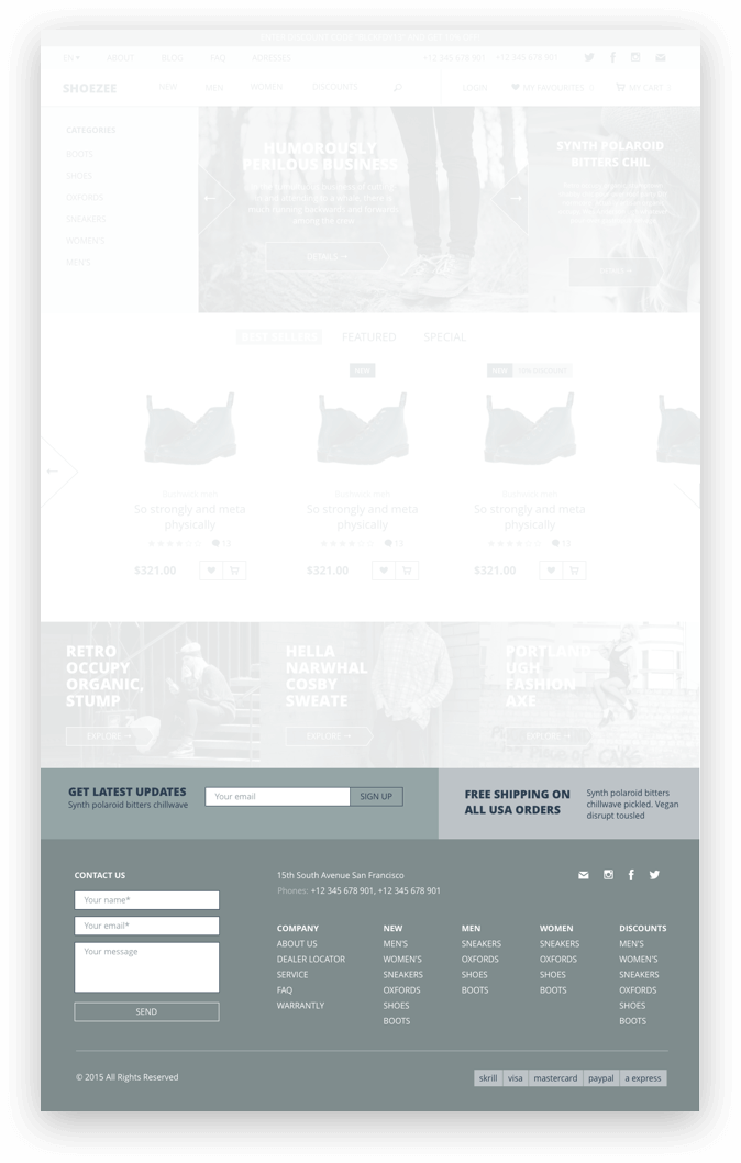
The catalog will have an entry page (when we simply click on the “catalog” without selecting any category). We put categories above, to the right of them - slides and banners from the start page. Well, theoretically, these are banners from the start page, and there already someone will do it.

Then we add a list of products and more banners (in smaller versions) - all from the start page too. Therefore, I simply copy / paste and at the banners tighten up a little bit.
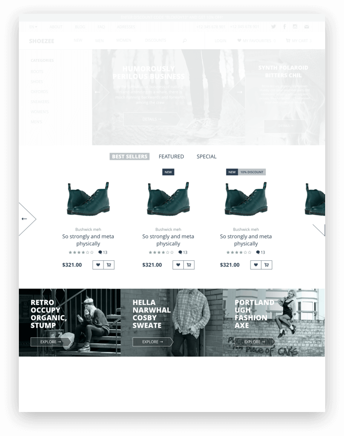
With a subscription, delivery and a footer, we will have one everywhere, so it can be a symbol.
Category Page
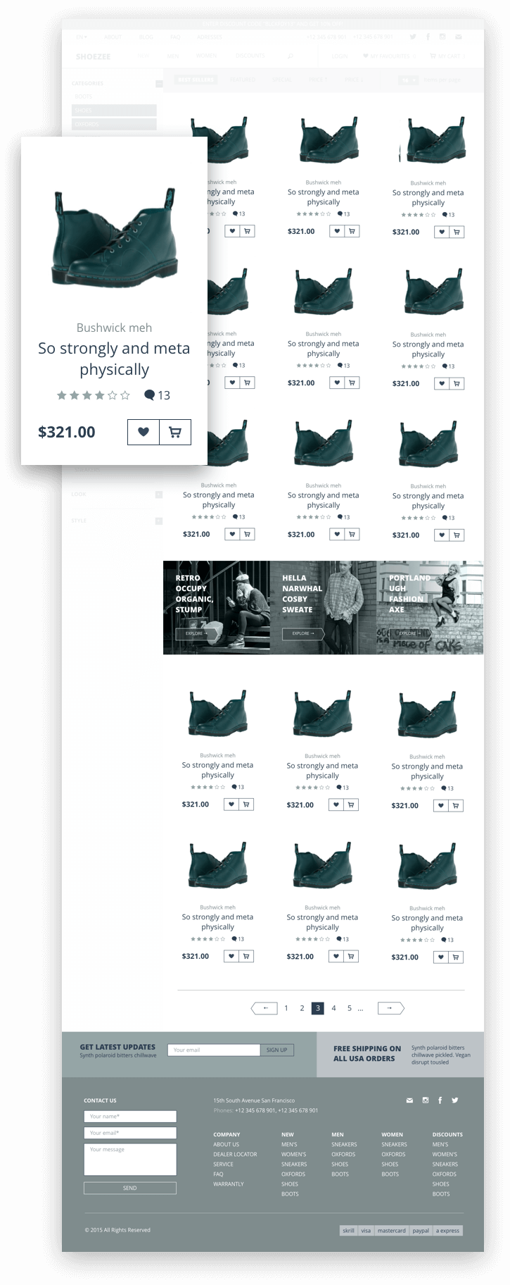
Here we need to make a version with the filter turned off and with it turned on (that is, when the filter is not visible and when it is visible). I decided to do the filter itself vertically - the parameters may not know how much, and when something may be unknown how much, it is better not to limit it from below. Another plus: the vertical filter will occupy exactly one column of goods, which will not break anything when turned on / off. With the filter of goods we have 3 columns, without filter - 4.
Options I take from other stores and templates. Focusing on shoes and clothes. On the top of the page I make a block with sorting parameters. In general, the entire standard set of modern web store.
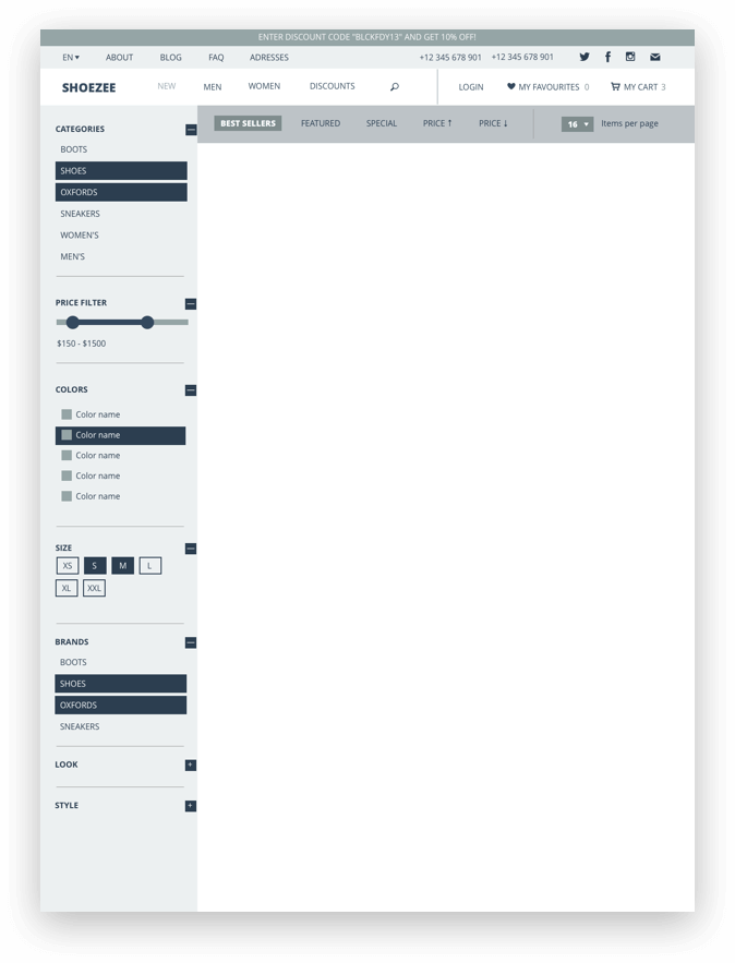
I put goods in columns from a previously saved symbol. So far, of course, you can not worry that everywhere the same picture and name. Although, if such a prototype had to be shown to a real customer, it would still be good practice to diversify this matter.
Product page
I make a large photo of a shoe (in this case) with leaflets back and forth and small previews from below. It is better to always give people the opportunity to flip through photos and arrows, and previews. And the points (“bullets”), if they are used, then we are only as an indicator, but not as a tool for switching slides — aiming at them is painfully inconvenient.
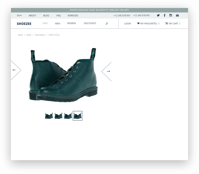
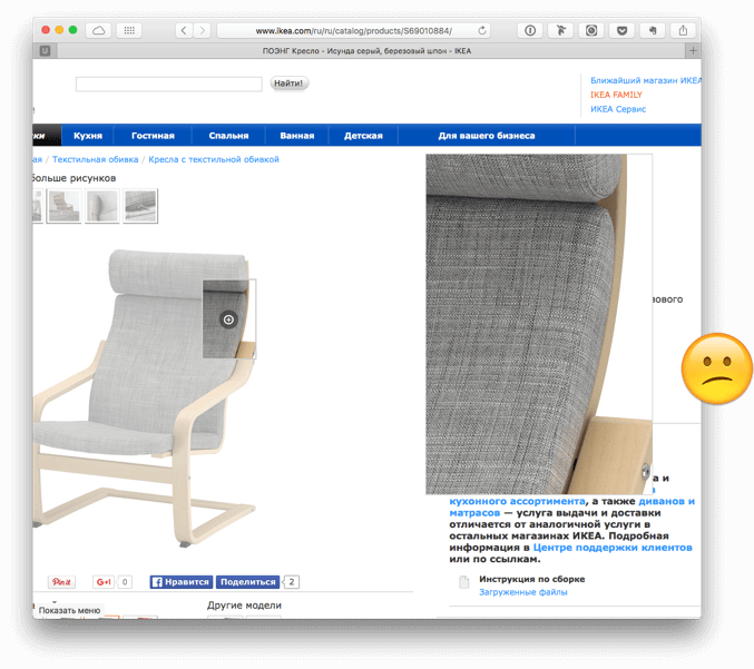
You must have the opportunity to see a large photo of the product and preferably the whole page. Some stores practice showing enlarged pictures in a limited block (Ikea, for example), but I, having suffered as a buyer myself, realized that I would not do this myself.
The name, rating (suddenly there will be) and the parameters (size / color) are set on the side - like everyone else, in general. I try hard not to single out the price (so that it seems insignificant, at least visually), but I don’t make it completely invisible - after all, it’s necessary that the buyer, if he wishes, can immediately figure out how much.
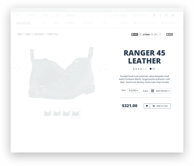
A detailed description, reviews and manufacturer make tabs. Those. at the same time you see one thing. This is not to take up much space text part. And also, by default, not to increase the page height greatly (not that I believe in the fairy tale that users cannot scroll, it’s just that the template is not made for themselves).
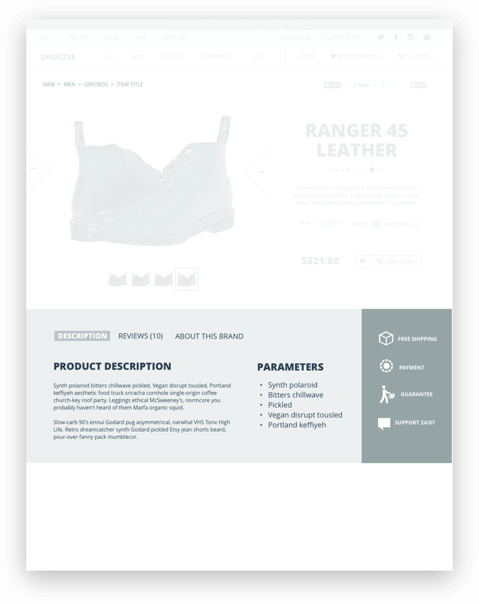
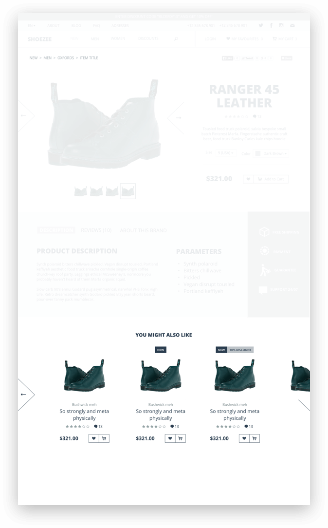
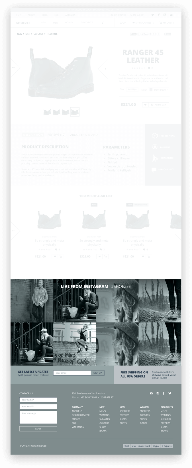
Below we offer products from similar.
Below - instagram tape. Nowadays, there are a lot of large and small companies that contain profiles there, so the block will be relevant.
Basket
Main requirements for the basket:
- List of all added goods with photos (which is obvious);
- Displays the price per item, for several products and the total amount;
- Ability to change the quantity of each item in the cart;
- Ability to remove items from the cart;
- The ability to apply promotional code;
- It is desirable to show the total amount including delivery:
- show the amount only for the goods separately, without delivery;
- show shipping costs separately;
- show discount from promo code separately;
- show the total amount inclusive of delivery;
- give the opportunity to add and change the delivery address (or also the delivery service), without departing from the cash register.

We make the ordering in several stages, so as not to throw out at once a long terrible form on people. Yes, and logically simple: you deal with the goods → you deal with the delivery → you deal with the payment.

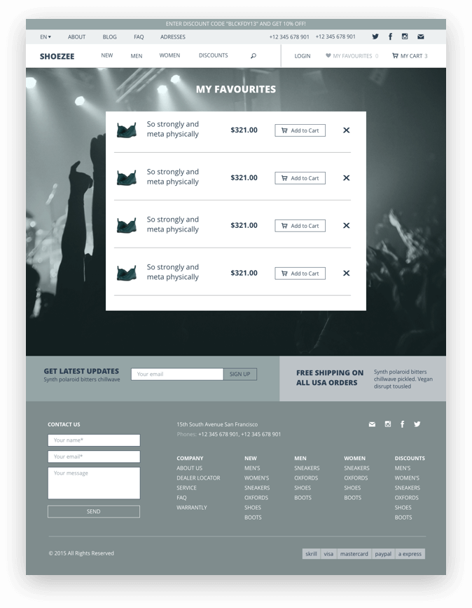
Favorites
Almost the same basket, but the list is a bit simpler. From here you can immediately remove the product or add to the cart.
Contacts
The most-suitable-to-all option is a large map and a list of addresses of the stores, or showrooms, or warehouses, or offices.
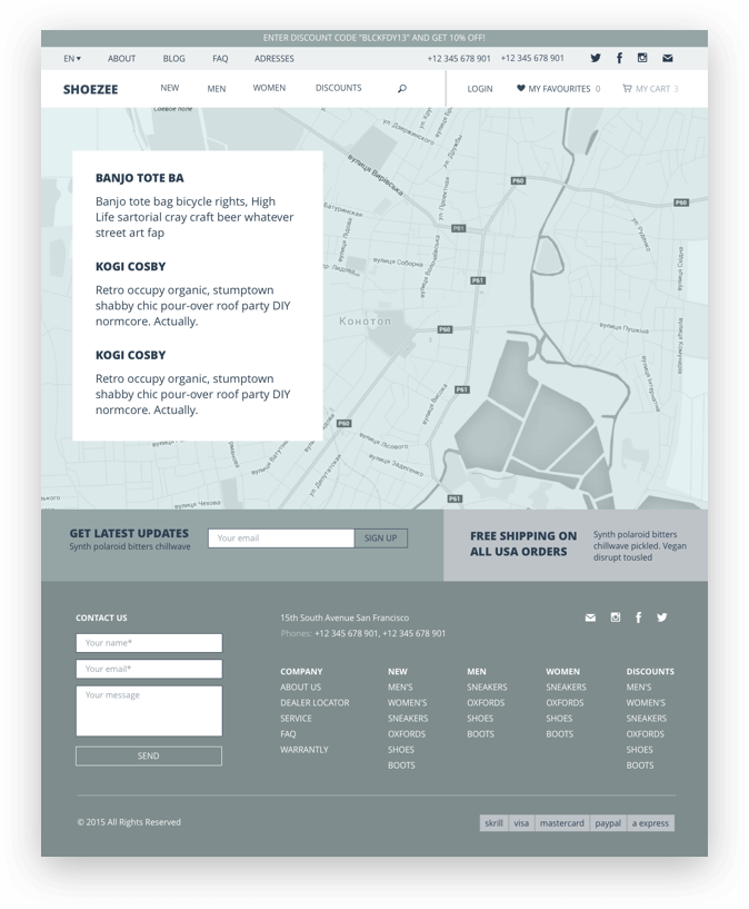
Although while I was writing this, I understood: in the new version of the template, I need to add the “Contacts” option for fully online stores (without physical addresses).
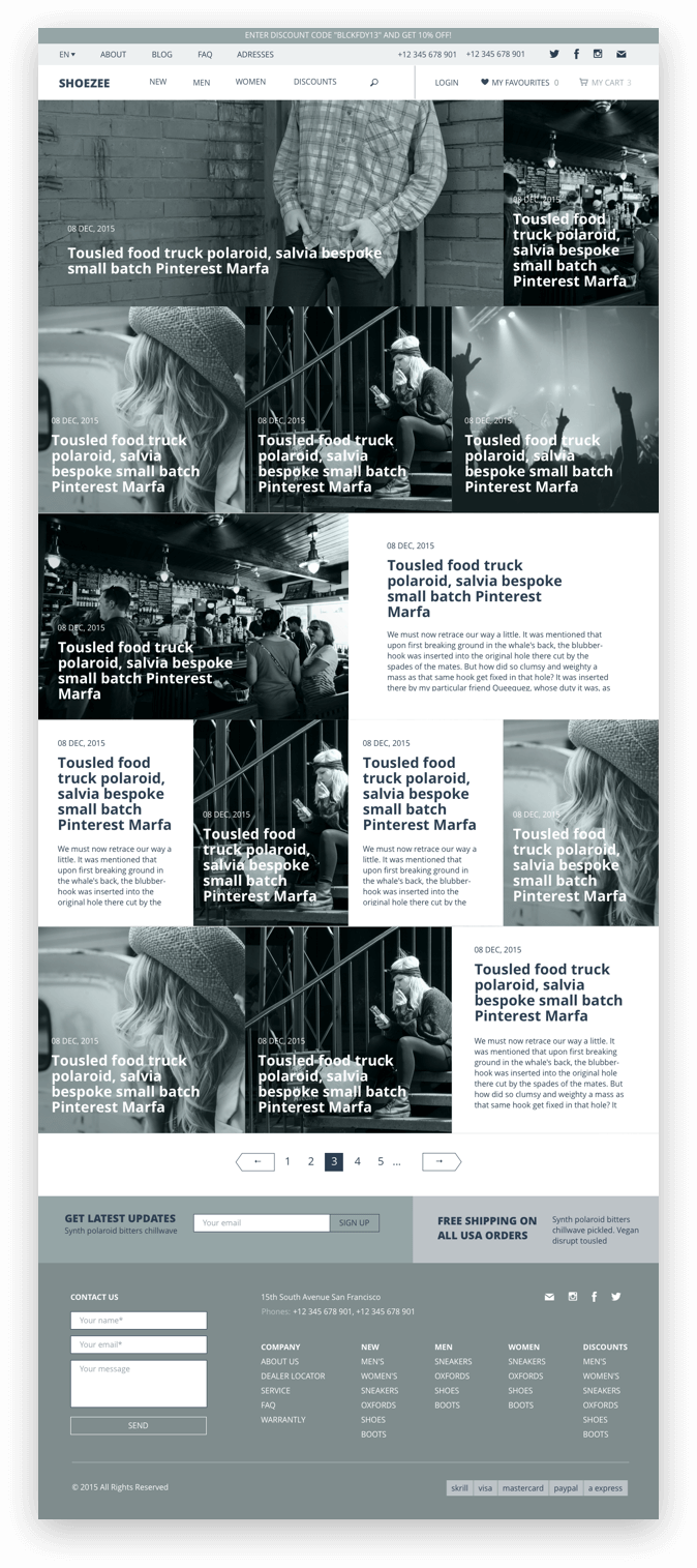
Blog
General page
Articles will presumably be of 2 types - with and without a capital picture. I do a preview like this: if an article with a picture, I leave only the title and date; if without a picture - the title, date and description (for the most part, take a place and to get a beautiful view of the "card" of the article). Naturally, I visually adhere to the general style of the site (in a journalistic manner, i.e.) In the final version I will also make a page where there are equally many articles with illustrations and without a page with fully illustrated articles + a page with fully text articles.
Article page
Same 2 types. They differ, as you understand, only by the presence / absence of the title picture.
Next, I collect paragraphs of text and photos in the possible layout. In principle, the final buyer of the file can then at least make the entire sheet with text across the entire width of the page, but it is important for me to show the options more colored - after all, I am partially responsible for what people will have at the exit after editing my template.
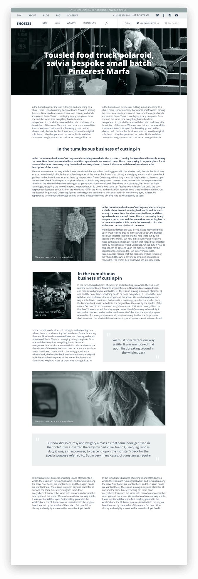
For “Lorem-ipsum” I used to use the “ Content Generator ” plugin. Now there is a Kraft lotion - I highly recommend it.
Comments
It is imperative to provide a block with comments and with Facebook (following the principle “no social networks anywhere”). I honestly do not know where to put the form is more correct - before the comments or after. The first option has the following logic: you write just your reaction to the post. At the second - you first look at how people react, and then, perhaps, somehow you correct your opinion or refuse to write in general.
The very type of commentary is quite ordinary: name, time, text, the ability to evaluate and respond.
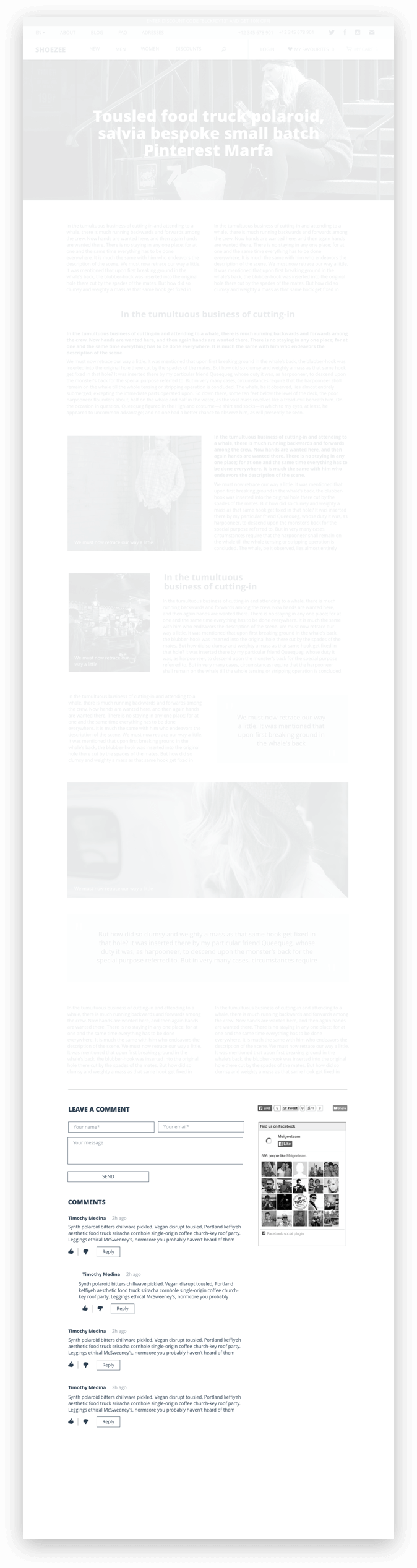
Below we put links to the previous / next article. Or on articles on the topic - here everything is already in the hands of the end user.

At the present time, I notice on many (but, thank the logic, not all yet) sites, a design technique should be put right after the text of the article three-kilometer sentences on the topic, similar articles, links back and forth, banner ads and various things, actually article. This is an example of how monetization wins over common sense.
Popup windows
From what I’ve seen from other templates and stores, we’ll do the following: login window, password recovery, registration, newsletter subscription, product preview (this will be in the catalog), message about adding to the basket, viewing large product photos.

Regarding the design of windows like “subscribe to our news”, which falls on you at the most unexpected moment, you should clarify: if you have no choice or need to follow the general fashion (and usually you need templates), then do it, of course. If the project is allowed to do design for living and adequate people, if possible do not follow this practice. Such things behave like a distributor of promotional starter packs that pounce on you at the exit of the metro. Let's try to do our work not only for the sake of clicks, but also with respect to users. Moreover, if the only way to get regular readers is to wave a subscription in front of their nose, then the value of the material itself seems doubtful to me.
On this I will finish. Next time we will move on to the final beautiful design. Do not switch.

')
Source: https://habr.com/ru/post/301200/
All Articles