Animated stub "Sorry, your browser doesn't support WebGL"
Hello! Today I want to tell a story about how I created a crying emoticon animation on the error page for devices that do not support WebGL technology.
To begin with we will create a container in which the future smile will be located.
')
I will begin the implementation of the smiley by making a circle. To do this, add an element with the sad-smile class inside the .demo element.
Next, you need to set the same values for the width and height properties, and also round the corners using 50% for border-radius.
Now, using a linear gradient, you need to paint over the circle, and also add an inner shadow for greater realism.
The emoticon should be centered on the page. This can be done using flexboxes.
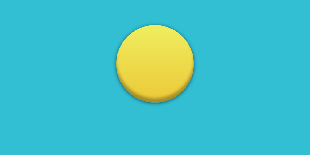
The head is ready!
Then add the eyes. To do this, you need to create two div tags with the class sad-smile__eye. Then for the left eye add a class sad-smile__eye_left, and for the right one - sad-smile__eye_right.
Eye styling should start with the size of the elements.
Next, fill them with a white background, make a black stroke and round the upper corners.
The position of the eye will be calculated relative to the element positioned relative to the .sad-smile.

Then with the help of the pseudo-element :: after I add pupils in the form of circles.
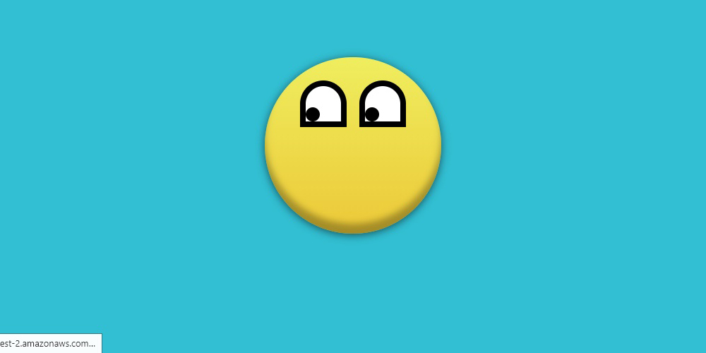
Eyes are made!
Next you need to add eyebrows. To implement them, you need to use the pseudo element :: before.
With the help of width, height and background-color, black rectangles are created which are the base of the eyebrows. And the border-radius property rounds the top corners so that the elements look like eyebrows.
Eyebrow position will be calculated from the element .sad-smile__eye.

I just have to add a mouth. To implement it will use a div with the class sad-smile__mouth.
The mouth itself will look like an arc. To create the base of the mouth, I will use a rectangle with a frame.
The resulting rectangle must be set to the correct position.
To implement the arc, I do not need a frame from all sides. It is enough to use border-bottom, border-right and border-left.
Now we need to set the value of transparent for the border-left and border-right properties.
It remains to round the corners using border-radius.
And the last step. Make a sad smiley out of a funny smiley by simply turning the element 180 degrees using the rotateX property.

Smiley ready!
Now you need to add tears. To implement them, you need to add 2 elements with the class sad-smile__tear.
Since the tears have a triangular shape, then they can be realized with the help of the CSS triangle.
The border-radius property will round the resulting triangle to make a tear.
Tears will be positioned relative to the parent element .sad-smile__eye.

It remains to write the script animation tears.
And add it to the elements.
But now the tears run parallel to each other, therefore for the left one I will set a small delay.

The final demo can be viewed on Codepen
To begin with we will create a container in which the future smile will be located.
<div class="demo-smile"></div> ')
.demo-smile{ width: 100%; height: 100vh; background-color: #32bfd3; } I will begin the implementation of the smiley by making a circle. To do this, add an element with the sad-smile class inside the .demo element.
<div class="demo-smile"> <div class="sad-smile"></div> </div> Next, you need to set the same values for the width and height properties, and also round the corners using 50% for border-radius.
.sad-smile{ width: 250px; height: 250px; border-radius: 50%; } Now, using a linear gradient, you need to paint over the circle, and also add an inner shadow for greater realism.
.sad-smile{ width: 250px; height: 250px; border-radius: 50%; background-image: linear-gradient(to bottom, #efee5f, #ecc837); box-shadow: inset 0 -14px 14px rgba(0, 0, 0, .3), 0 2px 20px rgba(0, 0, 0, .6); } The emoticon should be centered on the page. This can be done using flexboxes.
.demo-smile{ width: 100%; height: 100vh; background-color: #32bfd3; display: flex; } .sad-smile{ width: 250px; height: 250px; border-radius: 50%; background-image: linear-gradient(to bottom, #efee5f, #ecc837); box-shadow: inset 0 -14px 14px rgba(0, 0, 0, .3), 0 2px 20px rgba(0, 0, 0, .6); margin: auto; } The head is ready!
Then add the eyes. To do this, you need to create two div tags with the class sad-smile__eye. Then for the left eye add a class sad-smile__eye_left, and for the right one - sad-smile__eye_right.
<div class="demo-smile"> <div class="sad-smile"> <div class="sad-smile__eye sad-smile__eye_left"></div> <div class="sad-smile__eye sad-smile__eye_right"></div> </div> </div> Eye styling should start with the size of the elements.
.sad-smile__eye{ width: 50px; height: 50px; } Next, fill them with a white background, make a black stroke and round the upper corners.
.sad-smile__eye{ width: 50px; height: 50px; border: 8px solid #000; background-color: #fff; border-radius: 50% 50% 0 0; } The position of the eye will be calculated relative to the element positioned relative to the .sad-smile.
.sad-smile{ position: relative; width: 250px; height: 250px; border-radius: 50%; background-image: linear-gradient(to bottom, #efee5f, #ecc837); box-shadow: inset 0 -14px 14px rgba(0, 0, 0, .3), 0 2px 20px rgba(0, 0, 0, .6); margin: auto; } .sad-smile__eye{ width: 50px; height: 50px; border: 8px solid #000; background-color: #fff; border-radius: 50% 50% 0 0; position: absolute; top: 33px; } .sad-smile__eye_left{ left: 50px; } .sad-smile__eye_right{ right: 50px; } Then with the help of the pseudo-element :: after I add pupils in the form of circles.
.sad-smile__eye::after{ content: ""; width: 20px; height: 20px; border-radius: 50%; background-color: #000; position: absolute; left: 0; bottom: 0; } Eyes are made!
Next you need to add eyebrows. To implement them, you need to use the pseudo element :: before.
.sad-smile__eye::before{ content: ""; width: 34px; height: 7px; background-color: #000; border-radius: 50% 50% 0 0; } With the help of width, height and background-color, black rectangles are created which are the base of the eyebrows. And the border-radius property rounds the top corners so that the elements look like eyebrows.
Eyebrow position will be calculated from the element .sad-smile__eye.
.sad-smile__eye::before{ content: ""; width: 34px; height: 7px; background-color: #000; border-radius: 50% 50% 0 0; position: absolute; top: -20px; right: 7px; } I just have to add a mouth. To implement it will use a div with the class sad-smile__mouth.
<div class="demo-smile"> <div class="sad-smile"> <div class="sad-smile__eye sad-smile__eye_left"></div> <div class="sad-smile__eye sad-smile__eye_right"></div> <div class="sad-smile__mouth"></div> </div> </div> The mouth itself will look like an arc. To create the base of the mouth, I will use a rectangle with a frame.
.sad-smile__mouth{ width: 165px; height: 75px; border: 7px solid #222; } The resulting rectangle must be set to the correct position.
.sad-smile__mouth{ width: 165px; height: 75px; border: 7px solid #222; position: absolute; bottom: 12px; left: 125px; transform: translateX(-50%); } To implement the arc, I do not need a frame from all sides. It is enough to use border-bottom, border-right and border-left.
.sad-smile__mouth{ width: 165px; height: 75px; border-right: 7px solid #222; border-left: 7px solid #222; border-bottom: 7px solid #222; position: absolute; bottom: 12px; left: 125px; transform: translateX(-50%); } Now we need to set the value of transparent for the border-left and border-right properties.
.sad-smile__mouth{ width: 165px; height: 75px; border-right: 7px solid transparent; border-left: 7px solid transparent; border-bottom: 7px solid #222; position: absolute; bottom: 12px; left: 125px; transform: translateX(-50%); } It remains to round the corners using border-radius.
.sad-smile__mouth{ width: 165px; height: 75px; border-right: 7px solid transparent; border-left: 7px solid transparent; border-bottom: 7px solid #222; border-radius: 50%; position: absolute; bottom: 12px; left: 125px; transform: translateX(-50%); } And the last step. Make a sad smiley out of a funny smiley by simply turning the element 180 degrees using the rotateX property.
.sad-smile__mouth{ width: 165px; height: 75px; border-right: 7px solid transparent; border-left: 7px solid transparent; border-bottom: 7px solid #222; border-radius: 50%; position: absolute; bottom: 12px; left: 125px; transform: rotateX(180deg) translateX(-50%); } Smiley ready!
Now you need to add tears. To implement them, you need to add 2 elements with the class sad-smile__tear.
<div class="demo-smile"> <div class="sad-smile"> <div class="sad-smile__eye sad-smile__eye_left"> <div class="sad-smile__tear"></div> </div> <div class="sad-smile__eye sad-smile__eye_right"> <div class="sad-smile__tear"></div> </div> <div class="sad-smile__mouth"></div> </div> </div> Since the tears have a triangular shape, then they can be realized with the help of the CSS triangle.
.sad-smile__tear{ width: 0; height: 0; border-right: 8px solid transparent; border-left: 8px solid transparent; border-bottom: 24px solid #1ca5e2; } The border-radius property will round the resulting triangle to make a tear.
.sad-smile__tear{ width: 0; height: 0; border-right: 8px solid transparent; border-left: 8px solid transparent; border-bottom: 24px solid #1ca5e2; border-radius: 50%; } Tears will be positioned relative to the parent element .sad-smile__eye.
.sad-smile__tear{ width: 0; height: 0; border-right: 8px solid transparent; border-left: 8px solid transparent; border-bottom: 24px solid #1ca5e2; border-radius: 50%; position: absolute; top: 50%; left: 0; z-index: 2; } It remains to write the script animation tears.
@keyframes tear{ 0% { opacity: 0; transform: translate3d(0, 0, 0) scale(0); } 5%{ opacity: 1; transform: translate3d(0, 0, 0) scale(0); } 10%{ transform: translate3d(0, 25px, 0) scale(1); } 100%{ transform: translate3d(0, 175px, 0) scale(1); } } And add it to the elements.
.sad-smile__tear{ width: 0; height: 0; border-right: 8px solid transparent; border-left: 8px solid transparent; border-bottom: 24px solid #1ca5e2; border-radius: 50%; position: absolute; top: 50%; left: 0; z-index: 2; animation: tear 2.5s cubic-bezier(.63, .49, 1, -.15) .2s infinite both; } But now the tears run parallel to each other, therefore for the left one I will set a small delay.
.sad-smile__eye_left .sad-smile__tear{ animation-delay: 1s; } The final demo can be viewed on Codepen
Source: https://habr.com/ru/post/301136/
All Articles