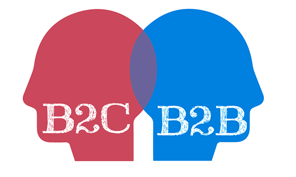
Design differences for b2b and b2c spheres

There are many sites in RuNet that do not perform their task well for one reason only: the designer, creating the visual appearance of this site, did not realize whether the site was for an individual client or for the whole business.
')
1. The level of visitor responsibility
First, we must understand that visitors in these two cases are different people. In b2b it is a person who thinks for the whole company. He solves his personal interests, but above all he solves the tasks of the organization as a whole.
In the case of b2c, you usually need to sell something to a person who thinks only about himself and is not a specialist. This means that the style of communication with a person should be easier, with an emphasis on emotional techniques. The client will rarely thoroughly understand the product - there are such people, but they are few.
2. Social level
A b2b site should communicate with a visitor in a different way, simply because it is most likely a person of a different social level: either the business owner, or the head of the purchasing department, or something else like that. He is much more versed in what he needs than a b2c client. He has been brewing in this business not for the first year and absolutely does not need any list of advantages like “we are a young, dynamic company ...”. He needs a case.
3. Image vs Usability
The site design for b2b needs more emphasis on image than in b2c. The buyer of the phone in the online store does not look much at the image: he looks more at the price, the convenience of the order and so on. But the business client wants to make sure that the company that owns the site is serious. And this should be reflected in the style of the site: more minimalism, less pretentiousness.
4. Conversion
If you make a b2b site, you need to understand that the conversion mechanisms will be different . Yes, it is convenient to buy a mobile phone, putting the goods in the "basket" on the site. But the company will not order spare parts for an elevator! And if there is, then after the call and discussion.
5. Submission of information
On the website for a retail client, you can describe the advantages of the company thesis, in four blocks with beautiful icons. But in b2b this is not a ride - we need real facts that will convince a businessman or middle / top manager that the site is telling the truth about the company.
For example, to bring to the advantage of some very specific and detailed points that show the expertise of the company owning the site. Only specialists will understand them - but a site has been created for them.
Or, if we are talking about “Reviews” on the website: in b2c, they can be remarkably made in the well-known format “Photo + FIO + link to a social network” or something like that. If you do this in b2b, it will only get worse! It is better to show letters of recommendation with signatures and seals (although they are often falsified), an interview with the head of a well-known company in the industry, a story about what was done in collaboration.
6. Decision speed
In b2b, stereotypical, banal decisions and stamps should be minimized. We must convince the decision maker of their competence. It’s impossible to reckon on the fool: the client thinks more difficult, the price of the question is different, and the level of responsibility.
A retail customer can be encouraged to buy quickly. In b2b, it is better to expect that the visitor will remember the site (by the way about the image!), Leave contacts, contact in the future, carefully consider and weigh everything.
Source: https://habr.com/ru/post/300978/
All Articles