Own UX application of housing and communal services of Moscow with chat and cool
Technology develops at supersonic speeds, and the design of interfaces, like any skill, needs constant practice. The combination of these two factors opens up a whole galaxy for flight design ideas.
In my opinion, in designing an interface, any bold ideas may be the key to success, but only under three conditions:
')
- if the decision is intuitive
- if the solution simplifies the process of interaction
- if the decision is realizable
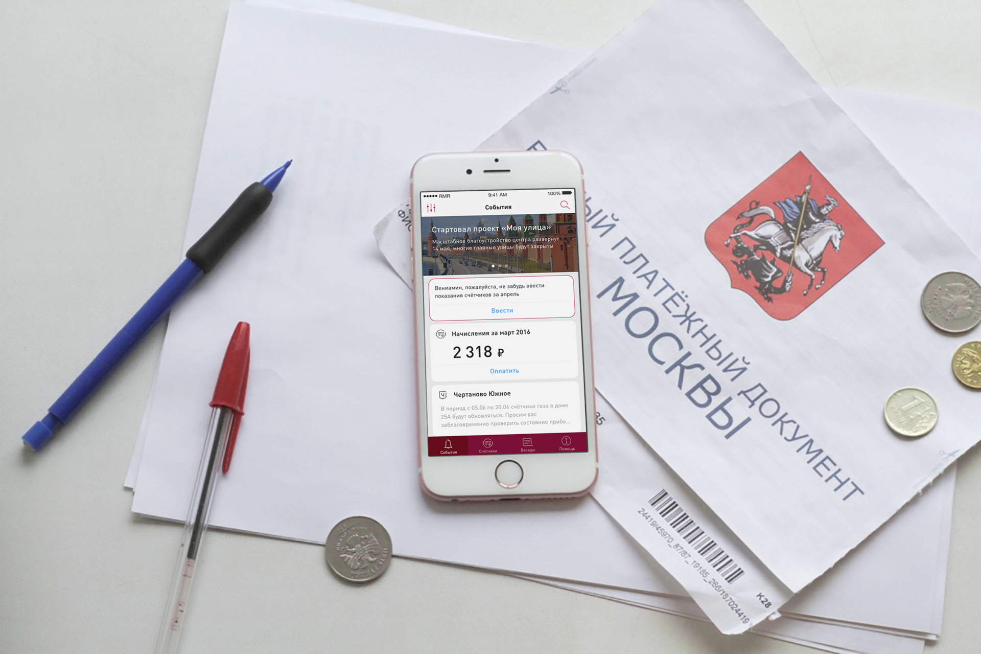
How sad that in a large city with Wi-Fi in the subway and air zebras still need to grasp the tangled receipts and stand in lines to pay for utilities.
Not so long ago, the Moscow Housing and Utilities Application was released, designed to make life easier for citizens. His description reads as follows:
“Using the application, it is possible to enter readings of water meters, find out when to turn off hot water, get information about the management company, find out the debt on utility services, take part in the survey, and discuss with your neighbors the problems of servicing your home on the forum.
Of course, there are many ways to deal with household chores, including using a smartphone, but is it really necessary for this to be a separate application, when most banks already allow you to pay for utilities in the personal account section? To be in demand, the tool should provide more opportunities for residents. I hasten to share with you the result of an experiment to redesign the utility utilities in Moscow.
Since everything described below is entirely a fantasy, there are no limitations in restructuring. So, we will present the application as a set of useful functions that are determined by the target scripts:
- Counters : entering readings, viewing debts and paying utility bills
- Events : an aggregator of interesting information and important announcements
- Conversations : discussion of topics relevant to Muscovites and communication with neighbors
- Help : solving housing issues 24 hours a day with the help of housing and public utilities-bot

Who is the tool for?
The target audience of the application is the residents of Moscow and the region with average incomes, keeping a record of the family or individual budget (we agree that the rich do not consider communal services on their own). The application can be used in different situations, therefore it should be accessible to all groups of citizens, especially for those who do not have too much time and attention.
To clarify, we’ll come up with a character that tells the course of actions in specific scenarios. They could be mediocre and average Benjamin Living, 34 years old, an iOS user. Veniamin is registered in the Chertanovo Yuzhnoye area and regularly pays for water / electricity / gas, etc., but he is very tired of unnecessary bureaucracy, wants to automate the process and save time.
Word captain
A bit of obviousness: it’s absolutely not a sin to borrow patterns realized by anyone. On the contrary, operating the usual interface elements does not require additional time and effort for their study. What is bad tool that is familiar and understandable? Recall patterns like pull-to-refresh, floating action button, or swipe to delete. Such algorithms have already been learned by the user, wound on the basal nuclei of his brain, they are done automatically.
The only negative cool new features in the interface - the time for learning and assimilation. Suppose Benjamin is interested in a new, potentially convenient way to deal with domestic affairs and is ready to strain his attention for the sake of learning, but what is the benefit here if his main goals were to save time and effort?
Combining the personal semantic bank of interface solutions with familiar elements, we get the desired middle ground.
Accruals
“Get up-to-date information about your utility bills.”
Now the situation looks like this: in order for the user to find the most interesting data that prompted him to download the application, he needs to read the contents of two tables from the utilities services catalog.
Psychological studies have shown that any thing a person is part of his identity, whether it is a piece of clothing or an electronic device. If you compare the application with a piece of clothing, the current implementation resembles a merchant's cloak with some kind of illegitimate: long, with a bunch of pockets, the contents of which are shown in the dusk to an interested buyer. In short, now it looks complicated.
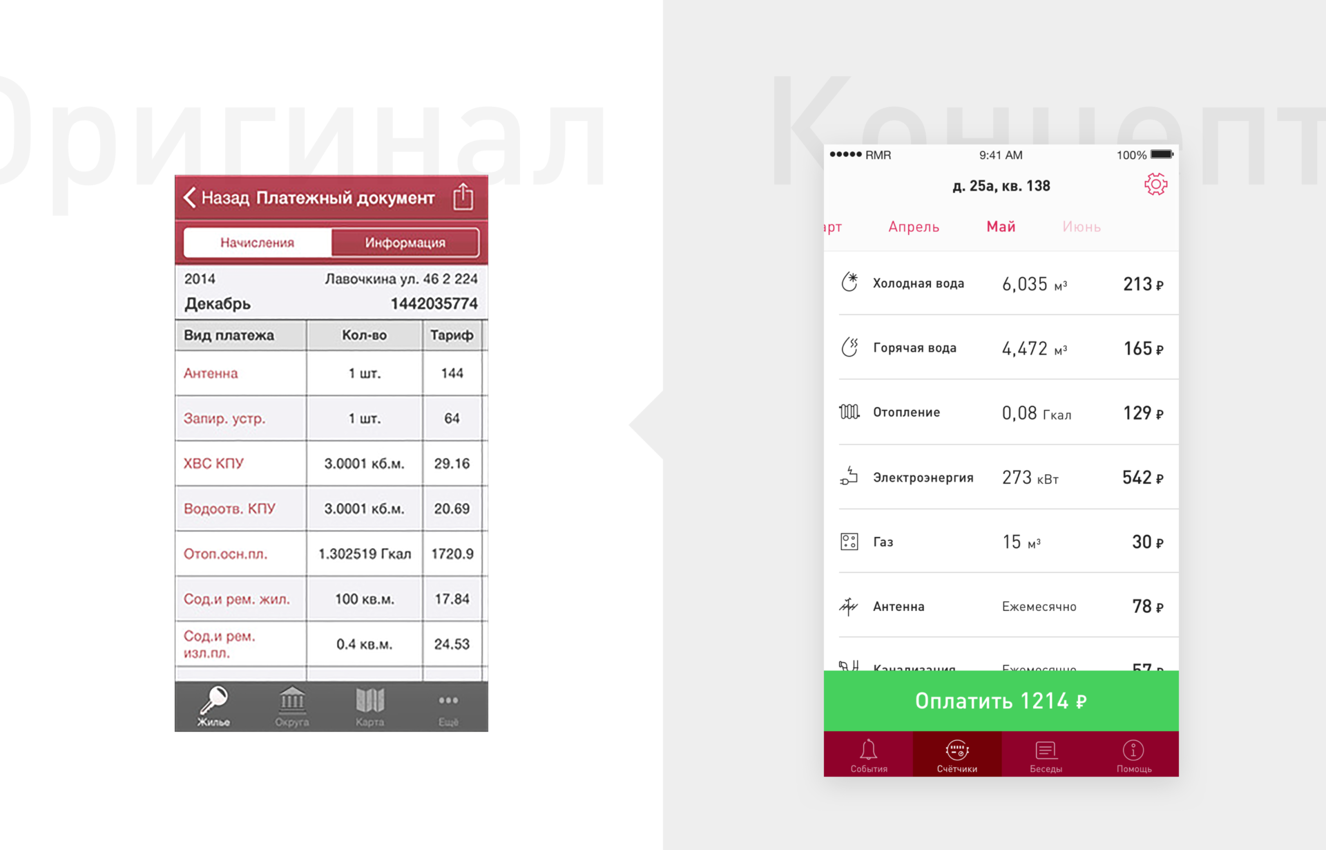
Veniamin Living, like most people, is not an expert in the intricacies of utility bills, and he can rightly expect meter readings from the Housing screen. That is, how many things are there and how it happened. Let me rename the screen to “Counters”, keeping the original idea of the heading-address. However, this title looks in some cases a bit overloaded. The address of the user can be the length of the entire line and more. Why was it necessary to do so in detail? Yes, suddenly a person will forget the name of his street. Obviously, this is rather an element of the profile, then just the numbers of the house and apartment will be sufficient for it for two reasons:
- Even if from one device authorization will occur on two or more accounts, the full coincidence of numbers is extremely unlikely.
- And why even without the need to show your passport data on the screen?

It would be very convenient to navigate through the history of monthly payments. Why not display it in the form of scrollable tabs with the names of the month, which is clear.
Everyone remembers that visual images are read faster than text. But if the current display is hung with icons, it may just burst. Exit: we sort the most important data up and visual weight we focus on the readings themselves.
Entering the readings is logically related to their subsequent payment. Paid invoices are relied on with the appropriate intelligible status, and unpaid - a button that initiates this process, which should be visible and be somewhere nearby. Structurally, the screen is similar to any price list: details + total amount to be paid. Let's skim and combine the amount with the payment button, leaving it stuck to the tab bar.
Entering evidence
Any data entry process is associated with cognitive load, and the task of the designer is to reduce this load in any feasible way. One of the ways associated with the hypothesis of the naturalness of the interface , which no one bothers to take literally. Moreover, the native date pickers in IOS confirm the familiarity of such an implementation of input for users. Here is the counter in real life:

Here is an example of its literal interpretation: drum testimony.
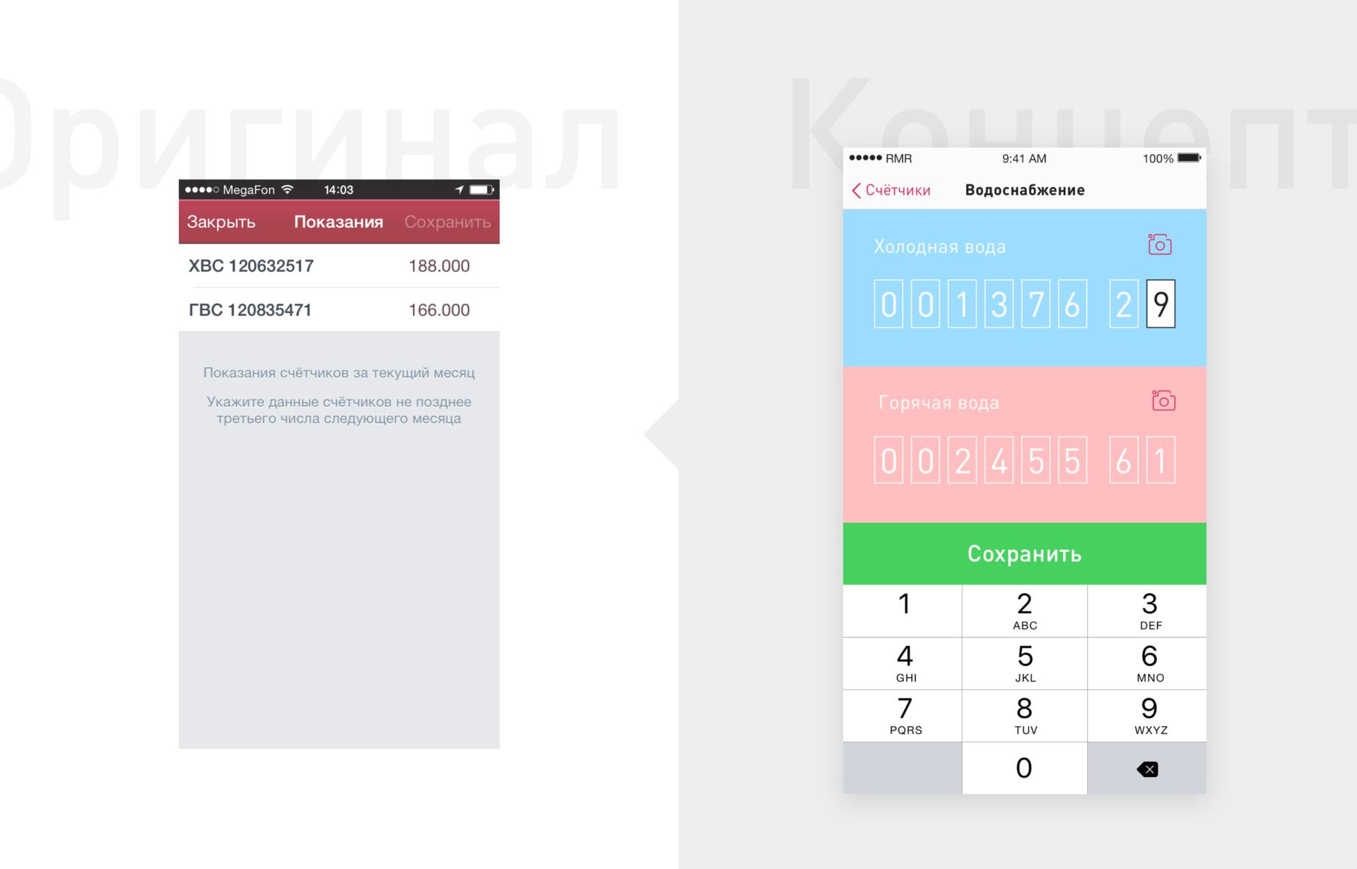
The drum allows you to compare the current and "running" units of measurement since their last scroll, with an eye on the real counter and its metaphor in the interface.
Add the usual color coding for hot and cold water and scan the digits of the analog instrument using the camera as an alternative input method. Wait to throw your stones: remember how conveniently you can take a picture of a card in popular banking applications, instead of trying to drive a long code without the right to make a mistake. That is, such a technology already exists and is actively used, its easy modification for our concept will be in place.
This simple function can significantly speed up the task and eliminates the cognitive strain when entering data in general: just take a picture of the numbers and values will be loaded automatically.
Developments
The screen tells about the events of the district and the city, for example, about the timing of repairs in the house or turning off the water supply, sends new receipts in the form of concise cards and reminds you to fill in the readings.
Keeping up with the times, Benjamin is often forgetful, so integration with wearable devices will serve as a useful innovation: broadcasting burning notifications, for example, in his Apple Watch.

In essence, it is squeezing useful information in the form of modules. By the way, it must be said that modularity is a proven way to implement the design of any main screen, even in complex interfaces.

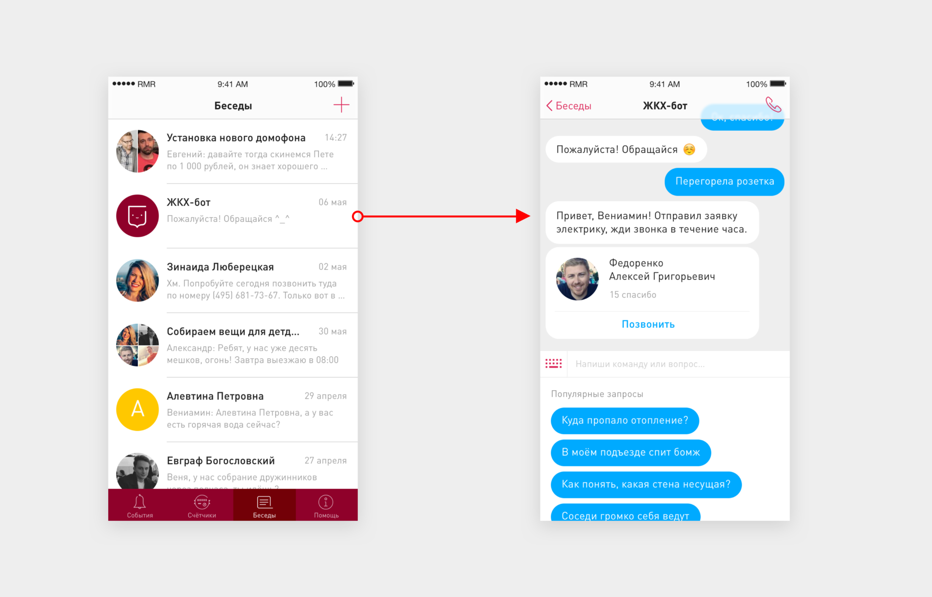
Conversations
In this section, residents can discuss organizational issues, latest news, find a way out of a difficult situation, consult with more experienced neighbors, or connect any contact from the address book to the conversation.
Any service is created by people for people, and a good service also regularly updates content. Chat, which involves the user in the process of creating a unique knowledge base, is much better than the statically presented information, since it simultaneously solves the issues of data updating and sorting by relevance, not to mention popularizing the service as a whole. Yes, and what could be there, it would be a great platform for targeted advertising.
Help
In most real-life situations when you need the help of public services, they are difficult to find and easy to lose. In addition, real people work there during working hours, and their work is very difficult.
Almost everyone has ever been confronted with a pipe break, suddenly disappeared with hot water, or languished in an elevator waiting for the Knights of the Housing and Public Utilities. It is a pity that there is not always a guarantee to quickly get feedback. The canonical case is illustrated in “12 chairs”: the engineer Shchukin found himself in an unpleasant everyday situation and did not know where to go until a random passer-by helped him.

Our Benjamin is not familiar with any of the employees of housing and communal services and does not know whom to turn to in case of anything. On Google, he can only find the phone numbers of the local government (which may not always solve the problem quickly). However, in any difficult situation, he will not understand that he is communicating with a huge system of many divisions and will scold the whole system. So why not make this communication as simple as possible, as if the system were a polite and responsive companion to the delight of Alan Cooper.
That is, yes, right in the conversation we implant a chat bot that responds to text commands, accumulates data on demand and helps in difficult situations. In order to make the conversation with the bot more operational, a set of popular requests will not be superfluous - you don’t have to score the same commands on the line.
Here is an example of this interaction: a smart bot understood the context and helped Benjamin by finding a specialist to solve the problem.
Conclusion
It is difficult to say for sure what the interface of the future is transforming into. Will it be controlled by voice commands, chat bots, or will it respond to changes in brain wave vibration, but the present is in our hands. Regardless of social roles and hobbies, you can improve the world with your ideas, because it is the common interest in the pursuit of perfection that turns the millstones of progress. So it goes.
Dear reader! If you have any suggestions or questions on the current concept, go to the comments, I will be glad to discuss.
Thanks for attention!

UPD: fixed icons and added a button on the clock. Thanks to attentive readers for their vigilance and proposed improvements.
Source: https://habr.com/ru/post/300896/
All Articles