Throw them into the neck: 11 conversion enemies on the landing pages

A week ago, we decided on an insane act: we announced to subscribers about parsing their landing pages. With recommendations on how to improve the value proposition and increase the conversion. As a result, we dismantled 69 landings and found 11 typical errors. See examples of errors in the article and drive them into the neck as quickly as possible. If you have them, of course)
Chatter in title
')
The title is a value proposition, in essence. Users want to know the facts and only the facts, without further explanation. What benefits they will receive and how you differ from competitors.
For example, the landing page of a repair company:

An eyeliner with the words "We offer a solution that includes ..." is relevant for SEO-texture, but not for the offer. Secondly, quickly and efficiently - everyone has their own measurements. For some, a week and a lot of garbage, for someone - 30 days and cleaning "under the broom."
How to fix: we leave specifics on the timing and cost + add decoding repair turnkey, without the "water".
"Turnkey apartment renovation / We do repair in 25 days from 3 000 rubles for sq.m / All is included: from finishing finishing to garbage removal"
The user came from advertising → saw compliance with the key query → saw specific benefits.
To the rescue - the article "Headers by the method of 4U: 30 examples . "
Lack of value proposition
And this is a critical error that we usually fix on multi-page sites. Users land from Yandex.Direct and AdWords to the service page where the blah blah blah goes. Not even the properties of the goods, but a simple description. How they do it, why this particular solution is not clear.
Example for the sale of gas gas holders:

The main thing is that the application form for the order (!) Of the equipment was not forgotten “to stick”)
Another bad example:

The official partner ... image of a certain equipment ... op-pa! Get a price list - for what? Even if you drive to the page super-targeted traffic and visitors instantly recognize the switchgear boxes, the lack of offers does not motivate to watch the site.
Callback service popup window
We do not call for “killing” callbacks) Error in a window that appears too fast, which closes the half of the screen. The advantage of the free version) The user has not yet had time to read the text on the first screen, and it pops up on it "You were at our site for 40 seconds, let us call you back." In fact, it took 10-15 seconds.
This is especially annoying in complex services - interior design, construction of houses. Moreover, in B2B (accounting services, installation of industrial equipment, etc.)
The user is forced to perform an extra action - close the callback window.
What to do: increase the time of appearance of the pop-up window. There is no single recipe. Look at the decision-making time, analyze the web-visor's records - when users start to “slow down” and the callback offer gets “right”.
Anti-Spam Tag
Good intentions to warn users about their honesty can play a cruel joke. Do not make them doubt: "Yes, they all say that, but in fact ..."

It is much more effective to sign “We will call you back in 30 minutes” under the CTA button, because it shows the development of events, and thus reduces stress. This is connected with the following error.
Stress CTA Button
Yes, imagine: sending personal data on a landing page is a stressful action. Your task is to soften him, as far as possible, with the help of the correct call.
Avoid a direct hint of sale. Landing is selling interest in a product, not the product itself. Therefore, drive to the neck “Buy”, “Order”: they work only in e-commerce (online stores and product landing pages in CPA networks).

What to do: focus on interest, and ideally - on the result, the final benefit of the user.
The first option is suitable for B2B, the second - for B2C.
An example of a microfinance center:

We recommend 6 calling-to-action models on the landing page: “Call = result”, “I want to know”, “Get a selection”, “Free test drive”, “Free value” and “Meeting”.
All the nuances with examples, see the article "How to make an effective call to action on the landing page: 15 examples . "
Two target actions nearby
"If the application does not send, so call": this logic works in the negative. Do not force to choose: “Write or call? Call or write? "
The more options, the higher the likelihood that the user will not select any of them.

And even more so you should not do this in the lead form itself:

Signature mismatch in application form and CTA button
See that the signature in the form and call to action coincide in meaning. Otherwise, the user will have cognitive dissonance. The explosion of the brain in Russian)
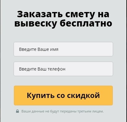
As in the following example - to order a quote and buy at a discount - what the f ... k! What to buy ??
Captcha on request form
Well, here, as it were, without comments)

Long text
Text "footcloths" about yourself favorite leave for articles in the newspaper "Gudok". On the landing page of the outpourings about the multi-stage production process, the improvement of production operations and a huge accumulated experience, no one is interested in anyone but you (and this is questionable).

If you have already decided to give facts about the company, do it briefly, with benefits in the client's world, like this:
Direct methods
There are nothing wrong in the Directive chips called “Order!”, “Come in!”, “PUSH!” While they work in advertisements. On the landing page, this is the same as appearing in flip-flops and shorts at the president’s reception.
Guess three times what these comrades sell:

Horrible images
About 100,000 words were written about stock photos without us, and we noticed one interesting “trick”: to adjust the size of the images to fit the template, as a result, models with cropped heads come out. In the photo with the product it looks awful:
Instead of conclusion
We continue the ruthless analysis of the landing pages in our community VKontakte . Throw links to your landing pages (if you are not afraid, of course), participate in discussions.
Source: https://habr.com/ru/post/300776/
All Articles