25 tips to improve your mobile applications and sites (part 2 of 2)

The second part of the article is a detailed guide on usability of mobile interfaces of sites and applications from two UX-ers from Google. Be sure to read to everyone who is thinking about creating a high-quality interface for mobile phones.
')
In order to fully grasp this useful material, please start reading from the first part which was published yesterday.
Sincerely yours team complete operator Yambox.
( Yambox - all logistics for an online store at your price.)
Chapter 3 Verification and Payment.
A record number of buyers are turning to their smartphones to search for products. But are these users ready to place an order on their mobile device? Use these guidelines to help customers place an order through the phone on the go.
14. Allow shoppers to continue shopping after adding items to cart
After users add a product to the cart, some sellers try to force them to proceed to checkout. Instead of providing feedback to confirm that this item has been added to the cart and allow users to continue shopping. This is also a good opportunity to resort to accompanying sales (see previous paragraph)
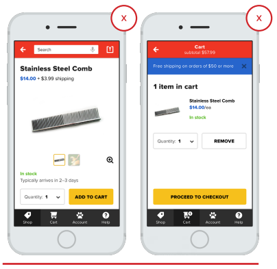
- “ADD TO BASKET” BUTTON SENTS USER TO BASKET, requiring additional unnecessary steps to be taken, if the client so desires, continue shopping
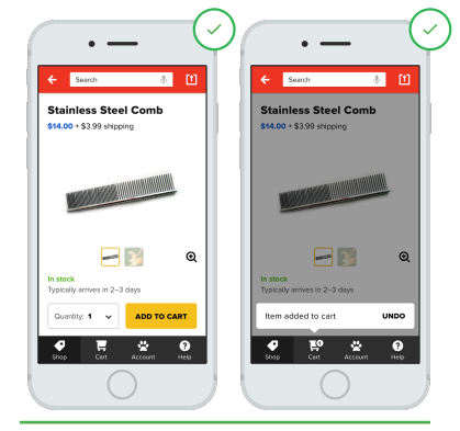
+ The item has been added to the cart, but the user can continue shopping.
15. Allow shoppers to make changes in the cart.
The seller must allow the buyer to add or remove items from the cart. If, suddenly, the buyer mistakenly added the wrong product or in the wrong quantity, and removing it from the basket will be difficult, the buyer may begin to get annoyed and just leave your site without making a purchase.

- The user is forced to go back and re-fill the basket.
+ After reviewing the details of the order and seeing the error, the buyer can easily make changes.
16. Promotions, special offers and discount coupons
Avoid losing customers who have yet to make a purchase, providing them with special offers and other discounts that can be used immediately when placing an order. If users have to hunt for promotions and special offers, they can stop using mobile apps by returning to their old way of shopping.
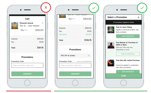
- I can’t see promotional codes without leaving the page, and this search increases the likelihood that users will leave the app or website.
+ Special offers are in the contextual, row at the top, and can be easily applied when placing an order.
17. Let the buyer shop on the site as a guest.
Users making purchases for the first time on your site and in your application may prefer to do this without registering as a guest without filling out long lists with information about themselves. Creating a full profile where the buyer can track the delivery, get special offers, it is better to offer him after the order is made
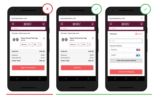
- Pushing the user to fill in their personal data can be an obstacle to the dialogue between you.
+ The possibility of ordering as a guest does not annoy the buyer and gives him a sense of greater control over the situation.
18. Show the user that the payment process in your store is protected.
Users are more than aware of data leakage in the payment process, and they contact the seller to reassure that their personal data will be transmitted in a reliable way. Make sure your site or application is secure by following modern security practices (for example, HTTPS and password encryption) and providing a visual security indicator. Applications and mobile sites without a security indicator allow users to think, and even change their mind to place an order through your application.
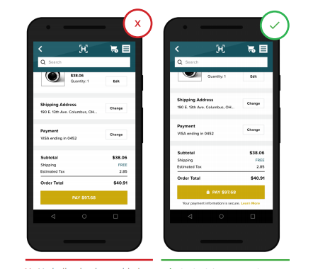
- There is no indication of whether the processing of personal data will be safe.
+ The information security lock icon, as well as the ability to learn more about security, provides the customer with the confidence that all his data is strictly confidential.
19. Provide the buyer with several payment options to choose from.
Users expect to see several options of payment systems to choose from. Applications and mobile sites that provide these payment options, such as PayPal, Apple Pay and Android Pay, free the user from wasting time filling out additional forms of payment, and can also provide greater trust from the buyer.
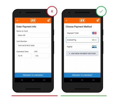
- Users are limited to one method of payment.
+ Offers several payment methods that give the user a choice and a sense of control over the situation.
20. Provide the buyer with all information about his order after the completion of the purchase.
Buyers want to be sure that they did not make any mistakes when placing an order. Provide them with a detailed transaction and any other information that the buyer may need after placing the order. And then let them correct any mistakes, while providing clear recommendations on how to do this after purchase.
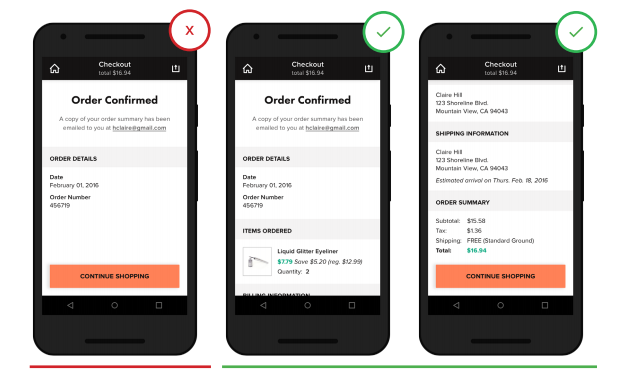
- Lack of information on the order after its execution leads to confusion and distrust of the buyer.
+ All items on order are provided to the buyer immediately after making a purchase.
Chapter 4. Shopping in pleasure.
When a consumer turns to shopping for devices, they expect to get easy and enjoyable shopping. Do your best to make your customers enjoy online shopping.
21. Create customer-friendly form filling.
The forms must be compatible with the perception of the buyer. Create a design with which your application can adapt to different mobile devices of the user. In addition, make sure that the form fields to fill out are not clogged with an interface such as, for example, a keyboard. As the user fills out the form, it can automatically change to the following. You can also enable auto-complete and credit card scanning.
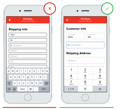
- Each time the user has to call the keyboard with a key.
+ The corresponding numeric keypad is automatically provided for those fields that require entering numbers or letters.
22. Make customer identification on the website quick and easy.
Users are extremely annoyed if they have to go through a difficult and multitasking process when resetting or resetting a password. Reduce the risk of failure to purchase by simplifying password identification.
Minimize the number of steps required for identification (for example, use a fingerprint input or log in through a third-party site)
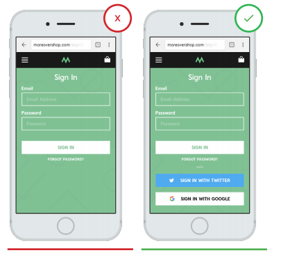
- The registration restriction makes you spend extra time on the buyer and once again fill out the registration form.
+ The user is given a choice of access through third-party sites where he is already registered, which saves him time and leads to fewer errors.
23. Request data in the context of the situation.
Users can stop ordering by refusing to give permission to access their data, not knowing why. This can be avoided not only by asking permission, but also explaining in the context of the situation what it is for. Users are much more willing to give permission in the corresponding task.
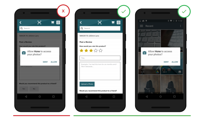
- The user is prompted to provide access to the photo in the context of no relation to the current task.
+ The user is asked to allow access to his photo in the context of the relevant task (upload photos for customer reviews).
24. Locate customer support information in a convenient and accessible location on the screen.
People tend to look at the bottom of a site or application for help, and they can opt out of shopping if they have a question, but they don’t find an obvious way to contact customer support. Providing customer support by phone or email is a good option, because it provides the customer with the opportunity to get an answer to his question.
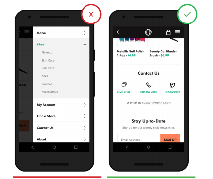
- Access to customer support information is hidden under the secondary user interface.
+ Three options for communication with customer support allows the buyer to choose the most convenient.
25. Show additional advantages.
Sellers who offer any additional benefits, such as free shipping or a discount, should broadcast this information in various parts of the site or application and as often as possible. Pay particular attention to whether such information pops up on the user's screen each time.
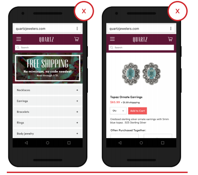
- Promotional action for free delivery pops up only on the first page of the application, the buyer can simply forget about this information.

+ Promotional offer highlighted and is in the buyer's eye during the entire purchase process.
Subscribe to our blog, there will be many more interesting things. :-)
( “Yambox” is the first complete operator that works with you at your price.)
Source: https://habr.com/ru/post/300248/
All Articles