25 Tips for Improving Your Mobile Applications and Websites (Part 1 of 2)

Very detailed guide on usability of mobile interfaces of sites and applications from two UX-ers from Google. Be sure to read to everyone who is thinking about creating a high-quality interface for mobile phones.
')
We continue to publish useful educational materials. I think it makes no sense to talk about how this wonderful guide on creating mobile interfaces is useful, so I’ll just leave it here. The material is too long so we had the audacity to break it into 2 parts. The second post tomorrow.
Sincerely yours team complete operator Yambox.
( Yambox - all logistics for an online store at your price.)
Introduction
When mobile technologies work well and smoothly, consumers are more likely to make purchases through a convenient mobile application. Let's review 25 useful tips for improving your mobile app.
In those moments when you want to find out something, go somewhere, do something or buy something, people increasingly turn to their smartphones and get the necessary information immediately.
When it comes to shopping, users want the mobile application to work immediately and smoothly, and the search query is relevant.
According to the latest data from Google Analytics, 30% of all sales in online stores now occur through a mobile application. In order to meet the needs and expectations of today's omnichannel buyers, sellers must change and improve their experience in mobile technology.
In order to help mobile applications, websites and companies to understand what the best mobile trends should include, we tested more than 100 people, 50 different applications, and as a result we received the 25 most important principles for creating the perfect mobile application.
Let the user be the most important actor of your application, create not only stylish, but also a convenient design for him
We looked at the behavior and users of applications, and users of mobile sites, carefully tracking their various activities: product search, navigation, research of the product page and the completion of the purchase when placing an order.
The results of the study clarified the following: the design and structure of applications and mobile sites should focus on meeting the needs of consumers and supporting them throughout their stay in this application. After the survey, it became apparent that there were several points in the process from the beginning of the search for a product to its purchase, when consumers are disappointed and tired. Sometimes this is because they are asked to register, although at the same time they have not received anything from the application that could satisfy them in their own request.
Often this is due to poor visual feedback and a lack of information about the product, as well as due to uncomfortable payment methods offered by the application.
The study also stresses the importance of usability, the need not to reduce it, since the Internet is developing every second. The good news is that companies are finding new ways to make the shopping process seamless for their customers. This is to improve the application interface, provide location services, and allow users to pay for purchases using third-party payment programs or by scanning credit cards.
New innovations in mobile e-commerce can help attract users and make the buying process a pleasure.
So, we have divided 25 tips into 4 categories: research and search, product information and review, payments and shopping in pleasure.
Chapter 1. Research and Search
The very first experience of the buyer with your mobile application should be good, so that the client wants to return to you again. First, remove all barriers that hinder you. Keep buyers interested in downloading the very first page. Do everything possible so that the client does not need to contact the support service.
1. Make sure your application loads correctly.
The expectations of users of mobile applications are high. Many users use mobile applications outside the home and outside the convenient workplace, so they often lack the patience for apps and mobile sites that load very slowly.
Your application must be high-speed. Use quick testing tools to understand where improvements can be made, how to increase productivity and reduce application size.
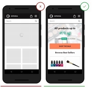
- Slow loading annoys users and risks losing their attention.
+ Fast download allows the buyer to focus on the product that he wants to buy, rather than on an empty wait
2. Before asking the user to register, give him a clear opportunity to understand what application he is in and what product you are selling.
Often, users leave the application, which asks them to immediately provide personal information, unless this is compensated immediately (for example, ordering a taxi or takeaway). In particular, low-brand or low-priced brand applications.
Ask the user to register only if it is really necessary.
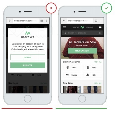
- The requirement to register in advance creates a huge obstacle to using the application
+ The page to attract attention does not force the user to enter their personal data
3. Speak the same language with your customers.
Unknown terms or phrases will increase the load on the perception of information by the user. When calls to action are expressed in any specific terms on a brand, users may become confused. Clear communication and functionality should always take precedence.
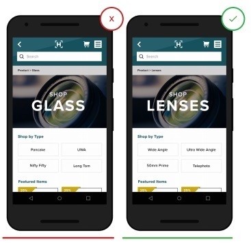
- Non-traditional terminology can
confuse users and discourage understanding
+ Clear terminology, freed from unnecessary jargon, to avoid misunderstanding by the client
4. Use an effective search classification.
Make sure the search query is user-friendly and fulfills its function. Given the frequency with which users rely on the search function to perform specific tasks, they expect that the search in your application works no worse than Google. Some useful features may include automatic spelling corrections, single-word word recognition, predictive text input, and purchase offers while the user is still entering text. These tools can reduce the likelihood of user error. They will also help speed up the search process and bring you to the user.
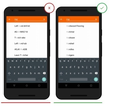
- Inefficient search classification provides inaccurate search
+ High quality search classification allows users to get accurate and effective results.
5. Do not force users to download your mobile application.
People are hesitant to download applications from companies with which they are not familiar. Various promotions that require users to download your application constitute a barrier to the user. Providing useful and interesting information in your mobile application is the best way to encourage users to refuse to download, but at the same time fully interact with your application. If you really want to offer a discount or promotion, use pop-up banners that can be easily scrolled down or closed.
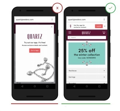
- Terminates the user, forcing him to download the application, which often leads to the client leaving the site.
+ Subtle hints and reminders about the ability to download an application give the user more freedom of choice.
Chapter 2. Product Overview.
The ability to easily see and understand product information is crucial for users when they make the decision: to buy or not to buy this product. This or that product page design can encourage a customer to change their opinion.
6. Provide a detailed product description.
Users appreciate when the seller shows all the available information on the product: availability, size, choice of colors, description, photo, video and so on. Fill your application with all the details and descriptions that the buyer will easily and intuitively understand.
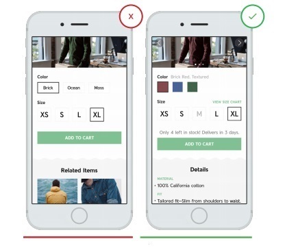
- Lack of detail in the product description leads to customer frustration and disappointment (in this case it is not clear which sizes can be ordered and whether this item is available)
+ Details allow the buyer to quickly understand the details of the purchase (the user sees that the size m is over)
7 Allow the user to control the level of approximation / removal of goods in the photo.
Users want to control the level of approximation and removal of goods in the photo at the moment when they look at the image. Very often, the annoying factor is the given level of increase. In particular, in the pictures below we see cases when such a deliberate increase forces you to look only at a certain part of the object and does not allow it to be perceived as it really is. When you give the user complete control and freedom in approaching and removing, he can view the goods from any desired angle.
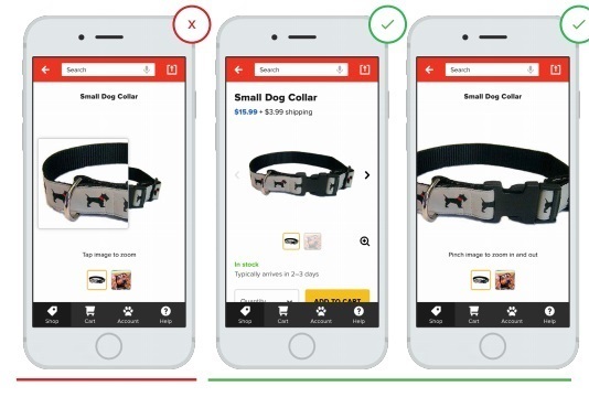
- A partial increase in the subject limits our perception and deceives the waiting.
+ v zone of approach and removal under control.
8. Show your users how much they save on discount goods.
In order to maximally advertise your product, make sure that you specify 2 costs: full, for comparison, and at a discount, show the customer how much it saves.
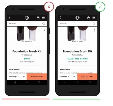
- The meaning of the discount is lost, since there is no initial price of the product
+ Now it is absolutely clear to the user what price was up to the discount and how much he saved as a result.
9. Show product availability on the pages of your online store.
Having a product in a store is a key factor for a customer who wants to pick up a product in a particular store. Allow your users to easily select their preferred store and see if the product is currently available.
A common mistake is an indifferent attitude to the location of the buyer and not providing him with the choice of shop.
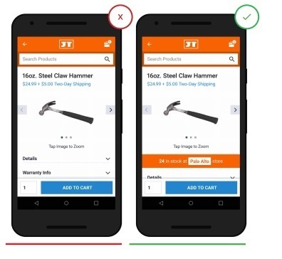
- The page does not show which store the item is in stock.
+ Users can easily check whether the product is located in the store that is more convenient for them geographically
10. Shipping cost and its terms on the application page
Users expect to see the cost of delivery and its terms, and are interested in making it known as soon as possible. When users buy something, they often estimate delivery costs based on the speed at which they can get the goods. Now many are waiting for free, expedited shipping.
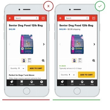
- Lack of information on delivery forces users to search for it on other pages, diverting their attention to other sites
+ Open information on the availability and cost of delivery allows the user to instantly make their choice
11. Let the customer view and filter reviews from other users.
User feedback is an important component of the purchase decision. A large number of reviews gives potential buyers more confidence in your company. Aggregate rating distributions allow users to sort reviews so that they can get a “real story” about a product. Let the buyer see the latest, most positive and most negative reviews.
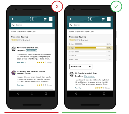
- The ability to filter reviews is hidden or excluded.
+ Filters and sorting by reviews included.
12. The system of votes, ratings and reviews created by the client.
Mass user feedback, such as photos, questions and answers, or aggregated data (for example, a detailed response on clothing sizes), helps users find answers to questions about those product details that cannot be found on the application page. Buyers find this information equally useful, if not better, compared to consulting a sales assistant in a store.
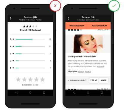
- The lack of content created by the buyer does not give him an understanding of the full picture of the product, its benefits and quality.
+ Information created by the buyer provides additional perspectives that will help buyers make their choice.
13. Accompanying sales
Accompanying sales are a tool for offering the buyer similar goods and accessories. It is most often used when a company sells products that are similar in use, as well as additions to a product that significantly expand its use.
When users think about whether to add some more goods to the cart, and then relevant recommendations appear, this is very useful and convenient.
Recommendations for adding a product can be on a page, in a shopping cart, or while checking a complete order before shipping.
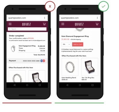
- Recommendations for the purchase in this example are absolutely ineffective, since the order has already been made and payment has been made.
+ Recommendations on a suitable product are very conveniently highlighted before the order is placed.
Subscribe and do not get lost tomorrow will be the second part of the article and many more interesting things.
( “Yambox” is the first complete operator that works with you at your price.)
Source: https://habr.com/ru/post/300242/
All Articles