As we have a logo for 300 rubles worldwide ordered
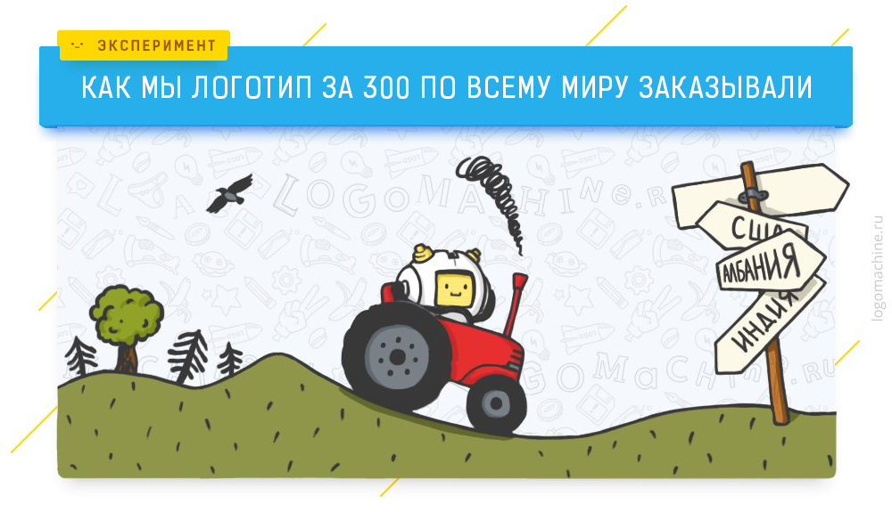
At the beginning of the year we decided to conduct an experiment - order an inexpensive logo from designers from different countries. Subscribers of Logo Machine in Kontakte helped to invent a fictional company for this - the boutique of the elite hand-made clothing “ROKK EBOL”. For designers, this is a sacred phrase:
')
Our comic experiment pursued several goals - to understand the mistakes of novice designers, to see the difference in design from different countries, to obtain the optimal result with a minimum budget. We evaluated the result based on our expert opinion and on the reaction of subscribers in Vkontakte. A wide audience usually evaluates the logo subjectively, from the “like / dislike” position. Designers look at the logo more objectively.
In simple terms, the result of the designer’s work consists of two parts - graphic and semantic. In the graphic part there should be no errors in the composition, color, font and typography. In addition, graphics should work on the semantic part. The meaning of the logo is not a hidden meaning, as many believe, the logo is not a rebus. Logo development pursues a specific goal, solves the problem, for example: emphasize the strengths of the product, stand out among competitors or vice versa, take a place in their row, show loyalty to traditions, etc. Most consider that the logo should be recognizable, original, memorable, unique , but it is not, it all depends on the task. About this - in the following articles (do not forget to subscribe, if you are interested), and now we will return to the logos for 300 rubles.
Problems of novice designers
All designers from whom we ordered a logo, regardless of the country, made a few mistakes.
The first problem arose at the stage of receiving the task. The freelance designer is forced to perform the functions of a manager who learns the task from the customer. Logoshin has been working on improving this process for several years - in order to offer the customer the best solution, it is very important to understand all the nuances at the start. It’s not at all easy - the client does not have to know what he wants, he doesn’t even always understand why he needs a logo. If you work with the customer via the Internet, you need a correct list of questions that will clarify the task.
For example, the logo always works in conjunction with the project name. Development of a logo for a taxi "Kopeechka" or "VIP-taxi" - obviously, different tasks. All foreign designers fell into our trap - none of them clarified what the mysterious name of our boutique “ROKK EBOL” means.

The second mistake, which almost always occurs in novice designers, is that fear is too easy to make. Because of this, in the logo appear several types of fonts, highlights, fills and other decorations. A beginner designer is very afraid to hear from the client “I can do this myself in the paint, for which I paid ?!”. Although in five minutes you can make, for example, the Nike logo, and many other great logos - elapsed time, this is not an indicator of success. Of course, not all tasks can be solved with minimalistic graphics, but you should not spoil the logo in order to impress the client.
The third problem is akin to the first - the designers not only did not recognize the meaning of the name of our fictional company, but also did not ask a few key questions. For example, no one asked where we will use the logo. Usually the customer has a clear need - to make a sign, place a logo on the site, on branded cars, staff uniform, etc. And if the main carrier, for example, the board of a bus, this is an important criterion when designing a logo.
These are standard problems for novice designers. Log machine also went through many of them, and some still arise. In general, these problems are solved by focusing on the task - why we make a logo. Not for the sake of getting rid of the customer quickly, but for the success of the product on the market and the correct perception from the audience. About this, again, in the following articles, and now let's move on to the options.
Three options from India
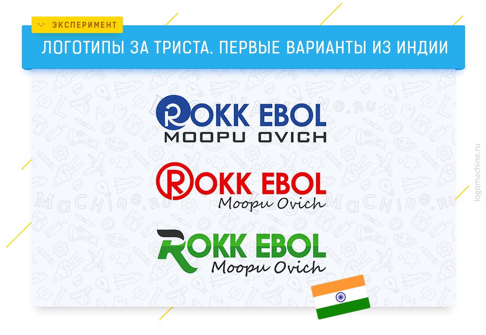
A designer from India offered three types of font logo at once. The main drawback is inattentive handling of the font. Upper-case need to be defused and it is not clear why the handwritten font is used - perhaps to emphasize that our clothes are handmade. Then it was worth making the main part of the sign handwritten - now they are arguing with the slogan for the right to be the first to catch the eye of the viewer.
Two options from the USA
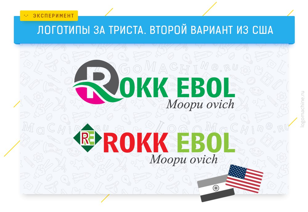
These options have a similar problem - inaccuracy. Certain parts of the logo badly rhyme and there is a craving for embellishment - how did the fuchsia color appear in the first version? Although it could make an interesting emblem in the form of the letter R, which would work on the memorability of the name "ROKK EBOL".
Two options from Bangladesh
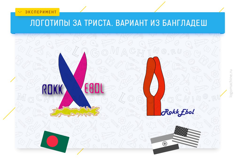
The designer tried to make expressive logo. I think most understand what the problems of these options. Positive aspects are originality and the author's vision, which, unfortunately, does not draw out weak graphics and incomprehensible, at least in our country, metaphors (in the second version, for example, the designer imitated fingers). Judging by the reaction of Logomashin's subscribers, the majority sees surfboards and kissing worms.
Option from Serbia

A Serbian designer hits the forehead - depicts a label with clothes, which is highly undesirable to do when working with "elite" brands (and ROKK EBOL is undoubtedly a well-known and expensive brand). Roughly speaking, when a client searches for plumbing and opens the first 10 sites in Yandex, a logo with a pipe and a key will help you make the right choice. But when he chooses which supercar to spend an extra million dollars, we don’t need to draw a car on the car badge - this will not make our sports car better, rather the opposite. We can help horses, bulls, symbols of power, continuity and more. But more about that next time.
Two options from Pakistan
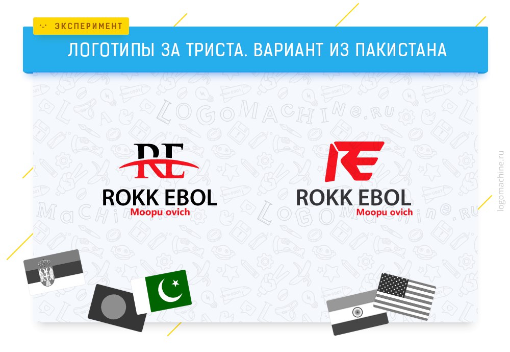
The difference between the first and second signs is striking - and there and there a trembling line, but the first composition is balanced and stable. This option is liked by many subscribers, but it soon turns out that the designer circled the stock logo.

The idea, of course, is not too complicated, and could come to two different people, but there’s obviously no borrowing, but a thoughtless stroke:

Variant from Germany
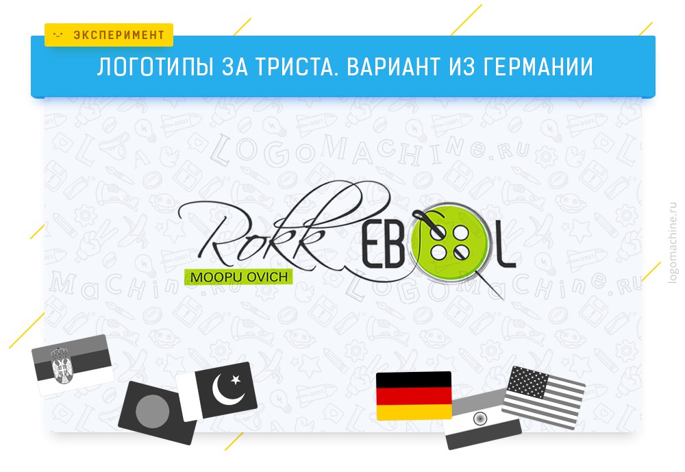
It can be seen that the designer tried - there is an idea with a thread, a button instead of the letter “o”, a pleasant color scheme. The problem is the same as that of the Serbian designer - this idea will suit the workshop for hemming of trousers, but not the boutique. The graphics are weak - the button casts a shadow, the eye of the needle is drawn in a hurry. Nevertheless, 27% of the two and a half thousand who participated in the survey voted for this option. The option stolen from the shutter stock did not participate in the survey.

What is the result
Of course, one doesn’t have to expect much from the logo for 300 rubles - the designer will be a beginner, and he will not pay much time to the project. We have plans to cooperate with novice designers from different countries, giving them the opportunity to learn, get a design profession through the Internet, and earn decent money working remotely in the Log Machine.
We didn’t see a big difference in design from different countries, except for Bangladesh. Subscribers wrote that the US version reflects the culture of the country, while German is of the highest quality, but it depends too much on the designer himself.
The best option in terms of graphics, oddly enough, was a circled logo from Shutterstock. Therefore, if you do not have a budget for the development of a logo, and tomorrow is a presentation before an investor, do not hesitate to buy a stock image - more often, the graphics will be an order of magnitude better than that of a novice designer. And when you raise a million dollars, choose a supercar with a horse on the logo and better understand the essence of your project, you can develop a professional corporate identity.
If you do not want to miss the next experiment, subscribe to the Log machine in Vkontakte (there are still many interesting things). Good luck to you and your projects!
Source: https://habr.com/ru/post/300186/
All Articles