Why I love ugly, sloppy interfaces - and you, probably, too
This is a translation of the original publication on the Signal vs. blog. Noise by authorship designer Jonas Downey.
Nice. Fresh. Clean. Plain. Minimalistic . These words have dominated the design environment lately. If you managed to skip them, then look at the review sites on Creativebloq. The word Beautiful is used 6 times, and Simple - 11 times. In one article.
Developers use these words to describe their values, goals, and results. They fill their portfolios and resumes with them. Non-designers also use them. They are everywhere.
If you're trendy, your website probably looks something like this:
')
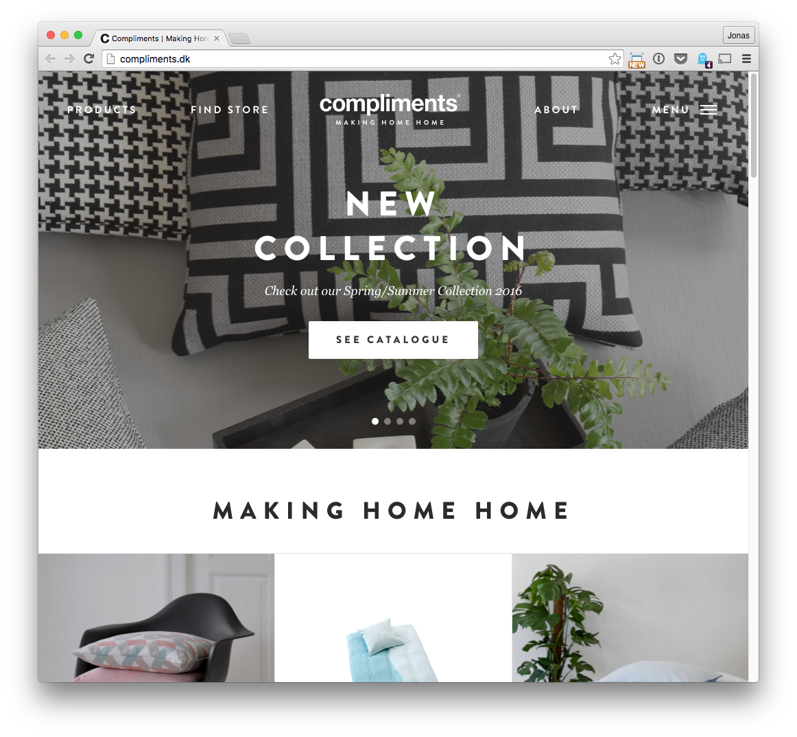
Such a design has become so commonplace that Beautiful and Clean are practically basic concepts for new projects.
And this makes sense! Everyone likes things that are easy to perceive and that look bright and stylish. No one needs an ugly and sloppy design.
Or still need?
An example of unsurpassed ugly design
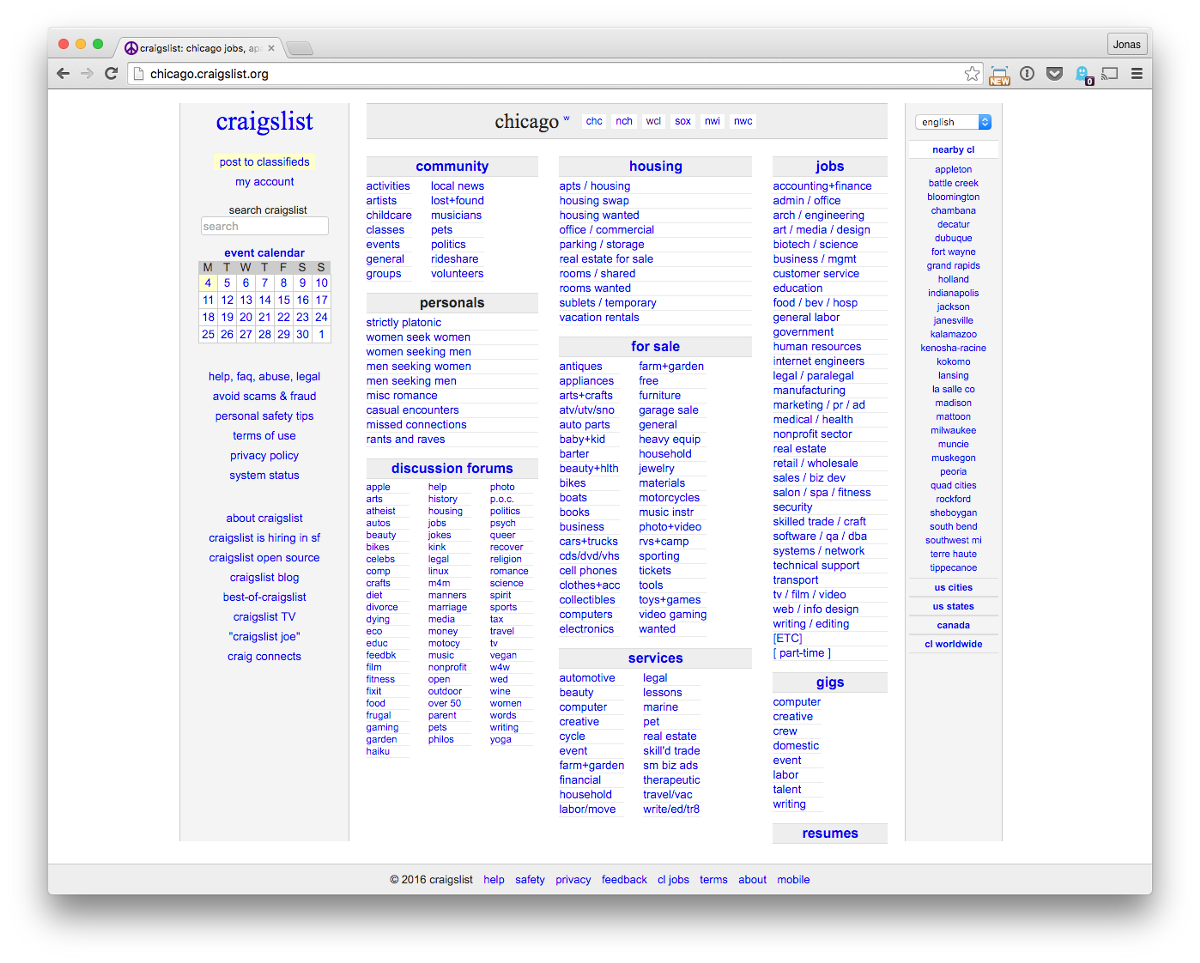
Here is an example of another, extremely popular, cumbersome design.

And this design 1.5 million people use every month

Wait a minute ... If Beauty, Freshness, Cleanliness, and Simplicity are so important, why has nobody replaced all these products with something better? And no, it's not about the lack of attempts. There are countless more simple and attractive competitors Craigslist and Photoshop.
Suppose your goal is to make a global network of trafficking between people. This is a big, complex project.
You could try to reduce your solution to the minimum version, cutting back on functionality and reducing the density of UI elements in the name of beauty and simplicity. Here is an attempt to redesign Craigslist. (Designers hate Craigslist, don't they? Is there another site for which so many unclaimed products are made?)

Craigslist redesign concept by Aurélien SALOMON
Or, you can decide that you really cannot remove functions, because it is more important to support all areas of work. (Remember that you must support a huge number of scenarios for this project.) Then beauty and simplicity instantly receive lower priority. Comes to the fore the desire to do something useful.
As another example, think about Photoshop. How many graphic designers who idolize Swiss Style (one of the founders of "Flat Design" - approx. Translation.) , Use Photoshop every day? Probably the most. However, Photoshop's user interface is the opposite of minimalism. But it doesn't matter at all, because people don’t come to Photoshop for UI inspiration. They use it to do the work.
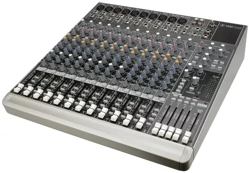
In other words, sometimes it’s not so great:
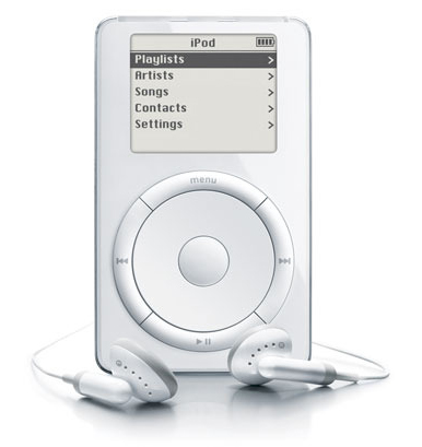
When in reality you need this:
I by no means suggest you go and start to clutter up the design of your site, or try to specifically make it repulsive. I also do not claim that the examples above cannot be improved.
I believe that there is no one correct way. There is no reason to believe that having a large number of links or text on a page, or dense placement of UI elements is definitely bad. This can be a great solution to a specific problem. Especially if it is a big, bearded problem.
Products that solve such big, bearded problems are lifebuoys in life. I like to use such products because they work damn well . Of course, it all seems like a growing mess. But that is why they work!
We do not have to pray all the time to the altar of beautiful minimalist design. Design should not be taken as a jewel.
Throw out your assumptions and build what works best.
Nice. Fresh. Clean. Plain. Minimalistic . These words have dominated the design environment lately. If you managed to skip them, then look at the review sites on Creativebloq. The word Beautiful is used 6 times, and Simple - 11 times. In one article.
Developers use these words to describe their values, goals, and results. They fill their portfolios and resumes with them. Non-designers also use them. They are everywhere.
If you're trendy, your website probably looks something like this:
')
Such a design has become so commonplace that Beautiful and Clean are practically basic concepts for new projects.
And this makes sense! Everyone likes things that are easy to perceive and that look bright and stylish. No one needs an ugly and sloppy design.
Or still need?
An example of unsurpassed ugly design
Here is an example of another, extremely popular, cumbersome design.
And this design 1.5 million people use every month
Wait a minute ... If Beauty, Freshness, Cleanliness, and Simplicity are so important, why has nobody replaced all these products with something better? And no, it's not about the lack of attempts. There are countless more simple and attractive competitors Craigslist and Photoshop.
The answer is that these products do an incredible job of solving the problems of their users, and their complex interfaces are one of the main reasons for their success.
Suppose your goal is to make a global network of trafficking between people. This is a big, complex project.
You could try to reduce your solution to the minimum version, cutting back on functionality and reducing the density of UI elements in the name of beauty and simplicity. Here is an attempt to redesign Craigslist. (Designers hate Craigslist, don't they? Is there another site for which so many unclaimed products are made?)
Craigslist redesign concept by Aurélien SALOMON
Or, you can decide that you really cannot remove functions, because it is more important to support all areas of work. (Remember that you must support a huge number of scenarios for this project.) Then beauty and simplicity instantly receive lower priority. Comes to the fore the desire to do something useful.
As another example, think about Photoshop. How many graphic designers who idolize Swiss Style (one of the founders of "Flat Design" - approx. Translation.) , Use Photoshop every day? Probably the most. However, Photoshop's user interface is the opposite of minimalism. But it doesn't matter at all, because people don’t come to Photoshop for UI inspiration. They use it to do the work.
In other words, sometimes it’s not so great:
When in reality you need this:
I by no means suggest you go and start to clutter up the design of your site, or try to specifically make it repulsive. I also do not claim that the examples above cannot be improved.
I believe that there is no one correct way. There is no reason to believe that having a large number of links or text on a page, or dense placement of UI elements is definitely bad. This can be a great solution to a specific problem. Especially if it is a big, bearded problem.
Products that solve such big, bearded problems are lifebuoys in life. I like to use such products because they work damn well . Of course, it all seems like a growing mess. But that is why they work!
We do not have to pray all the time to the altar of beautiful minimalist design. Design should not be taken as a jewel.
Throw out your assumptions and build what works best.
Source: https://habr.com/ru/post/300112/
All Articles