A / B testing for emails. 30 test ideas
The ability to generate brilliant and original ideas speaks of marketer talent. In email marketing, this ability is also much appreciated. The goal of the marketer in the email campaign is to develop ideas that will show the best result, that is, the maximum rate of discovery, clickability, as well as a high conversion rate.
But how to achieve this? Of course, to test, because the golden rule of professional marketing is testing all ideas, no matter how good, innovative, and maybe even revolutionary, they were not.
What is so important in A / V testing?
')
Often we have to deal with this situation: some letters successfully cope with their tasks, while others do not. One mailing has a good indicator of deliverability, a lot of discoveries, arouses interest in the reader, the conversion rate on the links is quite high. The other, at first glance, not much different in design and content from the first, does not bring such good results. In such a contradiction, a logical question arises: “Why? How to be sure that the email letter will bring the most return? "
To increase the effectiveness of mailing, A / B testing was invented, its other name is split testing. It helps to compare new and old letter components and choose a more efficient option.
With the help of A / V testing, you can test various ideas and find the most effective ones for your subscribers.
How to conduct A / V testing email distribution?
You can conduct it in your mailing list service. It will be quite easy to do this, as the services make it easier for the clients to work with the A / B test.
First you need to determine the parameter by which you will perform the test. For example, you can create two variants of a letter with different headers, images or text. Then you need to set the conditions for calculating the best option. These conditions may be as follows:
- Deliverability;
- Openability;
- Referrals;
- The number of unsubscribed subscribers.
Then you take option A, which was originally, and option B, with a modified email element. Choose 40% of the total base subscribers and divide them equally between options A and B. We start testing.
Upon completion of testing, we compare the results and send the letter with the highest metric indicators to the remaining number of subscribers (60%). The diagram below briefly conveys the meaning of A / B testing.

Many companies claim that this method is effective and can increase the number of clicks on the links in the letter. For example, Campaign Monitor was able to increase the discovery of its email campaign by 127%. They tested many of the components in the preparation of letters: headers and calls to action, templates.
How much time to test?
View statistics for previous campaigns. How did your letters open? If the majority of clicks occur in the first 24 hours, and in the following days they open 5% each, then it makes sense to limit the test to 24 hours.
Testing after one day does not make sense, since its effectiveness will be reduced to zero. But if you have a large enough user base and you did not manage to collect the desired results for the first day, you can extend the test and see what happens next.
What to test in email?
There are many components in the letter that need to be tested. In our article we will gladly share some of them. We have prepared for you 30 ready-made ideas for A / B testing your emails.
1. The name of the sender . The first thing the recipient of the letter pays attention to when opening his box is the sender's name. You can test it by changing the female and male names of employees or replacing them with the company name.
The design of the text and links
The text of your letter plays a big role in the perception of your newsletter information. It is necessary to determine its best font, size and location. If a person opens a newsletter, the first thing he pays attention to is the general visual image of the letter. And the text in this visual image plays a very important role. Therefore, test:
2. The subject of the letter . Here you should pay attention to the wording and length of the letter's subject: whether they are personalized or not, a question or statement, a call or a statement of fact, the number of signs used.
3. The text prehedera . This is the text that appears after the title (subject) of the letter. Give him great attention, because the text of the prehedera specifies the subject of the letter and convinces the subscriber to open the letter.

4. The font of the letter header and its size . After the A / B test, you decide whether to use large headers or not. After all, priority rules for titles does not exist. It all depends on your imagination and creativity. There is only a common standard in relation to the number of used fonts in a letter. To make the newsletter look readable and legible, use no more than three fonts in one letter. For example, one font for headings, another for the main text and the third for product descriptions.

5. Change the font of the main text.
6. Change the font description of the product.
The following types of fonts are used most often:
- Arial, Helvetica - related fonts, very simple, visually well perceived. They are displayed correctly in any postal services. Apple Mail and Gmail have chosen these fonts by default.
- Verdana - favorably affects the ease of reading because of its inter-letter space. Split testing will allow you to compare the effectiveness of fonts and choose the most suitable for your subscribers.

7. Text layout: one column, two or better three.

8. Use the list for text. Compare 2 letters: with a solid text and a list. In the list, the text looks organized, it's nice to read and easy to remember. But it is individual for each audience.

9. Number of links. What works best: a small number of links or more.
10. Type of links : test or graphic.
11. Tone of treatment . If you can't decide how to call your “you” or “you” subscriber, choose an official tone or a more informal one, test it. What is best for your audience will be decided by an A / B test.
12. Using the teaser in email . To interest the subscriber, you can use a cryptic message or photo, which will contain only a small part of the information and not reveal all the cards. Such letters will help create intrigue around a new service or product.

13. Ideas for content . If you decide, for example, to use the mailing "according to the weather", you need to check whether it works for your audience. Test every new idea, because you can not be 100% sure that it will interest your subscribers.

14. The limitation of time periods : "Instant sale!", "Only for 3 hours ...", "Hurry up to buy, it remains only ...". It is believed that a sense of urgency has a better effect on sales. Compare the regular newsletter and urgent mailing that will be more effective.
15. Price variations . Which wording is better: "10% discount" or "Save 1000 rubles."

Email design
16. The color scheme of the letter . Sometimes it is very difficult to predict what colors of mailing is suitable for your company. It has already been proven that colors affect consumers differently. Yellow is used to attract attention; red enhances heartbeat and creates an effect of urgency. One of the best is considered blue, because this color evokes a feeling of trust. Black is a symbol of authority and authority, sometimes it acts as a symbol of lux objects and pompous luxury. Learn more about color design and improve your newsletter.
Why not test the color of the email you would like to use, but still in doubt.

17. Adding additional items . These are elements such as arrows, icons, etc. They serve to highlight the most important fragments of the letter and attract the reader.
18. The allocation of prices by special blocks . How best to visually arrange prices, attract the attention of the audience and increase the CTR, you will be prompted by A / B testing.

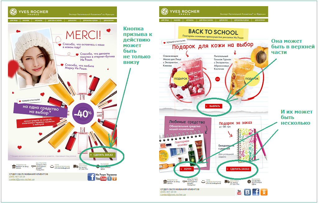
19. Location and number of calls to action . Often, the call-to-action buttons are at the bottom of the email list. You can test the location at the top. It is believed that there should not be too many calls to action so that the reader’s attention is not dissipated. You can try two or three CTA buttons if you previously used only one.
20. Full redesign . If you decide to change the graphic design of your email newsletter in whole or in part, you definitely need to test it in order to understand what is best for your audience.
Visual content
Any text is always supplemented with visual content. Use different visual tools, such as images, videos, animation, to enhance the text.
21. Variations of images of your product . Make a photo of the product from a different angle, in a different style and see what your reader likes more.
22. The number of photos in the newsletter . Sometimes it’s very difficult to decide how many products your reader will be interested in. You can talk about the benefits and characteristics of a single product, and you can talk about a whole line of products.
23. Size of products on images . You can add several small images, but then you will find that the reader does not see the details. A large image shows the product in all its glory. Popular marketer Neil Patel recommends using large detailed product images. So whether this is for your newsletter, determine using the A / B test.

As for the content of your letter, it is also very important to test it. Perhaps your audience prefers to view images in letters, or maybe watch videos.
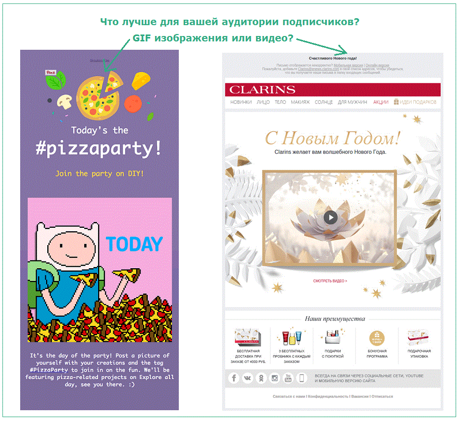
24. The use of videos. If you are not sure whether to use the video in your newsletters or not, test it. In the video message, you can show the presentation of the goods, place training material or simply congratulate the client on the holiday (see the example below).
25. Using GIF images. Using GIF animations in email newsletters is a delight. This is because the reader is already tired of static images, and the GIF speaker perfectly entertains, delights and introduces a special highlight. But not only. Often, GIF animations are used to make dynamic video previews. Flickering GIF frames cause the reader to see the full version of the video.
A few more ideas on what to test in the ezine:
26. Dispatch time. It is believed that the most suitable day for companies that advertise entertainment, is Friday, and for business letters is better on Tuesday, when a person is full of energy to break the new task. Try it and you test the time of sending your email newsletter.
27. Suggestions . In this case, you need to determine which offers your subscribers like to receive more: discounts, promotions, sales, bonuses, gifts, etc. Many people love discounts, but not the fact that your audience is waiting for just such an offer. Send a letter at a discount if metrics are not encouraging, just replace the offer.

28. Offer trial period services . For some audience it is very important to try first, whether your service will suit them or not. Therefore, if you can provide a free trial subscription for two weeks or a month, test how such a system works.

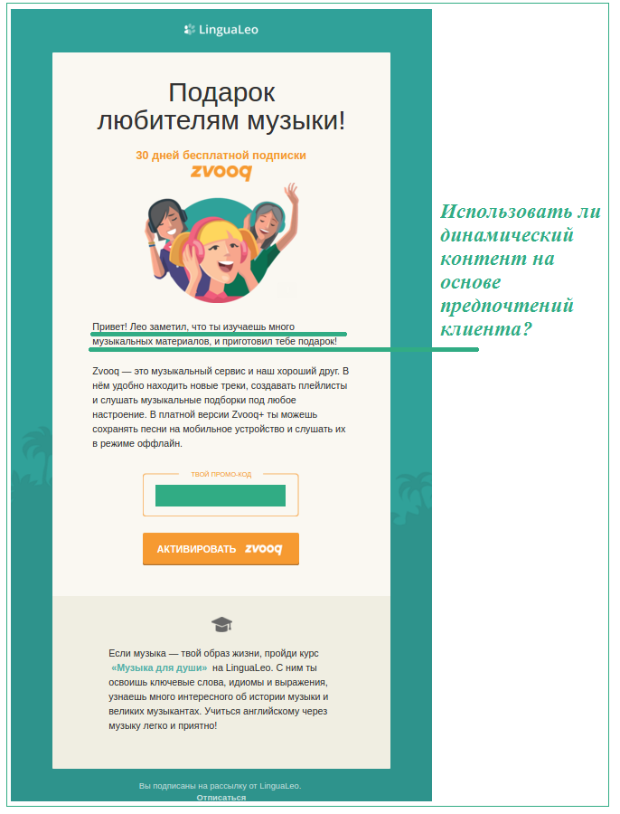
29. Dynamic content. Is it worth using this type of content in your newsletter, which changes depending on the gender of the addressee, on demographic aspects, and most importantly on the interests and preferences of subscribers? First test it. If you use dynamic content skillfully, then subscribers will be pleasantly surprised and will be satisfied with your newsletter.
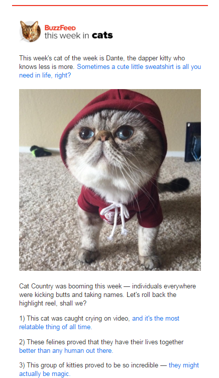
30. Use of humor. The online news magazine BuzzFeed is famous for its humorous newsletters, and it does it quite successfully. But if it works in your newsletter, show A / B test.
A / B testing is a good way to optimize your email messages, because there is no one right way to arrange a letter. The goal of the test is to help you understand what works best for your audience. We hope that our article will help you with the choice of ideas for split testing.
Source: https://habr.com/ru/post/299932/
All Articles