Why is simple online store better than complex
UPD : one important screenshot added (registration form)
This is the second article in the 11 Steps to a Good Online Store series. It is worth looking at the first one if you are interested in this topic.
')
Today we will discuss with examples how to make an online store simple, and why it will bring you more money faster.
It is assumed that the reader of this article either comes up with online shopping, or creates them, or owns or manages them.
The site should be simple, so that the buyer does not distract from the main task: to find the right product in your store and buy it as soon as possible. If he solves this problem successfully, he can be offered to buy something else.

Why is it bad to offer the buyer something before the desired purchase? It may turn out that the buyer will pay attention to advertising, be distracted from his goal, and as a result he may not have enough time to buy. Or he does not like something (for example, it turns out that the advertised product is too expensive, or the conditions of the action are unpleasant to him, or something else). Direct road from the entrance to the page with its goods and then to the payment of the basket - the most reliable way to increase sales.
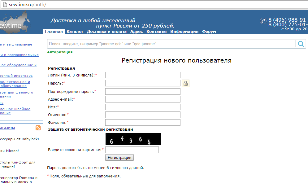
Any registration, separate from the purchase process - is difficult. Take, for example, this form from the site of a pretty good store sewtime.ru, where I bought an ironing board and a sewing machine. Think once bought - a good site? Nothing like that: if I have the opportunity to buy the same thing on another site, I will do it with pleasure, just sewtime sometimes sells something that cannot be found anywhere else, or offers the best price on Yandex.Market.
I will tell you about the sales strategy for unique products and work with the Market separately, now I will show what is simple and what is difficult.
Here is the complex form:
But a complicated form of password recovery on the same site:

In this form, superfluous - almost everything. It would be enough one line with the password request and the "OK" button.
How to make registration simple?
1) Username is always his e-mail, separate names are not needed.
2) No user codes need to be shown. To change the password, it is enough to request a password change, the link to the replacement page will come to his e-mail.
3) Remove technical terms from user pages. A person who buys a sewing machine may not know what “Authorization” is (especially since “Login” means here, and entering a name and password when entering the site is usually needed for authentication, not authorization; in comments we can arrange a heated discussion of how one differs from another.
Avoid technically and politically illiterate decisions. In particular:
1) Never store passwords of your users in the clear. Be sure to encrypt them!
2) Corollary to paragraph 1 - never send passwords to customers by mail. Your site does not have the right to know the password, and the more you can not send it by mail!
3) Never ask the user to enter data that you do not really need. If you ask too much, be sure to think of a useful reason for the client. For example, you want to know the client's birthday? Indicate directly in the registration form that you give him a discount on his birthday. If you promise that you are giving a discount, do you have to give it? Is it a pity for money or not to come up with something useful in exchange for customer data? Do not ask him to report too much about yourself!
Take for granted that you can be deceived with any data that you cannot verify with an independent source - there are many people who avoid giving out their real name, address and passport data. Believe: it is their right. They want to buy a sewing machine or a book from you, not a Saiga carbine, so the law and common sense do not forbid them to hide their data from you.
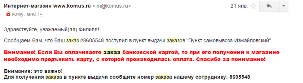
Another store gives an example of how NOT to do: in a letter to the customer, the store requires an uncomfortable action. It is particularly funny that when I come to this store to pick up my order, no one asks me to show a card. I do not know why: whether the sellers understand that this requirement is nonsense, or they do not know that they must demand a card.
In order not to require unnecessary actions from the buyer (“Submit a passport”, “present the card”, “the recipient of the goods must match the cardholder”, etc.), just trust him. An adult ordered goods delivered to the reception of the business center? This is his right. The task of the store is to deliver the goods, where it is said. Goods after this lost? The store has nothing to do with it. So that there is no doubt that the goods have been delivered, ask the receiving person to sign and clearly write his last name.
Requiring the buyer to personally meet the courier or say exactly who will meet him is a harmful excess. Even at home, I do not know exactly who will receive the parcel from the store - my mother, wife or daughter. To guarantee that the company’s employee will be at the company’s reception too, too: the person who usually sits there may suddenly get sick, go to the toilet or for lunch, and anyone can change it, including the security chief who happened to be nearby.
By the way, the stupid requirements of “presenting a passport upon receipt of goods” are also found in more well-known stores, for example, “Ozone” often suffers from this. Despite the formal obligation to do this, I never do it, because Ozon couriers come to our office dozens of times a week, they know the staff at the reception as relatives, and are sure that the package will reach the addressee, even if brought in early in the morning or late in the evening: practice says that it always happens.
I conjure all owners of online stores: stop demanding upon receipt of the goods passport details and the card with which the customer paid! For reference: I refused the services of two transport companies only because they insisted on receiving the goods with a passport in person.
Once again: if the goods are paid for and delivered to the address indicated by the payer, it doesn’t matter who received it. The payer is responsible for ensuring that the recipient is the one he trusts.
Anyone who has ever tried to arrange delivery to their customers knows how many difficulties can be encountered along the way. However, these difficulties can not be shifted to the buyer . The store should have a maximum of three delivery methods - courier, pickup, mail (pickup can be from your warehouse, and from an intermediate point of delivery).
In the minimal case, one way is acceptable - courier. The options "only mail" or "only self-pickup" are suitable only for rare categories of goods and, in general, can greatly limit the range of your customers.
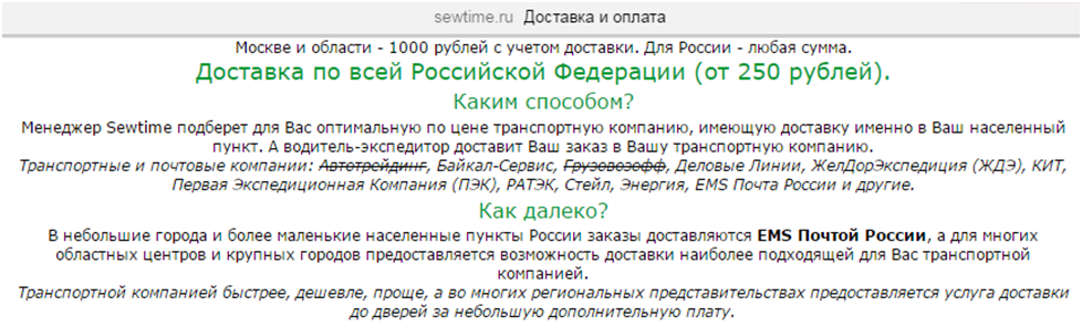
Just take a look: in the fall of 2015, the sewtime.ru store had more than 30 delivery options. Unfortunately, without a real order, all these methods now cannot be seen, but at the stage of choosing the method of delivery I really am not joking! - offered a choice of 30 delivery offices, for each of which only the name and price of delivery of my package were indicated. Prices varied from 250 rubles. up to 8000 rubles (the last option is in case I’ve lost my mind and ordered the delivery of the ironing board from DHL).
Meanwhile, the desire of the store owner to give me a convenient choice is not so difficult to implement: instead of the names of delivery services, among which I can only find the cheapest or most familiar one, you can offer a choice by a set of parameters: “door to door” or “to the warehouse” delivery. my city "," cheaper than 1000 rubles. "," It is necessary to show a passport or not, "and offer to choose the date and time of delivery.
Yes, it is not easy to make a simple website for a client: it is more difficult to create, design and program delivery choices than simply giving a client a list of unfamiliar services without comments. However, this will make it less annoying and more pleasing to the client, and he will advise your site to friends. Believe me, this gives a conversion no worse than Yandex.Direct :)
In the case of thirty delivery services, both the customer and the store lost time: I chose some service, but the store manager called me and asked if I was sure of my choice (this is a defective business process, but due to the difficult choice this step is inevitable). I asked what was wrong with my choice, and the manager said that I chose a service that delivers goods only to a warehouse in my city, where I can go almost longer than to a seller in another city (yes, “Sapsan” from Petersburg to Moscow sometimes goes faster than a car from one end of the city to the other).
When I was outraged by such a turn of events, the manager offered me another service, which for about the same money would bring me the goods home. I agreed, but after 5 minutes the manager called me back (you noticed that the store was losing money on every phone call - this was all long distance calls) and asked for my passport number. I refused to inform him, because the manager was going to share it with the courier service, which did not even sign any obligations to store personal data, so that I could immediately go and sell my passport data to those who wanted it. However, it turned out that this service does not deliver the goods without passport data provided in advance, and I had to select another service that costs another 100 rubles. more expensive, but it makes everything convenient.
Note: the store (a) spent my time (I am not happy), (b) spent the time of my manager (and paid him a salary for this time), (c) paid the telephone company for the negotiations.
If the site had gone without a list of delivery services, and the site was choosing a service, the cost of sales would be lower, the product could have been sold cheaper than its competitors, and this would lead more people from Yandex.Market and increase profits.
Have you noticed that the store we just talked about took me (for delivery) more money efficiently and without any resistance from me than I originally planned? This happened because I had already decided to buy the goods there, spent the time communicating with the manager, and I’m sorry to start all over again at another store. This effect should be used wisely, and then it will be possible to earn more by ourselves, and not just give to earn more expensive delivery services.
If a customer buys a product that costs, say, 6,000 rubles, then is it important to him that the delivery costs 350 rubles or 400? Let's face it: no! And 400 or 800? Yes! What's the difference? In that, as 350, and 400 is about as much as courier services in a big city should cost. Anyone can try the situation on themselves and agree that he will not agree to go through half the city for 100 rubles, and for 400 rubles, wherever he goes.
If the average price of any courier delivery is 400 rubles, you can safely ask for that much. Do you have a contract with a courier service that delivers cheaper? Great, put the difference in your pocket and set aside a little for the future: if the current couriers become impolite or sloppy, you can hire others for the money you have accumulated.
A good example of lost profits is my favorite site hvalwaters.ru. In Petersburg, they deliver water, which many of my friends consider the only decent water to taste in the city, and the delivery itself is fine-tuned to the smallest detail and works practically without failures. Do you know at what price they delivered 19-liter bottles in the city in 2013-2015? 150 rubles apiece. Then, it seems, they raised the price to 175, and only now they came to the price of 200 rubles. Considering that retail customers order water about once a month, customers would not even notice if the price was immediately 200.
Round prices, especially when paying in cash. This allows you to make discounts as well (“The price of a bottle is 200 rubles, for holders of Visa and Mastercard cards a special price is 199 rubles”). But when calculating cash, the price of 199 rubles is stupid: anyway, the courier will be given 200 rubles, of course there will be no surrender, and this is a trifle, but the sediment will remain.
Avoid inconvenient prices, illogical discounts and couriers that make your product more expensive (with advantage for your pocket).
Minimize voice communication. Do not spam. Order confirmation is enough to do once by SMS or e-mail. Call only if you have questions.
Some stores (for example, Media Markt) send messages every time the order status changes in their internal system. This is completely unnecessary: the buyer doesn’t care that his order was handed over to the manager, completed or sent to the warehouse. The buyer needs to know whether his order is accepted and whether it will be delivered on the promised date.
Some shops, on the contrary, are too silent: for example, I myself had to call the laf24.com store to find out whether my order was accepted, whether it would be delivered within a specified time, and when it was not delivered (although they promised) to find out when it will be delivered.
Alas, not a single store sends notifications about delays, and this could be important for shaping the image of a responsible supplier: if something cannot be brought on time, you should sit silently and wait for the upset customer to call and send him a message about the problem and the new delivery date.
Remember: a call to a store customer should be an exceptional case. The ideal option is the only call: confirmation from the courier that in an hour he will be in place. All other topics for a call should be taboo, because they are not urgent and can be replaced by SMS or e-mail.
An example of how NOT to: an operator from the Yokot store calls to report the monthly burnout of bonuses. This is VERY annoying. I understand that this “ingenious” move was invented so that customers buy more often in this store. Believe me: a customer who is cut off from business in the middle of the day with a bell is the worst creature to believe that he urgently needs to buy dog food. Irritation from such calls overpowers laziness to call on the way home to another store (the good of competitors is enough). And would write letters or SMS - it would be better for both the client and the store.
Moreover: knowing that my next purchase in Yokot could be cheaper, but the damned bonuses burned out and would not be cheaper, it increases the negative in relation to the store even more. And despite the fact that the quality of goods and prices in it are quite reasonable, I now deliberately avoid purchases in it. Even if I spend 200-300 rubles per month to his competitors, I value my nerves more.
Of course, to offer related products is also important. You just have to choose the time when to do it.
Regarding banners on the main page and special offers: if they concern everyone, let them see everything. If they relate only to certain categories of customers, you can not show them to others: it is distracting. Most people come to the online store for a specific product (maybe not for a specific model, but for a specific type of product, for sure - if I came to buy a vacuum cleaner, I would not buy a refrigerator instead, so I might be interested in advertising refrigerators only after I put the vacuum cleaner in my basket).
Simplicity for the buyer does not mean primitiveness inside. Excellent if your online store is simple in appearance, but smart enough inside. For example, it is useful to memorize the shopping patterns that users make and to anticipate their desires. If a visitor usually orders, say, books and cat litter, then when you next visit your store, you can immediately offer a filler (this is a consumable), and the accompanying product (for example, a toy for a pet).
In an ordinary supermarket, it is not always possible to put next to what a particular customer buys weekly, but in the online store no one bothers to remember the customer’s purchase profile (even without entering a name and password - there are cookies in the browser for this; if you don’t know what , just read on). Remember the shopping profile? Now you know that by putting tomatoes in a basket, this particular person will want cucumbers, salad dressing, and green onions. Let all this now be in his eye on the page where you have the goods in the catalog (yes, sorting vegetables in alphabetical order or by price may not be the best option).
More precisely, touch carefully, and be ready to put everything back in place, as it was.
If you already have a well-functioning online store, you should do such experiments with the delivery of the assortment carefully: customers could get used to the way the goods are displayed on the screen, and will be unhappy if something changes. Any changes can increase the search time for the right product on the site, and this should be avoided by all means.
For example, several years ago, my site radically redid the Yulmart store, and I still can’t get used to the fact that the site began to work more slowly, and it became more difficult to search for goods (although overall, ulmart.ru is one of the best in terms of convenience stores in Russia).
In the next article - about why it is important to show in the store only what is in stock, what to do, if it is difficult, and in what way your customer wants to pay you money. I would be happy for comments and suggestions that still need to be discussed.
Step 2. Make the store simple.
This is the second article in the 11 Steps to a Good Online Store series. It is worth looking at the first one if you are interested in this topic.
')
Today we will discuss with examples how to make an online store simple, and why it will bring you more money faster.
It is assumed that the reader of this article either comes up with online shopping, or creates them, or owns or manages them.
Directness is our friend and helper
The site should be simple, so that the buyer does not distract from the main task: to find the right product in your store and buy it as soon as possible. If he solves this problem successfully, he can be offered to buy something else.
Why is it bad to offer the buyer something before the desired purchase? It may turn out that the buyer will pay attention to advertising, be distracted from his goal, and as a result he may not have enough time to buy. Or he does not like something (for example, it turns out that the advertised product is too expensive, or the conditions of the action are unpleasant to him, or something else). Direct road from the entrance to the page with its goods and then to the payment of the basket - the most reliable way to increase sales.
Registration should be easy
Any registration, separate from the purchase process - is difficult. Take, for example, this form from the site of a pretty good store sewtime.ru, where I bought an ironing board and a sewing machine. Think once bought - a good site? Nothing like that: if I have the opportunity to buy the same thing on another site, I will do it with pleasure, just sewtime sometimes sells something that cannot be found anywhere else, or offers the best price on Yandex.Market.
I will tell you about the sales strategy for unique products and work with the Market separately, now I will show what is simple and what is difficult.
Here is the complex form:
But a complicated form of password recovery on the same site:
In this form, superfluous - almost everything. It would be enough one line with the password request and the "OK" button.
How to make registration simple?
1) Username is always his e-mail, separate names are not needed.
2) No user codes need to be shown. To change the password, it is enough to request a password change, the link to the replacement page will come to his e-mail.
3) Remove technical terms from user pages. A person who buys a sewing machine may not know what “Authorization” is (especially since “Login” means here, and entering a name and password when entering the site is usually needed for authentication, not authorization; in comments we can arrange a heated discussion of how one differs from another.
Avoid technically and politically illiterate decisions. In particular:
1) Never store passwords of your users in the clear. Be sure to encrypt them!
2) Corollary to paragraph 1 - never send passwords to customers by mail. Your site does not have the right to know the password, and the more you can not send it by mail!
3) Never ask the user to enter data that you do not really need. If you ask too much, be sure to think of a useful reason for the client. For example, you want to know the client's birthday? Indicate directly in the registration form that you give him a discount on his birthday. If you promise that you are giving a discount, do you have to give it? Is it a pity for money or not to come up with something useful in exchange for customer data? Do not ask him to report too much about yourself!
Take for granted that you can be deceived with any data that you cannot verify with an independent source - there are many people who avoid giving out their real name, address and passport data. Believe: it is their right. They want to buy a sewing machine or a book from you, not a Saiga carbine, so the law and common sense do not forbid them to hide their data from you.
Trust the buyer
Another store gives an example of how NOT to do: in a letter to the customer, the store requires an uncomfortable action. It is particularly funny that when I come to this store to pick up my order, no one asks me to show a card. I do not know why: whether the sellers understand that this requirement is nonsense, or they do not know that they must demand a card.
By the way: the stupid "respected (th)" appeal is better to remove, it will only improve the impression of the letter.
In order not to require unnecessary actions from the buyer (“Submit a passport”, “present the card”, “the recipient of the goods must match the cardholder”, etc.), just trust him. An adult ordered goods delivered to the reception of the business center? This is his right. The task of the store is to deliver the goods, where it is said. Goods after this lost? The store has nothing to do with it. So that there is no doubt that the goods have been delivered, ask the receiving person to sign and clearly write his last name.
Ask only the most necessary!
Requiring the buyer to personally meet the courier or say exactly who will meet him is a harmful excess. Even at home, I do not know exactly who will receive the parcel from the store - my mother, wife or daughter. To guarantee that the company’s employee will be at the company’s reception too, too: the person who usually sits there may suddenly get sick, go to the toilet or for lunch, and anyone can change it, including the security chief who happened to be nearby.
By the way, the stupid requirements of “presenting a passport upon receipt of goods” are also found in more well-known stores, for example, “Ozone” often suffers from this. Despite the formal obligation to do this, I never do it, because Ozon couriers come to our office dozens of times a week, they know the staff at the reception as relatives, and are sure that the package will reach the addressee, even if brought in early in the morning or late in the evening: practice says that it always happens.
I conjure all owners of online stores: stop demanding upon receipt of the goods passport details and the card with which the customer paid! For reference: I refused the services of two transport companies only because they insisted on receiving the goods with a passport in person.
Once again: if the goods are paid for and delivered to the address indicated by the payer, it doesn’t matter who received it. The payer is responsible for ensuring that the recipient is the one he trusts.
Delivery must be simple for the buyer.
Anyone who has ever tried to arrange delivery to their customers knows how many difficulties can be encountered along the way. However, these difficulties can not be shifted to the buyer . The store should have a maximum of three delivery methods - courier, pickup, mail (pickup can be from your warehouse, and from an intermediate point of delivery).
In the minimal case, one way is acceptable - courier. The options "only mail" or "only self-pickup" are suitable only for rare categories of goods and, in general, can greatly limit the range of your customers.
Just take a look: in the fall of 2015, the sewtime.ru store had more than 30 delivery options. Unfortunately, without a real order, all these methods now cannot be seen, but at the stage of choosing the method of delivery I really am not joking! - offered a choice of 30 delivery offices, for each of which only the name and price of delivery of my package were indicated. Prices varied from 250 rubles. up to 8000 rubles (the last option is in case I’ve lost my mind and ordered the delivery of the ironing board from DHL).
Meanwhile, the desire of the store owner to give me a convenient choice is not so difficult to implement: instead of the names of delivery services, among which I can only find the cheapest or most familiar one, you can offer a choice by a set of parameters: “door to door” or “to the warehouse” delivery. my city "," cheaper than 1000 rubles. "," It is necessary to show a passport or not, "and offer to choose the date and time of delivery.
Yes, it is not easy to make a simple website for a client: it is more difficult to create, design and program delivery choices than simply giving a client a list of unfamiliar services without comments. However, this will make it less annoying and more pleasing to the client, and he will advise your site to friends. Believe me, this gives a conversion no worse than Yandex.Direct :)
How does a store lose money on a complex website?
In the case of thirty delivery services, both the customer and the store lost time: I chose some service, but the store manager called me and asked if I was sure of my choice (this is a defective business process, but due to the difficult choice this step is inevitable). I asked what was wrong with my choice, and the manager said that I chose a service that delivers goods only to a warehouse in my city, where I can go almost longer than to a seller in another city (yes, “Sapsan” from Petersburg to Moscow sometimes goes faster than a car from one end of the city to the other).
When I was outraged by such a turn of events, the manager offered me another service, which for about the same money would bring me the goods home. I agreed, but after 5 minutes the manager called me back (you noticed that the store was losing money on every phone call - this was all long distance calls) and asked for my passport number. I refused to inform him, because the manager was going to share it with the courier service, which did not even sign any obligations to store personal data, so that I could immediately go and sell my passport data to those who wanted it. However, it turned out that this service does not deliver the goods without passport data provided in advance, and I had to select another service that costs another 100 rubles. more expensive, but it makes everything convenient.
Note: the store (a) spent my time (I am not happy), (b) spent the time of my manager (and paid him a salary for this time), (c) paid the telephone company for the negotiations.
If the site had gone without a list of delivery services, and the site was choosing a service, the cost of sales would be lower, the product could have been sold cheaper than its competitors, and this would lead more people from Yandex.Market and increase profits.
Do not mess around!
Have you noticed that the store we just talked about took me (for delivery) more money efficiently and without any resistance from me than I originally planned? This happened because I had already decided to buy the goods there, spent the time communicating with the manager, and I’m sorry to start all over again at another store. This effect should be used wisely, and then it will be possible to earn more by ourselves, and not just give to earn more expensive delivery services.
If a customer buys a product that costs, say, 6,000 rubles, then is it important to him that the delivery costs 350 rubles or 400? Let's face it: no! And 400 or 800? Yes! What's the difference? In that, as 350, and 400 is about as much as courier services in a big city should cost. Anyone can try the situation on themselves and agree that he will not agree to go through half the city for 100 rubles, and for 400 rubles, wherever he goes.
If the average price of any courier delivery is 400 rubles, you can safely ask for that much. Do you have a contract with a courier service that delivers cheaper? Great, put the difference in your pocket and set aside a little for the future: if the current couriers become impolite or sloppy, you can hire others for the money you have accumulated.
A good example of lost profits is my favorite site hvalwaters.ru. In Petersburg, they deliver water, which many of my friends consider the only decent water to taste in the city, and the delivery itself is fine-tuned to the smallest detail and works practically without failures. Do you know at what price they delivered 19-liter bottles in the city in 2013-2015? 150 rubles apiece. Then, it seems, they raised the price to 175, and only now they came to the price of 200 rubles. Considering that retail customers order water about once a month, customers would not even notice if the price was immediately 200.
Round prices, especially when paying in cash. This allows you to make discounts as well (“The price of a bottle is 200 rubles, for holders of Visa and Mastercard cards a special price is 199 rubles”). But when calculating cash, the price of 199 rubles is stupid: anyway, the courier will be given 200 rubles, of course there will be no surrender, and this is a trifle, but the sediment will remain.
Avoid inconvenient prices, illogical discounts and couriers that make your product more expensive (with advantage for your pocket).
Simply - it means "only the minimum necessary"
Minimize voice communication. Do not spam. Order confirmation is enough to do once by SMS or e-mail. Call only if you have questions.
Some stores (for example, Media Markt) send messages every time the order status changes in their internal system. This is completely unnecessary: the buyer doesn’t care that his order was handed over to the manager, completed or sent to the warehouse. The buyer needs to know whether his order is accepted and whether it will be delivered on the promised date.
Some shops, on the contrary, are too silent: for example, I myself had to call the laf24.com store to find out whether my order was accepted, whether it would be delivered within a specified time, and when it was not delivered (although they promised) to find out when it will be delivered.
Alas, not a single store sends notifications about delays, and this could be important for shaping the image of a responsible supplier: if something cannot be brought on time, you should sit silently and wait for the upset customer to call and send him a message about the problem and the new delivery date.
Remember: a call to a store customer should be an exceptional case. The ideal option is the only call: confirmation from the courier that in an hour he will be in place. All other topics for a call should be taboo, because they are not urgent and can be replaced by SMS or e-mail.
An example of how NOT to: an operator from the Yokot store calls to report the monthly burnout of bonuses. This is VERY annoying. I understand that this “ingenious” move was invented so that customers buy more often in this store. Believe me: a customer who is cut off from business in the middle of the day with a bell is the worst creature to believe that he urgently needs to buy dog food. Irritation from such calls overpowers laziness to call on the way home to another store (the good of competitors is enough). And would write letters or SMS - it would be better for both the client and the store.
Moreover: knowing that my next purchase in Yokot could be cheaper, but the damned bonuses burned out and would not be cheaper, it increases the negative in relation to the store even more. And despite the fact that the quality of goods and prices in it are quite reasonable, I now deliberately avoid purchases in it. Even if I spend 200-300 rubles per month to his competitors, I value my nerves more.
Related products
Of course, to offer related products is also important. You just have to choose the time when to do it.
Regarding banners on the main page and special offers: if they concern everyone, let them see everything. If they relate only to certain categories of customers, you can not show them to others: it is distracting. Most people come to the online store for a specific product (maybe not for a specific model, but for a specific type of product, for sure - if I came to buy a vacuum cleaner, I would not buy a refrigerator instead, so I might be interested in advertising refrigerators only after I put the vacuum cleaner in my basket).
How and why to create the illusion of simplicity.
Simplicity for the buyer does not mean primitiveness inside. Excellent if your online store is simple in appearance, but smart enough inside. For example, it is useful to memorize the shopping patterns that users make and to anticipate their desires. If a visitor usually orders, say, books and cat litter, then when you next visit your store, you can immediately offer a filler (this is a consumable), and the accompanying product (for example, a toy for a pet).
In an ordinary supermarket, it is not always possible to put next to what a particular customer buys weekly, but in the online store no one bothers to remember the customer’s purchase profile (even without entering a name and password - there are cookies in the browser for this; if you don’t know what , just read on). Remember the shopping profile? Now you know that by putting tomatoes in a basket, this particular person will want cucumbers, salad dressing, and green onions. Let all this now be in his eye on the page where you have the goods in the catalog (yes, sorting vegetables in alphabetical order or by price may not be the best option).
Works - do not touch!
More precisely, touch carefully, and be ready to put everything back in place, as it was.
If you already have a well-functioning online store, you should do such experiments with the delivery of the assortment carefully: customers could get used to the way the goods are displayed on the screen, and will be unhappy if something changes. Any changes can increase the search time for the right product on the site, and this should be avoided by all means.
For example, several years ago, my site radically redid the Yulmart store, and I still can’t get used to the fact that the site began to work more slowly, and it became more difficult to search for goods (although overall, ulmart.ru is one of the best in terms of convenience stores in Russia).
Thank you for reading!
In the next article - about why it is important to show in the store only what is in stock, what to do, if it is difficult, and in what way your customer wants to pay you money. I would be happy for comments and suggestions that still need to be discussed.
Source: https://habr.com/ru/post/299658/
All Articles