10 errors of the mobile version of the site that kill the desire to buy
Mobile traffic is growing and occupies, on average, about 25% of all visits. If earlier the loss of these visitors was insignificant, now it is every 4 or 5 users. I think statistics should not be given. We are busy and seriously engaged in the development of a new mobile version of the widget . We collected all the experience of previous mistakes and tested the results for weeks. I repeat that we were developing a mobile widget, and did not improve our own website. As a result, we have compiled a list of the most deadly errors in the mobile version of the site. Walked through the mistakes of mobile design and mobile layout. All these errors kill the conversion of mobile traffic. And it's time to pay attention to this:
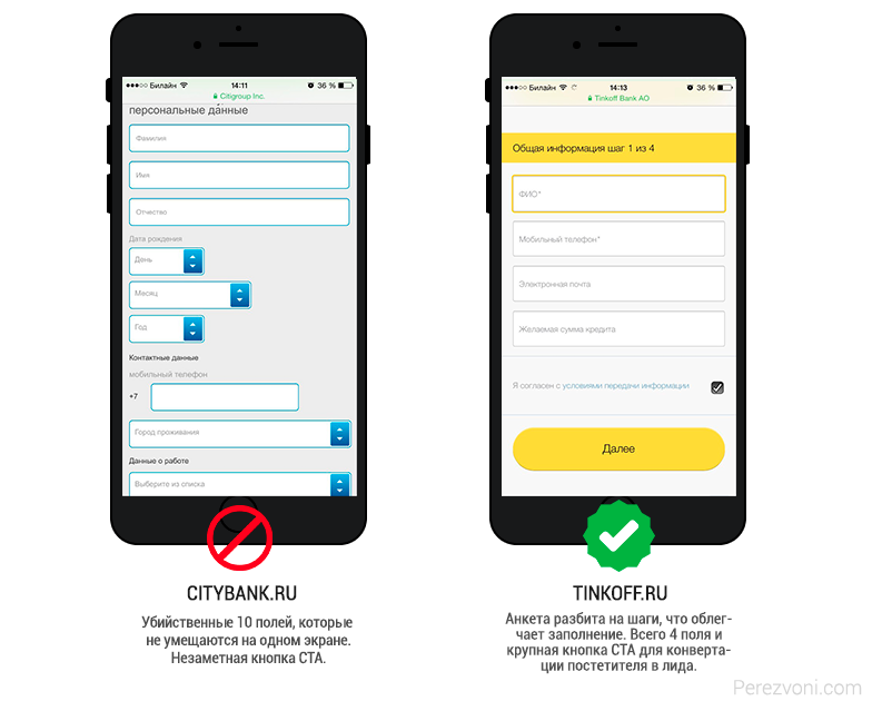
This is a real conversion killer on any site! The mobile versions are especially sensitive to this, as it’s extremely inconvenient to fill out questionnaires on the phone. Get rid of them.
The example shows how well the guys from Tinkoff Bank acted, who broke a long “loan” application for steps. Having filled in only 4 fields, the visitor will become a lead and, if he falls off in the second step, his contacts will remain.
')
This is just a hell of a hell! There is a special place in hell for such sites, when instead of 1 click you need to memorize the number and then enter it yourself. Heck! And if I'm driving?

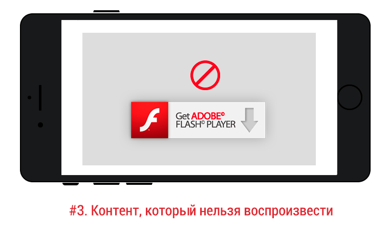
It is desirable for the mobile version to completely exclude such content. It will not work normally and will cause many difficulties for visitors. The video will not work, the game will not play, and a special animation in the menu will eat the brain. Apple iOS devices do not support Flash animation at all. Delete too much, why complicate viewing.
Online consultants, callback widgets, soc. sharings, e-mail collectors - these tools will help increase the conversion of the site, but if they are not adapted for mobile traffic, load the site, block content, then they will most likely do more harm than good. Therefore, be sure to check your site on mobile devices after installing a third-party service.
How to check the widget and what to look for, see in a short video review:
What are the advantages of having a mobile version?
First, search engines give preference in issuing. So google marks sites with “Mobile friendly”:

Secondly, it is convenient for users to view your site from different devices.
For this, the mobile version is required to work properly on all types of mobile devices, including mobile phones and tablets with different diagonals of screens. Regardless of platform, manufacturer or browser. Yes, it is obvious, but still it is the most important criterion.
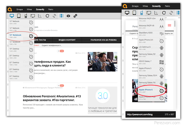
There is a good service quirktools.com to check the site on different devices.
For example, for viewing on small and large screens. Note that this is not a modulation of a mobile phone, but simply an adjustment to the size of its screen.
Of course, to make sure that it is correct, you should check it live on real devices:

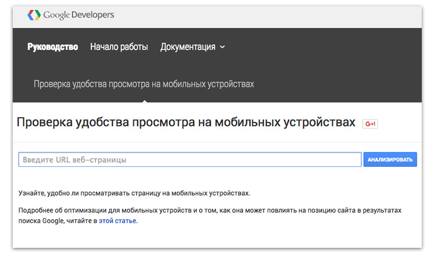
You can check the mobile version of the site for the convenience and speed of downloading through Google service. Recommendations on speed can be observed before evaluating 90, then they lose their relevance.
The important text should not be less than 16px and make sure that the line spacing does not turn the text into a single mess.

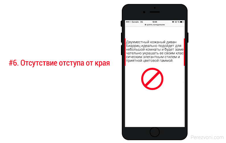
Do not forget about indents. At least 15px from the edge of the screen. Often, the content sticks to the very edge of the screen, which spoils the look:
The "buy" or "leave a request" button should be not only visible, but also convenient for touch-touch with your finger.

Although everyone has different fingers, there are recommendations from manufacturers. For example, Apple calls on the iPhone Human Interface Guidelines to use a touch-element size of at least 44px by 44px. Microsoft Guideline recommends a size of 34px, and a minimum of 26px. It is useful to read the article Perfect Design for touchscreens. True, the article is in English, but the meaning can be understood.
Another item that can lower the conversion site.
Nikolay Matsievsky, Technical Director, airi.rf., helped us in this matter.
The problem of speed is typical for all devices, but it becomes most relevant for mobile users. The speed is important for them immediately after the clear interface: if the user can figure out which button to push to make a purchase, then the next pitfall will be the waiting time for that button on the phone screen.
For reference: 1 second delay "costs" about 3-7% of site conversion (10 seconds "costs" 20-40%). If the site loads 15 seconds or more, acceleration up to 3-5 seconds will increase conversions by the same 20-40 points.
You can check the speed of the site using the services: Air.rf or WebPageTest or Pingdom
There are 3 key speed issues for a site - size, distance, and widgets. Usually, for a mobile user, no special effects on the site are required, the usual layout of the site without “frills” will do. Additionally, the screen of a mobile phone, most often, has a low resolution, so for mobile users you can “ship” smaller image sizes (and use a more progressive format, for example, WebP).
To solve the distance problem, you need to make sure that the site hosting is normally accessible from the networks of the main mobile operators. Optimal would be to place in a good Moscow (or regional - for regional projects) data center, which claims good connectivity with networks of mobile operators. Foreign hosting is not very suitable (and has a number of problems with the speed of data transmission from abroad).
For a comprehensive solution to problems with the speed and availability of both a mobile and regular site, you can use specialized services. For example, Ayri.rf
Naturally, all mobile users should get on the mobile version of the site, but typical errors occur in redirection.
For example, how is it?
The user searches for a specific product in Yandex and passes to you. The system detects a call from a mobile phone and redirects to the main page of the mobile version, rather than the one needed by the client. You have to re-search this product on the site or try to go to competitors.
Addition: Not always the mobile version is enough, perhaps you have hidden the functions needed by the client, links or in general, the client is used to the desktop version. Always leave the opportunity to return to the full version of the site.
Conversion grows if we reduce customer resistance. Each field can be made more convenient to fill. For this we prescribe accordingly:
E-mail field - input type = "email"
Phone field - input type = "tel"
Address field - input type = "text"
Index field, card number - input type = "text" pattern = "\ d *"
Date field - input type = "date"
Field "Send" button - input type = "submit"
A more detailed guide with a good example can be found on this site: http://ionicframework.com/

Supplement for convenience
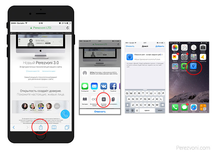
Few people know that you can add a bookmark to the desktop for quick access. The icon looks like an application and will be attached to the user's home screen.
How to do it:
Make an icon the size of 180px at 180px (without rounding), and on the site add the tag <link rel = "apple-touch-icon" href = "icon.png".
I hope these 10 points will help you improve the mobile version of the site and make customers happy. Some of them may already be known and obvious to you, but not including them in the list of the most deadly mistakes would be wrong.
High conversion of your mobile site!
Thank!
1. Too long gripping shapes.
This is a real conversion killer on any site! The mobile versions are especially sensitive to this, as it’s extremely inconvenient to fill out questionnaires on the phone. Get rid of them.
The example shows how well the guys from Tinkoff Bank acted, who broke a long “loan” application for steps. Having filled in only 4 fields, the visitor will become a lead and, if he falls off in the second step, his contacts will remain.
')
2. The phone number of the company is indicated without +7 or as a picture.
This is just a hell of a hell! There is a special place in hell for such sites, when instead of 1 click you need to memorize the number and then enter it yourself. Heck! And if I'm driving?
3. Using Flash on the site or content that cannot be played on mobile.
It is desirable for the mobile version to completely exclude such content. It will not work normally and will cause many difficulties for visitors. The video will not work, the game will not play, and a special animation in the menu will eat the brain. Apple iOS devices do not support Flash animation at all. Delete too much, why complicate viewing.
4. Widgets and pop-ups on the site that are not adapted for mobile.
Online consultants, callback widgets, soc. sharings, e-mail collectors - these tools will help increase the conversion of the site, but if they are not adapted for mobile traffic, load the site, block content, then they will most likely do more harm than good. Therefore, be sure to check your site on mobile devices after installing a third-party service.
How to check the widget and what to look for, see in a short video review:
5. The lack of an adapted mobile version. Cross-browser and cross-platform.
What are the advantages of having a mobile version?
First, search engines give preference in issuing. So google marks sites with “Mobile friendly”:
Secondly, it is convenient for users to view your site from different devices.
For this, the mobile version is required to work properly on all types of mobile devices, including mobile phones and tablets with different diagonals of screens. Regardless of platform, manufacturer or browser. Yes, it is obvious, but still it is the most important criterion.
There is a good service quirktools.com to check the site on different devices.
For example, for viewing on small and large screens. Note that this is not a modulation of a mobile phone, but simply an adjustment to the size of its screen.
Of course, to make sure that it is correct, you should check it live on real devices:
You can check the mobile version of the site for the convenience and speed of downloading through Google service. Recommendations on speed can be observed before evaluating 90, then they lose their relevance.
6. Too small font and lack of indents.
The important text should not be less than 16px and make sure that the line spacing does not turn the text into a single mess.
Do not forget about indents. At least 15px from the edge of the screen. Often, the content sticks to the very edge of the screen, which spoils the look:
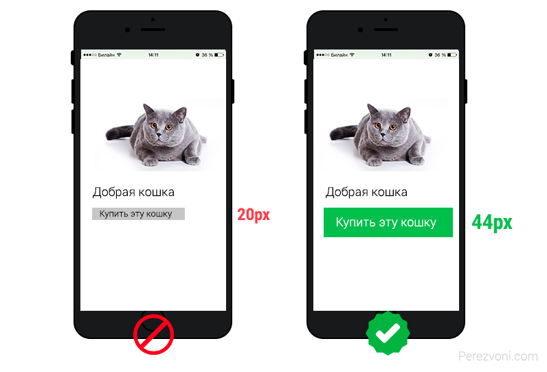
7. Buttons and links that are not friendly with the touch-screen.
The "buy" or "leave a request" button should be not only visible, but also convenient for touch-touch with your finger.
Although everyone has different fingers, there are recommendations from manufacturers. For example, Apple calls on the iPhone Human Interface Guidelines to use a touch-element size of at least 44px by 44px. Microsoft Guideline recommends a size of 34px, and a minimum of 26px. It is useful to read the article Perfect Design for touchscreens. True, the article is in English, but the meaning can be understood.
8. Long loading site.
Another item that can lower the conversion site.
Nikolay Matsievsky, Technical Director, airi.rf., helped us in this matter.
The problem of speed is typical for all devices, but it becomes most relevant for mobile users. The speed is important for them immediately after the clear interface: if the user can figure out which button to push to make a purchase, then the next pitfall will be the waiting time for that button on the phone screen.
For reference: 1 second delay "costs" about 3-7% of site conversion (10 seconds "costs" 20-40%). If the site loads 15 seconds or more, acceleration up to 3-5 seconds will increase conversions by the same 20-40 points.
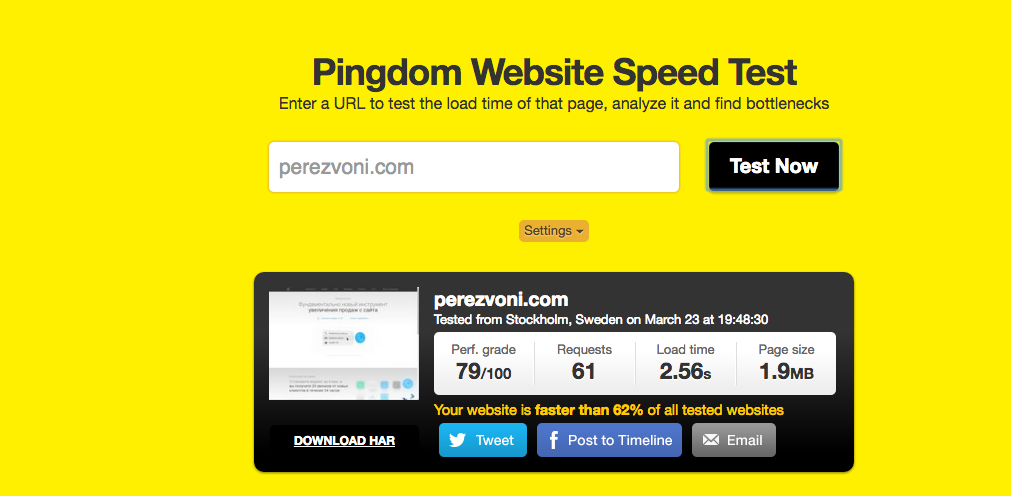
You can check the speed of the site using the services: Air.rf or WebPageTest or Pingdom
There are 3 key speed issues for a site - size, distance, and widgets. Usually, for a mobile user, no special effects on the site are required, the usual layout of the site without “frills” will do. Additionally, the screen of a mobile phone, most often, has a low resolution, so for mobile users you can “ship” smaller image sizes (and use a more progressive format, for example, WebP).
To solve the distance problem, you need to make sure that the site hosting is normally accessible from the networks of the main mobile operators. Optimal would be to place in a good Moscow (or regional - for regional projects) data center, which claims good connectivity with networks of mobile operators. Foreign hosting is not very suitable (and has a number of problems with the speed of data transmission from abroad).
For a comprehensive solution to problems with the speed and availability of both a mobile and regular site, you can use specialized services. For example, Ayri.rf
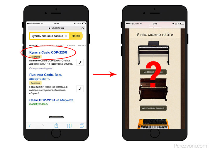
9. Erroneous redirect. No transition to the full version of the site.
Naturally, all mobile users should get on the mobile version of the site, but typical errors occur in redirection.
For example, how is it?
The user searches for a specific product in Yandex and passes to you. The system detects a call from a mobile phone and redirects to the main page of the mobile version, rather than the one needed by the client. You have to re-search this product on the site or try to go to competitors.
Addition: Not always the mobile version is enough, perhaps you have hidden the functions needed by the client, links or in general, the client is used to the desktop version. Always leave the opportunity to return to the full version of the site.
10. Autocomplete. Enable number dialing.
Conversion grows if we reduce customer resistance. Each field can be made more convenient to fill. For this we prescribe accordingly:
E-mail field - input type = "email"
Phone field - input type = "tel"
Address field - input type = "text"
Index field, card number - input type = "text" pattern = "\ d *"
Date field - input type = "date"
Field "Send" button - input type = "submit"
A more detailed guide with a good example can be found on this site: http://ionicframework.com/
Supplement for convenience
Few people know that you can add a bookmark to the desktop for quick access. The icon looks like an application and will be attached to the user's home screen.
How to do it:
Make an icon the size of 180px at 180px (without rounding), and on the site add the tag <link rel = "apple-touch-icon" href = "icon.png".
I hope these 10 points will help you improve the mobile version of the site and make customers happy. Some of them may already be known and obvious to you, but not including them in the list of the most deadly mistakes would be wrong.
High conversion of your mobile site!
Thank!
Source: https://habr.com/ru/post/299632/
All Articles