Visual data corruption
Important: this article is not about politics!
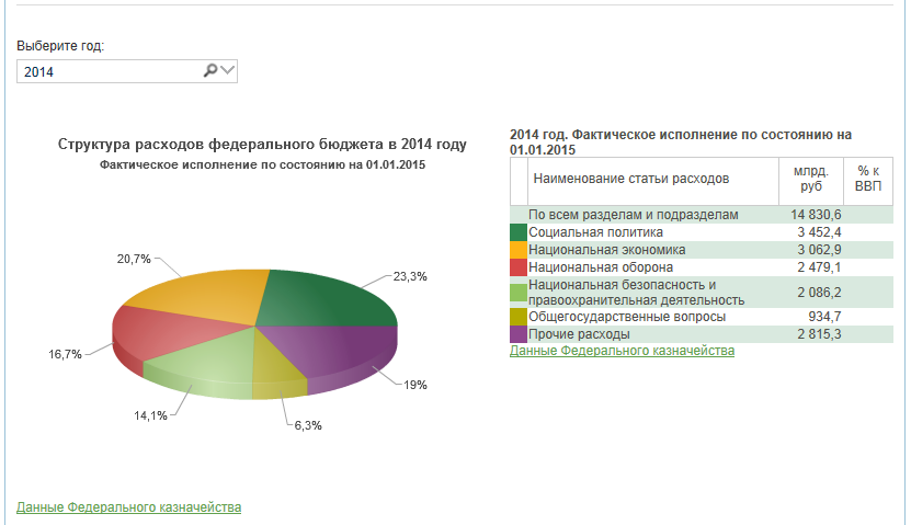
Source: info.minfin.ru/fbrash.php
The budget spending chart from the Ministry of Finance website is beautiful in many respects, it is from her that I will begin the story of how we, often unintentionally, distort the data, choosing the wrong visualization for them. The distortion of the data is, in my opinion, a loss-free way: we will mislead those who don’t notice the problem, and those who notice will probably think that we’re on purpose, also will write nasty things on these Internet sites of yours. IMHO, the data should be distorted only intentionally. Let's see how to avoid accidents in this matter.
Copy the data from the Ministry of Finance website into a conditional Excel and draw alongside two identical diagrams that differ only in the order of the lines:
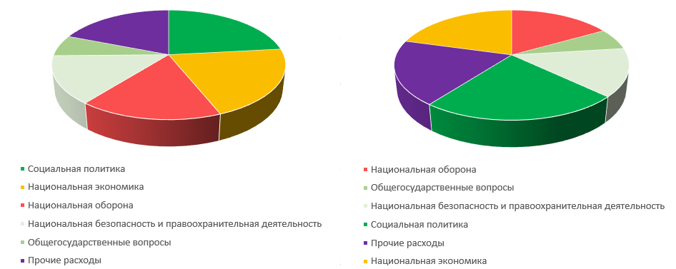
The same colors correspond to the same items of expenditure, but look at how much the sectors differ in size. In the right-hand diagram, “social policy” (dark green sector) is an undoubted leader, but on the left it looks, perhaps, less than the “national economy” (orange sector). Only the lazy one did not say that the volume pie charts distort the proportions, but they still occur. During the performance, the audience may not have time to think deeply into the numbers, and they will remember the visual correlation, which will be wrong. If someone did not hear about it or heard it, but did not believe it, I hope, now I have convinced you.
Another common way to confuse the viewer is by comparing numbers in the form of figures that have two dimensions. What is beautiful bar-chart? The bars in fact have one dimension, length, since the width of all bars in the diagram is the same. If instead of columns we use some two-dimensional (and even three-dimensional, not to the night be remembered) figures, then the comparative value of the presented numbers is not so obvious graphically. An inquisitive viewer will, at a minimum, reflect, corresponds to the number of the area or the linear size of the figure. I will illustrate this thought with an example from the speech of David McCandles:
')
The fragment of interest to us begins at 10:26 and ends at 12:15 (a little less than two minutes), here is the exact link to its beginning.
The truth about the rectangles of military budgets clears up quite quickly: when the speaker begins to place many rectangles inside the one that represents the US budget, it becomes clear that this is a square. But at the very beginning it is not obvious and, for example, distracted me.
It’s more difficult with soldiers representing the size of the army: it’s harder to estimate the soldier’s area, it’s impossible to place them in each other, and since they are human, we subconsciously evaluate them by height rather than by area:
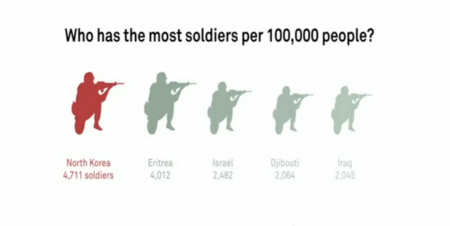
The Israeli soldier, who is actually almost half the size of the North Korean (2,482 against 4,711), looks quite comparable, and the Eritrean soldier can hardly be distinguished.
I think the fact is that McCandless, among his other specialties, is also a journalist. In this case, this is not a curse, just for magazines or websites, infographics has its own specifics compared to presentations. In a magazine or on a website, a person is not limited to viewing time, but it is even easier for him to switch to something else. Therefore, there it is necessary first of all to entertain him and show something beautiful, and then he himself will even look at the numbers, and estimate the reason. During the speech, we have limited time, so we can not allocate much for each diagram, and you don’t suddenly see it. And we need something that the idea was clearly illustrated and instantly clear. If you really want to influence the public also on emotions (and you always want to, indeed), then you can put some kind of military pictureas a background to the diagram, up to the “Apotheosis of War” by Vereshchagin .
I see many articles in which the authors recommend to stop using standard diagrams in presentations and look for an individual visual metaphor for each data element that you represent. So, I suggest these articles, when they come across to you, be critical.
When preparing slides with data, check whether the meaning in your slides is in conflict with beauty, and in the situation or, or without hesitation, choose the meaning.
McCandles mentions as his teacher Hans Rusling. Rusling is beautiful, but he uses the area of circles, not soldiers. For those who are not familiar with his work, it may be interesting to look at his approach to data visualization. I'll just leave it here:
Source: info.minfin.ru/fbrash.php
The budget spending chart from the Ministry of Finance website is beautiful in many respects, it is from her that I will begin the story of how we, often unintentionally, distort the data, choosing the wrong visualization for them. The distortion of the data is, in my opinion, a loss-free way: we will mislead those who don’t notice the problem, and those who notice will probably think that we’re on purpose, also will write nasty things on these Internet sites of yours. IMHO, the data should be distorted only intentionally. Let's see how to avoid accidents in this matter.
Volume distortion
Copy the data from the Ministry of Finance website into a conditional Excel and draw alongside two identical diagrams that differ only in the order of the lines:
The same colors correspond to the same items of expenditure, but look at how much the sectors differ in size. In the right-hand diagram, “social policy” (dark green sector) is an undoubted leader, but on the left it looks, perhaps, less than the “national economy” (orange sector). Only the lazy one did not say that the volume pie charts distort the proportions, but they still occur. During the performance, the audience may not have time to think deeply into the numbers, and they will remember the visual correlation, which will be wrong. If someone did not hear about it or heard it, but did not believe it, I hope, now I have convinced you.
Area Distortion
Another common way to confuse the viewer is by comparing numbers in the form of figures that have two dimensions. What is beautiful bar-chart? The bars in fact have one dimension, length, since the width of all bars in the diagram is the same. If instead of columns we use some two-dimensional (and even three-dimensional, not to the night be remembered) figures, then the comparative value of the presented numbers is not so obvious graphically. An inquisitive viewer will, at a minimum, reflect, corresponds to the number of the area or the linear size of the figure. I will illustrate this thought with an example from the speech of David McCandles:
')
The fragment of interest to us begins at 10:26 and ends at 12:15 (a little less than two minutes), here is the exact link to its beginning.
The truth about the rectangles of military budgets clears up quite quickly: when the speaker begins to place many rectangles inside the one that represents the US budget, it becomes clear that this is a square. But at the very beginning it is not obvious and, for example, distracted me.
It’s more difficult with soldiers representing the size of the army: it’s harder to estimate the soldier’s area, it’s impossible to place them in each other, and since they are human, we subconsciously evaluate them by height rather than by area:
The Israeli soldier, who is actually almost half the size of the North Korean (2,482 against 4,711), looks quite comparable, and the Eritrean soldier can hardly be distinguished.
I think the fact is that McCandless, among his other specialties, is also a journalist. In this case, this is not a curse, just for magazines or websites, infographics has its own specifics compared to presentations. In a magazine or on a website, a person is not limited to viewing time, but it is even easier for him to switch to something else. Therefore, there it is necessary first of all to entertain him and show something beautiful, and then he himself will even look at the numbers, and estimate the reason. During the speech, we have limited time, so we can not allocate much for each diagram, and you don’t suddenly see it. And we need something that the idea was clearly illustrated and instantly clear. If you really want to influence the public also on emotions (and you always want to, indeed), then you can put some kind of military picture
I see many articles in which the authors recommend to stop using standard diagrams in presentations and look for an individual visual metaphor for each data element that you represent. So, I suggest these articles, when they come across to you, be critical.
Conclusion
When preparing slides with data, check whether the meaning in your slides is in conflict with beauty, and in the situation or, or without hesitation, choose the meaning.
Bonus for attentive readers who get to the end
McCandles mentions as his teacher Hans Rusling. Rusling is beautiful, but he uses the area of circles, not soldiers. For those who are not familiar with his work, it may be interesting to look at his approach to data visualization. I'll just leave it here:
Source: https://habr.com/ru/post/299612/
All Articles