How to increase landing page conversion using email marketing

With each email sent to your subscribers, you expect action from them. You hope that the letter will open, click on the proposed links, go to the landing page of the site, buy your product, download, look, visit, use and so on. One of the important points is the desire of the subscriber to go to the page of the site, then perform targeted actions. Your task is to understand how you can encourage your subscriber to switch to a landing page. Today we will talk about how to improve conversion rates with the help of a concentration on the connection between the email list and the landing page, how to customize their interaction for better results.
How do users get on the landing page? New users come from search engines, visit a page from partner sites, social networks. But there is also direct traffic, when users know by heart the address of your site and go directly, typing the name of the site each time in the address bar of the browser or entering from their bookmarks. Newsletters also drive traffic to the site, so marketers have high hopes for it in increasing sales.
')
How can the link between email newsletter and landing page bring success?
The work of the mailing is closely connected with the work of the site: when receiving a letter, the user opens it, follows the links to the landing page, finds what suits him and makes a purchase.

Let us analyze this scheme, and what we get: for maximum conversion of the landing page, you need to come up with a bright letter subject, so as to motivate the reader to open it, create relevant content and offer, and then design its appearance for better perception, that is, develop the right design. The letter should be easy to read and contain clear calls to action, then the user goes to the site and makes purchases. And so, by returning loyal traffic via email distribution, you can get a conversion of 10-15% instead of 1-3%.
Let's take a closer look at the whole process and dwell on each component link of this correctly configured link between the email list and the site.
A few rules for a good writing subject.
What will positively affect the opening of the letter:
1. Maximum accuracy and simplicity.
2. Brevity. We recommend sticking to the rule of four words and even less. It is also appropriate to have a rule of 35 characters or less, including spaces. A total of 14 characters were used below:

3. Include numbers in the subject line (“three tips ...”, “7 reasons ...”, “10 things ...”).

4. Make sure that the topic is meaningful (the recipient must determine what will be discussed in the letter itself)
5. Use a periodicity indicator, for example, “Monthly”, from such and such date to such and such.

What is better NOT to use in the subject of the letter:
1. Do not put exclamation marks.
2. Do not use Caps Lock.
3. Do not use the word "FREE" in capital letters. Also, do not start with the word "Hello".
4. Do not start the name of the topic with words meaning a quantity, for example, 5,000 rubles, 1,000 points.
5. Do not use special characters. For example, if your text contains hearts, diamonds or something else like this, the recipient's mail service may not display them. Note does not display the heart icon. Subject with this symbol will be displayed as follows:

Be sure to test non-standard, funny, thought-provoking, shocking, and in this spirit topics.

You can also test the theme personalization. Previously, it was considered a controversial question whether to include the first and last names, the mention of the city of residence of the subscriber in the subject line. But now many studies have been done and it has been proven that personalization actually increases the likelihood of discovery by 22% . Below is a good example of personalizing the letter itself and its subject:


In order to contact the subscriber by name, you must make sure that all the names in the database are spelled correctly. They must begin with a capital letter, written in Cyrillic and not be a nickname. Sometimes users fill out registration forms for a quick hand. Of course, the subscriber may have deliberately indicated the name “Vasek” in the field, but a letter with the following topic: “Good afternoon, Vasek” will still not look very correct.
The first impression of an open letter - the key to success
Suppose that the subscriber is interested in the subject of the letter and nevertheless opened it. What happens next? Further the subscriber for several seconds looks through the letter. The visual image affects the clickability and the overall impression of the person from the received letter. Take care of the proper design, design, images that you use. Email should be bright, readable, understandable. Only in this case, turn out to lead the reader through the links to the landing page.
Use effective images and a uniform style between email and landing page.
The brain processes images very quickly, 60,000 times faster than text is a fact established by scientists. Improve visual content, use high-quality images. Make sure that the design of your newsletter is combined with the front-load image of your landing page. The combination of letter design with the landing page design affects the usability of the site for the audience. Having passed from the letter to the page of the site, the text, graphics, images should be of the same style, then the subscriber will remain on your site and will feel as comfortable as possible, “at home”.
The role of the image in the visual design:
1. To cause an instant desire to buy goods. Let the images be detailed, and show the goods from different sides, then the desire to go through the links will increase.

2. To interest the reader. A letter with an image that arouses interest and retains intrigue will surely be a bridge between the subscriber’s post and your landing page.
3. Do not distract from the main idea. Let the images convey the main idea of the letter.
Let's take a look at how the Lingualeo language learning club does it. The image concisely and clearly conveys the idea of the letter itself. The company uses the visual connection between the letter and the landing page - the same fonts, the same color range, images in the same vector design. Below is an email:
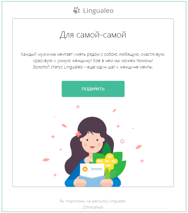
And here is the landing page, agree that unity can be traced.

This harmonious and visual connection pushes a targeted action. Let the same as in the letter, buttons and menu pages will be convenient to use. The subscriber should not get confused by going from the letter to the landing page.
Form clear calls to action, but keep the intrigue
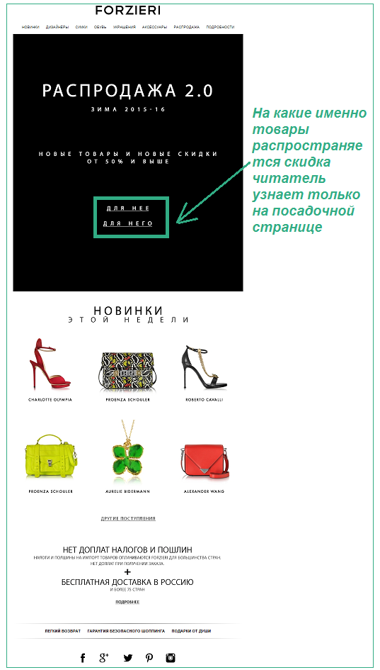
Do so not to reveal all the information in the letter, but to preserve the most interesting and important content for the landing page. For example, you should not disclose all cards about the current stock: do not indicate the prices of each product, but only report a discount of “- 50%”. The user will be interested, and he will want to go to the landing page. That is why your calls to action should not be lost among the rest of the information. Let them be clear, contrast and attract attention - so the user just wants to click them. Use no more than 2 calls in one letter, because the subscriber simply does not understand what he needs to do.
Use interesting content
Attention of the user is attracted not only by newsletters with promotions and special offers. See how Puma drives traffic from the letter to the landing page. Of course, the first move to use a photo of a celebrity is not subservient to everyone. But there is also a second move - to sign a pact, such a persuasion with yourself about regular training to be stronger and faster. This is interesting, and even the signing of such a pact is not entirely serious, but for some it may be another incentive to pull yourself together and go to the gym. Following the link “Challenge Yourself”, the subscriber fills out a form on the website, and then goes on to shopping.

Invent a game
Offer a letter to play an adventure game, come up with your own special quest. On the eve of Easter, the Banana Republic clothing store offers its subscribers to find a hidden golden egg on the pages of their website and get a 40% discount. This is how an everyday discount offer can turn into a fun game “egg hunt!”.

Relevant Offer
To make your offer relevant, use subscriber segmentation. They can be divided according to several principles:
- gender
- geography
- behavioral trait
- activity
- date added
- subscriber language
For more information about the options for segmentation of your subscription base, you can in our "Guide to the segmentation of subscribers . "
Do not forget to test
Test your letters in order to succeed. Do the same with the landing page. Change certain elements on the landing page and see which images, text, and calls to action resonate better with your followers audience.
Contacts are available, order form is at hand!
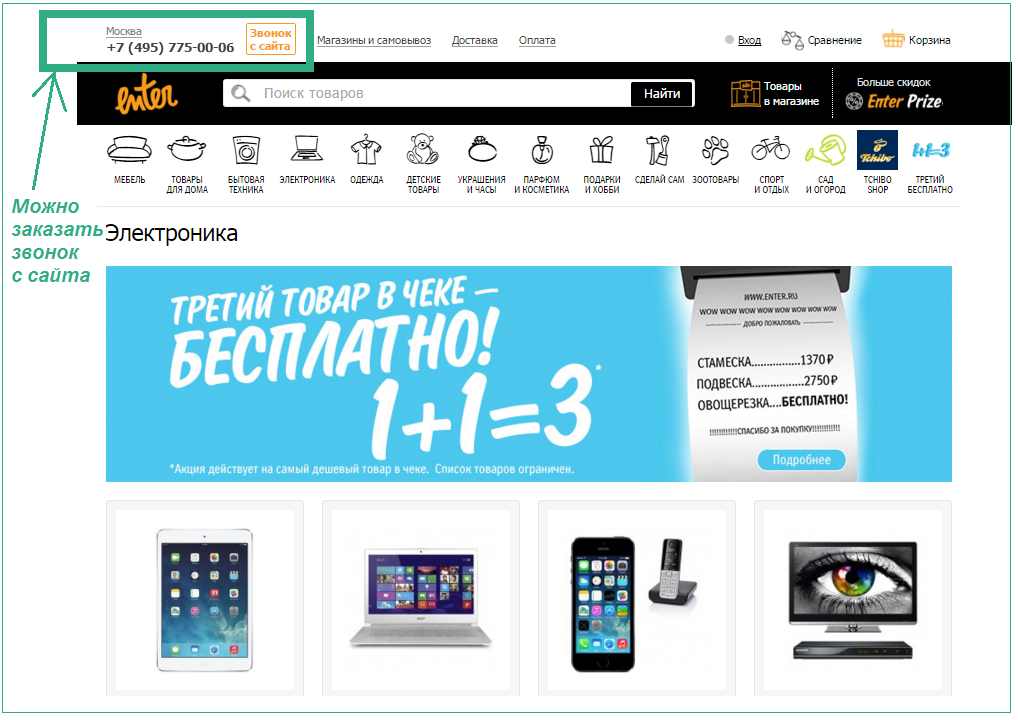
It is clear that you hope that after the user goes to your website page, he will most likely want to leave the order. Therefore, your order form should be as simple as possible. Also, the organization’s contacts or online consultant should be accessible by the user. Take care of the comfort of your visitor and offer a call back from the site.
We hope our tips will help your email newsletter and landing page work together and show the best results!
Source: https://habr.com/ru/post/299382/
All Articles