8 ways to refresh your logo
How to refresh the logo with minimal loss? You will learn about this from our selection. All methods are scientifically proven and supported by real examples!
1. Get rid of the effects.
Perhaps this is the easiest possible modification of the logo. Shadows, “glass” highlights and volume - this is the last century. Google got rid of the volume three years ago. We advise you to follow this example: the fewer effects in your logo, the easier it is perceived.
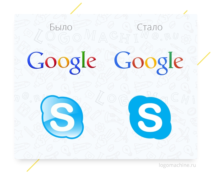
')
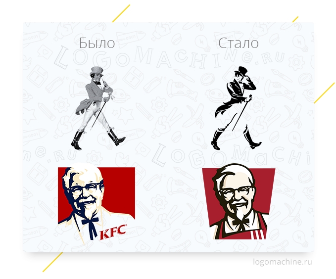
2. Simplify the illustration
If a character is depicted on your logo, then it is not necessary for it to be detailed as an engraving. Simplification with the preservation of recognizable features will only help your hero to be remembered more easily.
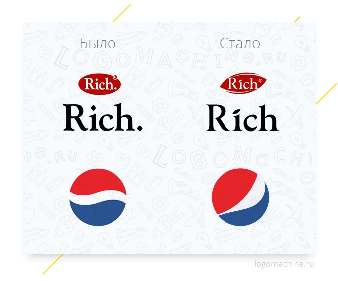
3. Add an interesting detail.
To give the logo freshness, it is not necessary to drastically change it. Just add some new detail to the familiar symbol. This will add a personal touch to your brand and will not frighten consumers.
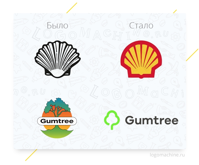
4. Rethink the symbol
If the symbol of your company is an object that is also present in the name, it does not mean that it should be as detailed as possible. Be concise, people will still understand what is depicted.
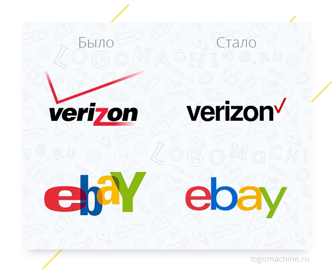
5. Reassure your logo
Looking at some logos, I want to say: “Wow, wow! Easy! ”Why are these jumping letters and sweeping strokes? The ebay logo was famous for the colors of the letters, but everyone remembers that verizon is a black lettering and a red check mark. All this remains with them and after redesign.
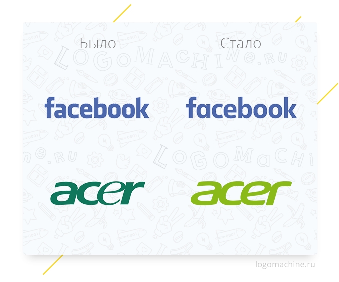
6. Work on the font
Refinement of the font logo is good because the changes are not striking, but at the same time you influence such properties of the logo as readability and scalability, and in general make it more accurate.
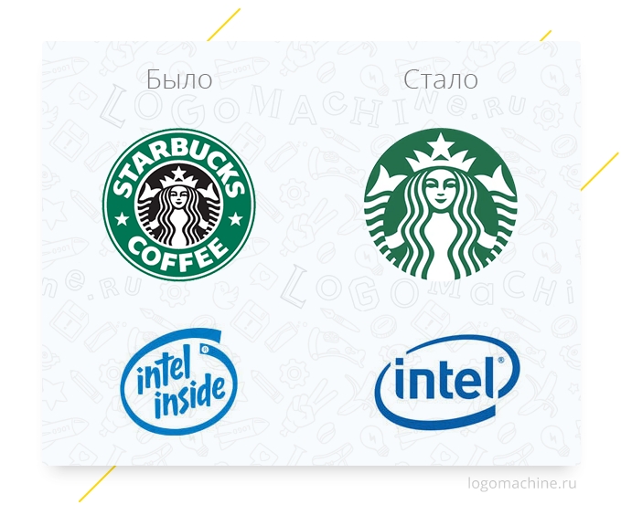
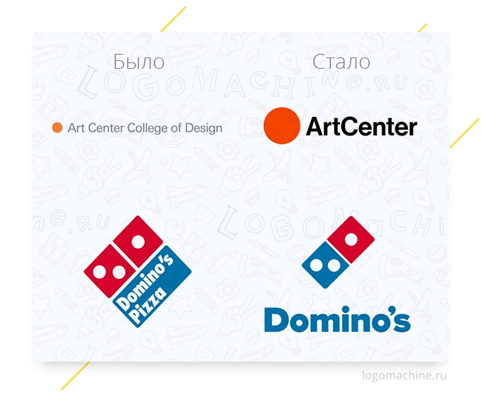
7. Throw away excess
If the recognition of a logo can be preserved without some of its elements, then these elements are superfluous: Starbucks does not need an inscription - there is enough mermaid; all have long understood that Intel inside, and not outside. Better to focus on the essentials.
8. Place accents
Alignment will help focus attention on the main thing and make a solid sign of solid mass.
Do not forget to subscribe to our public!
There is constant fun, trash, waste and beep-boob!
1. Get rid of the effects.
Perhaps this is the easiest possible modification of the logo. Shadows, “glass” highlights and volume - this is the last century. Google got rid of the volume three years ago. We advise you to follow this example: the fewer effects in your logo, the easier it is perceived.
')
2. Simplify the illustration
If a character is depicted on your logo, then it is not necessary for it to be detailed as an engraving. Simplification with the preservation of recognizable features will only help your hero to be remembered more easily.
3. Add an interesting detail.
To give the logo freshness, it is not necessary to drastically change it. Just add some new detail to the familiar symbol. This will add a personal touch to your brand and will not frighten consumers.
4. Rethink the symbol
If the symbol of your company is an object that is also present in the name, it does not mean that it should be as detailed as possible. Be concise, people will still understand what is depicted.
5. Reassure your logo
Looking at some logos, I want to say: “Wow, wow! Easy! ”Why are these jumping letters and sweeping strokes? The ebay logo was famous for the colors of the letters, but everyone remembers that verizon is a black lettering and a red check mark. All this remains with them and after redesign.
6. Work on the font
Refinement of the font logo is good because the changes are not striking, but at the same time you influence such properties of the logo as readability and scalability, and in general make it more accurate.
7. Throw away excess
If the recognition of a logo can be preserved without some of its elements, then these elements are superfluous: Starbucks does not need an inscription - there is enough mermaid; all have long understood that Intel inside, and not outside. Better to focus on the essentials.
8. Place accents
Alignment will help focus attention on the main thing and make a solid sign of solid mass.
Do not forget to subscribe to our public!
There is constant fun, trash, waste and beep-boob!
Source: https://habr.com/ru/post/298720/
All Articles