How we ordered usability audit and did not regret
The usability area has already managed to acquire myths and hundreds of tips from the section “How to increase conversion”. A manager, a programmer, a copywriter and any other specialist will certainly give a prepared usability advice, if asked about it. To dispel the myths and clarify our site, we sought the advice of an expert in the field of usability, for professional advice. We asked to check the ordering process on our website and compare it with competitors.
We were always confident that the order page on our site is intuitive and simple, and all the forms and buttons are in their places. It turned out we were a little wrong. Competitors have problems in the interface, and our ordering process was also far from ideal.
According to the results of usability testing, we received 10 practical recommendations, a table with interface ratings and an overall rating.
')
In order to conduct a comparative testing of our website and other copywriting exchanges, the specialist identified key indicators by which he will evaluate the convenience of the interface. Below is a list of these indicators.
1. The number of fields by default - the number of fields in the interface by default. Interface without advanced settings.
2. The total number of fields - the number of fields with advanced settings.
3. The number of required fields .
4. Names of required fields - is it clear what information you need to specify.
5. Visual selection of required fields - whether the required fields differ from the usual ones.
6. Evaluation of controls - how visible, understandable and convenient are the forms, fields, buttons, drop-down lists and checkboxes.
7. Compliance with the names of the buttons and actions to which they are pressed .
8. Error message - at which point the system notifies the user about the error.
9. The text in the error - is it clear from the text, what is the error and how to correct it.
10. Time spent filling out the form - how much time it took to fill out the application.
11. Efficiency - whether the order will be published if you fill in the required fields and click on the button.
We have compiled a list of all our competitors and have selected 4 of the most serious, in our opinion, for comparative analysis:
1. Advego
2. Copylancer
3. Etxt.ru
4. Text.ru
Each exchange has its own checkout process. Someone first requires to register, and then place an order, someone “embeds” the registration in the order. As they wrote in the usability report: “The easier the ordering process is, the more people place an order.”
The easiest way to place an order was on Text.ru. The site does not require registration, and all the fields that must be filled are on the same page. Personal account is created automatically after ordering.
One of the most difficult ordering processes, according to a specialist, is on Etxt. It is necessary to go through the registration on the site and only then you can place an order in your personal account. There is no separate “place order” button. The function is hidden somewhere in the navigation menu, which consists of several dozen sections.

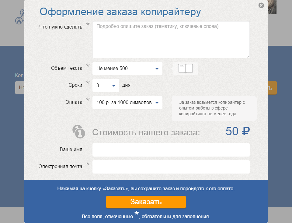
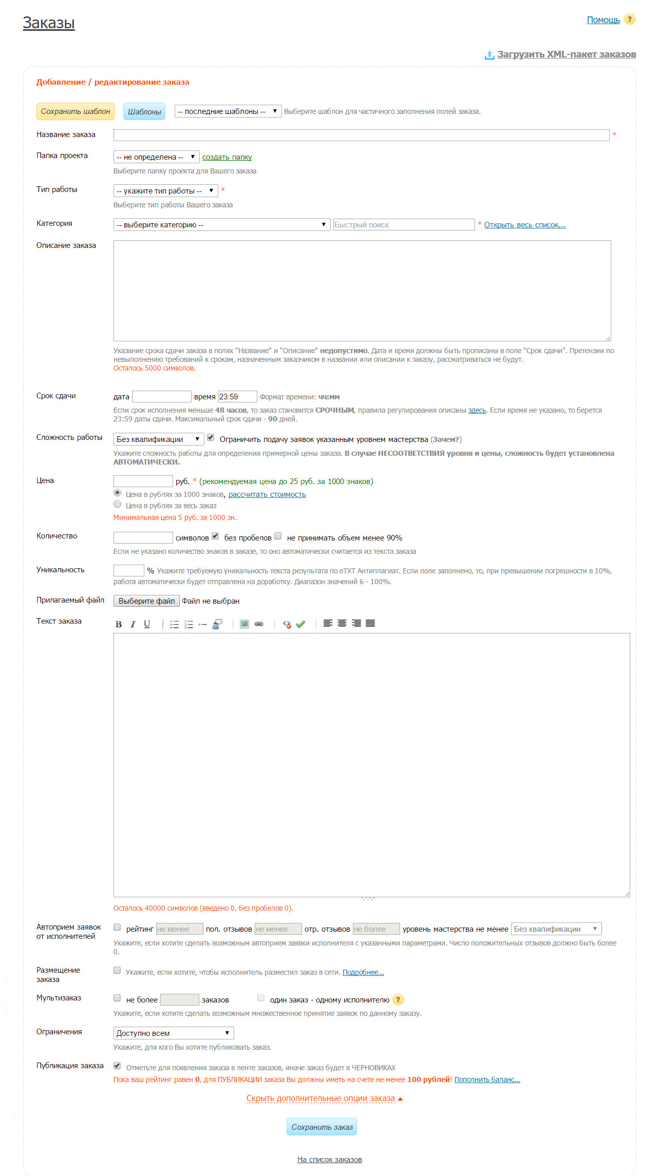
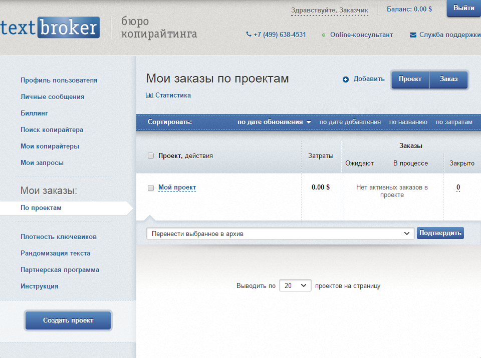
When we did TextBroker.ru , we wanted the process of ordering articles to be convenient. Therefore, it is possible to order text on our website without registration, and a personal account is created immediately, you just need to specify an email. On the main page the client can calculate the cost of his order. We took into account a lot of details, but in general the process of registration is rather complicated. They explained to us why.
In short, we broke down the design process into too many steps and made 2 possible scenarios. The first one consists of 4 steps. In it the order is not even made out.
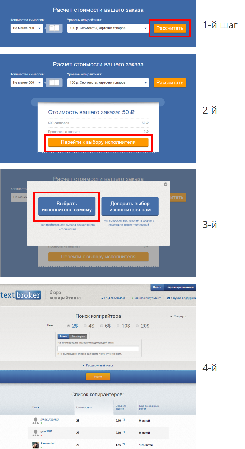
The second scenario consists of 5 steps. If you fill in the required fields, the order will be saved in your account.
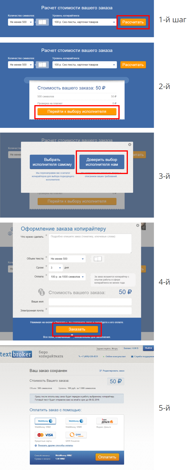
At each step of the order we can lose a certain percentage of potential customers. The more these steps, the more clients we lose as a result. Therefore, we plan to combine some steps, and some, probably, will be completely abandoned.
"The more information about the order - the better," - so many exchanges argue. In some ways they are right, but one thing is wrong for sure - giant pages and dozens of forms make ordering difficult for new customers. The smaller the forms, the greater the likelihood that the client will send the application.
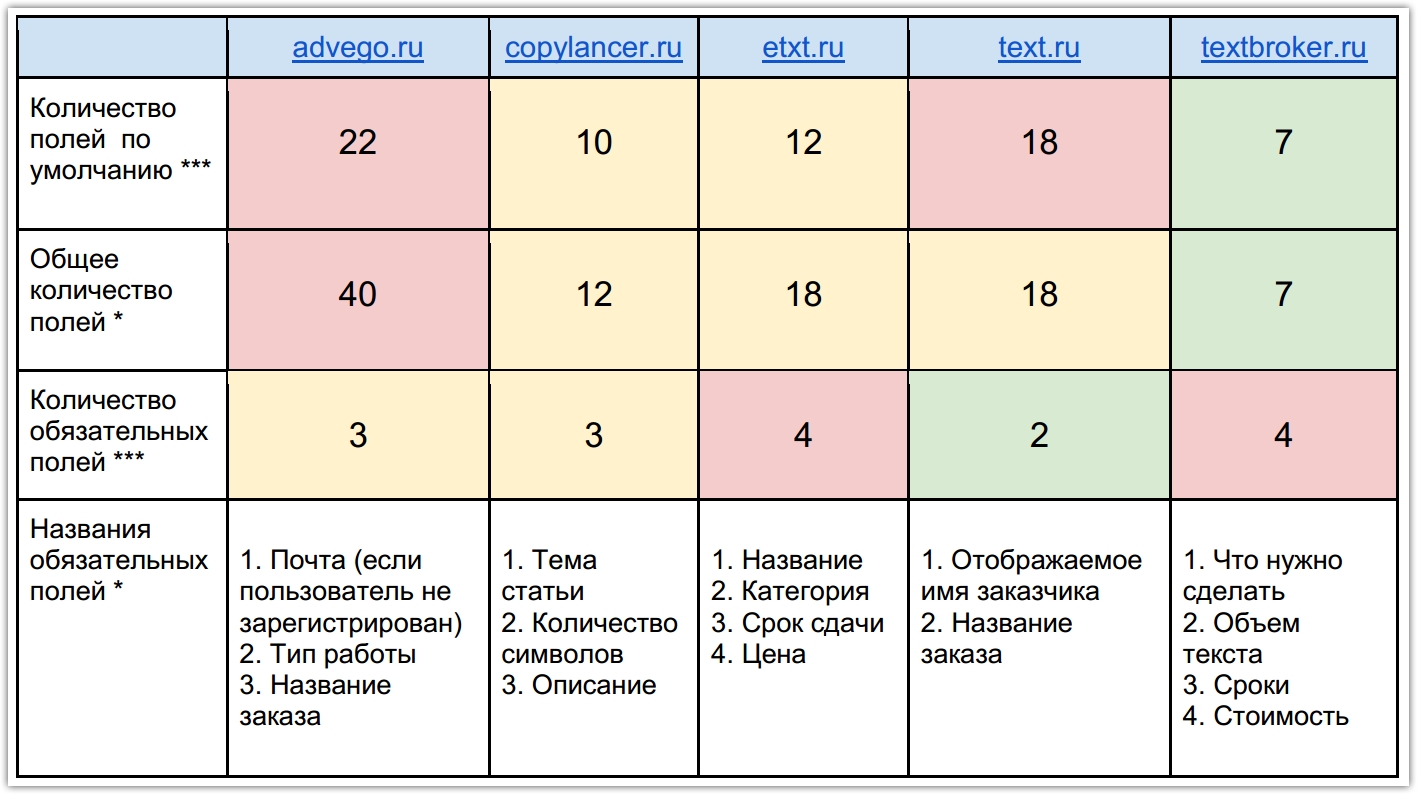
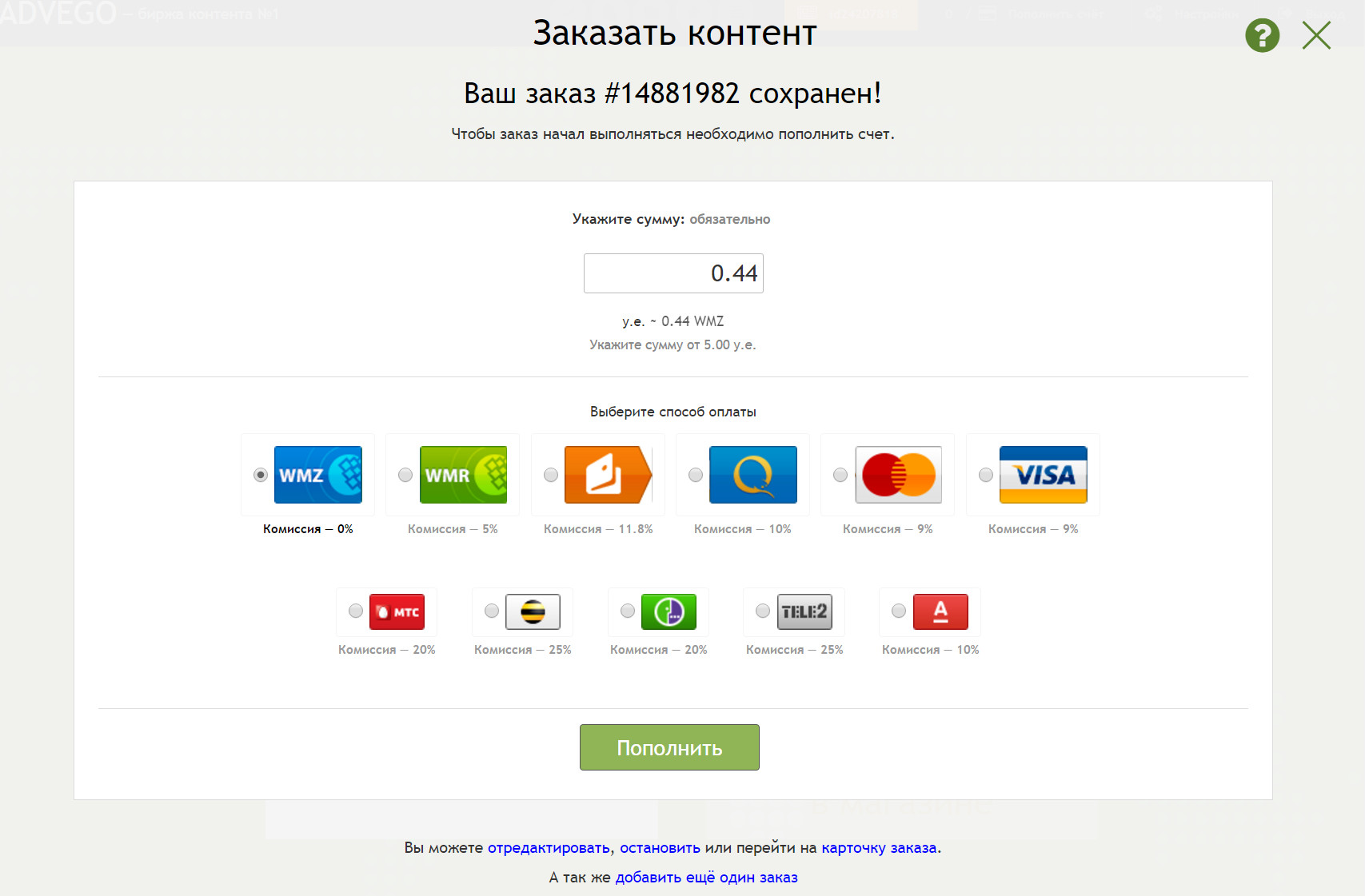
The hardest thing to deal with the order for Advego. On the page 40 fields, drop-down lists, checkboxes and other controls, not counting the buttons and information windows. The exchange tried to take into account all possible details, it made it even more difficult to place an order.

We decided to see the order page on Advego ourselves and found some rather strange fields, in our opinion. Here are some of them, as well as order settings:
- stop the order at a certain time (order cancellation timer). You can choose the exact time when your order will no longer see copywriters;
- make a secret description for the tender . It does not explain who can see this secret description and why write it at all.
- set the number of works that can be performed simultaneously by one author . You can forbid the author to work on a certain amount of work at the same time.
On our website, checkout pages were simple and straightforward. On each page we tried to leave the minimum number of fields, asking only the most important about the order. Therefore, we received the highest score on the results of the evaluation forms.
On the page for registration of the Copilancer Exchange there are 10 fields, 3 of which are required. Taking into account the advanced settings, the fields are 12. In general, a good result. What can not be said about Text.ru and Etxt, on the pages of which there are 18 fields with regard to the advanced settings.
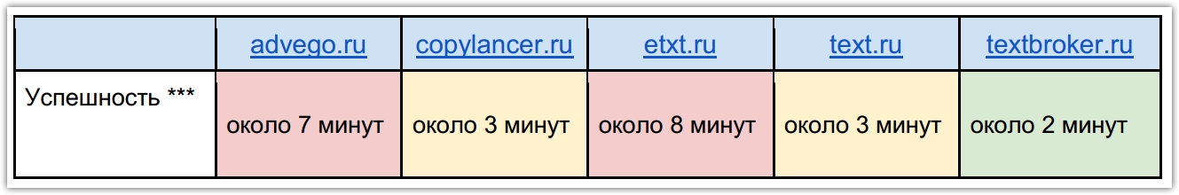
The most obvious and simplest experiment of all usability testing. Estimated metric "success", which shows the average elapsed time for the application.
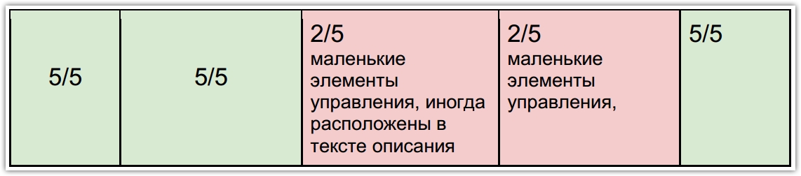
Convenience of the interface is one of the key metrics in usability. But as a rule, such metrics are difficult to objectively measure and explain. There is a Fitts law that allows you to determine the size of interface elements, their location and relative position on the screen according to how simple (or, on the contrary, difficult) their use should be.
Simply put, all interface elements: fields, drop-down lists, labels and buttons must be of sufficient size, shape and color to see them, understand what they mean and hit the mouse cursor over them.
The specialist evaluated the convenience of the interface elements on a five-point scale.
What happens if you press a button, as a rule, they write on the button itself. We are used to the names that correspond to the actions and therefore confidently pay for purchases and register on the sites. After comparative testing, we were convinced that on the copywriting exchanges the names of the buttons often do not coincide with the results of pressing.
For example, if you click the “Add Order” button on the Advego page, the system will direct the user to pay without notifying him in advance about the payment. The person who wanted to publish the order is obliged to deposit a certain amount on the newly created account. If this is not done, the project will remain unpublished.
On Textbroker, too, not everything goes smoothly. If you click on the "Order" button, the user will also be on the payment page. Despite the discrepancy between the button name and the action, we warn you about the payment with the text: “By clicking on the“ Order ”button, you will save the order and proceed to pay for it”.
TextBroker.ru saves the order in your account, but until the client replenishes the balance, the project will not be published.
Only on Text.ru the name of the button fully corresponds to the action. The button “publish the order” will publish the project on the site. After that, the customer will be able to get answers from copywriters, without any prepayment.
The metric "efficiency" shows whether the order will be published if you fill in the required fields and click on the button. On Advego, Etxt, Copilancer and TextBroker.ru the order will not be published without prepayment.

But the overall rating for all indicators and metrics that were measured. Despite the fact that we took the first place, the feeling of victory as there is none. Since we saw the site from the other side, from the user's side, and realized that we still need to work on it.
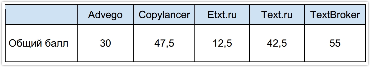
In order to make a rating, 2 types of metrics were identified: critical and less critical.
Each metric was rated. If metric is critical:
• high score - 10 points,
• average rating - 5 points,
• low score - 0 points.
Points for less critical metrics:
• high score - 5 points,
• average - 2.5 points,
• low score - 0.
In the usability report we received 10 recommendations. We made sure that we need to improve the ordering process and measure the data at each step. We will definitely implement some of the recommendations.
Recommendation # 1
Reduce the number of steps when placing an order. Combine the step “Cost of your order” with the step “Choice of the performer”.
Recommendation # 2
Save the fields that the user has already filled out and do not invite them to fill them in again.
Recommendation number 3
Make an independent artist selection easier. Recommend the user several suitable artists, for example 3 or more. Also save the ability to choose from the entire list of artists.
Recommendation # 4
Tell the user what choice he should make.
Recommendation # 5
Set goals in Yandex-Metrics by pressing the buttons in each step and create a “Composite goal”. So you can track the conversion funnel.
Recommendation # 6
Rename the button “Order”, as pressing the button with the current name does not lead to predictable results.
Recommendation # 7
Enter in the field "Copywriting level" first the task facing the user, then the cost.
Recommendation # 9
In the field "Number of characters" you can use the preposition "From" instead of "Not less."
Recommendation # 10
Use the monitor icon instead of the book icon.
We were always confident that the order page on our site is intuitive and simple, and all the forms and buttons are in their places. It turned out we were a little wrong. Competitors have problems in the interface, and our ordering process was also far from ideal.
According to the results of usability testing, we received 10 practical recommendations, a table with interface ratings and an overall rating.
')
Who and what was measured
In order to conduct a comparative testing of our website and other copywriting exchanges, the specialist identified key indicators by which he will evaluate the convenience of the interface. Below is a list of these indicators.
1. The number of fields by default - the number of fields in the interface by default. Interface without advanced settings.
2. The total number of fields - the number of fields with advanced settings.
3. The number of required fields .
4. Names of required fields - is it clear what information you need to specify.
5. Visual selection of required fields - whether the required fields differ from the usual ones.
6. Evaluation of controls - how visible, understandable and convenient are the forms, fields, buttons, drop-down lists and checkboxes.
7. Compliance with the names of the buttons and actions to which they are pressed .
8. Error message - at which point the system notifies the user about the error.
9. The text in the error - is it clear from the text, what is the error and how to correct it.
10. Time spent filling out the form - how much time it took to fill out the application.
11. Efficiency - whether the order will be published if you fill in the required fields and click on the button.
We have compiled a list of all our competitors and have selected 4 of the most serious, in our opinion, for comparative analysis:
1. Advego
2. Copylancer
3. Etxt.ru
4. Text.ru
What you need to do to place an order
Each exchange has its own checkout process. Someone first requires to register, and then place an order, someone “embeds” the registration in the order. As they wrote in the usability report: “The easier the ordering process is, the more people place an order.”
The easiest way to place an order was on Text.ru. The site does not require registration, and all the fields that must be filled are on the same page. Personal account is created automatically after ordering.
One of the most difficult ordering processes, according to a specialist, is on Etxt. It is necessary to go through the registration on the site and only then you can place an order in your personal account. There is no separate “place order” button. The function is hidden somewhere in the navigation menu, which consists of several dozen sections.
When we did TextBroker.ru , we wanted the process of ordering articles to be convenient. Therefore, it is possible to order text on our website without registration, and a personal account is created immediately, you just need to specify an email. On the main page the client can calculate the cost of his order. We took into account a lot of details, but in general the process of registration is rather complicated. They explained to us why.
In short, we broke down the design process into too many steps and made 2 possible scenarios. The first one consists of 4 steps. In it the order is not even made out.
The second scenario consists of 5 steps. If you fill in the required fields, the order will be saved in your account.
At each step of the order we can lose a certain percentage of potential customers. The more these steps, the more clients we lose as a result. Therefore, we plan to combine some steps, and some, probably, will be completely abandoned.
How many forms need to fill
"The more information about the order - the better," - so many exchanges argue. In some ways they are right, but one thing is wrong for sure - giant pages and dozens of forms make ordering difficult for new customers. The smaller the forms, the greater the likelihood that the client will send the application.
The hardest thing to deal with the order for Advego. On the page 40 fields, drop-down lists, checkboxes and other controls, not counting the buttons and information windows. The exchange tried to take into account all possible details, it made it even more difficult to place an order.
We decided to see the order page on Advego ourselves and found some rather strange fields, in our opinion. Here are some of them, as well as order settings:
- stop the order at a certain time (order cancellation timer). You can choose the exact time when your order will no longer see copywriters;
- make a secret description for the tender . It does not explain who can see this secret description and why write it at all.
- set the number of works that can be performed simultaneously by one author . You can forbid the author to work on a certain amount of work at the same time.
On our website, checkout pages were simple and straightforward. On each page we tried to leave the minimum number of fields, asking only the most important about the order. Therefore, we received the highest score on the results of the evaluation forms.
On the page for registration of the Copilancer Exchange there are 10 fields, 3 of which are required. Taking into account the advanced settings, the fields are 12. In general, a good result. What can not be said about Text.ru and Etxt, on the pages of which there are 18 fields with regard to the advanced settings.
Here is a summary table of the forms on the checkout pages.
How much time you need to spend
The most obvious and simplest experiment of all usability testing. Estimated metric "success", which shows the average elapsed time for the application.
How comfortable is everything
Convenience of the interface is one of the key metrics in usability. But as a rule, such metrics are difficult to objectively measure and explain. There is a Fitts law that allows you to determine the size of interface elements, their location and relative position on the screen according to how simple (or, on the contrary, difficult) their use should be.
Simply put, all interface elements: fields, drop-down lists, labels and buttons must be of sufficient size, shape and color to see them, understand what they mean and hit the mouse cursor over them.
The specialist evaluated the convenience of the interface elements on a five-point scale.
What happens if you press a button
What happens if you press a button, as a rule, they write on the button itself. We are used to the names that correspond to the actions and therefore confidently pay for purchases and register on the sites. After comparative testing, we were convinced that on the copywriting exchanges the names of the buttons often do not coincide with the results of pressing.
For example, if you click the “Add Order” button on the Advego page, the system will direct the user to pay without notifying him in advance about the payment. The person who wanted to publish the order is obliged to deposit a certain amount on the newly created account. If this is not done, the project will remain unpublished.
On Textbroker, too, not everything goes smoothly. If you click on the "Order" button, the user will also be on the payment page. Despite the discrepancy between the button name and the action, we warn you about the payment with the text: “By clicking on the“ Order ”button, you will save the order and proceed to pay for it”.
TextBroker.ru saves the order in your account, but until the client replenishes the balance, the project will not be published.
Only on Text.ru the name of the button fully corresponds to the action. The button “publish the order” will publish the project on the site. After that, the customer will be able to get answers from copywriters, without any prepayment.
The metric "efficiency" shows whether the order will be published if you fill in the required fields and click on the button. On Advego, Etxt, Copilancer and TextBroker.ru the order will not be published without prepayment.
But the overall rating for all indicators and metrics that were measured. Despite the fact that we took the first place, the feeling of victory as there is none. Since we saw the site from the other side, from the user's side, and realized that we still need to work on it.
About how to make a rating
In order to make a rating, 2 types of metrics were identified: critical and less critical.
Each metric was rated. If metric is critical:
• high score - 10 points,
• average rating - 5 points,
• low score - 0 points.
Points for less critical metrics:
• high score - 5 points,
• average - 2.5 points,
• low score - 0.
What recommendations did we receive and what do we think of doing next
In the usability report we received 10 recommendations. We made sure that we need to improve the ordering process and measure the data at each step. We will definitely implement some of the recommendations.
Recommendation # 1
Reduce the number of steps when placing an order. Combine the step “Cost of your order” with the step “Choice of the performer”.
Recommendation # 2
Save the fields that the user has already filled out and do not invite them to fill them in again.
Recommendation number 3
Make an independent artist selection easier. Recommend the user several suitable artists, for example 3 or more. Also save the ability to choose from the entire list of artists.
Recommendation # 4
Tell the user what choice he should make.
Recommendation # 5
Set goals in Yandex-Metrics by pressing the buttons in each step and create a “Composite goal”. So you can track the conversion funnel.
Recommendation # 6
Rename the button “Order”, as pressing the button with the current name does not lead to predictable results.
Recommendation # 7
Enter in the field "Copywriting level" first the task facing the user, then the cost.
Recommendation # 9
In the field "Number of characters" you can use the preposition "From" instead of "Not less."
Recommendation # 10
Use the monitor icon instead of the book icon.
Source: https://habr.com/ru/post/298612/
All Articles