Favorite infographics of Abraham Lincoln and the five characteristic qualities of the most memorable images

How much easier is it to remember visual graphic materials in comparison with the text?
You can often hear that visual images are remembered six times better than text. This statement was published on blog.bufferapp.com in an article describing the structure of the ideal post for a blog, and became the cause of heated debate. After reading this study ★ it becomes clear that the pictures are remembered better than words. Therefore, below is an analysis of what makes the visualization memorable . We hope this helps you to choose the optimal image for solving various problems.
Further reflections lead to another question:
')
Images are remembered better than text, but which images are we talking about?
Having spent some time collecting the best research works related to images, infographics, etc., we are pleased to present you with the search results, as well as some specific examples of using this knowledge in marketing!
Brief statistics reflecting the power of visual images
The fact that pictures are remembered better than text is a well-documented fact, although the values of how many times vary from two to six times. Checking this data, you can find many interesting facts. We give some figures for which we managed to find evidence:
• Back in 1894, researchers found that pictures are easier to memorize than text. After some time, this discovery was called the image superiority effect.
• 65% of the inhabitants of our planet are visuals. That is, imagery helps these people to better understand and remember information.
• According to scientist Alan F. Blackwell, one image replaces approximately 84.1 words. In his study, participants in the experiment created graphic materials, and then described them in words. On average, they needed 84.1 words to describe one image.
It turns out that one picture cannot replace 1000 words, although the result of 84 words is very impressive. This means that your brain will need to recycle and remember less information.
It is difficult to determine exactly how much easier it is to memorize visual graphic materials as compared to textual ones; however, it can be said with certainty that illustrations greatly facilitate the work of memory. Let's take a look at what makes an image memorable, and how you can use it to your advantage.
Why illustrations are stored in memory better than words
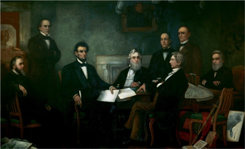
American President Abraham Lincoln, who went down in history, thanks to his expressive speeches, was known to be especially fixated on one image.
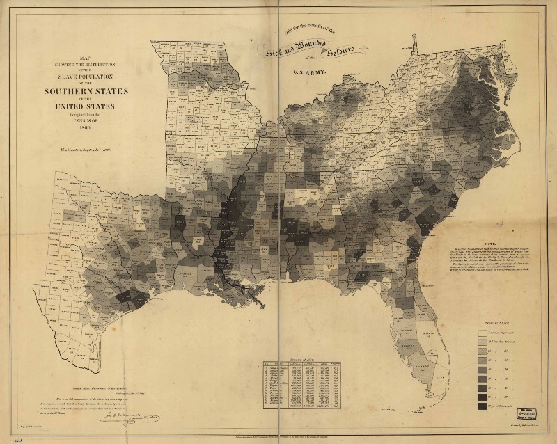
This is a map of the Southern States created in 1861, on which the number of slave owners in different regions of the country was shown in shades of black, gray and white.
This map was so important to Lincoln that it even fell into the portrait of Francis Bicknell Carpenter, which depicts the president and members of his office (the map can be seen in the lower right side of the canvas).
Thanks to her, Lincoln had a clear idea of which of the states would want to secede, and which could be persuaded to remain in the Union. This map is one of the earliest examples of infographics.
Currently, visual materials do the same for us as for Lincoln in those days: they help us quickly process complex information.
According to the Oxford Cognitive Psychology Handbook, about half of our brain is processing visual information. This explains the human ability to decode images so quickly.
The facts show that approximately 80% of what is seen or done remains in the person’s memory, but only 30% of what they have read and 10% of what they hear .
All the above confirms that graphic images are perceived and remembered easier than text, however, not all images are the same. Therefore, below is an analysis of what makes the visualization memorable. Hopefully this will help you choose the optimal image.
1. Choose harmonious colors
In one study, scientists found that colors help the brain to quickly process and identify the objects they see. In a discussion on choosing the best color for the brand, Color Association Executive Director Leslie Harrington noted:
Color is the most memorable property. That is what we see in the first place.
It turns out that properly chosen colors increase brand awareness by 80%.
Consider the pale blue color of Tiffany & Co. Currently, this shade is so associated with this brand that the company’s management has decided to register it as a trademark called Tiffany blue.
You can also give an example for sports fans - the bright orange color of the symbols of the University of Tennessee, which according to the Pantone classification is called UT Orange. In both cases, color is an integral part of the brand.
Color symbolism not only affects brand awareness, but also is much better stored in memory compared to black and white images. But this does not mean that you need to color everything you can in the brightest colors. Images are best remembered if they are similar to what we see in nature, so - do not overdo it with neon lights.
It should also be borne in mind that, according to the National Eye Institute (National Eye Institute), about 8% of men and 0.5% of women are color blind, and it is difficult to distinguish red from green. At the same time, almost all people can see the color blue , and for this reason it is ideal for hyperlinks.
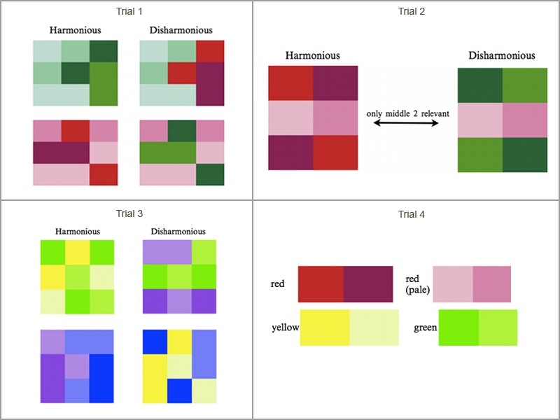
When choosing a multi-color image, consider the fact open by professors from the University of South Florida: harmonious color combinations are preserved in memory better than inharmonious ones. In this case, different shades of green work more efficiently than jumble pink, yellow and blue. Harmonious colors are better perceived by the brain, making the image easier to remember.
At the same time, an image consisting of seven or more colors has a better chance of remaining in memory than a picture with fewer shades. Various studies have shown that a surge in memory levels occurs when the number of colors exceeds six. In any case, this fact should be remembered or recorded in the diary.
2. The image should contain people's faces (the more emotions they express, the better)
Take a look at this stunning pink sunset below. Most likely, you will forget it.

Indeed, according to research on the ability of a person to memorize images, even the most beautiful picture of a landscape is likely to disappear from your brain very quickly. With a much higher probability you will remember the image in the center of which there is a person, even if it is something absolutely banal, for example, a man in the subway. Even better are the photos of people interacting with each other. Also good results show images focused on any one object.
However, images of people may also have different levels of memorability. In fact, the more intense the emotions expressed by the person photographed, the higher the likelihood that you will remember. Part of the reason for this is your own emotions caused by this image.

So when choosing images, first of all, pay attention not to the most stunning, but to those that cause an emotional response. And also give preference to emotional expressions, as more neutral expressions are forgotten much easier. Take at least these guys in the photo above, just won a computer game. Who does not feel this feeling of mad excitement appearing when you win something important for you?
Continuation - follows .
The author of the translation is Vyacheslav Davidenko, the founder of the TESTutor company.
Source: https://habr.com/ru/post/297846/
All Articles