Web typography today. Part V
Part I - Part II - Part III - Part IV - Part V - Part VI
Part V
It is obvious that in the field of high technology, development often occurs rapidly and rapidly. It happened with the means of displaying information. For some two or three years, conventional CRT monitors were almost completely and completely superseded by rapidly declining LCD counterparts. This made it possible to significantly improve both the display geometry and the color rendition, as well as reduce eye fatigue due to the absence of harmful flickering. And if a few years ago such an argument in favor of TFT panels could be challenged, now this fact does not cause any doubts: LCD displays are much better for the everyday work of an ordinary user. In connection with this factor, it became necessary to search for qualitatively new font display algorithms. One of these solutions, though not immediately, has nevertheless gained a certain recognition among the users, and today is almost the most popular on modern platforms. This, of course, is about the technology of rendering ClearType, which caused the development of new web-based fonts ...
')
It makes no sense to retell the essence of this technology. Suffice it to mention that subpixel rendering allows you to achieve the highest quality smoothing of the font on the screen. Some, however, may not like the visible "colorful halos" around the letters, although this is a matter of habit. And besides, there are also a number of important factors here.

This technology is not frozen at one point, and, like any computer industry, it is constantly evolving. Therefore, the ClearType algorithm in Vista is implemented a little better than in Windows XP. Obviously, in the future Vienna (and later versions of the system), this method will continue to be optimized and polished.
In my subjective opinion, sub-pixel anti-aliasing is best implemented in MacOS X (Quartz vector rendering technology), and in Leopard everything also looks a little better than in Tiger. And for users of UNIX-systems, there is an add-on FreeType , which also allows you to achieve a fairly high-quality anti-aliasing screen fonts.
In general, even five years ago, I was also annoyed by the well-distinguishable “coloriness” in XP (so I turned off the ClearType display and “enjoyed” non-smoothed letters), but now I absolutely do not notice this effect, although I use the same monitor connected now to the "poppy".
However, this is not very important stuff. The main thing is the fact that large software manufacturers have relied on ClearType (or analogs) and have not lost. The technology is improving, and over time it will get almost 100% use. How long this process of widespread implementation will take place - time will tell, but now we can say with confidence that designers should focus on the smoothed text using this or similar technologies.
As a matter of fact, the appearance of ClearType prompted Microsoft to develop a new set of fonts that would replace the outdated Core Fonts For Web set, which had served for a dozen years, until the time for a smooth text had come. We have already examined examples in which the flaws of fonts from this set of a decade ago are visible to the naked eye. For the same technology, new fonts were required.
So once again, experts from Ascender Corporation came to the aid of Microsoft, having developed a series of headsets combined into the ClearType Fonts Collection . Consider these fonts in more detail, since they are of considerable interest for modern web design.
For the first time this set appeared in the package of Microsoft Office 2007, and later became part of Windows Vista.
Users of earlier versions of Windows (2000, 2003 Server, XP) can download PowerPoint Viewer 2007 for free, after installing which all ClearType Fonts Collection fonts will appear in the system. These fonts can get on “Macs” with Microsoft mac: Office 2008. Only in the Linux family of operating systems (as well as other UNIX systems) there are no such fonts in the standard package. But you can buy them individually or as a complete set from Ascender Corporation . However, the demand in this case also regulates the offer, and therefore it would not be problematic to find these fonts for free of charge use in any OS, there would be a desire.
So, this set includes 7 fonts ( Segoe UI is often mentioned, but it is not included in this kit, but is a Windows Vista system font). All of them are presented in the OpenType format and contain a very wide range of Unicode characters (including extended Cyrillic). Due to the fact that the names of some of them begin with “Ca–” and others with “Co–”, this set is sometimes called CoCa-Fonts or C-Fonts.
These fonts are:

Font Cariadings is of no particular interest because, like Wingdings and Webdings headsets, it contains only pictographic symbols and patterns that will fit only in very rare specific cases (for example, for designing “bullets” or end characters in a newspaper layout).
But the other six fonts are very, very curious.
At first glance it seems that there is nothing unusual and special about them. It seems to be like the next variations on the theme of grotesques ( Calibri , Candara , Corbel ), antiques ( Cambria and Constantia ) and one fixed-width font ( Consolas ).
On conventional CRT displays and LCD monitors with anti-aliasing turned off, these fonts will look no better than the memorable Arial or Times New Roman . When printing on a printer, there is also no noticeable gain. However, I encountered a case of using the Cambria font in the printing industry. One familiar layout designer for a long time could not find a suitable antiqua to imitate a set of pre-revolutionary texts: I couldn’t manage to find a font in which the letter “yat” looked good, especially in italic. It turned out that Cambria is suitable for these purposes as well as possible, and in general, the impression of this typeface in print form is some kind of “old”, despite the relative youth of the headset.
And when the sub-pixel rendering algorithm is enabled, a significant advantage immediately becomes apparent when using each of the C-headsets. Let's see how this happens.
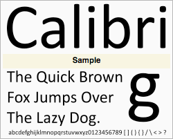 Calibri is a family of grotesque headsets designed for Microsoft in 2005 by the Dutch designer Lucas de Groot. Font won the Type Directors Club's Type Design Competition award in the category of system fonts.
Calibri has rounded touches and many rounded elements, which best affects the readability of small pins. In general, there is a very favorable impression compared to older headsets. This can be seen in the following example (for comparison, the text in the Tahoma font is shown on the right:
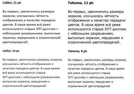
In this example, it is clear that Calibri has a slightly smaller point. Therefore, it seems that the size of this font is one point less than that of Tahoma . At the bottom, I deliberately used 10 points on the left side so that it could be compared with 9 points. A point is less, but due to this and readability is much higher.
Here's what the Calibri font would look like on our examples (excerpts from Apple and Co. ):

Overall, not bad. Although, in my opinion, not as elegant as in the case of Myriad Pro , but somewhere close to Lucida Grande and Trebuchet MS . It can be seen that this font behaves best in small size (up to 12 points), more or less suitable for medium headers (16-20 points). Although Calibri is not very suitable as a base font for non-stress reading, as it has pronounced roundness and monotony. After all, as it was established many centuries ago, humanistic fonts in this case are essentially losing with antiqual, but they are excellent for highlighting and emphasizing individual fragments.
Therefore, it is not entirely clear why in Microsoft Office 2007/2008, instead of Times New Roman , Calibri is used by default. It seems to me that this decision was somewhat unjustified. After all, the Times New Roman font, which is generally unsuitable for screen display, looked good in printed documents in general. But Calibri , on the contrary, is better suited for the Internet (emails, chat, web pages, etc.), and the print looks somewhat unusual. In the business sphere, where for some years certain standards of workflow have been developed, and a serif font is easily recognizable and readable, the appearance of documents with rounded strokes and letters looks, though fresh, but not so businesslike and strict. This fact, to a certain extent, has already caused outrage among businessmen, who often refuse to purchase Office 2007 and prefer to work with the more familiar Office 2003. However, in the context of our topic this is not so significant.
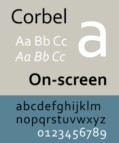 Corbel is a close relative of Calibri , a family of grotesque headsets designed for Microsoft in 2005 by designer Jeremy Tankard. This font is also easy to read in small size, and it also reduced the point and smoothed all the rounds. In combination with minuscule numbers (in the old style) it looks quite stylish and modern.
From a geometrical point of view, Corbel can be considered as a kind of hybrid between classical grotesques and modern grotesques. The font is clearly designed under the influence of all modern trends in font design. This can not fail to attract the attention of those designers who are forced to work with traditional means, but would like to expand the range of their capabilities through the use of fashionable fonts.
Corbel looks much better on pins up to 12 points than the somewhat outdated Tahoma :

Compared to Calibri , Corbel has a slightly more subtle touch and less saturation of the picture:
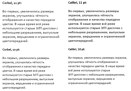
This may be useful for lightweight, “airy” sites with a large number of white fields, especially since the bold variation of this font is not as juicy as those of other grotesques. But with a little negative tracking, the letters look more elegant, especially on large pins:

Here are the Corbel font examples:

Both fonts - Calibri and Corbel - are quite good grotesques, quite suitable for replacing the teeth that have drilled Tahoma and Verdana . But Microsoft decided to go further and developed another font that can be very useful for web designers.
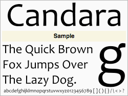 Candara is a curious grotesque, designed in 2006 by designer Gary Munch. Unusual terminal elements (for example, in the letters Q ) and slightly uneven, slightly curved vertical strokes distinguish it from previous fonts. Therefore, this headset with a stretch can be attributed to humanistic grotesques, but as a full-fledged decorative font Candara can hardly speak. Rather, it is a kind of hybrid of casual (for all occasions) and incidental (for selections and headings) directions in typography. Due to the slight curvature of the strokes, there is a significant decrease in readability in small skittles compared to Calibri and Corbel :

But in the headlines (size larger than 12 points), this headset can liven up the text quite well, although you should not get involved in this, because the letters “jump” a little in a line, giving the text a little excessive playfulness and lightheadedness.
In general, for blogs or youth communities, Candara will fit perfectly, but in the business sphere, its use seems to me somewhat inappropriate:
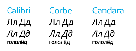
It is noteworthy that in all three grotesques the style of the execution of the letters l and d is equally realized. To someone, a bevel at an angle to the left in these letters will seem overly elaborate, but on the whole it looks quite modern and not too annoying:
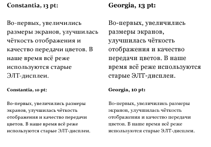
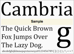 Cambria is a new antique headset, created in 2004 by Dutch designers Jelle Bosma, Steve Matteson and Robin Nicholas. A distinctive feature of this font is a certain vertical elongation in comparison with the classical type-setting antiqua, and also characteristic serifs, not cut out on the outside, but spliced with an end stroke. This is clearly seen, for example, in the letter C. The font itself is geometrically quite simple and even somewhat archaic during a cursory examination, but in reality it turns out to be a rather curious implementation, perfectly manifesting itself in various fields. Initially, its application was planned in the field of printing small text (for example, on packages), but Cambria was also good for web typography. Let's see how this headset manifests itself in comparison with Times New Roman :

And this is next to Georgia (the size is increased a little here):
There is definitely something in this. It is impossible to say with certainty what is better - Georgia or Cambria . The first one looks more monolithic and elegant, while the second one looks fresher and more unusual.
Here are the headings typed in these fonts:

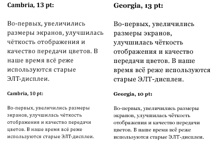
As can be seen from this example, Georgia’s bold face is very broad and rich, while Cambria remains more compact and strict. Here, the designer is free to choose: in some cases it is advisable to use Georgia for maximum contrast, especially in the case of large pins (30 points and above). But Cambria is much more suitable for small subtitles (14-24 points), and it is very suitable as a casual font. I have already met quite a few blogs, in which there was a use for Cambria , although there are still very few Russian-speaking ones among them. Domestic designers have not yet tried out a new headset and are very carefully applying it in their designs. Meanwhile, blogs and pages with articles are well combined with this font when using moderate (but not too small) pins (from 12 to 14 points).
Referring to our examples:
Here, it is clearly seen that the antiquarian font is not very suitable for multi-column layouts with inhomogeneous backings and small-size links. But the article is readable easily and visually perceived better than in the case of the grotesque.
 Constantia is another antiqua from the ClearType Fonts Collection, designed in 2005 by the designer John Hudson.
Its distinctive features are characteristic thin trapezoid-wedge-shaped serifs, thanks to which Constantia stands somewhere between classic, transitional and bar antiquas and modern-antiquas. It is rather difficult to find direct analogues for Constantia among the most common fonts, which can not but rejoice designers looking for unfinished and fresh solutions.
Indeed, the text typed in this font looks very interesting compared to the classic (and pretty bored) options:
The text looks clearer and more rigorous, some distinctive efficiency appears. Constantia is obviously suitable both for use in the business area as the main font for the design of documents, and for reading articles from the screen and blog entries. Yes, and in writing titles Constantia looks much nicer than, say, Times New Roman :

It's strange that this headset was not chosen as a replacement for Times New Roman and is not set as the default font in Office 2007. After all, most business people never change what is written in program settings, and there are many others about the existence of other C-fonts besides Calibri. do not suspect!
Otherwise, the situation is about the same as in the case of Cambria : for multi-column layouts, small texts and inscriptions on dies, this font is of little use (although it looks a little better than its fellow), and articles and blog entries look cute, fresh and stylish. :


However, with all the advantages of the considered fonts, there are a number of minor flaws or, rather, inconveniences.
First, in almost all fonts (except Calibri ), minuscule numerals are used (that is, in the old style, with remote elements). A typical Russian user didn’t meet with such a variant of writing very often, therefore getting used to it is rather difficult, and sometimes the numerals sometimes hurt the eyes and irritate with their uneven, spasmodic writing.
Secondly, as already noted, the font designers thought that the letters l and d only on the left side would look better, and meanwhile, again - a somewhat different image of these letters is more usual for us.
And thirdly, all these fonts have a reduced point of letters. This is a very important factor, especially for developers seeking to achieve the same display of their pages on different platforms. In such a case, with a design like
a Windows Vista user will see a layout using Constantia , and a Linux owner will get the same page, but with Georgia . And in this case, the text will look a little larger, and the layout itself may seriously suffer from distortions and sprawling text blocks. Therefore, when designing websites, you should still optimize them for old and proven headsets, and then try to add new fonts.
 And finally, the last font in the collection -
Consolas . This is a monospace headset designed to replace Andale Mono , Lucida Console and Courier New fonts. The font is also designed by the Dutchman Lucas de Groot. There is nothing particularly interesting in Consolas , except for the presence of italics, which is not typical of most monospace headsets. Consolas is not suitable for either casual or casual use, but programmers and web developers will appreciate it. Indeed, the program text typed by this headset is perceived much better:

Another font that appeared in Windows Vista is Segoe UI . It is not included in the ClearType Fonts Collection, although it is also optimized for display using sub-pixel rendering. This font is an unremarkable grotesque, which is best suited for displaying text on buttons and toolbars in Vista. But it can also be used as a web headset. I have encountered several options for using Segoe UI on sites, although this is rather an exception. Yes, and the legality of the existence of this font is questionable: Microsoft and Adobe have been charged that Segoe UI and Myriad are considered plagiarism against the well-known Frutiger headset. However, there are opposing opinions . Personally, I prefer to adhere to this position: the more good fonts, and the more common they are, the better for everyone. Are they like or not - what's the difference?
So, we looked at the newest of the popular fonts. We can’t say that Microsoft had something out of the ordinary, but to a certain extent it turned out to revive web typography that was stopped in its development. ClearType Fonts Collection fonts look quite fresh and allow you to better perceive textual information. So far, designers are very wary of using these fonts, fearing their relatively low prevalence among users who do not have Windows Vista or Office 2007. Meanwhile, the number of sales of these products is growing every day, and the popularity of C-fonts has increased significantly. compared to last year.
Given the merits of Microsoft in promoting its own products, you can safely predict the almost ubiquitous distribution of ClearType-fonts, as it once happened with CoreWeb Fonts. Therefore, it is worth paying special attention to the proper use of new headsets, the benefit now they have become more.
Do not be afraid to experiment!
UPD: I strongly recommend all fans of typography to watch this wonderful video (in English) . ;-)
Part V 
It is obvious that in the field of high technology, development often occurs rapidly and rapidly. It happened with the means of displaying information. For some two or three years, conventional CRT monitors were almost completely and completely superseded by rapidly declining LCD counterparts. This made it possible to significantly improve both the display geometry and the color rendition, as well as reduce eye fatigue due to the absence of harmful flickering. And if a few years ago such an argument in favor of TFT panels could be challenged, now this fact does not cause any doubts: LCD displays are much better for the everyday work of an ordinary user. In connection with this factor, it became necessary to search for qualitatively new font display algorithms. One of these solutions, though not immediately, has nevertheless gained a certain recognition among the users, and today is almost the most popular on modern platforms. This, of course, is about the technology of rendering ClearType, which caused the development of new web-based fonts ...
')
It makes no sense to retell the essence of this technology. Suffice it to mention that subpixel rendering allows you to achieve the highest quality smoothing of the font on the screen. Some, however, may not like the visible "colorful halos" around the letters, although this is a matter of habit. And besides, there are also a number of important factors here.
This technology is not frozen at one point, and, like any computer industry, it is constantly evolving. Therefore, the ClearType algorithm in Vista is implemented a little better than in Windows XP. Obviously, in the future Vienna (and later versions of the system), this method will continue to be optimized and polished.
In my subjective opinion, sub-pixel anti-aliasing is best implemented in MacOS X (Quartz vector rendering technology), and in Leopard everything also looks a little better than in Tiger. And for users of UNIX-systems, there is an add-on FreeType , which also allows you to achieve a fairly high-quality anti-aliasing screen fonts.
In general, even five years ago, I was also annoyed by the well-distinguishable “coloriness” in XP (so I turned off the ClearType display and “enjoyed” non-smoothed letters), but now I absolutely do not notice this effect, although I use the same monitor connected now to the "poppy".
However, this is not very important stuff. The main thing is the fact that large software manufacturers have relied on ClearType (or analogs) and have not lost. The technology is improving, and over time it will get almost 100% use. How long this process of widespread implementation will take place - time will tell, but now we can say with confidence that designers should focus on the smoothed text using this or similar technologies.
As a matter of fact, the appearance of ClearType prompted Microsoft to develop a new set of fonts that would replace the outdated Core Fonts For Web set, which had served for a dozen years, until the time for a smooth text had come. We have already examined examples in which the flaws of fonts from this set of a decade ago are visible to the naked eye. For the same technology, new fonts were required.
So once again, experts from Ascender Corporation came to the aid of Microsoft, having developed a series of headsets combined into the ClearType Fonts Collection . Consider these fonts in more detail, since they are of considerable interest for modern web design.
For the first time this set appeared in the package of Microsoft Office 2007, and later became part of Windows Vista.
Users of earlier versions of Windows (2000, 2003 Server, XP) can download PowerPoint Viewer 2007 for free, after installing which all ClearType Fonts Collection fonts will appear in the system. These fonts can get on “Macs” with Microsoft mac: Office 2008. Only in the Linux family of operating systems (as well as other UNIX systems) there are no such fonts in the standard package. But you can buy them individually or as a complete set from Ascender Corporation . However, the demand in this case also regulates the offer, and therefore it would not be problematic to find these fonts for free of charge use in any OS, there would be a desire.
So, this set includes 7 fonts ( Segoe UI is often mentioned, but it is not included in this kit, but is a Windows Vista system font). All of them are presented in the OpenType format and contain a very wide range of Unicode characters (including extended Cyrillic). Due to the fact that the names of some of them begin with “Ca–” and others with “Co–”, this set is sometimes called CoCa-Fonts or C-Fonts.
These fonts are:
Font Cariadings is of no particular interest because, like Wingdings and Webdings headsets, it contains only pictographic symbols and patterns that will fit only in very rare specific cases (for example, for designing “bullets” or end characters in a newspaper layout).
But the other six fonts are very, very curious.
At first glance it seems that there is nothing unusual and special about them. It seems to be like the next variations on the theme of grotesques ( Calibri , Candara , Corbel ), antiques ( Cambria and Constantia ) and one fixed-width font ( Consolas ).
On conventional CRT displays and LCD monitors with anti-aliasing turned off, these fonts will look no better than the memorable Arial or Times New Roman . When printing on a printer, there is also no noticeable gain. However, I encountered a case of using the Cambria font in the printing industry. One familiar layout designer for a long time could not find a suitable antiqua to imitate a set of pre-revolutionary texts: I couldn’t manage to find a font in which the letter “yat” looked good, especially in italic. It turned out that Cambria is suitable for these purposes as well as possible, and in general, the impression of this typeface in print form is some kind of “old”, despite the relative youth of the headset.
And when the sub-pixel rendering algorithm is enabled, a significant advantage immediately becomes apparent when using each of the C-headsets. Let's see how this happens.
Calibri is a family of grotesque headsets designed for Microsoft in 2005 by the Dutch designer Lucas de Groot. Font won the Type Directors Club's Type Design Competition award in the category of system fonts.Calibri has rounded touches and many rounded elements, which best affects the readability of small pins. In general, there is a very favorable impression compared to older headsets. This can be seen in the following example (for comparison, the text in the Tahoma font is shown on the right:
In this example, it is clear that Calibri has a slightly smaller point. Therefore, it seems that the size of this font is one point less than that of Tahoma . At the bottom, I deliberately used 10 points on the left side so that it could be compared with 9 points. A point is less, but due to this and readability is much higher.
Here's what the Calibri font would look like on our examples (excerpts from Apple and Co. ):
Overall, not bad. Although, in my opinion, not as elegant as in the case of Myriad Pro , but somewhere close to Lucida Grande and Trebuchet MS . It can be seen that this font behaves best in small size (up to 12 points), more or less suitable for medium headers (16-20 points). Although Calibri is not very suitable as a base font for non-stress reading, as it has pronounced roundness and monotony. After all, as it was established many centuries ago, humanistic fonts in this case are essentially losing with antiqual, but they are excellent for highlighting and emphasizing individual fragments.
Therefore, it is not entirely clear why in Microsoft Office 2007/2008, instead of Times New Roman , Calibri is used by default. It seems to me that this decision was somewhat unjustified. After all, the Times New Roman font, which is generally unsuitable for screen display, looked good in printed documents in general. But Calibri , on the contrary, is better suited for the Internet (emails, chat, web pages, etc.), and the print looks somewhat unusual. In the business sphere, where for some years certain standards of workflow have been developed, and a serif font is easily recognizable and readable, the appearance of documents with rounded strokes and letters looks, though fresh, but not so businesslike and strict. This fact, to a certain extent, has already caused outrage among businessmen, who often refuse to purchase Office 2007 and prefer to work with the more familiar Office 2003. However, in the context of our topic this is not so significant.
Corbel is a close relative of Calibri , a family of grotesque headsets designed for Microsoft in 2005 by designer Jeremy Tankard. This font is also easy to read in small size, and it also reduced the point and smoothed all the rounds. In combination with minuscule numbers (in the old style) it looks quite stylish and modern.From a geometrical point of view, Corbel can be considered as a kind of hybrid between classical grotesques and modern grotesques. The font is clearly designed under the influence of all modern trends in font design. This can not fail to attract the attention of those designers who are forced to work with traditional means, but would like to expand the range of their capabilities through the use of fashionable fonts.
Corbel looks much better on pins up to 12 points than the somewhat outdated Tahoma :
Compared to Calibri , Corbel has a slightly more subtle touch and less saturation of the picture:
This may be useful for lightweight, “airy” sites with a large number of white fields, especially since the bold variation of this font is not as juicy as those of other grotesques. But with a little negative tracking, the letters look more elegant, especially on large pins:
Here are the Corbel font examples:
Both fonts - Calibri and Corbel - are quite good grotesques, quite suitable for replacing the teeth that have drilled Tahoma and Verdana . But Microsoft decided to go further and developed another font that can be very useful for web designers.
Candara is a curious grotesque, designed in 2006 by designer Gary Munch. Unusual terminal elements (for example, in the letters Q ) and slightly uneven, slightly curved vertical strokes distinguish it from previous fonts. Therefore, this headset with a stretch can be attributed to humanistic grotesques, but as a full-fledged decorative font Candara can hardly speak. Rather, it is a kind of hybrid of casual (for all occasions) and incidental (for selections and headings) directions in typography. Due to the slight curvature of the strokes, there is a significant decrease in readability in small skittles compared to Calibri and Corbel :But in the headlines (size larger than 12 points), this headset can liven up the text quite well, although you should not get involved in this, because the letters “jump” a little in a line, giving the text a little excessive playfulness and lightheadedness.
In general, for blogs or youth communities, Candara will fit perfectly, but in the business sphere, its use seems to me somewhat inappropriate:
It is noteworthy that in all three grotesques the style of the execution of the letters l and d is equally realized. To someone, a bevel at an angle to the left in these letters will seem overly elaborate, but on the whole it looks quite modern and not too annoying:
Cambria is a new antique headset, created in 2004 by Dutch designers Jelle Bosma, Steve Matteson and Robin Nicholas. A distinctive feature of this font is a certain vertical elongation in comparison with the classical type-setting antiqua, and also characteristic serifs, not cut out on the outside, but spliced with an end stroke. This is clearly seen, for example, in the letter C. The font itself is geometrically quite simple and even somewhat archaic during a cursory examination, but in reality it turns out to be a rather curious implementation, perfectly manifesting itself in various fields. Initially, its application was planned in the field of printing small text (for example, on packages), but Cambria was also good for web typography. Let's see how this headset manifests itself in comparison with Times New Roman :And this is next to Georgia (the size is increased a little here):
There is definitely something in this. It is impossible to say with certainty what is better - Georgia or Cambria . The first one looks more monolithic and elegant, while the second one looks fresher and more unusual.
Here are the headings typed in these fonts:
As can be seen from this example, Georgia’s bold face is very broad and rich, while Cambria remains more compact and strict. Here, the designer is free to choose: in some cases it is advisable to use Georgia for maximum contrast, especially in the case of large pins (30 points and above). But Cambria is much more suitable for small subtitles (14-24 points), and it is very suitable as a casual font. I have already met quite a few blogs, in which there was a use for Cambria , although there are still very few Russian-speaking ones among them. Domestic designers have not yet tried out a new headset and are very carefully applying it in their designs. Meanwhile, blogs and pages with articles are well combined with this font when using moderate (but not too small) pins (from 12 to 14 points).
Referring to our examples:
Here, it is clearly seen that the antiquarian font is not very suitable for multi-column layouts with inhomogeneous backings and small-size links. But the article is readable easily and visually perceived better than in the case of the grotesque.
Constantia is another antiqua from the ClearType Fonts Collection, designed in 2005 by the designer John Hudson.Its distinctive features are characteristic thin trapezoid-wedge-shaped serifs, thanks to which Constantia stands somewhere between classic, transitional and bar antiquas and modern-antiquas. It is rather difficult to find direct analogues for Constantia among the most common fonts, which can not but rejoice designers looking for unfinished and fresh solutions.
Indeed, the text typed in this font looks very interesting compared to the classic (and pretty bored) options:
The text looks clearer and more rigorous, some distinctive efficiency appears. Constantia is obviously suitable both for use in the business area as the main font for the design of documents, and for reading articles from the screen and blog entries. Yes, and in writing titles Constantia looks much nicer than, say, Times New Roman :
It's strange that this headset was not chosen as a replacement for Times New Roman and is not set as the default font in Office 2007. After all, most business people never change what is written in program settings, and there are many others about the existence of other C-fonts besides Calibri. do not suspect!
Otherwise, the situation is about the same as in the case of Cambria : for multi-column layouts, small texts and inscriptions on dies, this font is of little use (although it looks a little better than its fellow), and articles and blog entries look cute, fresh and stylish. :
However, with all the advantages of the considered fonts, there are a number of minor flaws or, rather, inconveniences.
First, in almost all fonts (except Calibri ), minuscule numerals are used (that is, in the old style, with remote elements). A typical Russian user didn’t meet with such a variant of writing very often, therefore getting used to it is rather difficult, and sometimes the numerals sometimes hurt the eyes and irritate with their uneven, spasmodic writing.
Secondly, as already noted, the font designers thought that the letters l and d only on the left side would look better, and meanwhile, again - a somewhat different image of these letters is more usual for us.
And thirdly, all these fonts have a reduced point of letters. This is a very important factor, especially for developers seeking to achieve the same display of their pages on different platforms. In such a case, with a design like
body { font: 12pt Constantia, Georgia, “Times New Roman”, serif; }
a Windows Vista user will see a layout using Constantia , and a Linux owner will get the same page, but with Georgia . And in this case, the text will look a little larger, and the layout itself may seriously suffer from distortions and sprawling text blocks. Therefore, when designing websites, you should still optimize them for old and proven headsets, and then try to add new fonts.
And finally, the last font in the collection -Consolas . This is a monospace headset designed to replace Andale Mono , Lucida Console and Courier New fonts. The font is also designed by the Dutchman Lucas de Groot. There is nothing particularly interesting in Consolas , except for the presence of italics, which is not typical of most monospace headsets. Consolas is not suitable for either casual or casual use, but programmers and web developers will appreciate it. Indeed, the program text typed by this headset is perceived much better:
Another font that appeared in Windows Vista is Segoe UI . It is not included in the ClearType Fonts Collection, although it is also optimized for display using sub-pixel rendering. This font is an unremarkable grotesque, which is best suited for displaying text on buttons and toolbars in Vista. But it can also be used as a web headset. I have encountered several options for using Segoe UI on sites, although this is rather an exception. Yes, and the legality of the existence of this font is questionable: Microsoft and Adobe have been charged that Segoe UI and Myriad are considered plagiarism against the well-known Frutiger headset. However, there are opposing opinions . Personally, I prefer to adhere to this position: the more good fonts, and the more common they are, the better for everyone. Are they like or not - what's the difference?
So, we looked at the newest of the popular fonts. We can’t say that Microsoft had something out of the ordinary, but to a certain extent it turned out to revive web typography that was stopped in its development. ClearType Fonts Collection fonts look quite fresh and allow you to better perceive textual information. So far, designers are very wary of using these fonts, fearing their relatively low prevalence among users who do not have Windows Vista or Office 2007. Meanwhile, the number of sales of these products is growing every day, and the popularity of C-fonts has increased significantly. compared to last year.
Given the merits of Microsoft in promoting its own products, you can safely predict the almost ubiquitous distribution of ClearType-fonts, as it once happened with CoreWeb Fonts. Therefore, it is worth paying special attention to the proper use of new headsets, the benefit now they have become more.
Do not be afraid to experiment!
UPD: I strongly recommend all fans of typography to watch this wonderful video (in English) . ;-)
Source: https://habr.com/ru/post/29771/
All Articles