Case: Increase of registrations by 11.6% in the service Piktochart
Step-by-step process of increasing conversion: analyzing the current site and target audience> searching for ideas for testing> creating a test version> result - an increase in registrations by 11.6%.
Piktochart is one of the coolest services for creating infographics. He personally tried all the tools and, in the end, stopped on him. As for me, this is a great product.
')
Many at this stage (when they achieve a certain success) stop working on the site, service, because everything is so good. But this is not the case. The guys did not stop there and continued to work on increasing the conversion of the landing page. What and how they did, you will learn further.
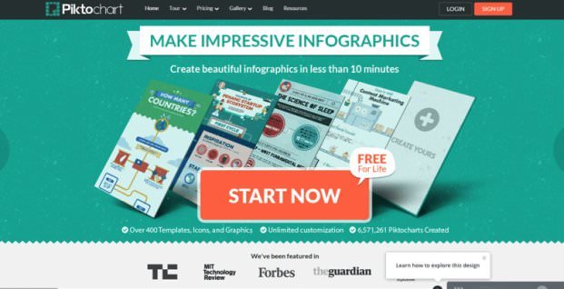
So, we have the original version of the main page of the site, where all the traffic goes.
The original version of the main page
At first glance, everything is very good. Nice colors, a large and noticeable title, a subtitle, a list of service functions, a video about the service and a large orange button (nothing is brighter than this button). There is even a small text stating that each user is provided with a perpetual free account without having to enter card data. And, of course, the logos of famous media that wrote about the service.
In principle, everything is cool. But this does not mean that it is this option that best converts visitors into registrations.
Article in the topic - 10 Google Analytics reports that will help you find all the conversion killers
Let's explore user interaction with the page.
Click Map
Before you run the A / B test , you need to do a qualitative and quantitative analysis. I hope everyone knows that. When the experts started analyzing the page, the first thing they did was analyze the click-through map.
Analysis of the click map allows you to see which elements of the page users click on most often. Services for analyzing the click map can be selected here .
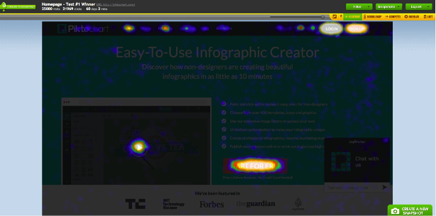
After analyzing the click map, it became clear that the most clickable element is the big orange “Start for free” button (except the “Login” button). And the video accounted for less than 1% of clicks. Although it was it that was supposed to convey the ease of use and functionality of the service. But since almost no one clicked on it, it did not fulfill its function.
Article in the topic - How to find an idea for A / B tests: click cards and polls
Scrolling card
This is another way to analyze user behavior on a page.
Analysis of the scrolling map allows you to see how deeply users are browsing the page. To conduct such an analysis, you can use Yandex.Metrica.
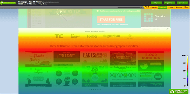
It became clear that only 50% of users flip through the page to infographic examples and only 25% scroll further.
What does this mean?
To test items that are below the green line is pointless. They will not see the majority of users. You need to test the first screen that the visitor encounters immediately after entering the site.
If the majority of your users do not scroll the page, then you should not have the most important elements there. For example, some sites sin by placing an order form only at the bottom of a long landing page. And most visitors do not even reach it and do not understand how you can make an order.
Stupid? Stupid!
At this stage, it was decided that the “first screen” would be tested. The main goal is to make the new visitor immediately understand the “whole power” of the service. So that he knows exactly what result he can get.
In addition, it was important not only to "force" the user to register with the service. It was necessary to stimulate him to create the first infographic, get the first experience of using the service. The so-called, aha-moment, after which he realizes the value of the product and begins to use it.
Then began the analysis of the product, market, competitors and target audience. “Portraits” of ideal clients were made for each segment of the target audience and it was described how to interact with each segment.
Article in the topic - Know your target audience or die: 34 vital questions
Work on text elements
1. According to Nielsen research data , visitors read about 20-28% of the entire text posted on the site . In the original version of the text was too much: a long subtitle and 6 elements in the list. I think that this list read the smallest number of visitors.
Therefore, only 3 of the most important points were selected from the list, and the subtitle was halved.
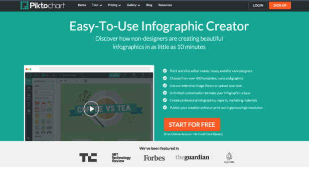
2. The original “Easy-to-use infographic creator” heading (Simple service for creating infographics) had no appeal to the user. Accordingly, did not cling to his attention and had no emotional impact.
Therefore, a new version of the title was chosen - Make impressive infographics (Create an impressive infographic). This header has a direct appeal to a potential customer. And this is very important!
3. After analyzing the market and the target audience, it became clear that the majority of site visitors are students, internet marketers, bloggers and teachers. And almost none of them have design skills. Therefore, a key factor in using the service for them is the ability to create infographics without experience in graphic design.
Based on this information, a new short subtitle was written - “Create beautiful infographic in less than 10 minutes” (Create a beautiful infographic in less than 10 minutes). The emphasis is on the fact that it is very fast and simple.
Although, in my opinion, the original subtitle better reflected the meaning of the service. And there it was clearly written that the service is NOT intended for designers (10 minutes). In this subtitle, only one confuses - its length. Otherwise, he is better. But, again, this is just my opinion.
Work with images
Images, like text elements, strongly influence conversion rate and user behavior. Therefore, it is also possible to carry out many manipulations with them, useful for conversion.
1. The first thing I wanted to do in terms of images is to show the final result of using the service. In our case, this is a service for creating infographics. Accordingly, the visitor had to show what he could do in him.
Therefore, on the first screen, 4 small colorful infographics and a fifth empty version with the text “Create yours” was added as a background. Great move. Showed the product face. Now every visitor should immediately understand what kind of service it is and what benefits it can give him.
2. If this is a service for creating infographics, then the site itself should be made in this style. In the original version of the site had the usual appearance, like most landing pages. But in the test version, everything changed. Now the title was made in the style of infographics - the inscription on the ribbon, and the outer borders of the individual blocks received "sharp edges".
Thanks to this, the page itself has become similar to infographics. At first glance, these are very small changes. But each such trifle influences the first impression of the visitor.
Article in the topic - How to increase website conversion using images - 6 tips based on successful cases
3. The last thing that was changed in the test version is the CTA button. The button has become 2-2.5 times larger. Now all the attention had to be riveted to her. Also, the text has slightly changed: instead of “Start for free” - “Start now”, and a small “Free For Life” inscription appeared on top.
And so that eventually turned out:
Testing
After creating a test case, an A / B test was launched. All traffic was divided 50/50, i.e. 50% of all users saw the original version, and the remaining 50% - the test version. The experiment lasted for 10 days. During this period, about 150,000 users took part in it.
Result:
The number of registrations in the test version increased by 11.4%. Statistical accuracy - 99%.
Since the service can register via Email, Facebook and Google, the effect on the number of registrations through each of these options was analyzed separately. So, with the help of E-mail, the number of registrations increased by 7.1%, through Google - by 13.8% and through Facebook - by 14.9%.
findings
1. Analyze the process of user interaction with the site. You need to know where visitors click, what they most often see and how deeply they turn over the page. Use for this card clicks and scrolling.
2. Analyze your target audience to understand the "pain" points and, on this basis, to build the process of the first contact . To do this, you need to communicate with potential and current customers, conduct surveys .
3. Speak not about the features / benefits of your service, but about the value and benefits that it will ultimately bring to the client.
4. Show the product "face" . A potential client should see how he can use your product / service, what he gets from him. This visualization helps him to present the final result. And this may affect further behavior.
5. Before making changes to the site, test them . Now everyone says that videos on the landing pages are cool and increase conversion. And in most cases it is. But in this article it turned out the opposite. And no one knows (without testing) how the use of video will affect the conversion specifically on your site.
Translation and adaptation - http://blog.crazyegg.com/2015/10/28/emotion-to-increase-conversions/
Prepared by the blog Boosta.ru and the project Changeagain.me
Read also our other popular articles:
1. They will help you find all the “killers” of the conversion - 10 reports in Google Analytics (5000+ views)
2. 100 ideas for A / B testing. Part One (2000+ views)
3. 100 ideas for A / B testing: Part Two (1000+ views)
4. How to find an idea for an A / B test: heat maps and polls (1000+ views)
Source: https://habr.com/ru/post/297562/
All Articles