3 rules for perfect website conversion (landing page)
Before revealing the secrets of increasing the conversion of the site, let's determine what it is. There are many definitions, but I like this:
And indeed sometimes we “prevent” a customer from buying. Sites are created on so many complex that the first time is not clear, but how to buy?
')
Let's see what the conversion of the site depends on!
To buy a client goes through a series of stages, which in turn affect the result.
Each advertising channel has its own personal effectiveness and depends on your target audience. According to independent data, Yandex is considered the most popular search engine in Russia. Behind him comes Gooogle, everyone else is sadly trailing behind ... Where are your customers?
The answer to this question can only give statistics. We always recommend running ad campaigns in both search engines and look at the result.
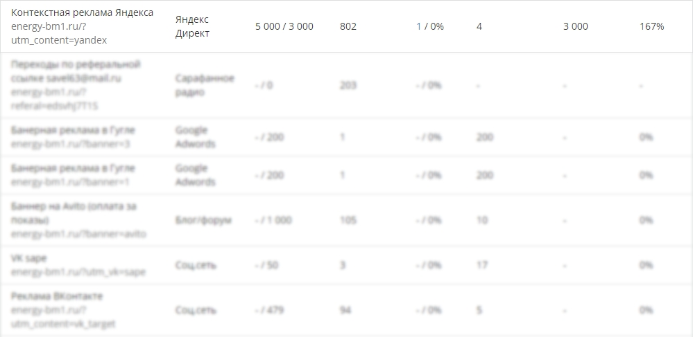
The site builder Energy-bm has an excellent tool “ADVERTISING”, it allows you to determine the quality of advertising channels. Automatically calculates ROI (profit percentage for each ruble invested). Find out the cost of 1 transition, 1 application. You can create an unlimited number of tags to account for transitions. And everyone can always answer the question: How much does an application cost you?
Suppose you create a great advertising campaign and your ad is quite different from your competitors. Traffic went ... what's next?
Now we are talking, not even about attractive discounts for the client, but about how your site looks. It takes 3 seconds after the download to understand where the client got when clicking on an ad.
Why 68% of customers leave the site in 3 seconds
I always hold the opinion that the transition should be obvious.
Do not think, the easier it is accessible and the front screen of your landing page (single-page site) looks better.
If you have a large catalog of products or services, here help multilending!
The script is arranging your site for a key request of your client.
There can not do without an example
Here is an example of using multilending using the example of the Energy-bm main page:
Option number 1
Option number 2
I recommend to go to see the difference.
The main title and the inscription on the button change. You can also change:
If you were selling felt boots in the winter with a 50% discount, and no competitor within a radius of 50 kilometers ...
Suppose you spend a decent share of profits on an advertising campaign in the search engines, your site maximally adapts to the key requests (needs) of your customers, BUT your offer is a price higher than the offer of your competitor ... there can be no question of high conversion!
In this case, only your lazy client, who has already used your services / product and was satisfied with your offer, will take advantage of your offer!
Conclusion: It is important to follow all three rules for the perfect conversion!
Yes, money will come with you!
Website conversion is the result of dividing the desire to buy into the opportunity to buy!
And indeed sometimes we “prevent” a customer from buying. Sites are created on so many complex that the first time is not clear, but how to buy?
')
Let's see what the conversion of the site depends on!
Clients often ask us if you guarantee the conversion of the site. Or let's even prescribe it in the contract!
To buy a client goes through a series of stages, which in turn affect the result.
Stage One: Customer Attraction (Traffic)
Each advertising channel has its own personal effectiveness and depends on your target audience. According to independent data, Yandex is considered the most popular search engine in Russia. Behind him comes Gooogle, everyone else is sadly trailing behind ... Where are your customers?
The answer to this question can only give statistics. We always recommend running ad campaigns in both search engines and look at the result.
According to the same statistics, the cost of one visitor at Google is cheaper than at Yandex. Due to the lack of "aggressive" competition.
The site builder Energy-bm has an excellent tool “ADVERTISING”, it allows you to determine the quality of advertising channels. Automatically calculates ROI (profit percentage for each ruble invested). Find out the cost of 1 transition, 1 application. You can create an unlimited number of tags to account for transitions. And everyone can always answer the question: How much does an application cost you?
Stage Two: The external attractiveness of the site
Suppose you create a great advertising campaign and your ad is quite different from your competitors. Traffic went ... what's next?
Now we are talking, not even about attractive discounts for the client, but about how your site looks. It takes 3 seconds after the download to understand where the client got when clicking on an ad.
Why 68% of customers leave the site in 3 seconds
I always hold the opinion that the transition should be obvious.
For example: “Meat Clearance” is written on the store door. The client opens the door and he should see only Meat special offers! And not grocery groceries!
Do not think, the easier it is accessible and the front screen of your landing page (single-page site) looks better.
If you have a large catalog of products or services, here help multilending!
The script is arranging your site for a key request of your client.
There can not do without an example
Here is an example of using multilending using the example of the Energy-bm main page:
Option number 1
Option number 2
I recommend to go to see the difference.
The main title and the inscription on the button change. You can also change:
- Section Background Image
- Just a picture
- Special offer
- Call to Action
Stage Three - Final: Price and Importance!
If you were selling felt boots in the winter with a 50% discount, and no competitor within a radius of 50 kilometers ...
Suppose you spend a decent share of profits on an advertising campaign in the search engines, your site maximally adapts to the key requests (needs) of your customers, BUT your offer is a price higher than the offer of your competitor ... there can be no question of high conversion!
The harsh law of the jungle!
In this case, only your lazy client, who has already used your services / product and was satisfied with your offer, will take advantage of your offer!
Conclusion: It is important to follow all three rules for the perfect conversion!
Yes, money will come with you!
Source: https://habr.com/ru/post/296772/
All Articles