Icon in Google Play - experiments and results in graphs
Good all!
We are developers for android, periodically we release games of a different genre, we try ourselves, so to speak. Releasing the game is half the battle. The second half, I would even say two thirds, is to unleash it in the market. Of course the web is full of resources devoted to reviews, promotion and promotion of applications. But in this article we will focus on the optimization work carried out on the icons of several games with specific examples.
The developer has three main tasks:
The second and third paragraph deserve attention in a separate article, and now let's consider the first one.
In Google Play to attract an audience, we have only two tools - the name of the game and the icon. Our task is to stand out from the crowd, of course within reason. The icon is of paramount importance in this matter.
')
On the example of one of our two games, I would like to show its value. So.
We decided to refresh the first game a little, since it is not new and has been hanging in the market for a long time.
 vs
vs 
On the left is an old icon, on the right is a new one. What was achieved:
Now the fun part. I present to you the download schedule from the Google Play Developer Console:
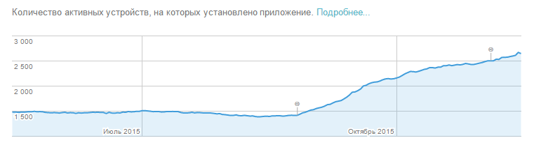
The graph shows that these changes allowed to attract more users to the game and get a daily positive increase in the total number of players.
The second game and similar comparisons:
 vs
vs 
By analogy with the first case, it was possible to achieve recognition of the game by an icon, which undoubtedly affected the installations.

Findings:
Experiment - it will allow you to achieve some success.
We are developers for android, periodically we release games of a different genre, we try ourselves, so to speak. Releasing the game is half the battle. The second half, I would even say two thirds, is to unleash it in the market. Of course the web is full of resources devoted to reviews, promotion and promotion of applications. But in this article we will focus on the optimization work carried out on the icons of several games with specific examples.
The developer has three main tasks:
- to draw the attention of the audience to the game;
- like the user and make him install the game;
- hold it and use it 100%
The second and third paragraph deserve attention in a separate article, and now let's consider the first one.
In Google Play to attract an audience, we have only two tools - the name of the game and the icon. Our task is to stand out from the crowd, of course within reason. The icon is of paramount importance in this matter.
')
On the example of one of our two games, I would like to show its value. So.
We decided to refresh the first game a little, since it is not new and has been hanging in the market for a long time.
vs On the left is an old icon, on the right is a new one. What was achieved:
- A new icon conveys the content of the gameplay - it is necessary to erase the protective layer and guess what was hidden under the animal;
- bright colors highlight the game from the masses;
- A certain note of humor in the form of "arrogant cat" attracts users.
Now the fun part. I present to you the download schedule from the Google Play Developer Console:
The graph shows that these changes allowed to attract more users to the game and get a daily positive increase in the total number of players.
The second game and similar comparisons:
vs By analogy with the first case, it was possible to achieve recognition of the game by an icon, which undoubtedly affected the installations.
Findings:
- make it simple and clear - the user must know by name and icon what awaits him;
- avoid dullness - your task is to stand out in the mass of other games;
- It is not advisable to use text on the icon, for this there is a name;
- consider the icons of competitors that appear in the search next to your project.
Experiment - it will allow you to achieve some success.
Source: https://habr.com/ru/post/296512/
All Articles