50 best newsletter designs (and how to do it yourself is just as cool) (Part 5)
We publish the last part of the translation of an article about the best mailing lists The first part , the second part , the third and fourth .
In fact, to learn from other people's examples is quite effective, but only when the quantity turns into quality, probably, therefore, the authors of the article chose 50, not 10 or 15. If you are interested in the topic, you can search for examples on your own , focusing on some techniques, described in this article, and, of course, on your own sense of what works and what doesn't.
General conclusion: do not be afraid to experiment!
Next on our blog are insights from the MailCon conference. Subscribe - there will be a lot of useful and interesting!
')
Squarespace chose a minimalist design in terms of both font and visual, and color palette. Only one image is used, a simple, almost monochromatic snapshot of nature, which overlaps the heading "10", and the rest of the letter is typed in the same black font, the hierarchy is formed only with the help of boldface. To design was spectacular, it is not necessary to add a lot of bells and whistles, try not to add, but to remove.
In the Sephora layout an interesting zigzag arrangement is used, the images are placed diagonally, which is emphasized by bright color blocks. Such layout is not only original and attracts attention, but also effective in presenting a large amount of information and images.
Handy letter design is built like an annual report, which includes thanks to customers and celebrates their own success with the help of graphs and visual pictures. The design is based on a large number of graphic elements, but it is a fun and effective way to convey a lot of information to customers in an understandable way.
It is well known that aligning text along the left edge provides a lighter perception of it, however, you should not take it as an axiom. In the example from Brother Moto, the text is centered, which makes it possible to focus extremely on the middle of the page, forming a balanced design without compromising the readability of the text.
This letter to Jack Spade is made simple: one image, one call to action (CTA) - but creates a topic of urgency. Using a large font, bright, eye-catching color and a simple image that sends the reader to the central message of the letter - all this conveys the idea that you need to act quickly. A good example of quick, clear and direct communication to an audience.
If you want to use photos in the mailing list, think in advance so that they successfully fit into the design of the letter. TOMS give a good example of such planning ahead of time - the used image framing allows both the foreground and the background to act, when needed, as a textured background for text and other letter elements. A simple tactic is to extract the maximum possible from the images and include many elements in the letter, avoiding confusion.
Borrow reception from web design textbooks and try to include a sidebar in the newsletter. Most letters consist of several parallel horizontal blocks, but as you can see with the Super Things as an example, the vertical positioning of information on the sidebar helps to evenly distribute text and information and avoid excessively increasing the size of the letter vertically.

The design of the letter Canopy demonstrates the benefits of dropping text. If you work in retail or you have several products you want to show, let the images speak for themselves. In this example, the elements are grouped under one motto, which sufficiently explains each of them. Rejection of the text allows the letter to be simple, direct and clear.

For a company that wants to introduce a product and explain its functionality, it can be extremely helpful to use a visual step-by-step guide. An InVision letter is an illustrated guide to the functionality of their software, emphasizing its advantages, and at the same time being an operating manual for beginners. One more plus: quite a bit of text is needed in visual guides, and those who have difficulty can follow the links for more detailed explanations.
The use of photography as a background in ezines began not so long ago, so use this to your advantage for your letters. The DCW Design mailing list is a great example of a simple design with a focus on the text and at the same time a fine introduction to the letter of images. Arranging stylish objects along the edges of a black background, an elegant visual frame for the text is created here, complementing its main content.
In fact, to learn from other people's examples is quite effective, but only when the quantity turns into quality, probably, therefore, the authors of the article chose 50, not 10 or 15. If you are interested in the topic, you can search for examples on your own , focusing on some techniques, described in this article, and, of course, on your own sense of what works and what doesn't.
General conclusion: do not be afraid to experiment!
Next on our blog are insights from the MailCon conference. Subscribe - there will be a lot of useful and interesting!
')
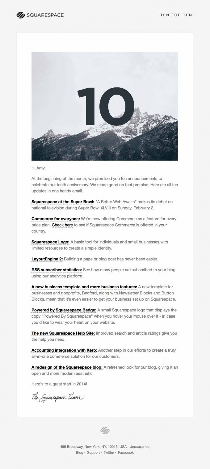
41. Aim for minimalism
Squarespace chose a minimalist design in terms of both font and visual, and color palette. Only one image is used, a simple, almost monochromatic snapshot of nature, which overlaps the heading "10", and the rest of the letter is typed in the same black font, the hierarchy is formed only with the help of boldface. To design was spectacular, it is not necessary to add a lot of bells and whistles, try not to add, but to remove.
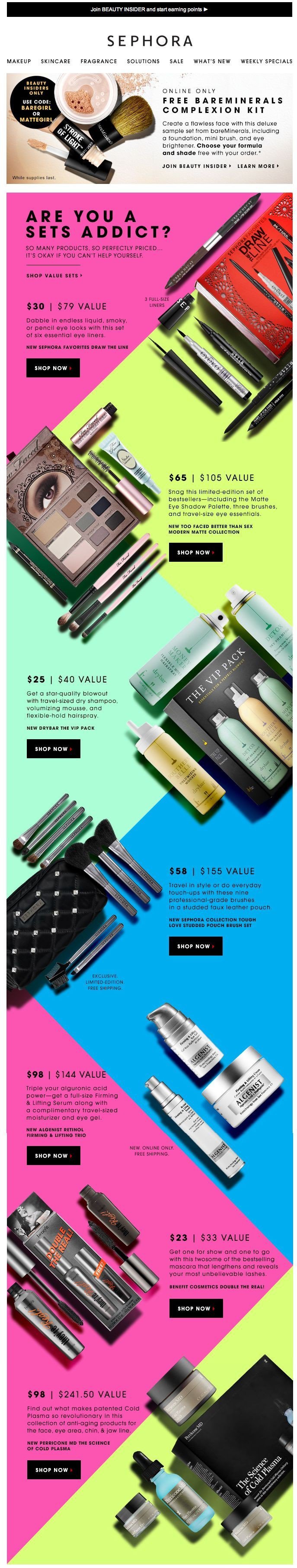
42. Experiment with a diagonal arrangement.
In the Sephora layout an interesting zigzag arrangement is used, the images are placed diagonally, which is emphasized by bright color blocks. Such layout is not only original and attracts attention, but also effective in presenting a large amount of information and images.
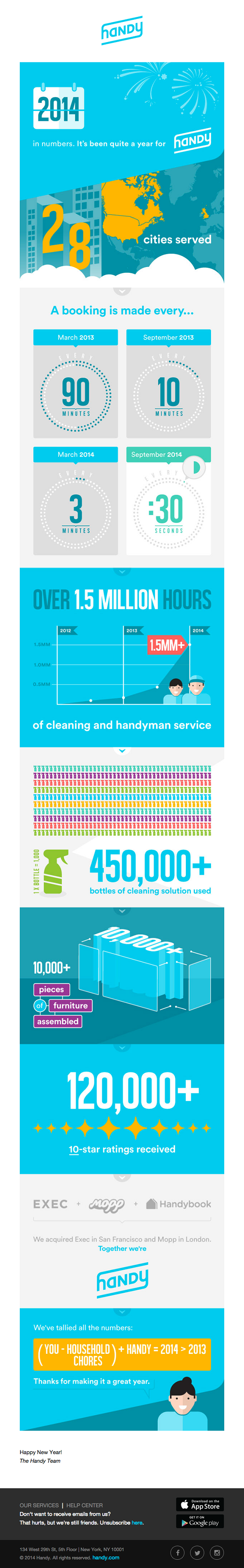
43. Use graphics
Handy letter design is built like an annual report, which includes thanks to customers and celebrates their own success with the help of graphs and visual pictures. The design is based on a large number of graphic elements, but it is a fun and effective way to convey a lot of information to customers in an understandable way.
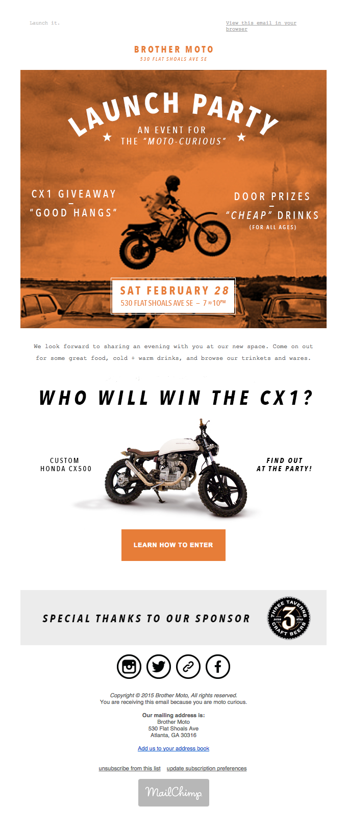
44. Experiment with text alignment.
It is well known that aligning text along the left edge provides a lighter perception of it, however, you should not take it as an axiom. In the example from Brother Moto, the text is centered, which makes it possible to focus extremely on the middle of the page, forming a balanced design without compromising the readability of the text.
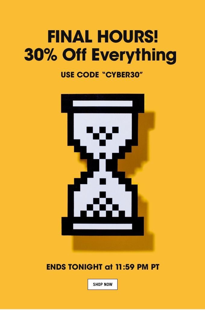
45. Create Urgency
This letter to Jack Spade is made simple: one image, one call to action (CTA) - but creates a topic of urgency. Using a large font, bright, eye-catching color and a simple image that sends the reader to the central message of the letter - all this conveys the idea that you need to act quickly. A good example of quick, clear and direct communication to an audience.
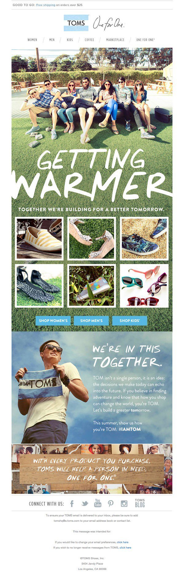
46. Frame pictures
If you want to use photos in the mailing list, think in advance so that they successfully fit into the design of the letter. TOMS give a good example of such planning ahead of time - the used image framing allows both the foreground and the background to act, when needed, as a textured background for text and other letter elements. A simple tactic is to extract the maximum possible from the images and include many elements in the letter, avoiding confusion.
47. Experiment with the sidebar
Borrow reception from web design textbooks and try to include a sidebar in the newsletter. Most letters consist of several parallel horizontal blocks, but as you can see with the Super Things as an example, the vertical positioning of information on the sidebar helps to evenly distribute text and information and avoid excessively increasing the size of the letter vertically.
48.Cut out the text
The design of the letter Canopy demonstrates the benefits of dropping text. If you work in retail or you have several products you want to show, let the images speak for themselves. In this example, the elements are grouped under one motto, which sufficiently explains each of them. Rejection of the text allows the letter to be simple, direct and clear.
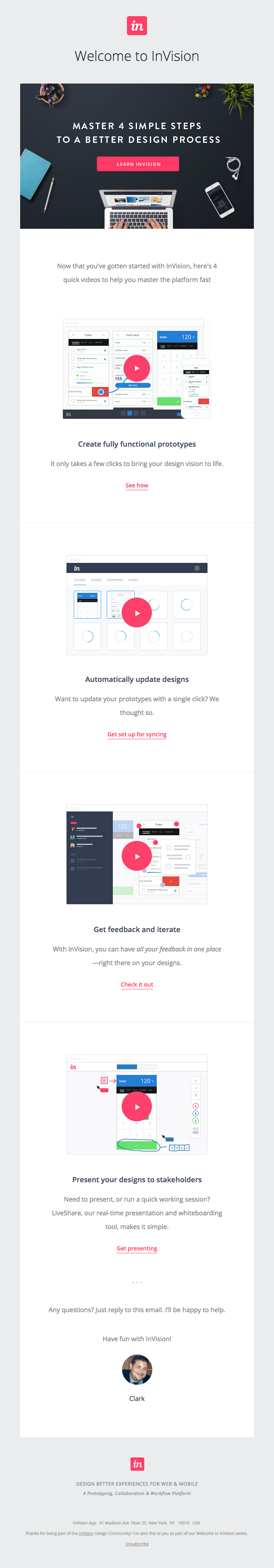
49. Use the visual walkthrough.
For a company that wants to introduce a product and explain its functionality, it can be extremely helpful to use a visual step-by-step guide. An InVision letter is an illustrated guide to the functionality of their software, emphasizing its advantages, and at the same time being an operating manual for beginners. One more plus: quite a bit of text is needed in visual guides, and those who have difficulty can follow the links for more detailed explanations.
50. Frame content
The use of photography as a background in ezines began not so long ago, so use this to your advantage for your letters. The DCW Design mailing list is a great example of a simple design with a focus on the text and at the same time a fine introduction to the letter of images. Arranging stylish objects along the edges of a black background, an elegant visual frame for the text is created here, complementing its main content.
Source: https://habr.com/ru/post/295514/
All Articles