Top 50 Newsletter Designs (and how to do it yourself is just as cool) (Part 4)
The fourth, penultimate, part of the translation of an article about the best mailing list designs , let's discuss the experience of foreign colleagues! For those who may have missed - the first part , the second part and the third part . To make it more interesting, we slightly disturb the order and start with the 32nd, not the 31st ... I hope you appreciate it :)
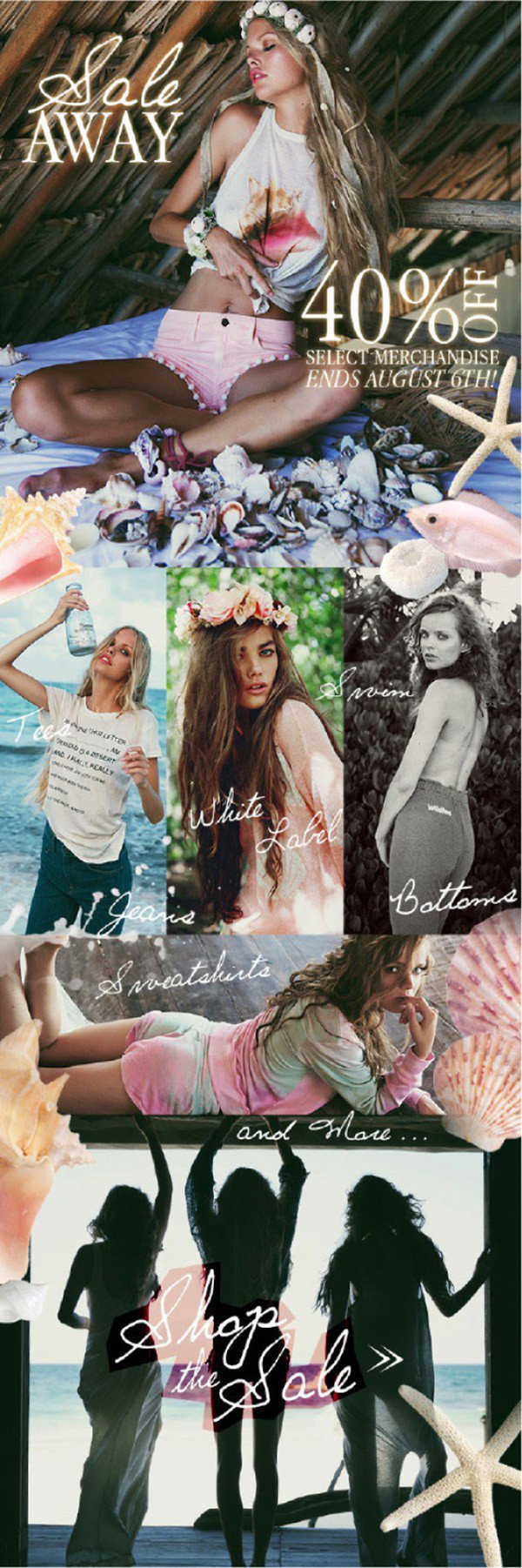
In Wildfox design , images are carefully thought out and create a strong brand theme. Bright and dreamy photos create a fantasy aesthetics that instantly delays the reader. The design benefits from the use of a handwritten font that complements the images, but is easy to read.
')
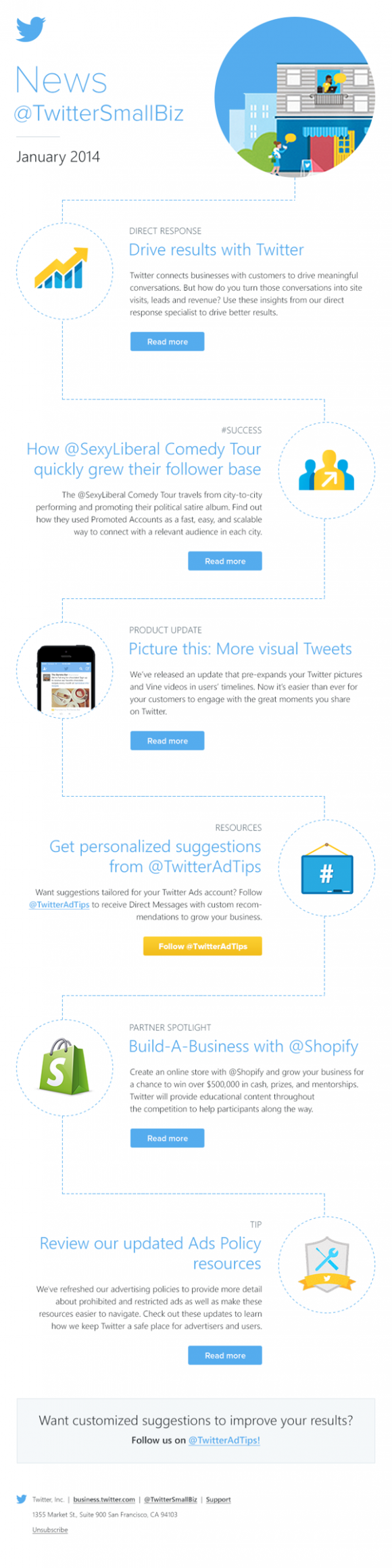
Petr Pliska introduces a visual algorithm that allows the reader to more easily perceive information. Each item is accompanied by its own iconic image, which serves as a hint, so that there is no information overload. The large amount of free white space and minimal color palette make this design balanced and easily perceived.
In developing this layout, J.Crew took into account how the user will perceive it. The huge exclamation mark that appears during the scrolling of the screen and then immediately a large and intriguing call to action makes the letter easy to read, and following the link is very likely, thanks to human curiosity. Simple, bold and well thought out design.

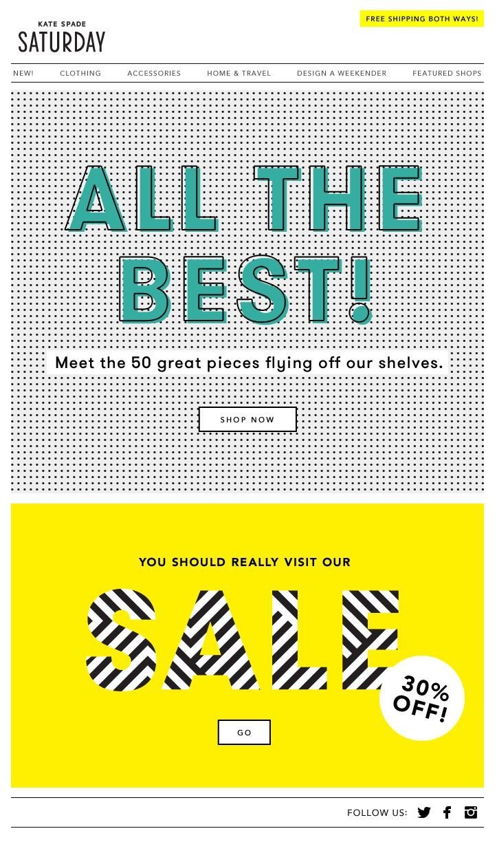
In this example, Kate Spade uses strongly contrasting patterns (hatching) and simple bright colors as the main graphic means. Black and white patterns, opposed to bright yellow and turquoise, instantly attract attention without creating problems with the readability of the text. Think about whether to use such bold drawings that draw immense attention when creating your own mailings.
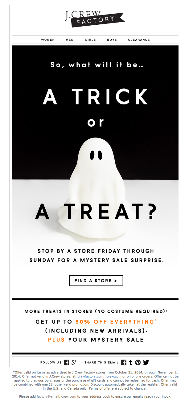
Hot time for retailers and for email newsletters is a holiday, but when it comes to creating a holiday newsletter, try not to make it template. This J.Crew letter was made for Halloween, but instead of repeating the typical black and orange scale, heaps of webs and bats, which is typical for Halloween, a cool design was chosen, corresponding to the brand, black and white, with orange accents in the signature. Posh twist in the holiday newsletter!
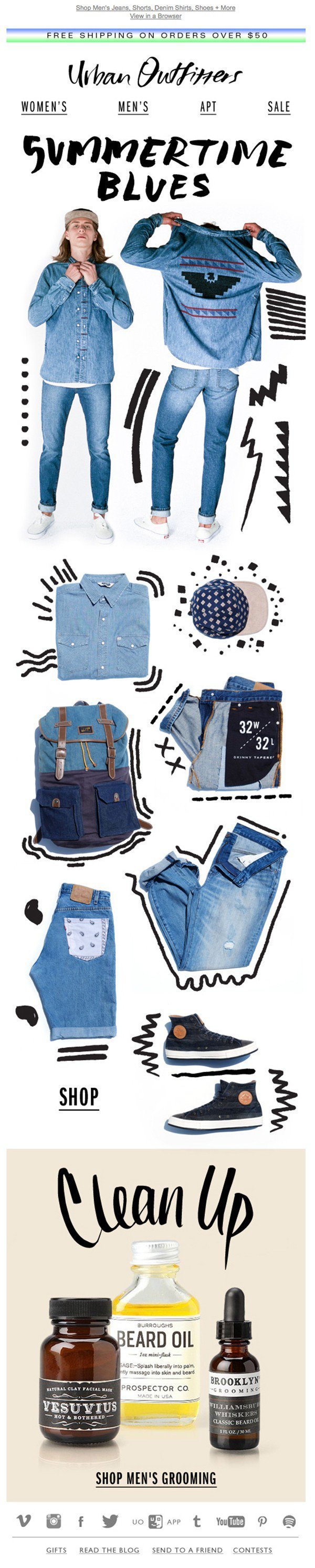
The layout of the Urban Outfitters is so simple that the eye would not have something to catch on if it were not for the painted elements. Thanks to these small black scribbles, the letter becomes much more personal, funny and special, which is in perfect harmony with the spirit of the brand. A clear example of how adding a single element can fundamentally change the entire design.
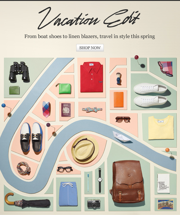
This letter design was developed by Michael Bodiam for the Mr Porter menswear brand and perfectly combines uniqueness, fun and functionality. The objects presented in the letter are depicted in the form of a paper map, which conveys the idea that all these objects are necessary for the journey. A clever and funny presentation of the product can be what will make your letter stand out from the masses of others.
Layout Advolocaru associates information with a letter in an envelope to arouse the emotions associated with the receipt of this paper letter. This simple graphical solution helps to accurately organize information and make the newsletter creative and personal.

Imagine how your audience will read the newsletter: it is likely to begin by quickly scrolling through the letter and gliding over the information. A letter from Banana Republic beats up this scenario, the main text is shown gradually, leading to a spectacular call to action (link). A simple way to play on user behavior.

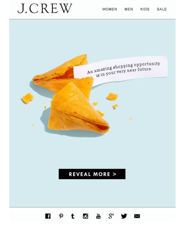
A rectilinear design can give a faster effect, and not a rectilinear gives a more ambitious effect. In the example from J.Crew , none of their products is shown, but this is a bold step for the clothing brand. Instead, an image of a predictive cookie is used, and this sophisticated “prediction” works like a call to action. If we talk about the design of mailings, then a less straightforward approach to selling a product or introducing a brand is more risky, but with proper implementation it gives a much greater effect.
The last 10 cases we will publish in our blog on Tuesday. If you want to personally discuss email marketing issues - you can still catch the Mailcon conference on October 16, it promises to be mega-interesting. You can find more examples of emails, including domestic ones, not foreign ones, in the Email-Competitors.ru mailing collection .
32. Underline Images
In Wildfox design , images are carefully thought out and create a strong brand theme. Bright and dreamy photos create a fantasy aesthetics that instantly delays the reader. The design benefits from the use of a handwritten font that complements the images, but is easy to read.
')
31. Create a visual plan.
Petr Pliska introduces a visual algorithm that allows the reader to more easily perceive information. Each item is accompanied by its own iconic image, which serves as a hint, so that there is no information overload. The large amount of free white space and minimal color palette make this design balanced and easily perceived.
33. One big call to action
In developing this layout, J.Crew took into account how the user will perceive it. The huge exclamation mark that appears during the scrolling of the screen and then immediately a large and intriguing call to action makes the letter easy to read, and following the link is very likely, thanks to human curiosity. Simple, bold and well thought out design.
34. Play with patterns
In this example, Kate Spade uses strongly contrasting patterns (hatching) and simple bright colors as the main graphic means. Black and white patterns, opposed to bright yellow and turquoise, instantly attract attention without creating problems with the readability of the text. Think about whether to use such bold drawings that draw immense attention when creating your own mailings.
35. Create a holiday (but only correctly!)
Hot time for retailers and for email newsletters is a holiday, but when it comes to creating a holiday newsletter, try not to make it template. This J.Crew letter was made for Halloween, but instead of repeating the typical black and orange scale, heaps of webs and bats, which is typical for Halloween, a cool design was chosen, corresponding to the brand, black and white, with orange accents in the signature. Posh twist in the holiday newsletter!
36. Draw
The layout of the Urban Outfitters is so simple that the eye would not have something to catch on if it were not for the painted elements. Thanks to these small black scribbles, the letter becomes much more personal, funny and special, which is in perfect harmony with the spirit of the brand. A clear example of how adding a single element can fundamentally change the entire design.
37. Play with the product
This letter design was developed by Michael Bodiam for the Mr Porter menswear brand and perfectly combines uniqueness, fun and functionality. The objects presented in the letter are depicted in the form of a paper map, which conveys the idea that all these objects are necessary for the journey. A clever and funny presentation of the product can be what will make your letter stand out from the masses of others.
38. Return to the "email" topic "letters"
Layout Advolocaru associates information with a letter in an envelope to arouse the emotions associated with the receipt of this paper letter. This simple graphical solution helps to accurately organize information and make the newsletter creative and personal.
39. Experiment with the gradual disclosure of ideas.
Imagine how your audience will read the newsletter: it is likely to begin by quickly scrolling through the letter and gliding over the information. A letter from Banana Republic beats up this scenario, the main text is shown gradually, leading to a spectacular call to action (link). A simple way to play on user behavior.
40. Do not be blunt
A rectilinear design can give a faster effect, and not a rectilinear gives a more ambitious effect. In the example from J.Crew , none of their products is shown, but this is a bold step for the clothing brand. Instead, an image of a predictive cookie is used, and this sophisticated “prediction” works like a call to action. If we talk about the design of mailings, then a less straightforward approach to selling a product or introducing a brand is more risky, but with proper implementation it gives a much greater effect.
The last 10 cases we will publish in our blog on Tuesday. If you want to personally discuss email marketing issues - you can still catch the Mailcon conference on October 16, it promises to be mega-interesting. You can find more examples of emails, including domestic ones, not foreign ones, in the Email-Competitors.ru mailing collection .
Source: https://habr.com/ru/post/295322/
All Articles