Top 50 Newsletter Designs (and how to do it yourself is just as cool) (Part 3)
Today we publish the third part of the translation of the article on the best designs of mailings , here is the first part , and here the second . In these 10 examples, special attention is paid to the style and organization of the layout, in which a lot of information. We are waiting for you at the MailCon email marketing conference this Friday, and will be happy to discuss the cases given in the article in the comments!
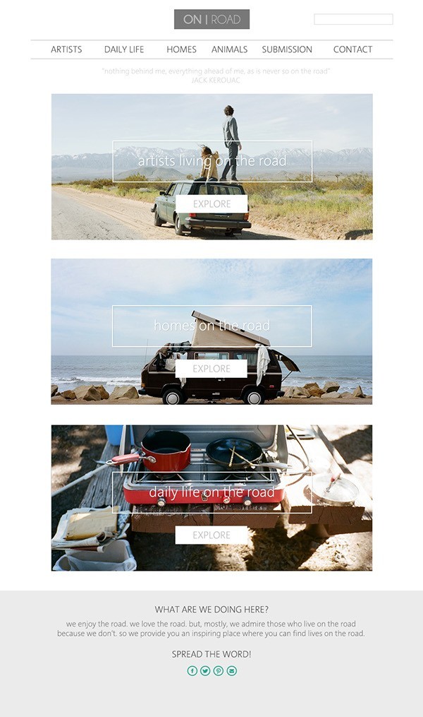
The minimalistic design in the example from Elizabeth Lies helps to convey the idea clearly and efficiently. Since the mission of the brand is to show the simplicity of life on the road, the use of simple font and clear images gives the reader a clear picture of the mission of the brand and its style.
')
The layout of this newsletter by Hatch Inc is simple and effective, well organized a large amount of information is clear and balanced. The reader is led from block to block, and each image has wide enough borders so that the overall design is not overloaded, a minimal font is chosen that looks neat. Perfectly balanced design, in which a lot of air and which the reader is easy to consume.
Nick Cade did a great job of presenting a large amount of information in a clear, orderly, and attractive way. Pastel green is used consistently throughout the layout to separate blocks typed in black, and is introduced at the very beginning, and the exact font and text organization in blocks make it easier to read.
In this example, Pixel Buddah uses beautiful photos that attract attention and hold it for a long time and create their own style, supported by a soft color palette. The font is beautifully organized, despite the fact that the copied phrase is used. Using the simple word “more” as the main call to action only motivates you more, this is a smart decision to encourage the reader to action. The thoughtful placement of elements and the reasonable use of color and type are what makes this design so effective.
Wonderful monochrome palette and excellent use of contrast make the Seipp design outstanding. Through the use of shades of gray and geometrically divided sections of information, the letter takes on the appearance of a modern and sophisticated. The layout of images, font and graphic elements allows the eye to easily slide around the page and not get confused in the information. This monochromatic design is extremely harmonious.
The mockup of Shopbop is balanced, well organized, and hits right on target. Images are attractive and seductive, with bright colors, and are well matched with a nice and simple font. This layout has everything you need to make the reader want to follow the links.
Beans N 'Rice Creative Studio uses consecutive sections to transmit several messages of equal importance at once. The header and footer are clearly separated, and the vertical sequence of blocks, separated by bright horizontal lines, allows the reader to easily scroll through the letter. Each image itself is simple, but strong in color and composition, which allows each section to speak for itself, while not drawing attention from the others.
Black background, colorful images, and white text make this design from Stolen Girlfriends Club very contrasting, interesting and glossy. Large white numbers and bold headlines lead readers down the path, which is easy to navigate. Alignment is changing, but remains consistent in general and interesting.
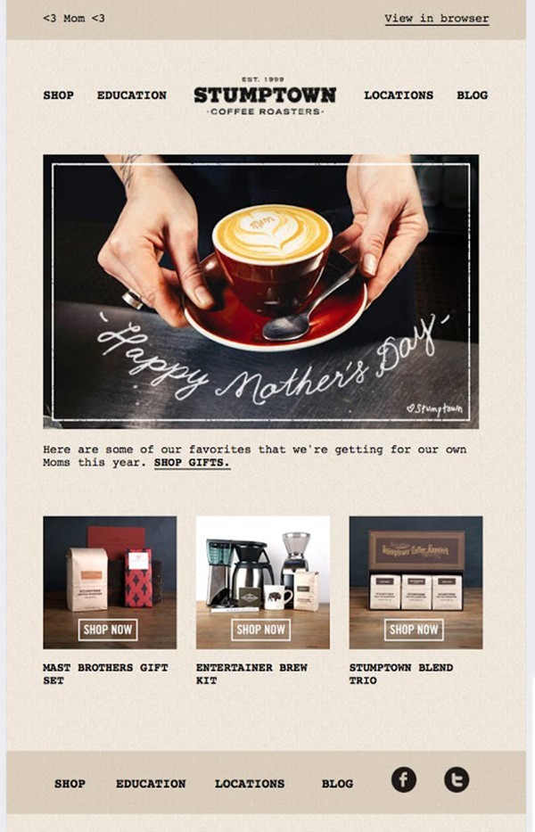
Vintage design from Need More Designs ( translated - “Need more designs” ) creates a sense of antiquity by using a typewriter font and a dark brown color palette. Handwritten greetings give the letter a pleasant personal character and help to establish contact with the reader. Beautiful product images, with interesting background textures, and calls to action, and descriptions are minimal, to encourage the reader to follow the link and learn more.
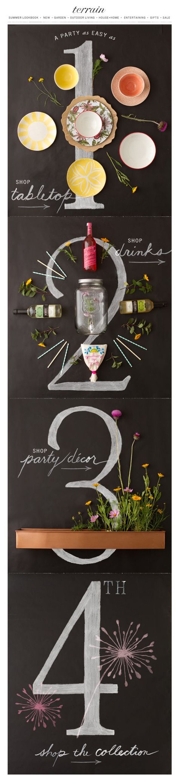
The layout of the Terrain is based on an entertaining and creative idea, which is implemented very well here. So many different unique elements look like a party that just waits for it to be organized. The inscriptions, as if made on the blackboard with chalk, are combined with real photographs, and the step-by-step arrangement gives the atmosphere “do-it-yourself”, creating the emotional involvement of the reader.
The next 10 cases we will publish in our blog on Wednesday. If you want to personally discuss email design trends and other email marketing issues - we are waiting for you at the first regional Mailcon conference on October 16, and you can always find more examples of email design examples, including domestic ones, not foreign ones. Email-Competitors.ru newsletters .
21. Maintain style
The minimalistic design in the example from Elizabeth Lies helps to convey the idea clearly and efficiently. Since the mission of the brand is to show the simplicity of life on the road, the use of simple font and clear images gives the reader a clear picture of the mission of the brand and its style.
')
22. Avoid clutter and congestion.
The layout of this newsletter by Hatch Inc is simple and effective, well organized a large amount of information is clear and balanced. The reader is led from block to block, and each image has wide enough borders so that the overall design is not overloaded, a minimal font is chosen that looks neat. Perfectly balanced design, in which a lot of air and which the reader is easy to consume.
23. Use colored lines
Nick Cade did a great job of presenting a large amount of information in a clear, orderly, and attractive way. Pastel green is used consistently throughout the layout to separate blocks typed in black, and is introduced at the very beginning, and the exact font and text organization in blocks make it easier to read.
24. Every decision must be justified.
In this example, Pixel Buddah uses beautiful photos that attract attention and hold it for a long time and create their own style, supported by a soft color palette. The font is beautifully organized, despite the fact that the copied phrase is used. Using the simple word “more” as the main call to action only motivates you more, this is a smart decision to encourage the reader to action. The thoughtful placement of elements and the reasonable use of color and type are what makes this design so effective.
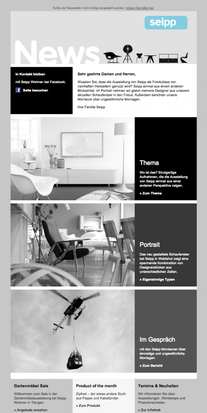
25. Make the layout black and white
Wonderful monochrome palette and excellent use of contrast make the Seipp design outstanding. Through the use of shades of gray and geometrically divided sections of information, the letter takes on the appearance of a modern and sophisticated. The layout of images, font and graphic elements allows the eye to easily slide around the page and not get confused in the information. This monochromatic design is extremely harmonious.
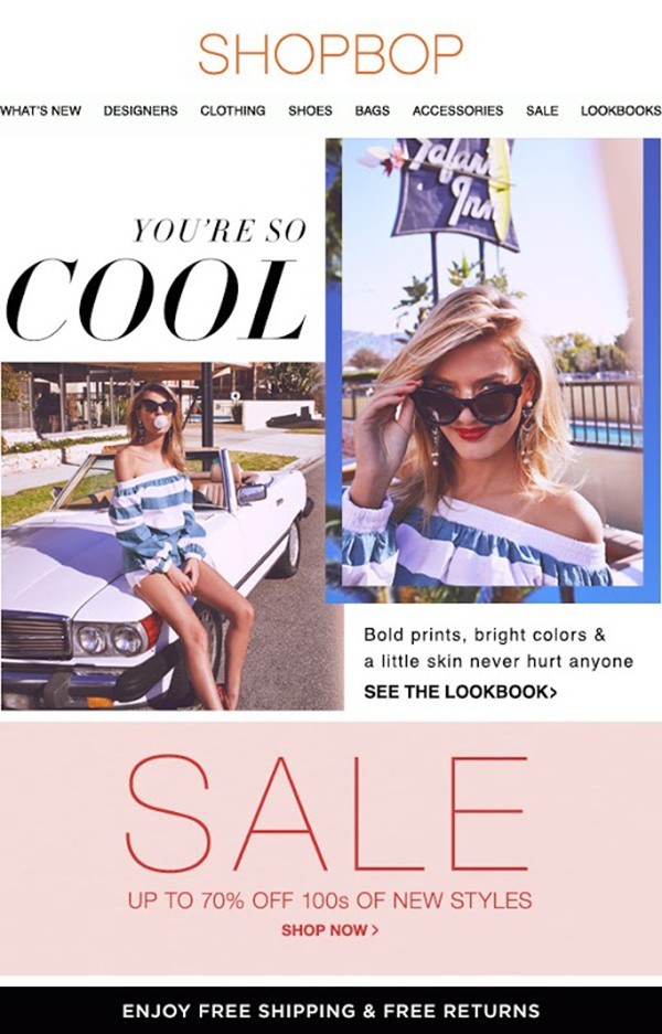
26. Keep the balance of images and fonts.
The mockup of Shopbop is balanced, well organized, and hits right on target. Images are attractive and seductive, with bright colors, and are well matched with a nice and simple font. This layout has everything you need to make the reader want to follow the links.
27. Separate information by horizontal line.
Beans N 'Rice Creative Studio uses consecutive sections to transmit several messages of equal importance at once. The header and footer are clearly separated, and the vertical sequence of blocks, separated by bright horizontal lines, allows the reader to easily scroll through the letter. Each image itself is simple, but strong in color and composition, which allows each section to speak for itself, while not drawing attention from the others.
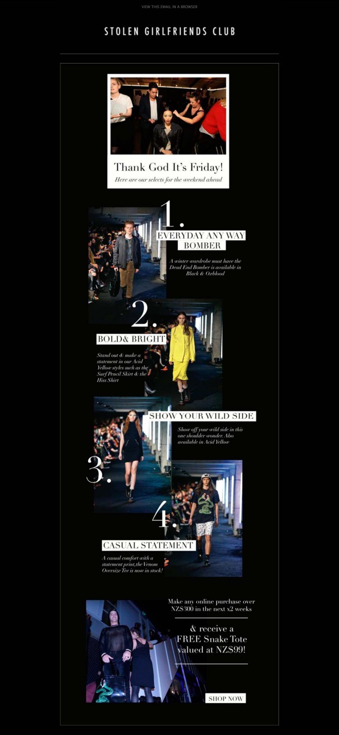
28. Increase contrast
Black background, colorful images, and white text make this design from Stolen Girlfriends Club very contrasting, interesting and glossy. Large white numbers and bold headlines lead readers down the path, which is easy to navigate. Alignment is changing, but remains consistent in general and interesting.
29. Let the design be simple.
Vintage design from Need More Designs ( translated - “Need more designs” ) creates a sense of antiquity by using a typewriter font and a dark brown color palette. Handwritten greetings give the letter a pleasant personal character and help to establish contact with the reader. Beautiful product images, with interesting background textures, and calls to action, and descriptions are minimal, to encourage the reader to follow the link and learn more.
30. Encourage readers to co-create
The layout of the Terrain is based on an entertaining and creative idea, which is implemented very well here. So many different unique elements look like a party that just waits for it to be organized. The inscriptions, as if made on the blackboard with chalk, are combined with real photographs, and the step-by-step arrangement gives the atmosphere “do-it-yourself”, creating the emotional involvement of the reader.
The next 10 cases we will publish in our blog on Wednesday. If you want to personally discuss email design trends and other email marketing issues - we are waiting for you at the first regional Mailcon conference on October 16, and you can always find more examples of email design examples, including domestic ones, not foreign ones. Email-Competitors.ru newsletters .
Source: https://habr.com/ru/post/295250/
All Articles