Top 50 Newsletter Designs (and how to do it yourself is just as cool) (Part 2)
We continue to publish a translation of an article about the best newsletter designs . Learn the experience of foreign experts, discuss the hot topics of email marketing at conferences and share your observations in the comments!
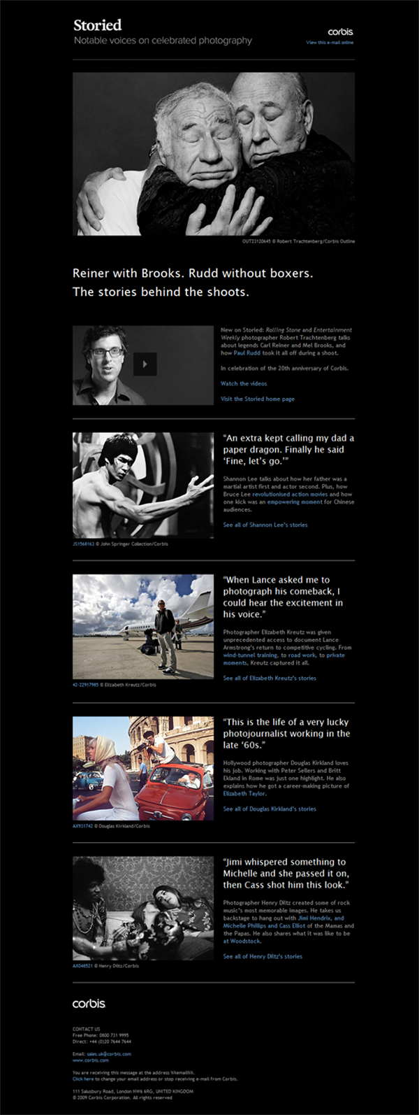
A great example of focusing on the essentials is presented in the Corbis letter. Emotional photos on a strict black background very much attract attention and make a powerful impression. Large margins along the edges help avoid layout overload. The selected design works great for this material: using quotes from the story as headlines encourages the reader to read everything.
Despite the simple minimalistic design, this list from Toben is attractive and interesting. Images and logo are perfectly combined due to a well-thought-out interposition, and highlighting of orange color adds to the layout of life and volume. Center alignment and a clear balance of all elements form a harmonious composition that inspires the reader to spend a couple of minutes and look through the letter.
')

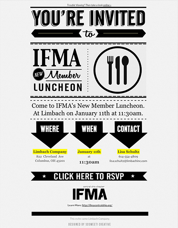
In this example, SoSweet Creative uses a large font, and a small number of colors and a strict hierarchy make it easy to perceive the information in the game key. Each font complements the adjacent ones and is easy to read, yellow highlights draw attention to the most important points, and bold arrows direct the movement of the eye. Easily perceived and eye-catching design.
The interesting use of framed images and geometric shapes makes us pay attention to this design by Peter Świerkowsk i. In general, the letter remains fairly linear and streamlined, but the geometric shapes and guide lines give it an unusual look, while helping to linger on information and highlight the main thing. Consider using some geometric shapes in the design of your list to achieve an interesting effect.

This design by Lindsey McMurray represents the brand in bright colors, separated from each other by a large amount of white. Colors are used consistently and consistently throughout the layout, linking text and images. Spray paint looks fun and emphasizes the creativity of the product, maintaining the overall color and layout style. Bright colors, diluted with plenty of white, can form an interesting consistent design.

The design of Marni is based on a creative approach - the presentation of images as paper clippings, which gives the letter a nostalgic mood and at the same time invites the reader to imagine how each item will be combined with others. This list differs from those in that the items from the catalog are presented here in an unusual, amusing, but functional way.

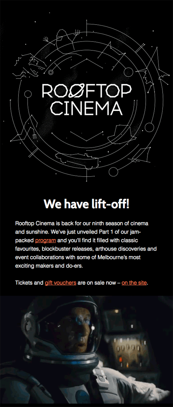
The use of bright themes in the design also makes it possible to stand out from the mass of letters. For example, Open Season exploits a space theme that is associated simultaneously with the brand and the subject of the letter. Unobtrusive planetary animation of the title, graphics on the theme of the constellations, space themes in the text - all this reinforces the general theme, making an impressive distribution of this brand.
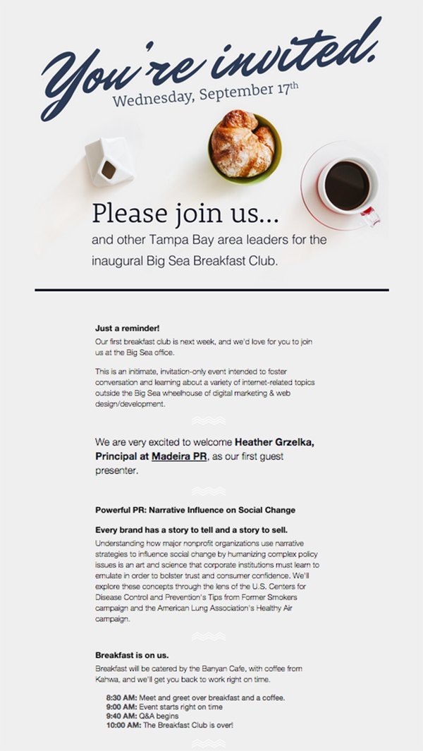
This design from Big Sea Design & Development uses a simple and clear photo at the top, which seems to dissolve in the light background of the layout. Instead of emphasizing the borders of the picture or separating it with a thick line, try to immerse it in the layout, making the overall design more harmonious and more relaxed.
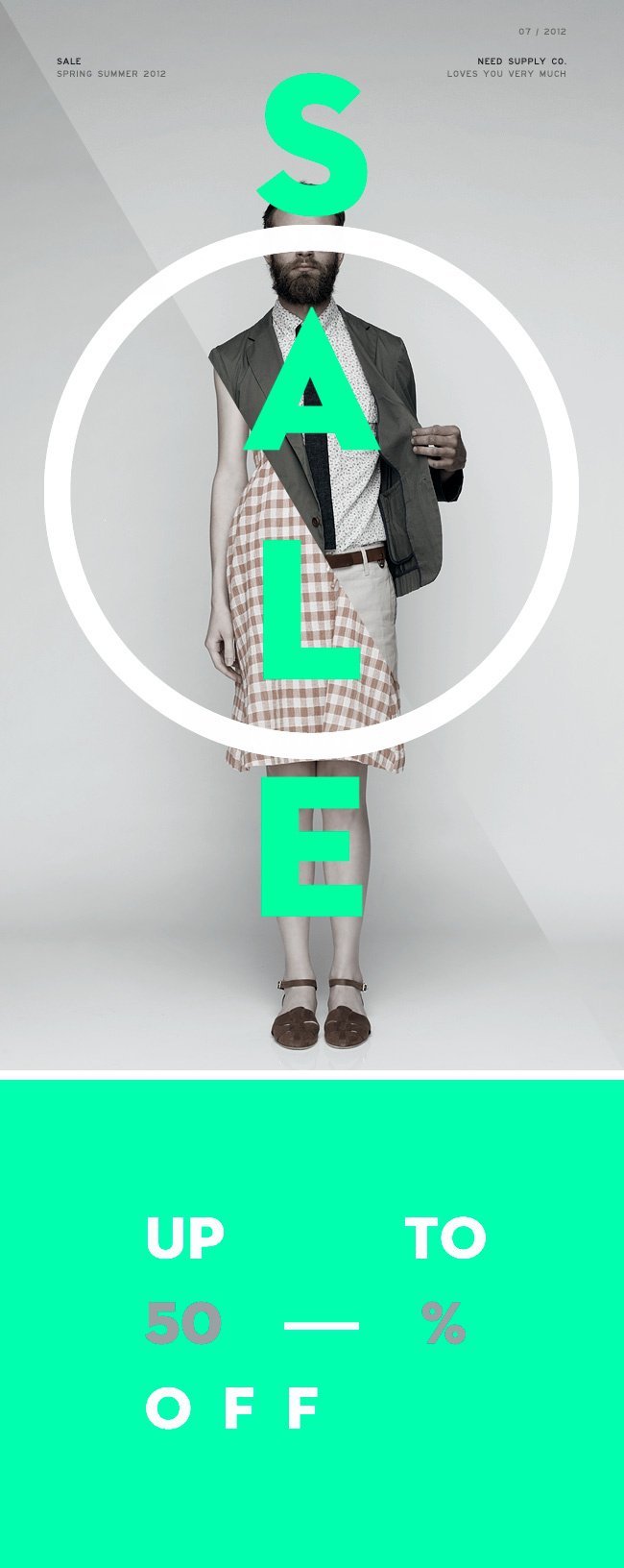
This is the design of Need Supply Co. different unique and creative: the arrangement of each element carefully thought out, to convey the idea of sales. The fat white circle immediately attracts the eye, so that the main idea cannot be missed, fragments of images of men and women work on the same - thin visualization of a 50% discount. Neon green is striking, highlighting all the elements, so that the idea of writing is read and accepted.
A neatly organized layout and bright pink highlights are what makes this Simon Ker newsletter very effective in presenting a large amount of information. Links are highlighted in bright pink against a dark background, creating a sharp contrast and attracting the eye. Neatly aligned squares and the same distance between the elements make it possible to arrange a large number of these elements. An excellent example of how to create order and hierarchy with a large information density.
Another 10 cases we will publish in our blog on Monday. If you want to personally discuss trends in email design and other email marketing issues, we are waiting for you at the Mailcon conference, and you can always find more examples of email design examples, including domestic ones, not foreign ones, in the Email-Competitors collection. .ru .
11. Direct attention
A great example of focusing on the essentials is presented in the Corbis letter. Emotional photos on a strict black background very much attract attention and make a powerful impression. Large margins along the edges help avoid layout overload. The selected design works great for this material: using quotes from the story as headlines encourages the reader to read everything.
12. Keep balance
Despite the simple minimalistic design, this list from Toben is attractive and interesting. Images and logo are perfectly combined due to a well-thought-out interposition, and highlighting of orange color adds to the layout of life and volume. Center alignment and a clear balance of all elements form a harmonious composition that inspires the reader to spend a couple of minutes and look through the letter.
')
13. Design should be easily perceived.
In this example, SoSweet Creative uses a large font, and a small number of colors and a strict hierarchy make it easy to perceive the information in the game key. Each font complements the adjacent ones and is easy to read, yellow highlights draw attention to the most important points, and bold arrows direct the movement of the eye. Easily perceived and eye-catching design.
14. Use geometric shapes.
The interesting use of framed images and geometric shapes makes us pay attention to this design by Peter Świerkowsk i. In general, the letter remains fairly linear and streamlined, but the geometric shapes and guide lines give it an unusual look, while helping to linger on information and highlight the main thing. Consider using some geometric shapes in the design of your list to achieve an interesting effect.
15. Make the color work on style.
This design by Lindsey McMurray represents the brand in bright colors, separated from each other by a large amount of white. Colors are used consistently and consistently throughout the layout, linking text and images. Spray paint looks fun and emphasizes the creativity of the product, maintaining the overall color and layout style. Bright colors, diluted with plenty of white, can form an interesting consistent design.
16. Make the functionality fun.
The design of Marni is based on a creative approach - the presentation of images as paper clippings, which gives the letter a nostalgic mood and at the same time invites the reader to imagine how each item will be combined with others. This list differs from those in that the items from the catalog are presented here in an unusual, amusing, but functional way.
17. Develop the theme
The use of bright themes in the design also makes it possible to stand out from the mass of letters. For example, Open Season exploits a space theme that is associated simultaneously with the brand and the subject of the letter. Unobtrusive planetary animation of the title, graphics on the theme of the constellations, space themes in the text - all this reinforces the general theme, making an impressive distribution of this brand.
18. Do not emphasize boundaries.
This design from Big Sea Design & Development uses a simple and clear photo at the top, which seems to dissolve in the light background of the layout. Instead of emphasizing the borders of the picture or separating it with a thick line, try to immerse it in the layout, making the overall design more harmonious and more relaxed.
19. Let the images speak
This is the design of Need Supply Co. different unique and creative: the arrangement of each element carefully thought out, to convey the idea of sales. The fat white circle immediately attracts the eye, so that the main idea cannot be missed, fragments of images of men and women work on the same - thin visualization of a 50% discount. Neon green is striking, highlighting all the elements, so that the idea of writing is read and accepted.
20. Organize information logically
A neatly organized layout and bright pink highlights are what makes this Simon Ker newsletter very effective in presenting a large amount of information. Links are highlighted in bright pink against a dark background, creating a sharp contrast and attracting the eye. Neatly aligned squares and the same distance between the elements make it possible to arrange a large number of these elements. An excellent example of how to create order and hierarchy with a large information density.
Another 10 cases we will publish in our blog on Monday. If you want to personally discuss trends in email design and other email marketing issues, we are waiting for you at the Mailcon conference, and you can always find more examples of email design examples, including domestic ones, not foreign ones, in the Email-Competitors collection. .ru .
Source: https://habr.com/ru/post/295188/
All Articles