50 best newsletter designs (and how to do it yourself is just as cool) (Part 1)
In the run-up to the MailCon Email Marketing conference , we want to talk about trends in the design of emails and mailings. We bring to your attention a translation of an article about the best designs of e-mails , which, due to the large volume, we have broken into 5 parts (10 cases) and will be published with an interval of 2 days. It seems that we have something to discuss, comparing the observations and advice of foreign experts with our own experience in creating mailings. The first 10 cases are mainly devoted to the role of color in the creation of letters. We are waiting for your comments!
It is expected that by the end of next year, the number of registered worldwide email boxes will exceed 4.3 billion. Whether we like it or not, we live in a world where people prefer to use e-mail. It is fast, convenient, and most importantly - efficient.
As McKinsey & Company found out, to attract new customers, emails are 40 times more effective than Facebook or Twitter - and this is just one of the interesting facts that speak about the success of email marketing.
If your company or startup wants to use this success, good letter design becomes critical. With such a big competition for the user's attention, an outstanding design should immediately attract attention in order to avoid the risk that it will be sent to the basket without reading.
Reach your customers, create newsletters to reach a mass audience. This is how professionals do it - and we hope that this article will inspire you to your own outstanding letter designs!
The rejection of the color in the photograph and the color toning in this example from The Stylish City (“Stylish City”) are amazing and impressive. The muted colors and the combination of pink and black create a modern and sophisticated design. The layout looks attractive and unique, similar to the newsletter and fashion magazine at the same time, however, as before, the focus is on the text located in the center, as well as above the image.
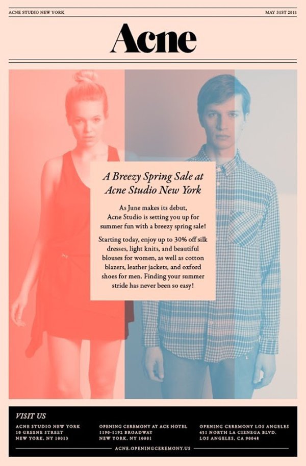
')
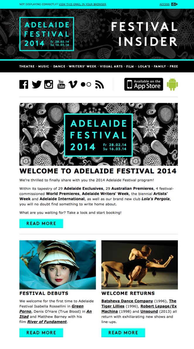
In this example, from IS Design + Digital, the neon color very quickly attracts the attention of the reader and it is very difficult to hold onto and not read the title. A rectangular stroke around the font enhances this effect so much that the name of the festival is likely to be remembered by even the most disinterested readers. Strong images, outstanding calls to action (calls to action) and sharp contrast - all these are effective elements within this design.
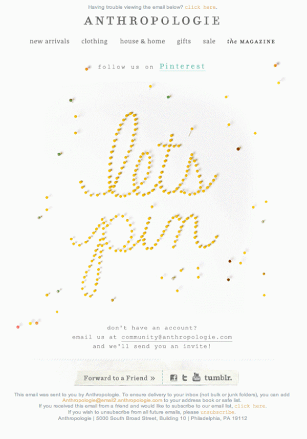
In this example, Mika Osborn used an amusing and creative GIF-animation, which is designed to convey one simple idea (“Let's pin” - “let's make a pin”, from the name of the social network “pintest”) - in a unique, surprising and memorable way. The call is well understood by users, it inspires them to subscribe to the blog of the social networking site Pinterest for seeing great new pictures like this one. The neutral background color and central location fully focuses attention on the gif, and the information around it is placed in such a way that the reader takes the necessary action.
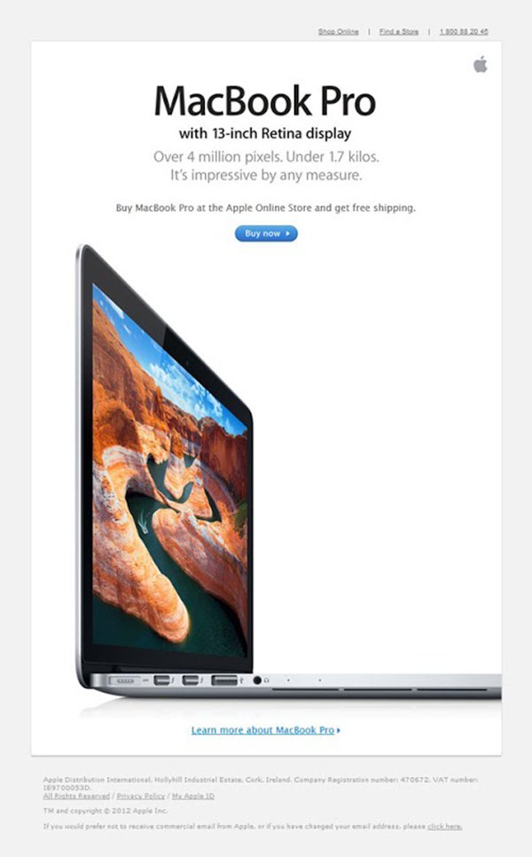
Apple's mailing list design assumes a lot of free space and a clear focus on the product. The product is highlighted in bright colors to increase interest, and the information is carefully placed and perfectly aligned, and has a vertical organization for quick and easy perception. Using different font sizes and different shades of gray allows the reader to understand what is important and what is not. This design hits right on target with a minimum of elements and a simple structure.
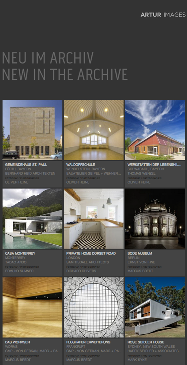
In this project, Artur focuses on well-chosen photos and, as expected, they are forced to look at them again. After them, attention is drawn to the text typed in white, and everything else is left in the shade. Dark gray complements the colors of each image, giving the letter a cool and modern look.
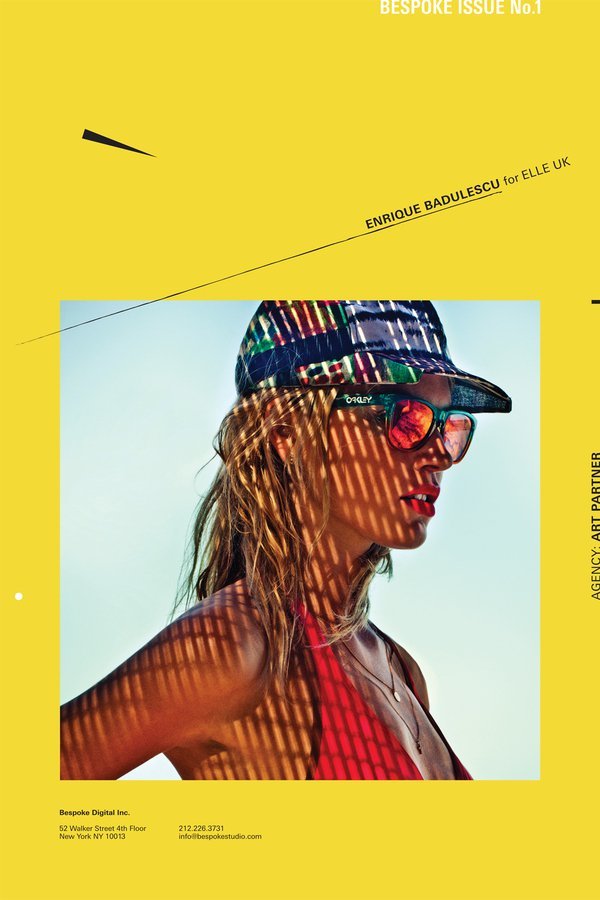
The palette of bright intense shades and the unique concept of the letter Engage immediately attract attention. Bright yellow paired with a patterned texture and black and white graphics forms a simple but fresh color gamut, which undoubtedly stands out from the crowd.

You can not go past the case Studio Newwork , showing the creative work of agency staff. Bright background captures attention and effectively frames the image. This use of color allows the image to "shoot" and directs the look to the important, while abstract elements and creative text layout help to add movement to the layout. This design combines minimalism with vibrant color, and it's great.
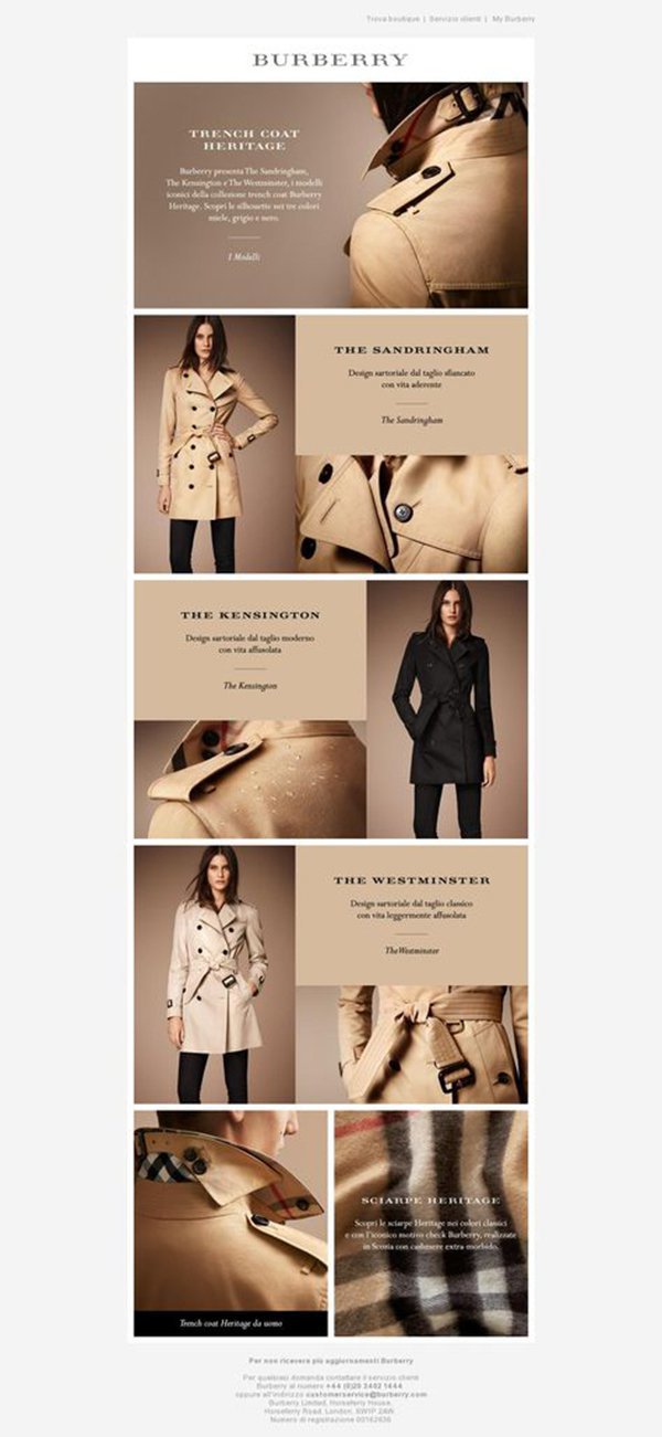
The Burberry letter is a brilliant solution to showcase their iconic trench and at the same time increase brand awareness. The design is remembered through the use of sepia (yellow-brown shades) and photos of the iconic coat from different angles. An excellent selection of font styles, consistently implemented throughout the layout, allows the reader to easily perceive the proposed visual-shaped story. Simple, effective and easily recognizable design.
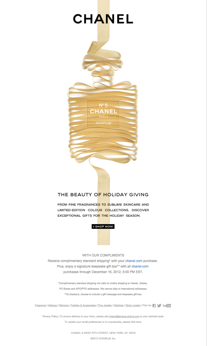
Chanel's strict and beautiful design makes the best use of simplicity. Only one image representing the brand, one title, one description and one button-call to action, everything is centered, none of the elements overlap the rest. all centrally focused and aligned, no one element overpowers the other. Despite the minimalism, the use of the ribbon as a brand image makes the letter playful and attractive.
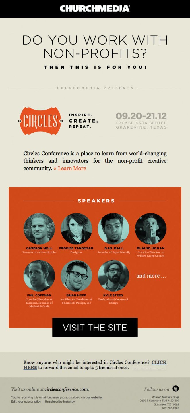
This churchmedia example demonstrates an interesting way to create a newsletter before an event. Various fonts, harmoniously opposed to each other, plain and bold, serif and non-serif fonts, as if jumping off the page, creating a visual hierarchy in the layout. The contrasting but well-matched color palette gives the whole letter a modern look, with a vibrant and positive mood.
We will publish another 10 cases in our blog the day after tomorrow, and if you want to personally discuss email design trends and other email marketing issues, we are waiting for you at the Mailcon conference, and find other examples of email design, including domestic ones, and not foreign ones. You can always in the Email-Competitors.ru mailing collection .
It is expected that by the end of next year, the number of registered worldwide email boxes will exceed 4.3 billion. Whether we like it or not, we live in a world where people prefer to use e-mail. It is fast, convenient, and most importantly - efficient.
As McKinsey & Company found out, to attract new customers, emails are 40 times more effective than Facebook or Twitter - and this is just one of the interesting facts that speak about the success of email marketing.
If your company or startup wants to use this success, good letter design becomes critical. With such a big competition for the user's attention, an outstanding design should immediately attract attention in order to avoid the risk that it will be sent to the basket without reading.
Reach your customers, create newsletters to reach a mass audience. This is how professionals do it - and we hope that this article will inspire you to your own outstanding letter designs!
01. Experiment with color
The rejection of the color in the photograph and the color toning in this example from The Stylish City (“Stylish City”) are amazing and impressive. The muted colors and the combination of pink and black create a modern and sophisticated design. The layout looks attractive and unique, similar to the newsletter and fashion magazine at the same time, however, as before, the focus is on the text located in the center, as well as above the image.
')
02.Use color to get attention
In this example, from IS Design + Digital, the neon color very quickly attracts the attention of the reader and it is very difficult to hold onto and not read the title. A rectangular stroke around the font enhances this effect so much that the name of the festival is likely to be remembered by even the most disinterested readers. Strong images, outstanding calls to action (calls to action) and sharp contrast - all these are effective elements within this design.
03. Have fun with animation.
In this example, Mika Osborn used an amusing and creative GIF-animation, which is designed to convey one simple idea (“Let's pin” - “let's make a pin”, from the name of the social network “pintest”) - in a unique, surprising and memorable way. The call is well understood by users, it inspires them to subscribe to the blog of the social networking site Pinterest for seeing great new pictures like this one. The neutral background color and central location fully focuses attention on the gif, and the information around it is placed in such a way that the reader takes the necessary action.
04. Keep it simple
Apple's mailing list design assumes a lot of free space and a clear focus on the product. The product is highlighted in bright colors to increase interest, and the information is carefully placed and perfectly aligned, and has a vertical organization for quick and easy perception. Using different font sizes and different shades of gray allows the reader to understand what is important and what is not. This design hits right on target with a minimum of elements and a simple structure.
05. Make the letter shine
In this project, Artur focuses on well-chosen photos and, as expected, they are forced to look at them again. After them, attention is drawn to the text typed in white, and everything else is left in the shade. Dark gray complements the colors of each image, giving the letter a cool and modern look.
06. Use bright colors
The palette of bright intense shades and the unique concept of the letter Engage immediately attract attention. Bright yellow paired with a patterned texture and black and white graphics forms a simple but fresh color gamut, which undoubtedly stands out from the crowd.
07. Use bright colors
You can not go past the case Studio Newwork , showing the creative work of agency staff. Bright background captures attention and effectively frames the image. This use of color allows the image to "shoot" and directs the look to the important, while abstract elements and creative text layout help to add movement to the layout. This design combines minimalism with vibrant color, and it's great.
08. Become recognizable
The Burberry letter is a brilliant solution to showcase their iconic trench and at the same time increase brand awareness. The design is remembered through the use of sepia (yellow-brown shades) and photos of the iconic coat from different angles. An excellent selection of font styles, consistently implemented throughout the layout, allows the reader to easily perceive the proposed visual-shaped story. Simple, effective and easily recognizable design.
09. Less is actually more
Chanel's strict and beautiful design makes the best use of simplicity. Only one image representing the brand, one title, one description and one button-call to action, everything is centered, none of the elements overlap the rest. all centrally focused and aligned, no one element overpowers the other. Despite the minimalism, the use of the ribbon as a brand image makes the letter playful and attractive.
10. Increase contrast
This churchmedia example demonstrates an interesting way to create a newsletter before an event. Various fonts, harmoniously opposed to each other, plain and bold, serif and non-serif fonts, as if jumping off the page, creating a visual hierarchy in the layout. The contrasting but well-matched color palette gives the whole letter a modern look, with a vibrant and positive mood.
We will publish another 10 cases in our blog the day after tomorrow, and if you want to personally discuss email design trends and other email marketing issues, we are waiting for you at the Mailcon conference, and find other examples of email design, including domestic ones, and not foreign ones. You can always in the Email-Competitors.ru mailing collection .
Source: https://habr.com/ru/post/295114/
All Articles