100 ideas for A / B testing. Part two
A / B testing is one of the most effective ways to increase website conversion. For beginners, the testing process most often causes only problems and frustrations. After all, to come up with a good idea is not so simple. Therefore, we decided to help and compiled the largest list of ideas for A / B tests.

I just want to warn you that proper A / B testing is a very difficult process. The difficulty is not to run the experiment. This is the easiest. The whole difficulty lies in the formulation of a hypothesis, in the search for an idea for testing.
')
If you follow the rules that experts advocate, to search for potentially successful A / B testing ideas you will have to use web analytics, analyze user behavior, communicate with your target audience, conduct polls.
And these rules are absolutely logical. They need to be respected. But if you have a small company, a small team, there are no necessary specialists, it is very difficult to do all of the above.
In this case, a list of 100 ideas was compiled. In the previous article, we already reviewed 51 ideas for testing calls to action, forms, text and visual elements.
In this article we will talk about the remaining 49 ideas for A / B tests. Explore, learn and test the best ideas on your site.
In recent years, social networks have become one of the most effective channels of interaction with their target audience. Through them, you can attract the target audience, communicate with it and even make sales. On each site you can find social buttons. Some use them to attract more people to their groups, while others use them to share content. Anyway, the buttons are present almost everywhere. And they may be subject to testing.
52. Change the location of the social buttons. If now they are located only at the top or bottom of the article, then make them floating - let them accompany the reader. As practice shows, such a change can lead to a significant increase in reposts. If your main goal is to increase the number of subscribers in your groups on social networks, then place these buttons in the most visible places on the site.
Article in the topic - Case of AMD - improved conversion by 3600% due to the proper placement of social buttons (3rd case inside the article)
53. Increase the size of social buttons. To make the user want to share your information, 2 conditions must be met: the content must be useful / interesting, and the social buttons must attract attention and have a call to action. If in your case they are too small and not attractive, then increase. It is likely that involvement (comments, reposts, likes) will also increase.
54. Experiment with button design . If you use something creative, try a standard design. Creativity is, of course, good. But over the years people have become accustomed to certain standards, the violation of which most often leads to negative results. In my opinion, social buttons should have a standard design that is used on the most popular sites.
55. Test the call-to-action text. If there is no text next to the social buttons, add it. If he does not call for action, change it. This is an excellent and very easy to implement idea for A / B testing.
56. If you are active in social networks, then add the widget with links to groups / public pages. Thanks to this you can increase the number of subscribers.
After a potential customer visits your website, you should lead them to the desired goal. He does not have to think how to do this or that action. Namely, you must manage it. And site navigation plays an important role in this. After all, using the menu, you can give the user the opportunity to navigate through the most important sections of the site.
57. Change the order of the blocks in the menu. On many sites, the menu looks so erratic that it misleads visitors. Therefore, it should have a logical structure. For example, the blocks “About us” and “Contacts” have always been placed and will be placed at the end (on the right side). While the key blocks about the product / service, the benefits are always placed at the beginning (on the left side), as they have priority.
58. Experiment with different kinds of menus: vertical, horizontal, fixed, vanishing. Surely you have noticed that many sites use a fixed menu, which is always before the eyes of the user. Therefore, if he even squandered to the middle of the page, you can still quickly navigate and go to the desired page using the menu, which is right before your eyes. And this affects the user engagement, the reduction in bounce rates and the increase in the length of stay on your site.
59. Place the menu on the left side of the screen. It has long been known that people view pages in the form of the letter “F” and pay more attention to the left side of the page.
60. Test the name of the individual blocks in the menu. For example, the block "Why us?" Can be replaced by "How it works." The block "Benefits" can be replaced by "Benefits". And these two words are perceived completely differently by a potential client. And there can be a lot of such experiments. The main thing is to test the very blocks that play a key role in the interaction with the user.
61. Highlight the most important blocks in your menu using the background color or the text size / color. I repeat once again that you yourself must direct the user to the right places where he will perform the conversion. Therefore, the visual selection of certain objects - one of the ways to attract attention. If you understand that, after entering, not a specific page, the visitor is most likely to perform the target action, make them go to this page!
62. Remove extra blocks from the menu. Thanks to this visitor will be easier to concentrate on those sections that you want him to see. However, there is one caveat - before removing extra blocks, make sure they are not popular with potential customers. For this you need to use web analytics services. You can select the service at this link.
Article in the topic - Overview of services for web analytics
63. Add icons to the texts in the menu . This will make them more attractive and interactive.
64. Remove the menu at all from your site, if it is very rarely used by visitors and does not bring any benefit to them. There are examples when deleting the menu doubled the conversion. This was due to the fact that users had less choice for further actions, as a result of which they clicked on the CTA-button more often.
65. If you have an online store - change the navigation. Add categories, the ability to choose the size, color. Here everything is individual and depends on a specific example. In this case, it is important to use only the necessary filters so as not to cause a backlash from the visitors, since a large number of options is also not the best alternative
Price is one of the most important factors when a customer makes a purchasing decision. Conclusion? This is one of the key pages in the sales funnel. Therefore, A / B testing of this particular element of the site is one of the real ways to increase conversion and sales.
66. If you have several tariff plans, then in the test version select one of them as “the most popular” . It can be distinguished by size, color, additional text, or in some other way. For example, you can insert the words “Most Popular” or “Most Profitable Tariff Plan” next to it. And you should not allocate the lowest or the highest price - it is better to choose something average
67. Experiment with the prices themselves. Surely, you are familiar with such a trick, when instead of 100 rubles they write 99. And this technique is used almost everywhere. Most likely, it works. So why not check it out with A / B testing. Below is a very cool article on this topic. I advise everyone to read!
Article in the topic - Pricing psychology: 30 product pricing tactics
68. Add information that only today discounts, promotions, special offers for this product or tariff plan are in place and analyze how this will affect sales.
69. Add the ability to test your product for free for a limited period of time. In most cases, customers need to “touch” the product before making a payment decision. And after the test period it will be much easier to convert it into a paid user. So try to add such a function and analyze how this will affect the growth of paid users and sales in the future.
70. Test the effectiveness of the freemium plan (access with disabilities) compared to the free trial (full access for a limited period of time). It often happens that people refuse a product and do not want to pay for it due to the inability to test all the functionality. In this case, a weekly or two-week trial with full functionality can have a very positive effect on increasing the client base.
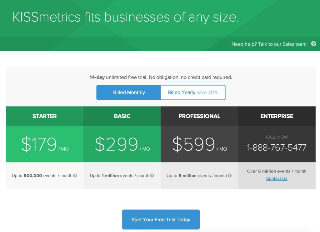
71. Test the duration of the free trial. More does not mean better. In one experiment, KISSMetrics found that a trial for 14 days affects the conversion to paid customers better than a trial for 30 days. When users are offered such a long free period, many postpone testing at a later date, after which they generally forget about the product. In this case, 14 days is too short a time to postpone testing for the next week.
72. Place a block with prices on the page where the first acquaintance of the visitor with the product takes place. On some sites it is sometimes very difficult to find out the prices. In fact, it is not clear why someone is trying to hide the cost until the last moment. But for many clients this is the basic information on the basis of which the decision is made. Therefore, if they do not find her, they are unlikely to want to contact you personally. It will be easier to leave the site and use the services of competitors. To determine how important information with prices for a potential client, you can use web analytics. In Google Analytics, for example, you can view the pages to which visitors most often go. If among them the leading pages with prices, then this information is very important for them.
73. On the page with tariff plans, test two types of payment - monthly and annual - instead of one . And see how your customers are more comfortable and better paid. After all, the payment for the year is much more profitable for you: the client immediately becomes attached to you. And next year it will be even harder for him to abandon you if his business processes are highly dependent on your service.
74. Add information about the guarantee of the authenticity of your product, the security of the transaction. And see how this will affect the increase in sales. Also next to prices and a call to action, you can put more and reviews. This will cause even more trust in an indecisive client.
75. Test the addition of a 30-day warranty: If the customer is unhappy with something, you will return the money to him. This small mark may be exactly the trigger that will push the customer to buy / subscribe. And after that, it's up to you - the client starts processing in such a way that he wants to stay with you.
76. If you offer something for free, add a note with a cash equivalent . For example: "Free course: how to double the conversion for 30 days (costing $ 300)." As soon as a person sees how much such a course costs in monetary terms, he begins to appreciate this offer better. Because of this, he has more incentives to do a certain action: leave your e-mail address, make a repost, etc.
77. If you offer free shipping, provided that the customer makes a purchase for a certain amount, this element should always be visible. First, free shipping is one of the incentives to make a purchase. Secondly, if a customer places an order for a smaller amount, and sees that he will have to pay extra for the delivery, then this will stimulate him to buy something else. More purchases - more sales - more profit. So test!
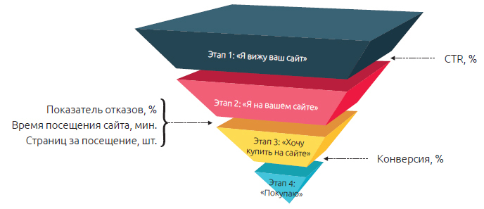
The sales funnel is the process of moving a potential client from the first contact with the site to the final target action - selling a product or service, registering, subscribing, downloading a file.
As an example, you can consider the online store. Where at the first stage the user enters the main page, then he finds the right product through the search, adds it to the cart, goes to the payment page and, finally, makes a purchase. In this case, the funnel looks like this: Homepage of the site> Product search> Product Page> Add to cart> Payment.
Obviously, if you can increase the conversion at each stage of the sales funnel, it will increase your profit. Therefore, it is possible and necessary to conduct A / B testing.
78. Remove all distracting information (offers of other products, promotions, etc.) on pages where the user enters payment information and performs other key actions. If you look at the payment process on Amazon.com, you will notice that there are practically no distracting elements. As if they were, the probability of leaving the payment page would increase, which in many cases is equivalent to losing a client.
79. If your sales funnel consists of a large number of stages, then try to reduce it. For example, some pages can be combined or even removed from the sales funnel, if they do not play a key role in decision making. This will reduce the number of actions for the user. After all, everyone understands that in most cases, the smaller and simpler, the better.
80. Experiment with the progress bar if the process of payment and personal data entry consists of several stages. When the user sees that he is in the third stage out of five, this subconsciously affects him. This increases the likelihood that he will finish the job.
81. At the stage of entering personal data and payment information, remove links to other pages that lead a potential client from the sales funnel. If the user needs to know the delivery information, add it to one of the pages of the sales funnel, but in no case do not send it to the pages, after which he is unlikely to return to payment.
82. Test the length of the landing page: short vs long. On this score are ongoing disputes. However, one thing is certain. Short landings are better suited for simple and understandable products with which potential customers are already familiar. And long landings should be used when users need more information before making a decision. This applies to complex technological goods. But in each case it is necessary to conduct A / B testing, so as not to hope for assumptions and intuition.
83 Make a complete redesign of the page and analyze how the test version affects the main metrics: conversion rate, bounce rate, views, etc. The saying "Meet on clothes, and escorted by the mind" is applicable to sites. Attractive design creates a good first impression and has a significant impact on future actions. But since everyone has his own “attractive”, it is better to test the design before introducing it.
84. Swap the main blocks of your landing page: benefits, benefits, reviews, social evidence, pricing, etc.
85. Add chat to the key pages of the site - landing page, payment page, etc. Due to this, potential customers will be able to ask questions that concern them at the most crucial moment. In addition, it will allow you to collect information about what interests you most and makes it difficult for customers to purchase.
86. Add a call widget so that the user can leave your number and get advice from your sales managers. I am sure that this A / B experiment will significantly increase the conversion rate and sales.
87. Place the logos of your most famous customers on the landing page. Moreover, these companies should be familiar to your target audience so that they have a positive attitude. The same applies to the logos of popular online publications that wrote about you.
88. If you have an online store, then add a recommendation block with similar or additional products to the product description page. It is likely that through this experiment you can increase sales by increasing the average bill per customer.
89. Post a widget with positive customer reviews next to the product description . This will be another convincing factor for a potential customer to make a purchase.
90. Test how adding a product rating next to the "Buy" button will affect the increase in conversion of this button. As the practice of the company Mneniya.pro (http://mneniya.pro/), which is engaged in the implementation of widgets with reviews and retyingov in cards of goods, shows, this very well affects the conversion rate.
Article in the topic - Cases: how reviews of goods increased the conversion of an online store by 14% and traffic by 200%
91. Add a block with the best selling items. Such elements are very popular: many people act like most. Therefore, if they see that everyone buys a certain product and trusts it, then this will further motivate them to make a purchase.
92. If your main source of income is banner advertising on the site, then test various advertising options - change the text, image, call to action, etc. By increasing the clickability of ads, you can increase the effectiveness of the site as an advertising platform.
93. Add pop-up windows at the entrance and exit from the site. And test how it will affect the increase in the number of subscribers (if we are talking about a subscription to your site).
94. Conduct an experiment on the “Thank you for your purchase” page, placing useful information, links to the most popular products and the like. Then analyze how this affects the average duration of the sessions on the site, the number of pages viewed, and other metrics.
95. If you describe your advantages on the landing page, then change this text. Write about the benefits that a potential customer will receive from your product / service and see how this will affect the increase in conversion and sales. Remember! You are not selling a product, not a service, not your benefits. You sell the benefits that a customer receives by paying money. So experiment with this text.
96. Test as adding a widget "Similar articles" or "Articles on the same subject" affects the average number of articles viewed on the site, as well as the duration of each session. This A / B experiment is perfect for online media as well as bloggers who want to increase visitor engagement.
Article in the topic - The effectiveness of recommendations for the blog - A / B test Related Posts
97. If you work on a subscription model and offer a free test period with the condition of entering payment card data, try to remove this condition. Most likely this will increase the conversion of visitors to test users, some of whom will later become your paid customers.
98. Spend A / B testing on the “Thank you for your purchase / subscription / registration” page. For example, you can add social buttons there, with which the client can get the opportunity to tell about a new purchase to his friends. After all, many people love to brag about their purchases. And for sure, that part of your client’s friends is the target audience, which through this link will then go to your site and make a purchase.
99. Test the field “Coupon code for a discount”, if such an option is present when paying for your goods / services. The fact is that some potential buyers, when they see this field, immediately begin to look for this code on the Internet. As a result of this, for some time they leave your site, do not find a coupon, get upset and do not complete the purchase process. Therefore, if you are not very actively providing discounts on coupons, it makes sense to remove this field altogether and analyze the indicators of exits from the payment page, as well as the conversion rate.
100. Add to your site a block with the number of customers that you have already served or how many subscribers are reading you, etc. If this figure is large enough, then this is another incentive to use your services.
So this was the second part of the ideas for A / B testing. If you missed the first article, here is a link to it.
I hope that this largest and most detailed list of 100 ideas for A / B testing turned out to be useful for you. Subscribe to our site and you definitely do not miss useful information.
PS If in your practice you used any other ideas, tell us about it in the comments. I am sure that everything will be useful. And to you plus to karma and many likes for a useful comment.
I just want to warn you that proper A / B testing is a very difficult process. The difficulty is not to run the experiment. This is the easiest. The whole difficulty lies in the formulation of a hypothesis, in the search for an idea for testing.
')
If you follow the rules that experts advocate, to search for potentially successful A / B testing ideas you will have to use web analytics, analyze user behavior, communicate with your target audience, conduct polls.
And these rules are absolutely logical. They need to be respected. But if you have a small company, a small team, there are no necessary specialists, it is very difficult to do all of the above.
In this case, a list of 100 ideas was compiled. In the previous article, we already reviewed 51 ideas for testing calls to action, forms, text and visual elements.
In this article we will talk about the remaining 49 ideas for A / B tests. Explore, learn and test the best ideas on your site.
A / B testing social buttons
In recent years, social networks have become one of the most effective channels of interaction with their target audience. Through them, you can attract the target audience, communicate with it and even make sales. On each site you can find social buttons. Some use them to attract more people to their groups, while others use them to share content. Anyway, the buttons are present almost everywhere. And they may be subject to testing.
Ideas for testing:
52. Change the location of the social buttons. If now they are located only at the top or bottom of the article, then make them floating - let them accompany the reader. As practice shows, such a change can lead to a significant increase in reposts. If your main goal is to increase the number of subscribers in your groups on social networks, then place these buttons in the most visible places on the site.
Article in the topic - Case of AMD - improved conversion by 3600% due to the proper placement of social buttons (3rd case inside the article)
53. Increase the size of social buttons. To make the user want to share your information, 2 conditions must be met: the content must be useful / interesting, and the social buttons must attract attention and have a call to action. If in your case they are too small and not attractive, then increase. It is likely that involvement (comments, reposts, likes) will also increase.
54. Experiment with button design . If you use something creative, try a standard design. Creativity is, of course, good. But over the years people have become accustomed to certain standards, the violation of which most often leads to negative results. In my opinion, social buttons should have a standard design that is used on the most popular sites.
55. Test the call-to-action text. If there is no text next to the social buttons, add it. If he does not call for action, change it. This is an excellent and very easy to implement idea for A / B testing.
56. If you are active in social networks, then add the widget with links to groups / public pages. Thanks to this you can increase the number of subscribers.
A / B site navigation testing
After a potential customer visits your website, you should lead them to the desired goal. He does not have to think how to do this or that action. Namely, you must manage it. And site navigation plays an important role in this. After all, using the menu, you can give the user the opportunity to navigate through the most important sections of the site.
Ideas for testing:
57. Change the order of the blocks in the menu. On many sites, the menu looks so erratic that it misleads visitors. Therefore, it should have a logical structure. For example, the blocks “About us” and “Contacts” have always been placed and will be placed at the end (on the right side). While the key blocks about the product / service, the benefits are always placed at the beginning (on the left side), as they have priority.
58. Experiment with different kinds of menus: vertical, horizontal, fixed, vanishing. Surely you have noticed that many sites use a fixed menu, which is always before the eyes of the user. Therefore, if he even squandered to the middle of the page, you can still quickly navigate and go to the desired page using the menu, which is right before your eyes. And this affects the user engagement, the reduction in bounce rates and the increase in the length of stay on your site.
59. Place the menu on the left side of the screen. It has long been known that people view pages in the form of the letter “F” and pay more attention to the left side of the page.
60. Test the name of the individual blocks in the menu. For example, the block "Why us?" Can be replaced by "How it works." The block "Benefits" can be replaced by "Benefits". And these two words are perceived completely differently by a potential client. And there can be a lot of such experiments. The main thing is to test the very blocks that play a key role in the interaction with the user.
61. Highlight the most important blocks in your menu using the background color or the text size / color. I repeat once again that you yourself must direct the user to the right places where he will perform the conversion. Therefore, the visual selection of certain objects - one of the ways to attract attention. If you understand that, after entering, not a specific page, the visitor is most likely to perform the target action, make them go to this page!
62. Remove extra blocks from the menu. Thanks to this visitor will be easier to concentrate on those sections that you want him to see. However, there is one caveat - before removing extra blocks, make sure they are not popular with potential customers. For this you need to use web analytics services. You can select the service at this link.
Article in the topic - Overview of services for web analytics
63. Add icons to the texts in the menu . This will make them more attractive and interactive.
64. Remove the menu at all from your site, if it is very rarely used by visitors and does not bring any benefit to them. There are examples when deleting the menu doubled the conversion. This was due to the fact that users had less choice for further actions, as a result of which they clicked on the CTA-button more often.
65. If you have an online store - change the navigation. Add categories, the ability to choose the size, color. Here everything is individual and depends on a specific example. In this case, it is important to use only the necessary filters so as not to cause a backlash from the visitors, since a large number of options is also not the best alternative
A / B testing pricing pages
Price is one of the most important factors when a customer makes a purchasing decision. Conclusion? This is one of the key pages in the sales funnel. Therefore, A / B testing of this particular element of the site is one of the real ways to increase conversion and sales.
Ideas for testing:
66. If you have several tariff plans, then in the test version select one of them as “the most popular” . It can be distinguished by size, color, additional text, or in some other way. For example, you can insert the words “Most Popular” or “Most Profitable Tariff Plan” next to it. And you should not allocate the lowest or the highest price - it is better to choose something average
67. Experiment with the prices themselves. Surely, you are familiar with such a trick, when instead of 100 rubles they write 99. And this technique is used almost everywhere. Most likely, it works. So why not check it out with A / B testing. Below is a very cool article on this topic. I advise everyone to read!
Article in the topic - Pricing psychology: 30 product pricing tactics
68. Add information that only today discounts, promotions, special offers for this product or tariff plan are in place and analyze how this will affect sales.
69. Add the ability to test your product for free for a limited period of time. In most cases, customers need to “touch” the product before making a payment decision. And after the test period it will be much easier to convert it into a paid user. So try to add such a function and analyze how this will affect the growth of paid users and sales in the future.
70. Test the effectiveness of the freemium plan (access with disabilities) compared to the free trial (full access for a limited period of time). It often happens that people refuse a product and do not want to pay for it due to the inability to test all the functionality. In this case, a weekly or two-week trial with full functionality can have a very positive effect on increasing the client base.
71. Test the duration of the free trial. More does not mean better. In one experiment, KISSMetrics found that a trial for 14 days affects the conversion to paid customers better than a trial for 30 days. When users are offered such a long free period, many postpone testing at a later date, after which they generally forget about the product. In this case, 14 days is too short a time to postpone testing for the next week.
72. Place a block with prices on the page where the first acquaintance of the visitor with the product takes place. On some sites it is sometimes very difficult to find out the prices. In fact, it is not clear why someone is trying to hide the cost until the last moment. But for many clients this is the basic information on the basis of which the decision is made. Therefore, if they do not find her, they are unlikely to want to contact you personally. It will be easier to leave the site and use the services of competitors. To determine how important information with prices for a potential client, you can use web analytics. In Google Analytics, for example, you can view the pages to which visitors most often go. If among them the leading pages with prices, then this information is very important for them.
73. On the page with tariff plans, test two types of payment - monthly and annual - instead of one . And see how your customers are more comfortable and better paid. After all, the payment for the year is much more profitable for you: the client immediately becomes attached to you. And next year it will be even harder for him to abandon you if his business processes are highly dependent on your service.
74. Add information about the guarantee of the authenticity of your product, the security of the transaction. And see how this will affect the increase in sales. Also next to prices and a call to action, you can put more and reviews. This will cause even more trust in an indecisive client.
75. Test the addition of a 30-day warranty: If the customer is unhappy with something, you will return the money to him. This small mark may be exactly the trigger that will push the customer to buy / subscribe. And after that, it's up to you - the client starts processing in such a way that he wants to stay with you.
76. If you offer something for free, add a note with a cash equivalent . For example: "Free course: how to double the conversion for 30 days (costing $ 300)." As soon as a person sees how much such a course costs in monetary terms, he begins to appreciate this offer better. Because of this, he has more incentives to do a certain action: leave your e-mail address, make a repost, etc.
77. If you offer free shipping, provided that the customer makes a purchase for a certain amount, this element should always be visible. First, free shipping is one of the incentives to make a purchase. Secondly, if a customer places an order for a smaller amount, and sees that he will have to pay extra for the delivery, then this will stimulate him to buy something else. More purchases - more sales - more profit. So test!
A / B testing in the sales funnel
The sales funnel is the process of moving a potential client from the first contact with the site to the final target action - selling a product or service, registering, subscribing, downloading a file.
As an example, you can consider the online store. Where at the first stage the user enters the main page, then he finds the right product through the search, adds it to the cart, goes to the payment page and, finally, makes a purchase. In this case, the funnel looks like this: Homepage of the site> Product search> Product Page> Add to cart> Payment.
Obviously, if you can increase the conversion at each stage of the sales funnel, it will increase your profit. Therefore, it is possible and necessary to conduct A / B testing.
Ideas for testing:
78. Remove all distracting information (offers of other products, promotions, etc.) on pages where the user enters payment information and performs other key actions. If you look at the payment process on Amazon.com, you will notice that there are practically no distracting elements. As if they were, the probability of leaving the payment page would increase, which in many cases is equivalent to losing a client.
79. If your sales funnel consists of a large number of stages, then try to reduce it. For example, some pages can be combined or even removed from the sales funnel, if they do not play a key role in decision making. This will reduce the number of actions for the user. After all, everyone understands that in most cases, the smaller and simpler, the better.
80. Experiment with the progress bar if the process of payment and personal data entry consists of several stages. When the user sees that he is in the third stage out of five, this subconsciously affects him. This increases the likelihood that he will finish the job.
81. At the stage of entering personal data and payment information, remove links to other pages that lead a potential client from the sales funnel. If the user needs to know the delivery information, add it to one of the pages of the sales funnel, but in no case do not send it to the pages, after which he is unlikely to return to payment.
Additional ideas for A / B testing
82. Test the length of the landing page: short vs long. On this score are ongoing disputes. However, one thing is certain. Short landings are better suited for simple and understandable products with which potential customers are already familiar. And long landings should be used when users need more information before making a decision. This applies to complex technological goods. But in each case it is necessary to conduct A / B testing, so as not to hope for assumptions and intuition.
83 Make a complete redesign of the page and analyze how the test version affects the main metrics: conversion rate, bounce rate, views, etc. The saying "Meet on clothes, and escorted by the mind" is applicable to sites. Attractive design creates a good first impression and has a significant impact on future actions. But since everyone has his own “attractive”, it is better to test the design before introducing it.
84. Swap the main blocks of your landing page: benefits, benefits, reviews, social evidence, pricing, etc.
85. Add chat to the key pages of the site - landing page, payment page, etc. Due to this, potential customers will be able to ask questions that concern them at the most crucial moment. In addition, it will allow you to collect information about what interests you most and makes it difficult for customers to purchase.
86. Add a call widget so that the user can leave your number and get advice from your sales managers. I am sure that this A / B experiment will significantly increase the conversion rate and sales.
87. Place the logos of your most famous customers on the landing page. Moreover, these companies should be familiar to your target audience so that they have a positive attitude. The same applies to the logos of popular online publications that wrote about you.
88. If you have an online store, then add a recommendation block with similar or additional products to the product description page. It is likely that through this experiment you can increase sales by increasing the average bill per customer.
89. Post a widget with positive customer reviews next to the product description . This will be another convincing factor for a potential customer to make a purchase.
90. Test how adding a product rating next to the "Buy" button will affect the increase in conversion of this button. As the practice of the company Mneniya.pro (http://mneniya.pro/), which is engaged in the implementation of widgets with reviews and retyingov in cards of goods, shows, this very well affects the conversion rate.
Article in the topic - Cases: how reviews of goods increased the conversion of an online store by 14% and traffic by 200%
91. Add a block with the best selling items. Such elements are very popular: many people act like most. Therefore, if they see that everyone buys a certain product and trusts it, then this will further motivate them to make a purchase.
92. If your main source of income is banner advertising on the site, then test various advertising options - change the text, image, call to action, etc. By increasing the clickability of ads, you can increase the effectiveness of the site as an advertising platform.
93. Add pop-up windows at the entrance and exit from the site. And test how it will affect the increase in the number of subscribers (if we are talking about a subscription to your site).
94. Conduct an experiment on the “Thank you for your purchase” page, placing useful information, links to the most popular products and the like. Then analyze how this affects the average duration of the sessions on the site, the number of pages viewed, and other metrics.
95. If you describe your advantages on the landing page, then change this text. Write about the benefits that a potential customer will receive from your product / service and see how this will affect the increase in conversion and sales. Remember! You are not selling a product, not a service, not your benefits. You sell the benefits that a customer receives by paying money. So experiment with this text.
96. Test as adding a widget "Similar articles" or "Articles on the same subject" affects the average number of articles viewed on the site, as well as the duration of each session. This A / B experiment is perfect for online media as well as bloggers who want to increase visitor engagement.
Article in the topic - The effectiveness of recommendations for the blog - A / B test Related Posts
97. If you work on a subscription model and offer a free test period with the condition of entering payment card data, try to remove this condition. Most likely this will increase the conversion of visitors to test users, some of whom will later become your paid customers.
98. Spend A / B testing on the “Thank you for your purchase / subscription / registration” page. For example, you can add social buttons there, with which the client can get the opportunity to tell about a new purchase to his friends. After all, many people love to brag about their purchases. And for sure, that part of your client’s friends is the target audience, which through this link will then go to your site and make a purchase.
99. Test the field “Coupon code for a discount”, if such an option is present when paying for your goods / services. The fact is that some potential buyers, when they see this field, immediately begin to look for this code on the Internet. As a result of this, for some time they leave your site, do not find a coupon, get upset and do not complete the purchase process. Therefore, if you are not very actively providing discounts on coupons, it makes sense to remove this field altogether and analyze the indicators of exits from the payment page, as well as the conversion rate.
100. Add to your site a block with the number of customers that you have already served or how many subscribers are reading you, etc. If this figure is large enough, then this is another incentive to use your services.
So this was the second part of the ideas for A / B testing. If you missed the first article, here is a link to it.
I hope that this largest and most detailed list of 100 ideas for A / B testing turned out to be useful for you. Subscribe to our site and you definitely do not miss useful information.
PS If in your practice you used any other ideas, tell us about it in the comments. I am sure that everything will be useful. And to you plus to karma and many likes for a useful comment.
Source: https://habr.com/ru/post/294660/
All Articles