Meet on clothes: how to transform your corporate website

Today I want to share new and therefore especially interesting for our team experience in creating a corporate website. Of course, this is not our first web page - which company does not currently distribute its products on the web? - but the first attempt is to introduce yourself as a brand. Unlike all the old ones, the new site was not designed to demonstrate the range of products, but to represent the company as a manufacturer and business entity. The new goal implied new priorities, and new priorities - new solutions.
As with any unfamiliar business, we expected difficulties and were ready for the fact that even with the help of numerous SEO resources with recommendations somewhere we would have to act at random. However, everything turned out to be surprisingly clear. As soon as the concept of the site was outlined in general terms, everything else: the structure, the content, the look, quickly began to emerge.
')
The minimal concept on which all the other calculations were based was as follows: we need a corporate website that would attract partners and specialists interested in cooperation, and also help the brand name to be heard; distribution of goods in our goals is not included. Having decided on the functions and the target audience, we began to build a logical chain: what should the site be like in order to meet the goals, what will it be interesting to see for the people we want to attract?
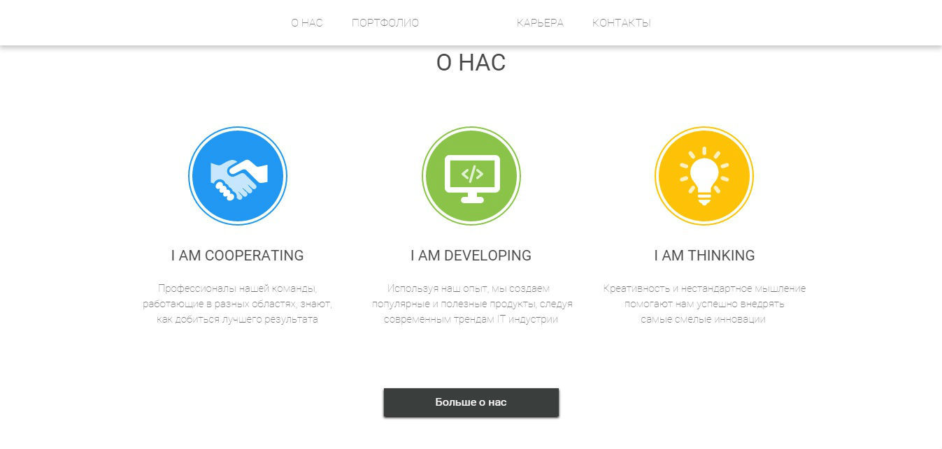
Sites that contain only basic information about the company, without demonstrating the range of products and not providing the opportunity to make purchases online, are often called business cards. The name is quite apt and immediately suggests one of the main standards of such pages - conciseness. The business card serves to give a general idea of the subject and his field of activity, as well as all the necessary contact information. The same principles should be followed when creating the content of your web page.
We started with fairly lengthy texts telling about our history, products and strengths, but in the process we cut the content almost twice and, I must say, without much damage to the information content. I think vanity is a common weakness among copywriters and optimizers. Even a literate, well-built text is often full of “water” or standard, familiar phrases that slip past the reader’s mind. Do not forget: if it is difficult to gain interest in your products, then it is difficult to get interested in yourself as a company. Therefore, it is better to facilitate their task and separate the wheat from the chaff in advance.
In hindsight, we developed the following algorithm for ourselves. Decide which segments of visitors you intend to focus on (customers / buyers, partners, investors, applicants). Carefully select only the most relevant information and the loudest achievements for each of the segments and arrange them in thematic blocks. Then subtract. And again, and more. To achieve the most capacious wording, clarity and freshness - then the text has a chance to be read and understood by all the right groups of users.
The desire for conciseness has another advantage: it makes your text visually compact. Designers are much easier to work with such a format than with the immense "sheets" that usually have to be hidden or squeezed, making them less accessible and easy to read. The small blocks of text mentioned above unleash the hands in this respect: not only can they be easily distributed across the page without creating a feeling of congestion, but also supplemented with graphic content — all kinds of icons, headers and auxiliary icons that will attract, accentuate and complement text information.
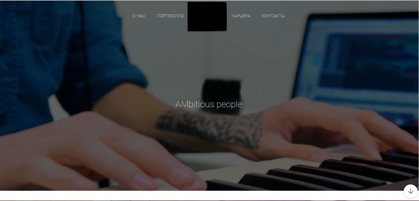
By the way, when the concept of “less text, more graphics” took shape completely, we decided to go all in and insert a small background video on the page - not a review of products, but a presentation of the brand. Although mobile graphics are nowadays considered the most promising type of content, its use is often associated with a known risk. A self-playing video, if it gives information not in the way it should be - too quickly, messy or aggressive, may not keep the visitor’s attention, but push it away. And in our century, the ubiquitous animation, which often also turns out to be advertising, excessive movement on the web page makes you slightly tense. We understood all this, so the video was perfectly calibrated in all respects, ranging from the color gamut to the pace. We tried to critically approach every little thing, wondering how it will affect the general perception of the visitor: the dominant neutral tones and slow transitions will not cause visual overload and irritation, rare color accents will "cling" the eye, excessive plot will only confuse, the general idea and the structure of the clip should be fairly transparent - it would be nice to mark the scenes with text hints. I must say, the first reviews and the increase in traffic allow us to conclude that our efforts were not in vain.
Finally, the last concession to conciseness and compactness was the rejection of the multipage site. We placed the main array of content on the main page in bands, composing it so as to prevent visual monotony, and established a convenient navigation system. A couple of the largest fragments nevertheless went to separate secondary pages, at the same time giving an opportunity to expand the list of key queries.
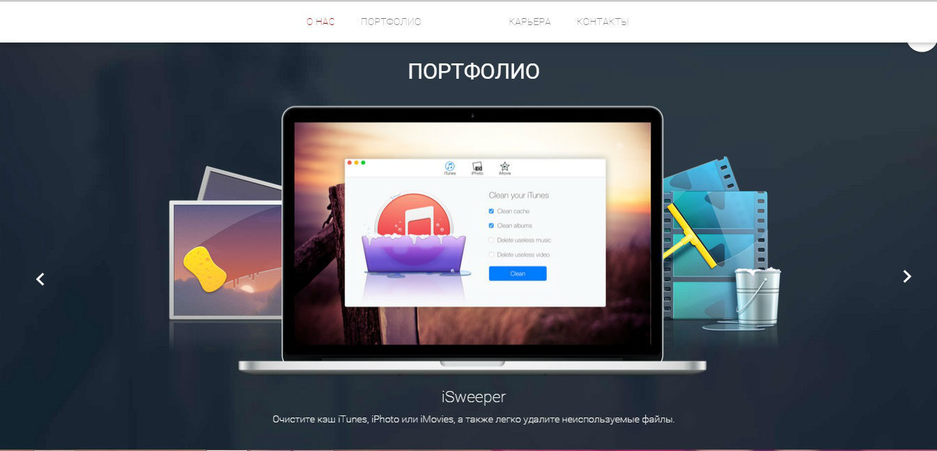
So, with the content and its presentation sorted out. What's next? Portfolio. Let us focus on the company, and not on products, it is unlikely that it will be possible to interest someone with a cat in a bag - it means you cannot do without it. However, guided by the developed concept, we did not allow him to take too much space, in all senses. Products were not honored with a separate page: we defined them in a slider for easy viewing, and also to emphasize the diversity and contrast of what we produce. Based on the type of products the company creates (mobile games and applications), the textual component was minimized on this slide, but our designers worked as they should on the visual presentation.
At the beginning of the article we called the provision of communication channels to the user as one of the main functions of the business card site. Accordingly, there can be no doubt about the tab “Contacts”. But what should it contain? Here we again return to the first step: the definition of the target audience. It is on what goals people will turn to you, which tools will best meet their needs.
We have broken all the popular communication tools in web space that we could offer into three groups, following the criterion of accessibility and time costs on the part of the user:
- instant: online consultation, call order (you can make a contact directly on the web page, the answer comes instantly);
- quick: contact form (you can make a contact directly on the web page, the answer comes after a while);
- slow: e-mail, phone (contact is established outside the web page).
Instant communication is required for those visitors whose needs arise most spontaneously - and this is mainly buyers who want to make or discuss a purchase. Since our site is not an online store, there is practically no information on products, we refused from this group in the first place, especially since they are the most resource intensive.
The second group was also rejected as inappropriate for the style of communication that we are tuned to. It was clear that neither applicants (who, at a minimum, would need the file transfer option), nor would potential partners find such a way convenient - all the same, all correspondence will take place through other, less one-way channels. Such communication tools are good for technical support, which, again, was not among our priorities. Thus, as a result, we stopped at the third group, trying to provide the maximum variety of channels - e-mail, telephones and Skype, which should partly compensate for the lack of "instant" communication tools.
The above listed are the three whales that have a business card site: a company presentation, contact information, examples of work. Only one final touch is left. The corporate site should be a kind of portal, the center of the network of resources that promote it. Consequently, we need a relink with the latter. In our case, only corporate pages on social networks are related to such resources, but soon we hope to add a block of partners and publishers.
This is how we gradually deciphered this mysterious concept for ourselves - a business card site, enriched by a new web resource and new experience in the process. The moral of this story is: do not be afraid to take on the unfamiliar, articulate for yourself what you want to get answers to all the questions, well, come to us a spark, of course!
Source: https://habr.com/ru/post/294642/
All Articles