10 interesting trends in the design of mobile applications
Thanks to the development of mobile applications - from Uber to Vine - we are gradually beginning to understand how trends in program design have taken shape over the course of half a decade. Many factors influence how mobile applications look at a certain length of time: from social trends such as “mutual aid economics” to changes in technology — this year, for example, we see huge phone screens combined with tiny wearable accessories.
The more users use mobile technology in their daily lives, the more they think about the applications they use. Checking mail, booking a hotel room, ordering gluten-free pizza delivered to your home. Applications like Airbnb and GrubHub stand out from the crowd and minimize the amount of thought to use them. Therefore, users can combine work in the application with something else and not waste time thinking about how to find the functions that they need. The more things users do at the same time, the more they need mobile apps with a design that meets their needs and gives them what they want - when they need it.
')
Given the above, let's take a look at the current trends in the design of mobile applications that provide users with what they want right now:
1. Large phone screens
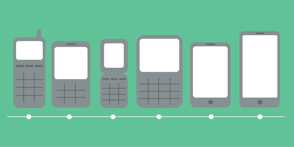
Whether you like it or not, phablets require more and more usable screen space. What does this mean for designers and mobile application developers?
Working above the obvious “big design”, it is important to understand how people will hold their devices during their use. This means that, first of all, the navigation elements should be located in such a way that a person can easily reach them with his thumb (for example, the upper opposite corner is likely to be too far). It's easy to think of this, isn't it? You just need to arrange all the interactive elements on the right at the bottom of the screen. Only it complicates the fact that about 10% of users are left-handers.
You can “force” your left-handed users to hold the screen with two hands, but taking into account how big the screens of mobile devices are now, the hand that the navigation elements are closer to will be used more often. Or, if it is really important for you that your application is convenient for all users (and it is important for you), then you should make sure that the following conditions are met: all navigation elements must be large enough so that they can be easily reached from any side of the screen. In addition, you really got more useful screen area, with which you need to work. Another idea is to use a custom interface with the ability to "flip" it for left-handers.
But regardless of whether your users are better off with their right hand or vice versa, it is important to approach the design of applications with the understanding that certain design decisions may entail not only reducing the usability of the interface (make it less intuitive), but also lead to fatigue and discomfort in the hands. This is an important detail that must be taken into account and corrected in various types of testing.
Of course, when working on applications for large screens, you need to remember the following:
2. Swap - new click
When the first mobile applications adapted for touchscreens appeared, designers and developers had to face the reality of programming for an object that was significantly different from previous types. Zooming into the first iPhone of 2007 was an unusual novelty for us, but the design of the application, in which the user has to zoom the page to be able to read the content, cannot be called successful. At the same time, who among us has not had the opportunity to face the “nasty” tiny button, which is too small to press it without problems (unless you are the owner of a rare combination of miniature hands and the pianist’s refined motor skills).
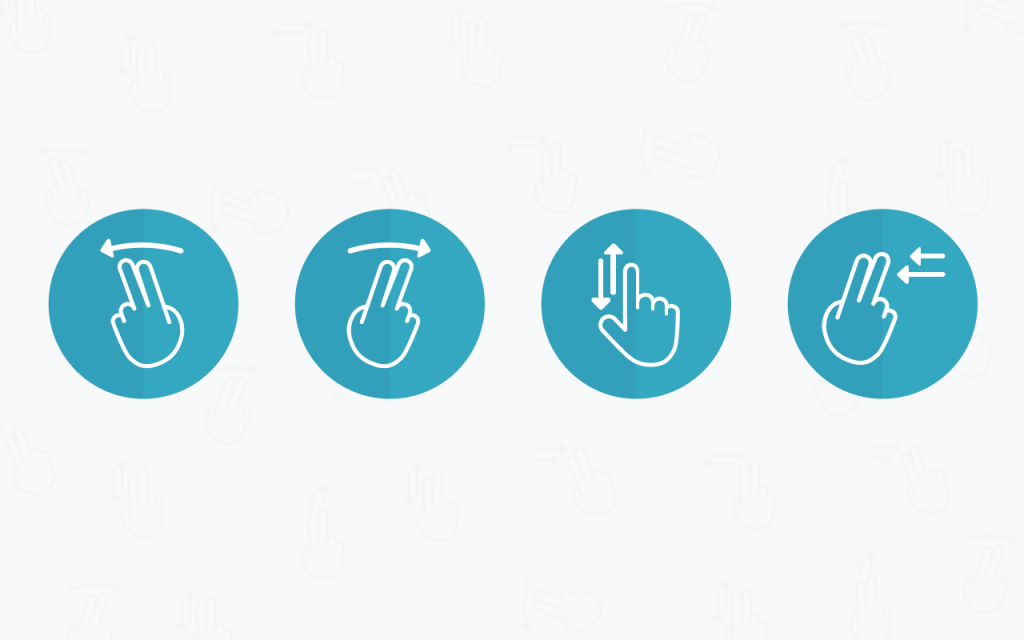
Scrolling movements seem more natural when using mobile devices, especially if you are doing everything with one hand. What is the evidence? Imagine that you have a phone jammed in your hand and try to make a thumb click on an imaginary screen. Remember your feelings. Next, make a scrolling movement through the screen. What did you find more comfortable?
Of course, the most obvious example of using svaypov in applications is Tinder, who simplified the incredibly complex nature of dating to two simple steps: scrolling right and left. In less time, which would have taken you to watch a trailer, you can send a signal to an entire army of potential cavaliers (or ladies) with just a flick of the thumb on the screen of a mobile device. It seems that Tinder's ideas do not let him down, as evidenced by more than a billion users of the application.
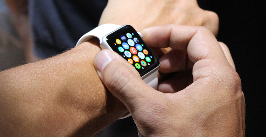
3. Wearable accessories have an increasing impact on application design.
The tiny displays of smart watches are the opposite of the huge screens of tablets. Analytical firm International Data Corporation predicts that vendors this year will supply 45.7 million wearable devices, including gadgets worn on the wrist (they make up the largest percentage of the total, their number is 40 million), as well as garments and points.
Those devices, which were originally developed as fitness gadgets, are now seizing all large market areas with releases from the Apple Watch and Android Wear. Wearable devices are no longer advertised pedometers with mechanisms that monitor pulse and sleep. They really became reliable smart gadgets that can tell the user how long the trip to work will last, show the weather forecast for tomorrow or remind to boil the kettle before the aunt's arrival. How does this affect the work of mobile application designers?
We are still in the early stages of this growing trend, although Apple and Android are already offering a range of solutions for wearable devices. As creators of watch-like devices, both brands emphasize the importance of making information on them easily perceived from a quick glance. Unlike programs for phones and tablets, which, according to the expectations of developers, users have been watching for a long time, applications for wearable devices should be designed in such a way that the user can quickly perceive a sufficient amount of content. Information must be assimilated from a single glance, even a corner of the eye. This means that the font, color contrast and attendant factors (where is the user? What data does he need right now?) Are especially important when designing and developing applications for wearable devices.
And since this technology is quite new, it is extremely important to pay attention to the feedback and wishes of users and work on future updates. And while Apple and Android can make assumptions about the future look of mobile applications for wearable devices, it’s the users who will actually determine their design.
4. Layered layouts
Can the eternal discussion about what is better - a flat design and skeuomorphism - end with a find of something average? Opponents of skevomorphism argue that at the aesthetic level, the use of a faded resemblance of natural textures in the context of modern IT technologies is just as tasteless as an attempt to imitate wood on a car dashboard. But even despite the recognition of lovers of aesthetics in the IT world, and a flat design has its drawbacks. If you remove the texture from all the design elements of a mobile application, it will be difficult to determine which of them are interactive, if you can even distinguish the boundaries between different interface elements.
The compromise is a multi-layered flat design or what Google calls "material design." This aesthetics still relies heavily on a flat design, but some of its principles are borrowed from skeumorphism. As with a flat design, the elements of a multi-layered or material design are geometric in nature, filled with “monolithic” colors rather than imitating natural textures or a banal glitter or shine. But skepomorphism borrowed metaphors from the natural world, especially how objects interact with each other. This is seen in the shadows and other background light effects.
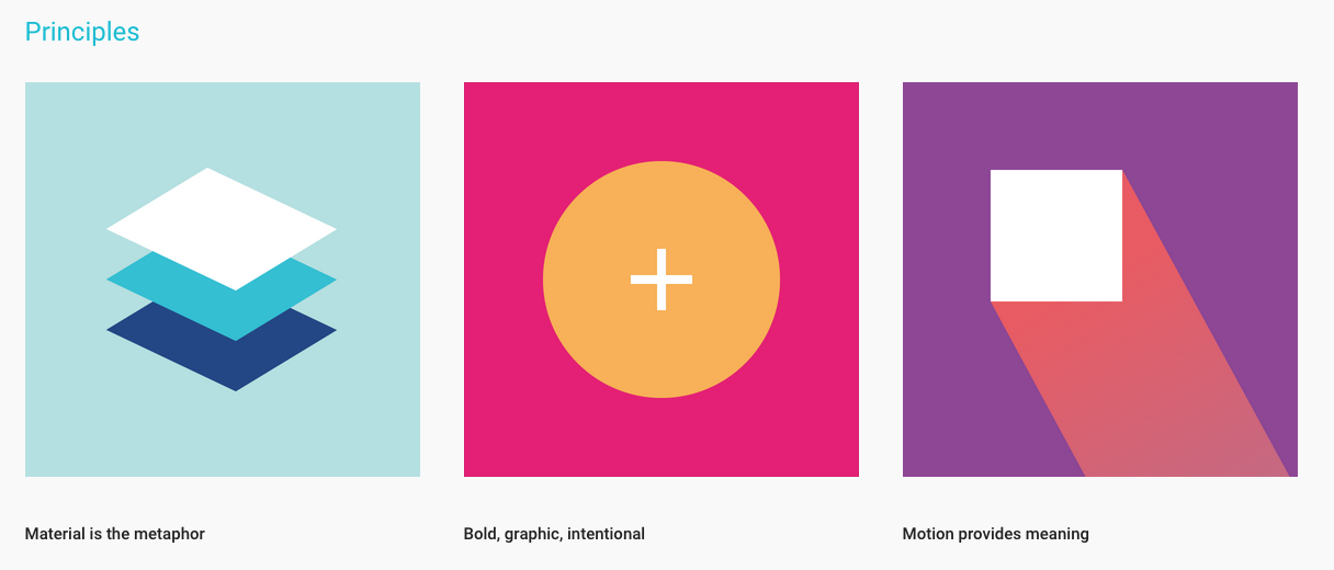
Google Material Design Principles
By merging flat design with natural physics, users can more intuitively understand how elements on the screen work. When you manipulate objects on your device, they have mass and inertness. It may give the impression that they have a mass when you move them around the screen, or when they cast shadows on the elements behind them. This combination of the ease of use of skeuomorphism and the aesthetics of a flat design creates an elegant look for the application, generating a positive user experience.
5. More movement
Your smartphone has more performance than the equipment, thanks to which NASA managed to send the first man to the moon, as well as the Super Blue supercomputer, which in 1997 beat Garry Kasparov in chess. And mobile devices are getting smarter and smarter. And not only mobile devices become more powerful, but with the arrival of three types of 4G (everyone is trying to overcome the other in power and speed) to replace the 3G, you have more freedom to animate the design of your mobile application.
TimeLine Page , author Sergey Valyukh
Animation offers many advantages for mobile app design. It can contribute to attracting the user's attention to a particular object, lead it to the necessary action, or simply create a more pleasant and amazing user experience. Currently, smartphones are already quite advanced, and their networks have enough power to digest the animation of HTML5 or parallax effects that you already use on your computer. This year, we are watching how more moving elements have appeared in the design of mobile applications, which has less impact on the signal speed and device power than before. And this is just the flowers, because smartphones are becoming smarter.
6. Simple soft colors
Each year is characterized by its own color palette, and now we prefer a very simple range of colors that are distinguished by soft contrast. This is a natural consequence of the omnipresent minimalism and flat design of mobile applications. Nevertheless, the colors are selected according to the current trends (in the Pantone Spring 2015 color palette, preference is given to “cooler and softer solutions with gentle warm tones”). Try using a pattern with different shades of the same color, with white font and contrasting elements. Or try a pattern with only two or three muted tones.
In the context of a simple design of mobile applications, the choice is given to a less diffused experience, in which a sharp color contrast requires more attention from the eye. With a long contemplation of the luminous screen, the eyes are unlikely to say “thank you”, but muted tones and a softened glow (again, these are the strengths of the flat design) make the appearance of the mobile application more pleasant and complete.
7. Texturing comes to the scene
It seems that more recently, fonts in mobile applications were represented only by secure web fonts that could be read on low resolution screens. Over the past two years, iOS and Android have been optimizing operating systems for more dynamic, scalable, and readable fonts. Another side effect of big screens and technological innovations (thanks to you, TypeKit ) is the use of fonts to add beauty and expressiveness to the design of your mobile applications. Regardless of whether your text is accompanied by a huge fashionable image in the background or it is surrounded by negative space, we can use the font to convey your idea in a powerful minimalistic way.

Wild Canada's iOS app by Marshall Lorenzo.
8. Built-in blur
One of the trends in the design of mobile applications is the blurring of the background, which adds to the convenience of using "translucent" applications. And despite the fact that mobile applications that close the user interface, have a clean and holistic look, they can still cause usability problems.
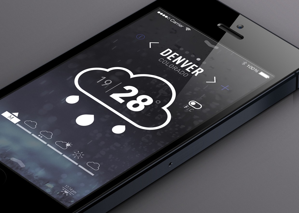
User Interface (UI) "Weather", the author Nathan Smith (Nathan Smith).
Depending on the user-selected background image for mobile devices, as well as the number of icons and widgets, the lack of transparency can make your application more difficult to understand. Using the blur effect Gaussian blur in the design of the program will make it more understandable and pleasing to the eye, while maintaining the “sound” of the user interface.
9. Innovations in convenient design of mobile applications
As a bonus, we get that modern design trends actually make applications more user-friendly. Simple layers with huge elements and fonts require less effort of the visual apparatus, while wide hand movements (swipes) are opposite to gestures that require more developed motor skills (two-finger zooming, pressing) and are acceptable for people with musculoskeletal problems. . Along with the fact that Typekit allows you to use more lively text in the design of mobile applications without sacrificing the quality of fonts, it also makes our programs easier to use for people with visual impairments. The increase in the availability of devices with large screens and phablet contributed to the fact that the design of the mobile application has become more convenient for more people.
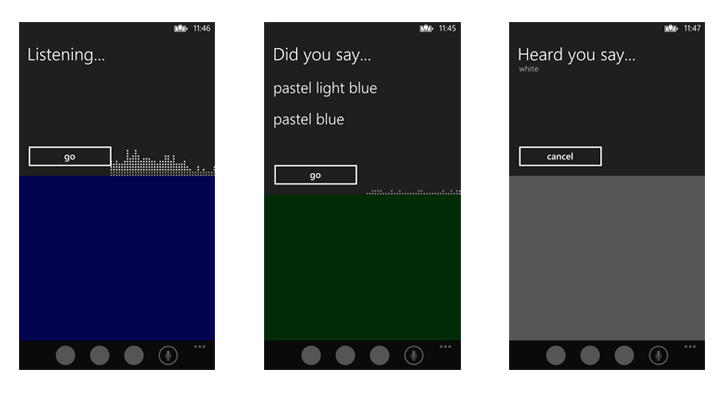
An example of embedded speech recognition software that uses the SRGS grammar.
Remember that creating a user-friendly mobile application design requires a thorough reflection on how clear your product is and is easy to use for the consumer. Is this template customized for someone who may need a larger and more legible font? Creating a list of features that enhance the usability of the application can be a good idea when working on the design of your product. The Accessibility Project offers a wealth of resources for designers and developers that will help their products to be accessible and convenient for more users.
10. Wiser prototyping
Every application we used was once a prototype. Many experimental prototypes began with simple sketches printed on several sheets of paper or saved in PDF. Now that the design of mobile applications has become more complex, it is not enough to show only a few static layouts and make the client (or developer) present the intended movements in it. If the application is rich in animation to direct the user or attract interest due to visual effects, your client is not able to grab everything that should make the application interesting and easy to use. In addition, flat models do not create a sufficient “wow effect”.
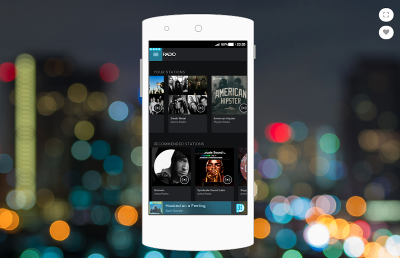
The Spotify app is a prototype created with Proto.io .
However, the work of programmers in the development of an experimental prototype has its own set of headaches, because developers have to work with might and main on elements that may not appear in the final prototype. In order not to waste energy in vain, designers must either very clearly describe their ideas to the developers, or take the prototype in their hands to match their vision.
Fortunately, there are currently enough solutions for prototyping, so the designer can do it. With minimal coding knowledge or even without it, the designer can create an experimental prototype that shows how the user should interact with the application. In this case, you can create the necessary animation for the design of the application. As a result, you not only get a prototype that will amaze your potential customers, but also facilitate the application development process. Since you have already described all the details that are important for the operation of the application and its interaction with the user, developers need to start creating the product directly, without wasting their time and effort on creating endless versions of the design.
Source: https://habr.com/ru/post/294282/
All Articles