They will help you find all the "killers" of conversion - 10 reports in Google Analytics
Your site can do more. Just find and patch all the "holes" through which you lose potential customers. After all, every lost client is a lost profit. In this article you will learn how to find weaknesses on the site using reports in Google Analytics!

The "Sequence Visualization" report is a sales funnel (Sales Funnel - distribution of the entire sales process into several stages. For example: First contact with the site> Registration on the site> Paid subscription)
')
How to find: Conversions> Goals> Multichannel sequences
What this report gives: In it, you can see how many potential customers “fall off” at each stage of the sales funnel.
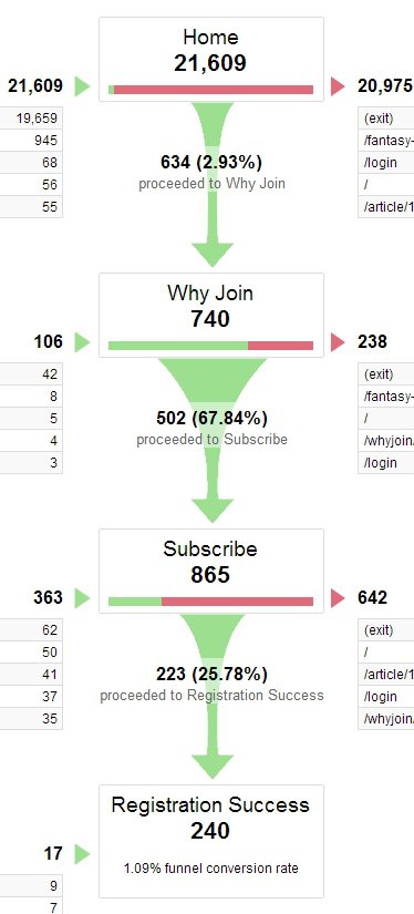
Here is a sales funnel with 3 stages. The first stage is the transition from the main page to the page “Why should I subscribe?” (Why Join). As seen in the picture, the conversion is only 2.93% or 634 people. At this stage, the first “hole” in the sales funnel is located.
On the left side you can also see where users are going. In our example, 19,659 people simply leave the site (exit).
What conclusions can be drawn from this?
Either the main page does not meet the expectations of visitors, or non-targeted traffic is attracted.
In addition, 945 users - go to another page that is not included in the sales funnel. If they are looking for some important information there, then perhaps it should be placed on the main one, so that users can correctly move through the sales funnel.
If we assume that 3% of the traffic that goes to the next stage of the sales funnel is targeted traffic, then the next “hole” is the Subscribe page. 865 users come to this page (most likely they are interested, once got to it), but only 25% of them subscribe. 25% - not the best indicator. Therefore, the subscription page is the best place to start working on increasing conversions.
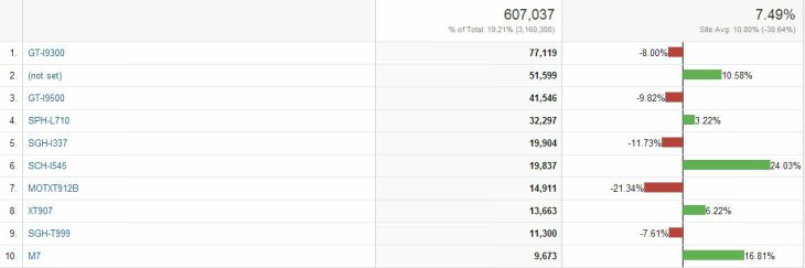
How to find: Audience> Technology> Browser and OS> Select the target of interest in the table.
What this report gives: You can understand how the use of different browsers (and their versions) affects conversion rates.
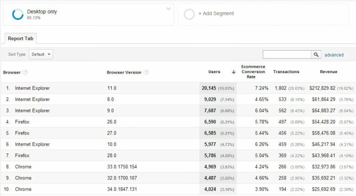
In this case, you see that most often the site is accessed using an Internet Explorer browser. The conversion between the 11, 9 and 8 versions is very different. In version 11, the conversion is 7.24%, and in 8 - 4.65%. This is too big a difference. Therefore, you need to test how your site is displayed in this browser, and what problems arise.
At the moment, a conversion of 4.65% generates $ 61,000. Now calculate how much revenue would be if the percentage of conversion is increased to 7%? It turns out about $ 92,000. $ 31,000 more. It is worth analyzing the conversion in each browser.
Attention: There are two conditions that must be observed when analyzing the conversion by browsers:
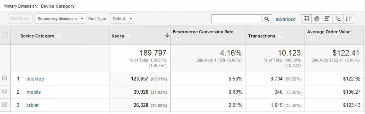
In this report, you need to keep track of differences between devices. As a rule, the indicators between computers and tablets should be the same (or tablets have less than 10%). As for mobile devices, their conversion is one-third or one-quarter of the same indicator on computers / tablets.
These are approximate numbers that can fluctuate in each case!
In addition to the difference in conversion between devices, pay attention to the proportion of devices from which users access the site. To do this, click on the diagram icon above the table on the right side.

If less than 50% of the traffic falls on computers (Desctop), then it is worthwhile to begin serious work on processing mobile traffic (Mobile). If the conversion from tablets (tablet) is very different with the standard conversion, then there are some problems, and you lose money. If the conversion from mobile devices is less than 25% of the normal rate, then you again lose money.
If this is your case, then the results of the device report are a valid argument for creating a separate mobile version of the site or making it adaptive for all types of devices.
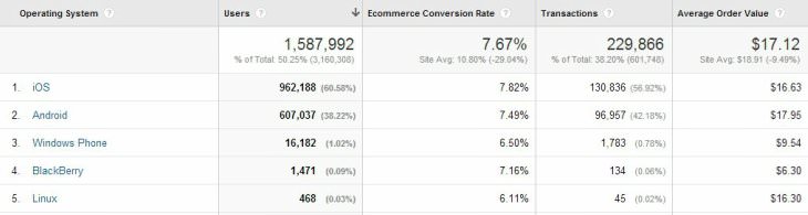
There is another type of report on devices that you should pay attention to - the conversion of the site depending on the operating system and the specific type of device. If the conversion rate on iOS is very different from the coefficient on Android, then front-end programmers could forget to take something into account.
The same with specific types of devices. For example, you can see how different the conversion is for specific devices running on the OC Android. To make it easier to analyze, click on the "Comparison" icon, which is located above the table on the right side. If you notice a very large difference in performance between different models of devices, then try to test yourself what the problem is.
At the same time pay attention to the most popular devices. If you start to optimize the site for each device, it may be economically inefficient. First, not all devices have a large share. Secondly, some of them become obsolete and will no longer be used in the near future. Keep this in mind!
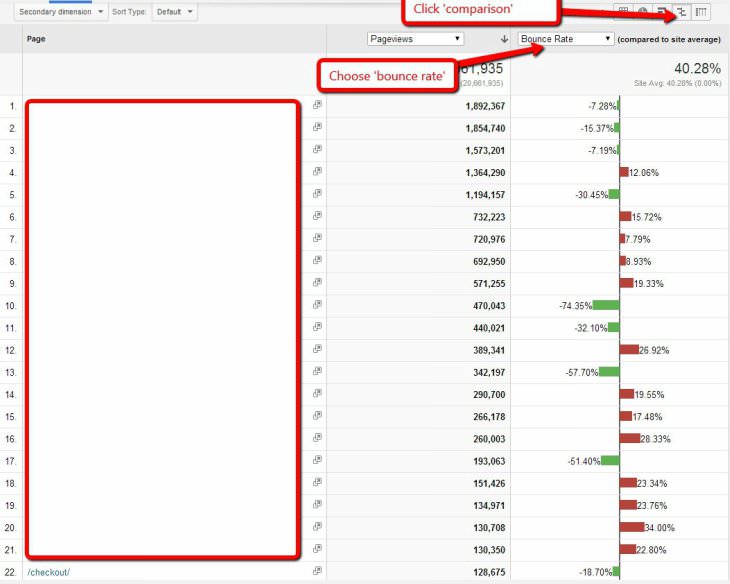
Percentage of exits (Exit Rate) - the percentage of exits from the site performed from the specified page.
How to find: Behavior> Site Content> All Pages (Click on the “Comparison” icon on the right above the table and select the bounce / OUT indicator)
What this report gives : You will find out which pages have the highest bounce / exit rates and will be able to compare these data in the context of the most visited pages. This way, you will know exactly which pages you need to refine and what is the difference between effective pages and ineffective ones.
Since the first contact of the visitor with the site takes place on the landing pages, this report is one of the most important in web analytics. Moreover, all paid traffic you drive to the landing pages, so you need to clearly know the behavior of users on them.
How to find: Behavior> Site Content> Entry Pages (Click on the "Comparison" icon on the right above the table and select the conversion / bounce rate)
What this report gives: You will find out which landing pages have the highest bounce rate, i.e. the user gets on it and immediately logs out without completing the target action.
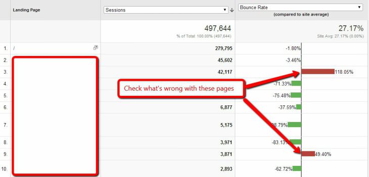
After the pages with the highest bounce rates are identified, you can either improve them or stop driving traffic. If it is paid traffic, then the second option is preferable. In any case, as long as you do not reduce the bounce rate.
You will also find out which landing pages convert visitors better / worse.
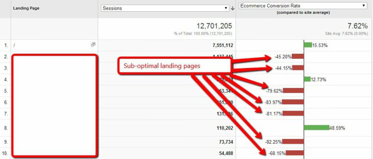
After the low conversion landing pages are identified, you can apply one of the above options.
How to find : Audience> Mobile devices> Devices (Above the table on the right, click on the text "Screen resolution", after which it will be selected as the main parameter)
What this report gives: Since now users are browsing the Internet from different devices, the resolution of the screens also differs accordingly. Through this report, you will find out if there are any problems in using your site depending on the screen resolution.
Suppose you open this report and see that users with a higher screen resolution have a higher conversion. Perhaps this is due to the fact that they have more money.
On the other hand, can users with a small screen resolution have a lot of problems when using the site? This is very likely.
And if so, then the problem must be urgently addressed.
Download speed is very important. If the site loads slowly, the user may not wait for it and click the “close” button. The result - you have lost a client.
In accordance with the research of KISSmetrics, every extra second download reduces the site conversion by 7%. Not bad, huh?
How to find: Behavior> Site loading speed> Page load time
What this report gives: You will find out which pages of the site load slowly and need some work.
After determining the slowest pages, go to Google PageSpeed Insights (https://developers.google.com/speed/pagespeed/insights/), enter the links of these pages there and get a detailed report on how this problem can be fixed.
Most likely, at this stage you will need the help of a front-end specialist who can easily fix these problems.
How to find: Behavior> Map Behavior
What this report gives: With the help of a behavior map you can study the users' internal transitions through the pages of the site

The picture above shows a map of the behavior of a single site. As you can see, visitors go over and over again to the Course directory page, then back to the main page. Most likely, they are looking for something, but can not find.
After reviewing the behavior map, an analysis of the conversion was carried out for two segments: the first segment - people who visited the Course directory page, the second segment - which did not visit it. It turned out that the second segment has a conversion of almost twice as high.
What is the conclusion?
The “Course directory” page has certain problems, as a result of which the site conversion is reduced.
What to do?
Find out why users are switching to this page over and over again. Understand what they are looking for and what they lack. Redo, if possible, or stop the flow of traffic to this page.
How to find: Traffic sources> All traffic> Channels
What this report gives you: You will find out from which traffic sources come users who are better / worse converted into customers.
After analyzing this report, you will clearly know which traffic source works efficiently, and which vice versa. Accordingly, you can concentrate all your labor / financial efforts on the first and abandon the second.
This image shows that e-mail traffic has the highest conversion, while paid advertising and banners are small. It is logical that it is worth investing more in e-mail marketing, since the “exhaust” from investments will be maximum.
Moreover, each source of traffic can be considered in more detail by clicking on it.
How to find: Audience> Behavior> New and returning users
What this report gives you : You can find out how much the conversion rate differs depending on the type of user.
As practice shows, many sites lose money, because they are too “aggressively” trying to sell their products / services to new visitors. This tactic is not always effective. Sometimes it scares users. And they leave the site.
The image shows that the conversion is 3 times different between new and returning users.
In this case, it will be logical to concentrate on returning visitors back to the site. For example, e-mail marketing, through which you can gently remind yourself to a potential client and return it to the site.
I am sure that these 10 simple reports in Google Analytics will help you find weaknesses in the site and create good hypotheses for subsequent A / B testing and improving the site’s performance.
Translation and adaptation: conversionxl.com/10-google-analytics-reports-tell-site-leaking-money/#
Sequence Visualization (Funnel Visualization)
The "Sequence Visualization" report is a sales funnel (Sales Funnel - distribution of the entire sales process into several stages. For example: First contact with the site> Registration on the site> Paid subscription)
')
How to find: Conversions> Goals> Multichannel sequences
What this report gives: In it, you can see how many potential customers “fall off” at each stage of the sales funnel.
Here is a sales funnel with 3 stages. The first stage is the transition from the main page to the page “Why should I subscribe?” (Why Join). As seen in the picture, the conversion is only 2.93% or 634 people. At this stage, the first “hole” in the sales funnel is located.
On the left side you can also see where users are going. In our example, 19,659 people simply leave the site (exit).
What conclusions can be drawn from this?
Either the main page does not meet the expectations of visitors, or non-targeted traffic is attracted.
In addition, 945 users - go to another page that is not included in the sales funnel. If they are looking for some important information there, then perhaps it should be placed on the main one, so that users can correctly move through the sales funnel.
If we assume that 3% of the traffic that goes to the next stage of the sales funnel is targeted traffic, then the next “hole” is the Subscribe page. 865 users come to this page (most likely they are interested, once got to it), but only 25% of them subscribe. 25% - not the best indicator. Therefore, the subscription page is the best place to start working on increasing conversions.
Browser Conversion (Conversions Per Browser)>
How to find: Audience> Technology> Browser and OS> Select the target of interest in the table.
What this report gives: You can understand how the use of different browsers (and their versions) affects conversion rates.
In this case, you see that most often the site is accessed using an Internet Explorer browser. The conversion between the 11, 9 and 8 versions is very different. In version 11, the conversion is 7.24%, and in 8 - 4.65%. This is too big a difference. Therefore, you need to test how your site is displayed in this browser, and what problems arise.
At the moment, a conversion of 4.65% generates $ 61,000. Now calculate how much revenue would be if the percentage of conversion is increased to 7%? It turns out about $ 92,000. $ 31,000 more. It is worth analyzing the conversion in each browser.
Attention: There are two conditions that must be observed when analyzing the conversion by browsers:
- All reports need to be segmented by device: only computers, only tablets, only mobile devices. You can not mix this data. Initially, Google Analytics is not able to view the report only on computers. To add such a function, follow this link .
- Every browser and version must have at least 100 conversions, otherwise the results may be unreliable.
Conversion / Bounce Per Devices Ratios
In this report, you need to keep track of differences between devices. As a rule, the indicators between computers and tablets should be the same (or tablets have less than 10%). As for mobile devices, their conversion is one-third or one-quarter of the same indicator on computers / tablets.
These are approximate numbers that can fluctuate in each case!
In addition to the difference in conversion between devices, pay attention to the proportion of devices from which users access the site. To do this, click on the diagram icon above the table on the right side.
If less than 50% of the traffic falls on computers (Desctop), then it is worthwhile to begin serious work on processing mobile traffic (Mobile). If the conversion from tablets (tablet) is very different with the standard conversion, then there are some problems, and you lose money. If the conversion from mobile devices is less than 25% of the normal rate, then you again lose money.
If this is your case, then the results of the device report are a valid argument for creating a separate mobile version of the site or making it adaptive for all types of devices.
There is another type of report on devices that you should pay attention to - the conversion of the site depending on the operating system and the specific type of device. If the conversion rate on iOS is very different from the coefficient on Android, then front-end programmers could forget to take something into account.
The same with specific types of devices. For example, you can see how different the conversion is for specific devices running on the OC Android. To make it easier to analyze, click on the "Comparison" icon, which is located above the table on the right side. If you notice a very large difference in performance between different models of devices, then try to test yourself what the problem is.
At the same time pay attention to the most popular devices. If you start to optimize the site for each device, it may be economically inefficient. First, not all devices have a large share. Secondly, some of them become obsolete and will no longer be used in the near future. Keep this in mind!
Bounce / OUT rates on the most visited pages
Percentage of exits (Exit Rate) - the percentage of exits from the site performed from the specified page.
How to find: Behavior> Site Content> All Pages (Click on the “Comparison” icon on the right above the table and select the bounce / OUT indicator)
What this report gives : You will find out which pages have the highest bounce / exit rates and will be able to compare these data in the context of the most visited pages. This way, you will know exactly which pages you need to refine and what is the difference between effective pages and ineffective ones.
Conversion / bounce rates on landing pages
Since the first contact of the visitor with the site takes place on the landing pages, this report is one of the most important in web analytics. Moreover, all paid traffic you drive to the landing pages, so you need to clearly know the behavior of users on them.
How to find: Behavior> Site Content> Entry Pages (Click on the "Comparison" icon on the right above the table and select the conversion / bounce rate)
What this report gives: You will find out which landing pages have the highest bounce rate, i.e. the user gets on it and immediately logs out without completing the target action.
After the pages with the highest bounce rates are identified, you can either improve them or stop driving traffic. If it is paid traffic, then the second option is preferable. In any case, as long as you do not reduce the bounce rate.
You will also find out which landing pages convert visitors better / worse.
After the low conversion landing pages are identified, you can apply one of the above options.
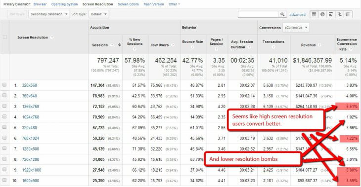
Screen Resolution and Conversion / Bounce Rates
How to find : Audience> Mobile devices> Devices (Above the table on the right, click on the text "Screen resolution", after which it will be selected as the main parameter)
What this report gives: Since now users are browsing the Internet from different devices, the resolution of the screens also differs accordingly. Through this report, you will find out if there are any problems in using your site depending on the screen resolution.
Suppose you open this report and see that users with a higher screen resolution have a higher conversion. Perhaps this is due to the fact that they have more money.
On the other hand, can users with a small screen resolution have a lot of problems when using the site? This is very likely.
And if so, then the problem must be urgently addressed.
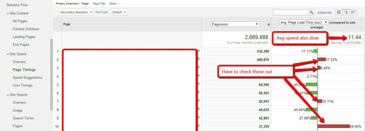
Download speed of the most visited pages
Download speed is very important. If the site loads slowly, the user may not wait for it and click the “close” button. The result - you have lost a client.
In accordance with the research of KISSmetrics, every extra second download reduces the site conversion by 7%. Not bad, huh?
How to find: Behavior> Site loading speed> Page load time
What this report gives: You will find out which pages of the site load slowly and need some work.
After determining the slowest pages, go to Google PageSpeed Insights (https://developers.google.com/speed/pagespeed/insights/), enter the links of these pages there and get a detailed report on how this problem can be fixed.
Most likely, at this stage you will need the help of a front-end specialist who can easily fix these problems.
User Map
How to find: Behavior> Map Behavior
What this report gives: With the help of a behavior map you can study the users' internal transitions through the pages of the site
The picture above shows a map of the behavior of a single site. As you can see, visitors go over and over again to the Course directory page, then back to the main page. Most likely, they are looking for something, but can not find.
After reviewing the behavior map, an analysis of the conversion was carried out for two segments: the first segment - people who visited the Course directory page, the second segment - which did not visit it. It turned out that the second segment has a conversion of almost twice as high.
What is the conclusion?
The “Course directory” page has certain problems, as a result of which the site conversion is reduced.
What to do?
Find out why users are switching to this page over and over again. Understand what they are looking for and what they lack. Redo, if possible, or stop the flow of traffic to this page.
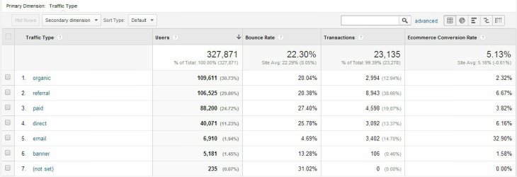
Conversion by traffic source
How to find: Traffic sources> All traffic> Channels
What this report gives you: You will find out from which traffic sources come users who are better / worse converted into customers.
After analyzing this report, you will clearly know which traffic source works efficiently, and which vice versa. Accordingly, you can concentrate all your labor / financial efforts on the first and abandon the second.
This image shows that e-mail traffic has the highest conversion, while paid advertising and banners are small. It is logical that it is worth investing more in e-mail marketing, since the “exhaust” from investments will be maximum.
Moreover, each source of traffic can be considered in more detail by clicking on it.
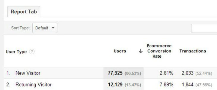
Report on new-returning users (New vs Returning)
How to find: Audience> Behavior> New and returning users
What this report gives you : You can find out how much the conversion rate differs depending on the type of user.
As practice shows, many sites lose money, because they are too “aggressively” trying to sell their products / services to new visitors. This tactic is not always effective. Sometimes it scares users. And they leave the site.
The image shows that the conversion is 3 times different between new and returning users.
In this case, it will be logical to concentrate on returning visitors back to the site. For example, e-mail marketing, through which you can gently remind yourself to a potential client and return it to the site.
I am sure that these 10 simple reports in Google Analytics will help you find weaknesses in the site and create good hypotheses for subsequent A / B testing and improving the site’s performance.
Translation and adaptation: conversionxl.com/10-google-analytics-reports-tell-site-leaking-money/#
Source: https://habr.com/ru/post/294238/
All Articles