Filing errors. Part 1. Introduction.

Travel guide: Part 1. Introduction • Part 2. Speech barrier • Part 3. Errors in forms • Part 4. Errors on the server • Part 5. Helping hand
Introduction
Millions of people visit various sites every day. Naturally, this does not always go on smoothly and sometimes errors occur, either through the fault of the developers or by the fault of the users. In my opinion, it is obvious that if the error took place to be, and it does not matter from which side, the script should appear it in a user-friendly form.
')
In total, I plan to write 5 articles on how to give errors to users - how much to pepper and salt, where to drip sauce and on what tray to bring. Since I do not like verbosity, I will show everything with examples and explain them with comments so that readers would not get tired. So let's go.
The simple truth: errors must be shown ( http://www.dexknows.com )
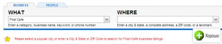
I went to the yellow pages website, selected the PEOPLE tab, and then in the Food & Dining column I chose Restaurants and entered that (what) I was looking for “First Cafe” , but forgot to indicate where (where) I was looking for. The site showed me an error saying that I forgot to indicate where I am looking, instead of showing me a blank page, as some websites do, or worse, redirect to the main page.
Action without explanation or Error must be shown 2 ( http://www.hilton.com )
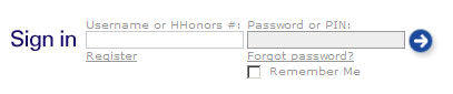
This is the authorization block on the Hilton website. If you do not enter one of the parameters in the authorization form, it redirects you to the authorization page (in the screenshot below), which for some reason is available on the site separately. This page does not show an error, but there is only a timid request that you can use either the username or HHonors.
Error in system dialog box ( http://www.hilton.com )

If you enter only one parameter already on a separate authorization page, we see a dialog box (in my case, Firefox) with a request to enter either the username or the HHonors standard . There are no complaints to the request, there are claims to its type. The site itself is a system that has its own interface. Use the interface elements of other programs, to put it mildly - poor tone (with the exception of radio batts, text fields and checkboxes; drop-down lists - in some cases). Someone else will click on this error and think that the browser has flowed.
Attachment of an error to its cause ( http://gmail.com )
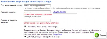
When registering an account with Gmail, errors are shown directly, as they say, “in place” (under the field that was filled out is not correct). Errors are correct and noticeable.
Attachment in cramped ( http://sonyawards.com )
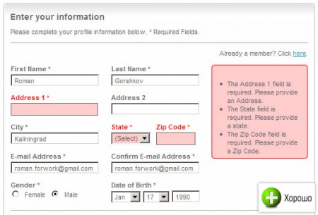
On the Sonyawards website , the designers used color coding (and the wrong fields and the block with errors are highlighted in pink) for the attachment of errors, since due to the compactness of the form (the State and Zip Code fields), it was impossible to place them like Google . Incorrect fields are highlighted. Errors are noticeable.
Note! In the first sample article ( dexknows.com ), the error is not shown below the field. In place of this, it is listed where the search results should appear. Be careful in placing errors, because their placement in the registration form or in the search form is different.
Uncertainty of error ( http://etrade.com )

On etrade.com, I deliberately entered the wrong password. First, the system showed an uncertain error, without exactly specifying where I made a mistake. Secondly, she cleared the User ID and Password fields and now I will be forced to re-enter them (I only had to erase the wrong field, and then only if it is a password).
Error prevention ( http://dexknows.com , http://gmail.com )
Take a look at the screenshots of these sites above. Under the fields is written either an example or an explanation where it is indicated how this field should be filled. This is a good tone rule and warns the user against errors.
Summarize
The purpose of this article is to remind website developers that errors should be displayed correctly on the website. I will dwell on various types of errors in other articles. And now let's draw the main conclusions:
- Errors must be shown, no redirects
- It is necessary to arrange them in the same style as the site and not to use the interface of other programs.
- It is necessary to use the attachment of errors to their causes or place them in the expected place
- If it is not possible to use attachment, use color coding.
- Avoid uncertain errors like “You have entered either a password or a login incorrectly”
- Prevent errors, by explanation, under the input field
The original article can be found in my LJ .
Roman Gorshkov
Source: https://habr.com/ru/post/29411/
All Articles