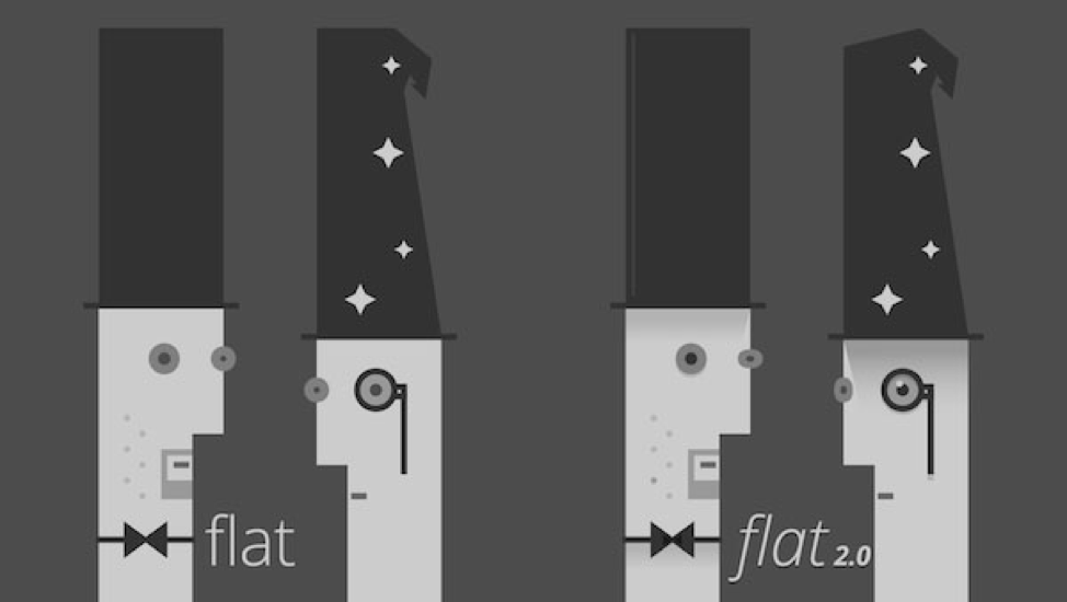
Becoming flat 2.0 is the next step in “flat” design
The “flat design” revolution continues to gain momentum from the moment it was introduced on the Windows Phone platform in 2010. It is not difficult to understand why: an interface with such a design seems more intuitive, well suited for adaptive elements, modern frameworks and, if properly executed, looks attractive.
Flat design began to exist in opposition to the ubiquitous skeuro-morphic style, but has since become much more than just “Variant B”.
Initially, the flat was exclusively two-dimensional with a total orientation towards minimalism. Modern flat 2.o uses shadows, gradients and other elements that make it “almost flat”.
')
5 characteristic components of modern flat design:
1. Long shadows
Long shadows add depth and volume to images without the need to sacrifice minimalistic details for icons that make the interface attractive.
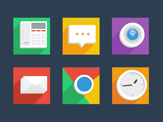
2. Dynamic colors
Complement rare visual effects simply with the help of energetic colors, especially light shades.
Different color background in contrast with the basic color of the elements make the page with the “tiled” menu more vivid.
The Flat UI Colors website contains the most effective color patterns for flat.

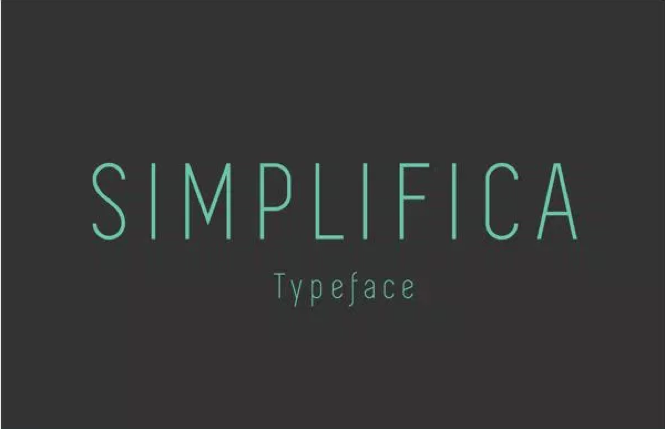
3. Simple typography
Font selection in flat is determined by one criterion: readability. Commonly used sans serif fonts with a constant stroke width.
4. Transparent button
One of the trend elements in modern web design. The reason is that it does not attract too much attention, but is clearly recognized as a button.

5. Minimalism
Flat and minimalism go hand in hand, using the same principles: simplicity and focus on content.
It may seem that the use of a flat design is a universal way out, but minimalism is complex in execution: the less working elements, the more attention they require.
No matter how excellent the solution is not a flat design, there is no guarantee that it is applicable to your website. Familiarize yourself with its main advantages in order to understand whether it is worth planning a global redesign.
Benefits:
• used in adaptive interface;
• simplifies user perception of navigation;
• a clear structure and a schematic visual range emphasize the internal logic of the page;
• fast loading pages, due to the simplicity of graphics;
• familiar typography improves readability.
Flat design is simplicity and minimalism, which, on the other hand, make it difficult to convey visually complex messages. Therefore, before you rush headlong into simplifying the interface, you should carefully consider the scheme of interaction between the site and the user.
Based on Web design book of trends.
Flat design began to exist in opposition to the ubiquitous skeuro-morphic style, but has since become much more than just “Variant B”.
Initially, the flat was exclusively two-dimensional with a total orientation towards minimalism. Modern flat 2.o uses shadows, gradients and other elements that make it “almost flat”.
')
5 characteristic components of modern flat design:
1. Long shadows
Long shadows add depth and volume to images without the need to sacrifice minimalistic details for icons that make the interface attractive.
2. Dynamic colors
Complement rare visual effects simply with the help of energetic colors, especially light shades.
Different color background in contrast with the basic color of the elements make the page with the “tiled” menu more vivid.
The Flat UI Colors website contains the most effective color patterns for flat.
3. Simple typography
Font selection in flat is determined by one criterion: readability. Commonly used sans serif fonts with a constant stroke width.
4. Transparent button
One of the trend elements in modern web design. The reason is that it does not attract too much attention, but is clearly recognized as a button.
5. Minimalism
Flat and minimalism go hand in hand, using the same principles: simplicity and focus on content.
It may seem that the use of a flat design is a universal way out, but minimalism is complex in execution: the less working elements, the more attention they require.
No matter how excellent the solution is not a flat design, there is no guarantee that it is applicable to your website. Familiarize yourself with its main advantages in order to understand whether it is worth planning a global redesign.
Benefits:
• used in adaptive interface;
• simplifies user perception of navigation;
• a clear structure and a schematic visual range emphasize the internal logic of the page;
• fast loading pages, due to the simplicity of graphics;
• familiar typography improves readability.
Flat design is simplicity and minimalism, which, on the other hand, make it difficult to convey visually complex messages. Therefore, before you rush headlong into simplifying the interface, you should carefully consider the scheme of interaction between the site and the user.
Based on Web design book of trends.
Source: https://habr.com/ru/post/293938/
All Articles