Caution! Other people's cases are dangerous for your conversion.

Cases, best practices, market analytics are all used to trusting them, but in vain.
In this article, we show the danger of someone else's experience on research materials by Craig Sullivan, a well-known expert in optimizing conversion and user experience (UX).
')
So, look at 4 examples when test results surprised business owners.
Craig calls best practices of experts the same mystical essence as unicorns. Are all cases, rules, expert developments really worthless? This is not quite true: the danger of failure awaits, if you recklessly rely on someone else's experience, when you make a decision to change a particular element in the hope of increasing the conversion.
A million words were said about the role of tests, but, apparently, such is the ineradicable property of human psychology - to draw conclusions on our own assumptions. More precisely, because a certain marketing “guru” wrote this way or competitors did so. This is what everyone is sinning in: marketers, general directors, startups, and giant corporations. Approximately like hippo)

"I think it should look bluer"
Each business, each advertising campaign has its own unique parameters, where it is necessary to take into account the context, target audience, traffic sources, conversion analytics. And that's why.
Context
When you look at the results of A / B tests from other companies, you have just a tiny fragment of a huge picture before your eyes. “Which button is more effective: blue or green?”, “Call to action above or below the fold line?” Suppose blue gives twice as many conversions. Hurray, run to copy. At the same time, nothing is known about the brand, the level of trust in Central Asia, competitors, or product features.
The target audience
It's funny when business owners say, “Oh, what a cool video XXX has. Let's do something similar! ”And it doesn’t matter that the example was taken from an insurance company, and you are selling clothes from China. The main thing is to be cool)
What should be taken into account: selection criteria, speed of decision making (impulsive or rational sales), main objections of the target audience.
Data
Most of the data on the A / B tests resemble porn movies: it’s great to watch, it’s impossible to repeat. Important points: sample size, statistical confidence, traffic sources.
Traffic
This is the most fickle thing in marketing with a lot of options. Get at least the ratio of desktop and mobile traffic. Affects conversion? And how! What is known about this? As a rule, nothing.
According to Craig, absolutely identical conditions need to be created in order to translate the best practices into your business. It is like trying to copy the air and soil of Silicon Valley in the Urals.
Yes, and the best experts on conversion optimization instead of “I know how to”, say “While I’m not sure about the action plan, let's first find out the reason for the low conversion on your site. That is the way ... ”Their confidence lies in the ability to get key information, to draw the right conclusions. And only then test.
There is no such thing as best practice specifically for you. There are users, the boundary layer between their minds and the product, and the tools that help them understand what is happening there.
Best practices increase the ability to conduct a successful conversion test, while blind copying can ruin everything. The following four cases confirm this.
Example 1. Moving the CTA button above the "fold line"
The Australian center Compare Courses helps students decide on career guidance and get an appropriate education. In order to engage visitors, they made landing pages with a lead form and equivalent CTA - “Request a description” and “Submit a request”. Applicants receive a detailed description of a specific curriculum.
This is the original version of the undergraduate accounting page:
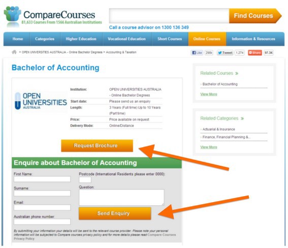
Marketers Compare Courses hypothesized that if you place the form with the call "Send Request" above the fold line (on the first screen), the page conversion will increase. Also, social evidence was inserted under the form itself: the feedback of one of the students and the logos of partners.
Test option:
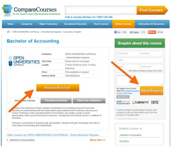
As a result, the CTA “Request Description” conversion increased by 13.3%; and the conversion of sending the request fell by 53.9% (!).
The important point: when there are several calls to action on the page, measure the conversion of each of them. Especially after making changes. Otherwise, you can get a false picture of conversions throughout the landing page as a whole.

Example 2. Adding a left sidebar
According to Best practices, it is considered that users pay the least attention to the left sidebar. This is confirmed by studies of the theory of the F-pattern:
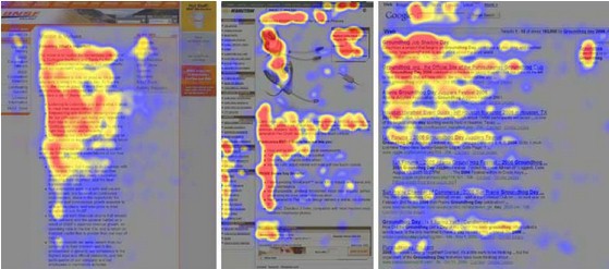
This is a heat map. Bright red color - the area of greatest attention. As you can see, the menu in the left sidebar is almost ignored. However, the following test breaks the theory of the F-pattern to pieces.
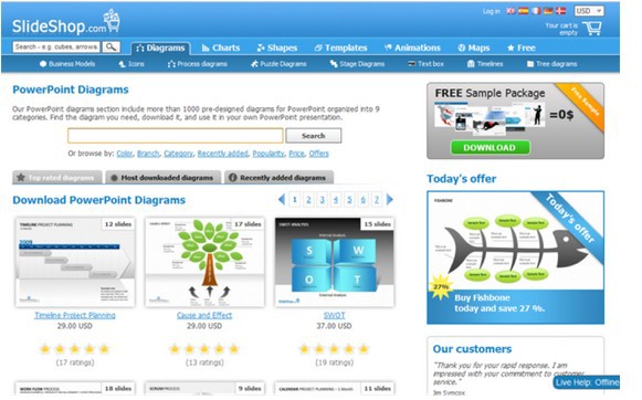
This is the control version of the SlideShop.com page (selling Power Point templates):
And this is a test:
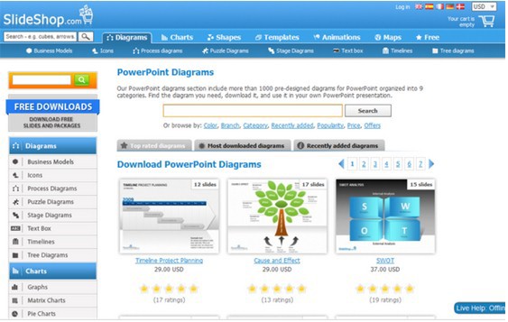
After adding the left sidebar, viewing time increased by 8.9% and conversion to orders by 34%. How could this happen?
Example 3. Hiding the registration form
If the main purpose of the page is to register users, you need to make a noticeable, expanded subscription form. Hell no!
The Vendio example (a free platform for online stores) refutes this rule.
Original option:

A test version with a hidden form, only the “Sign Up Now” button is visible:

Despite the fact that users had to take an extra step (click on the button and then fill out the registration form), the conversion to a subscription jumped 60% (!). Yes, the wording with the benefits of the platform remained the same.
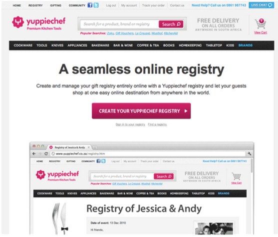
Example 4. Deleting the menu bar
The main menu bar helps in user navigation, improves usability. Yuppiechef (online store of kitchen utensils) decided to find out if it really is.
Original version:
A new version:
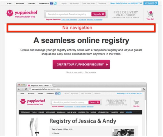
As a result, the conversion of registrations for special offers increased by 2 times, from 3 to 6%.
See 7 more examples of huge failures, when the conversion increase rules do not work in this article.
Commentary by the head of Yagla.ru Alexander Alimov
As you can see, it is reckless to make decisions only on the basis of other people's experience. What worked for 999 other companies might not work for you. And, conversely, a move against the rules can significantly increase conversion. It remains to test everything, test and test again.
With the help of the Yagla service , you can simultaneously test dozens of headings, subtitles, form captions, images, and CTA. Yagla "on the fly" replaces the content of the site for requests from contextual advertising and automatically compares the conversion of each substitution with the original version.
Yes, we deliberately do not draw conclusions, why this or that rule did not work. Share your opinion in the comments, discuss together.
Source: https://habr.com/ru/post/293790/
All Articles